.jpeg)
The parts of the martech exist in almost every other industry. That means that martech websites are often the first proof that their product works, and that they can actually improve the marketing performance for you. But if a martech website isn’t set as a conversion tool and has a confusing homepage, the buyer will likely drop off before they ever book a demo.
Marketers are the ones who will check your website. They are more than familiar with the terms you use, and they likely have tried products like yours. The goal is to treat your online presence as a product demo and get the most out of your martech website.
This article analyzes ten martech websites, all sorted into three types of martech. There is also a five-point framework that will help you score your initiatives. At the end of it, you will find a practical checklist you can use to check your website.
Why Martech Websites Get Judged Harder Than Any Other B2B Category
The Credibility Paradox
As we explained in the beginning, your martech website is proof of whether you get marketing or not. This is something that many martech companies forget about. Buyers won’t judge your website as they would in other industries; they will judge your product right away.
Let’s use forms as an example. If an attribution tool’s demo form asks for eleven fields, the buyer receives a clear signal - this company does not understand how forms lose customers.
This applies most in martech. A logistics company can have a simple, outdated website and still be great at logistics because buyers won’t treat their online presence as the proof of a product.
Veza Digital works instead to solve this problem directly through our martech web design practice. That’s why we built this framework instead of just listing sites we like.
Your Buyer Reads Websites Professionally
Marketing ops leads, growth leads, demand gen managers, and CMOs are your target audience. Those are seasoned marketers who have opinions about hero copy and can spot a fake urgency button in less than two seconds.
Knowing this changes the way we look at martech websites.
Here:
- Aggressive urgency tactics damage credibility
- Generic statements signal lack of substance
- Stock photos show that the company isn’t bothered by the positioning
What works for martech is being specific about the offer, showcasing a real metric, a product demo, and bringing the way it solves the problem to the fore.
We see that other technical categories face a related problem. Our health tech website design article covers a similar kind of scrutiny in a regulated space.
The Five-Point Martech Website Framework
We scored all ten examples in this article using five criteria. Each one is worth up to five points, for a total possible score of 25.
- Positioning clarity - Can a stranger say what this product does within ten seconds of landing on the page?
- Product surfacing - Does the reader see the actual product interface above the fold, or is everything abstract illustration?
- Integration proof - Can a buyer confirm the product fits their existing tools without talking to sales?
- Conversion architecture - Is there a clear, short path from any page on the site to a demo or trial?
- Performance discipline - Does the site load fast, or is a company that sells marketing performance failing its own Core Web Vitals test?
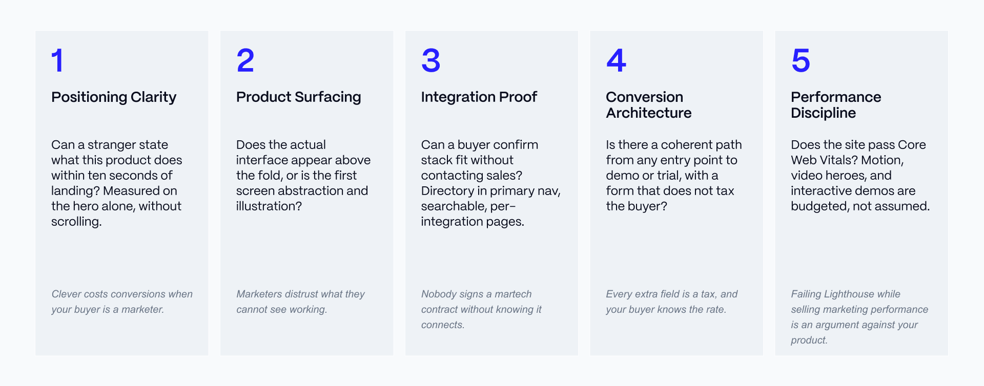
We use this same scale for every example below, and for the three martech categories we cover.
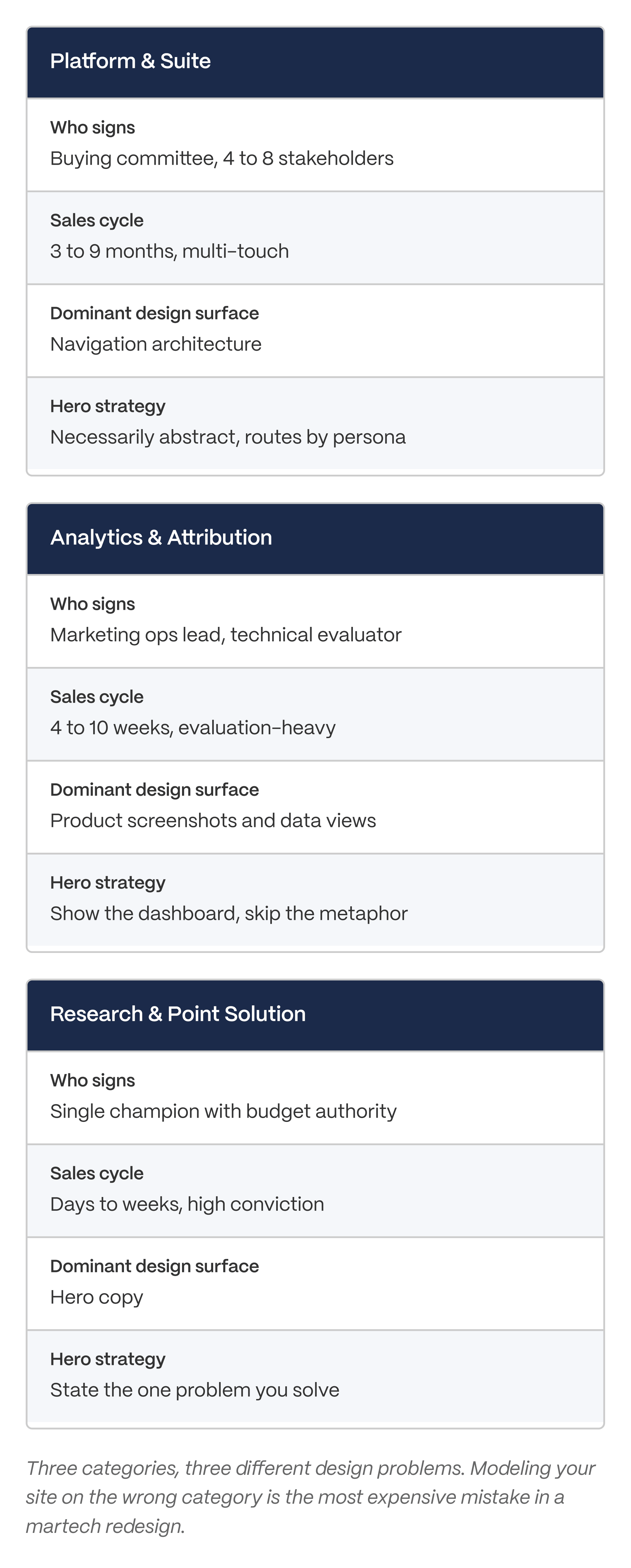
Platform and Suite Martech: Designing for a Buying Committee
What Platform Martech Has to Solve
Platform and suite martech sells several products to several kinds of buyers over a long sales cycle. A committee usually signs off, not one person.
That creates a routing problem. The same homepage has to serve a marketing manager checking out one tool, a RevOps lead comparing the whole suite, and a procurement reviewer checking compliance boxes. This is why navigation, not the hero image, is the main design job at this tier. It is also why the homepage message at this level tends to be broader and more abstract than a smaller, focused product's message.
For a wider set of large-scale B2B examples, see B2B SaaS website examples.
HubSpot: The Reference Point for Suite Positioning
HubSpot's homepage message resolves quickly even though the product line behind it is huge. The site routes visitors down an inbound funnel with several paths open at once: demo, free tier, and a self-guided product tour.
The navigation is built to route by product, by company size, and by use case at the same time, without collapsing into a wall of menu items.
Three patterns worth stealing from HubSpot:
- A homepage message that stays simple even when the product line is large.
- Multiple entry points into the funnel instead of one forced path.
- Navigation built around more than one way of describing what a visitor needs.
Two trade-offs worth avoiding:
- This level of density only works because HubSpot already has strong brand recognition. A smaller company copying the density without the recognition risks confusing visitors instead of routing them.
- The free-tier funnel is expensive to run and most martech companies cannot copy it directly.
Zapier: Navigation as the Product's Argument
Zapier is the clearest example of turning integrations into a design feature instead of a footer link. The main navigation routes by use case and by app, and the app directory works as a top-of-funnel page on its own.
Zapier generates landing pages for individual integration pairs, which helps both search ranking and buyer confidence that their tools will connect. Real product screenshots inside these pages reduce the abstraction problem that hurts a lot of platform martech sites.
Three patterns worth stealing:
- Treating the integrations directory as a real page in the main navigation, not a footer link.
- Building individual pages for specific integration pairs.
- Showing real screenshots instead of illustrations to prove the product works with a buyer's stack.
Two trade-offs worth avoiding:
- A directory this large needs programmatic page infrastructure, which most teams do not have.
- Depth like this takes real engineering investment, not just a design pass.
Analytics and Attribution Martech: Designing for the Practitioner Buyer
What Analytics Martech Has to Solve
Analytics and attribution buyers are technical. They want to see the interface before they read a single line of benefit copy. Abstract illustration is actively punished in this category.
The design job here is proof: showing real dashboard views, real data states, and real numbers, without exposing anyone's private information. Product screenshots carry more weight than illustration at this tier, which is why the hero section is often the dashboard itself. AI products face a similar penalty for being too abstract, covered in our AI startup website design article.
Ahrefs: Numbers as the Trust Signal
Ahrefs' landing pages lean on specific numbers instead of adjectives to make the ROI case. Index size and other hard metrics are placed early to answer the practitioner's first doubt, which is usually about data quality.
The homepage routes visitors to individual tools rather than pushing everyone toward one generic demo request.
Three patterns worth stealing:
- Leading with hard numbers instead of adjectives.
- Placing proof-of-data-quality signals early, before the buyer has to ask.
- Routing by tool instead of forcing one generic path.
Two trade-offs worth avoiding:
- A numbers-first strategy only works if your numbers are actually strong.
- Routing by individual tool adds complexity that a smaller product line may not need.
HockeyStack: Dark Mode as an Audience Signal
HockeyStack uses a dark theme that signals its intended buyer: someone who lives inside dashboards all day. The dashboard-style UI carries over into how the marketing pages themselves are built, and the landing pages route into trial and demo paths.
Dark mode is not just a style choice. It has to meet accessibility standards. Dark themes need to hit WCAG AA contrast minimums, and a forced dark theme with no toggle shuts out users with astigmatism and some low-vision conditions.
A note on Inciper: Inciper is a Microsoft Dynamics consultancy, not a martech product company. It is included here only as a reference for handling dark-mode contrast well, not as a martech example.
Three patterns worth stealing:
- Using theme choice to signal who the product is built for.
- Carrying dashboard visual language into the marketing pages.
- Clear trial and demo routes from the landing pages.
Two trade-offs worth avoiding:
- Dark mode without a real toggle can exclude low-vision users.
- A practitioner-only visual style can alienate a marketing-generalist buyer if the product also needs that audience.
Research and Point-Solution Martech: Designing for a Narrow, High-Conviction Use Case
What Point-Solution Martech Has to Solve
Point solutions win on how clear their message is, not on how many features they show. The buyer already knows their problem. The site has one job: confirm, fast, that this product solves that exact problem.
This is why copy-led heroes usually beat visual-led heroes at this tier. The most common mistake at this level is trying to look like a platform. That makes a focused product look thin instead of making it look bigger.
Wynter: The Copy-Led Hero Done Right
Wynter sells message testing, which means its own messaging is the ultimate test of whether the product works. This is the credibility paradox from earlier in this article, playing out directly.
The hero is copy-led, and the positioning statement is clear about what the product does. The landing pages are built to collect responses efficiently.
Three patterns worth stealing:
- Letting copy carry the hero instead of an illustration.
- A positioning statement that states the problem and the fix without extra words.
- Landing pages built around one clear action.
Two trade-offs worth avoiding:
- A copy-led approach fails completely if the writing is not sharp.
- A narrow use case limits how much navigation the site can support.
CoLab, Partful, and Productive.io: Three Shorter Examples
CoLab uses visual hierarchy well on product-heavy pages and gives visitors a self-serve path through the product.
Partful uses an interactive hero, letting visitors experience part of the value instead of just reading about it. The trade-off: interactivity can confuse visitors more than it converts them when the product concept is unfamiliar.
Productive.io uses small motion and interaction details to keep the homepage feeling clear and alive. The trade-off: motion has a real cost to page speed, and that cost has to be measured, not assumed to be fine.
The Four Design Patterns That Show Up in Every Strong Martech Website
Hero Clarity Beats Hero Cleverness
Across all ten examples, the strongest heroes do three things in order: state what the product does, state who it is for, and state what happens next. Clever heroes that need a second read cost conversions, because this audience is grading you as they read.
A simple test: if a stranger cannot say what your product does within ten seconds of reading your hero, rewrite it. For more on this, see our homepage design patterns breakdown.
Integration Proof Is a Conversion Asset
The Zapier lesson applies everywhere in martech. Buyers cannot say yes until they know the product fits their existing stack. That makes the integrations directory a mid-funnel conversion page, not a documentation page.
To do this well, the integrations directory should be searchable, filterable, and linked from the main navigation instead of the footer. Each integration page should work like its own landing page, with its own call to action. This connects directly to conversion rate optimization practice, and the SaaS landing page conversion data shows why every extra step costs you visitors.
The Demo Path Is the Whole Funnel
Every additional form field is a small tax on conversion, and martech buyers notice it because they run the same kind of forms themselves.
Across the ten examples, the strongest ones keep the demo path short: fewer fields, and a clear choice between booking a call and starting a free trial. See our demo page design piece for a deeper look at this specific page type.
Visual Convention Is Positioning, Not Decoration
Dark mode signals a practitioner audience. Bright, illustration-heavy design signals a marketing-generalist audience. Neither one is better. Both are a positioning statement, whether the team chose it on purpose or not.
If you use dark mode, treat accessibility as a requirement, not an afterthought: meet WCAG AA contrast minimums, ship a real toggle, and test with real low-vision users. And remember the performance cost. A company selling marketing performance that fails its own Core Web Vitals test is making an argument against its own product.
How to Audit Your Own Martech Website Before You Redesign It
The Twelve-Point Martech Website Audit
Before you write a redesign brief, run this audit against your own site and your two closest competitors, in the same sitting. Your position relative to competitors matters more than your raw score.
Five Anti-Patterns We See Repeatedly
Leading with the funding announcement instead of the product. A funding headline tells the buyer nothing about whether the product works. Lead with what the product does.
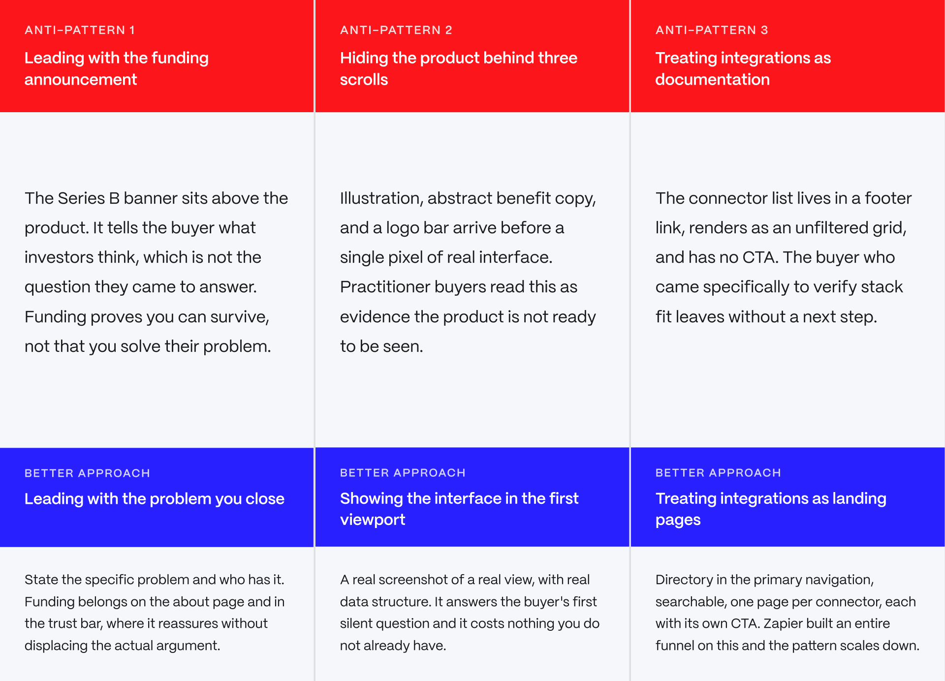
Hiding the product screenshot below three scrolls of abstract copy. If the buyer has to scroll past illustrations to see what the product looks like, you have already lost the practitioner buyer.
Treating the integrations page as documentation. An integrations page written like a manual, buried in the footer, wastes a page that should be closing deals.
Which Example Should You Model?
The right model depends on which type of martech you sell.
DECISION BY MARTECH TYPE
Use this as a starting point, not a binding answer. The five-point framework is the real evaluation tool. The category recommendation gets you to the right model.
TYPE 1: PLATFORM AND SUITE MARTECH
- Profile: Multiple products, multiple personas, committee purchase
- Top constraints: Navigation must route without collapsing, positioning must stay legible at scale
- Top use cases: Automation platforms, CDPs, full marketing clouds
- Model: HubSpot for navigation architecture, Zapier for integration proof
- Why: These are the two hardest problems at this tier and both are solved examples. HubSpot proves a dense product surface can stay navigable. Zapier proves an integration directory can be a funnel rather than a reference doc.
The verdict: Steal the routing logic, not the density. Density is a brand-recognition privilege you do not have yet.
TYPE 2: ANALYTICS AND ATTRIBUTION MARTECH
- Profile: Technical marketing buyer, evaluation-heavy cycle, high skepticism
- Top constraints: Prove data quality early, surface the product interface immediately
- Top use cases: Attribution, product analytics, SEO and search intelligence platforms
- Model: Ahrefs for numeric trust signals, HockeyStack for practitioner-audience signaling
- Why: This buyer discounts adjectives and rewards specifics. Ahrefs replaces claims with figures throughout. HockeyStack uses visual convention to say who the product is for before the copy does.
The verdict: Show the dashboard in the first viewport. If you are not willing to show the product, the buyer assumes there is a reason.
TYPE 3: RESEARCH AND POINT-SOLUTION MARTECH
- Profile: One sharp use case, single champion, fast conviction
- Top constraints: Confirm the specific problem fit in seconds, resist platform envy
- Top use cases: Message testing, research tools, single-workflow products
- Model: Wynter for copy-led clarity
- Why: Wynter sells message testing, so its own messaging is the product demonstration. That is the credibility paradox in its purest form and it is why the copy-led hero works there.
The verdict: Do not design like a platform. A focused product with platform navigation looks thin, not bigger.
CROSS-CATEGORY: PRE-PRODUCT-MARKET-FIT MARTECH
- Profile: Positioning still moving, under 50 customers, category unclear
- Top constraints: The site will be rewritten within nine months
- Model: Point-solution structure regardless of eventual ambition
- Why: Building platform navigation before you have a platform locks you into an architecture you will have to tear out. Point-solution structure is cheap to expand and expensive to over-build.
The verdict: Build for the product you have. The redesign for the product you want is a better problem to have later.
PRINCIPLE
Your website is your product demo. In every other B2B category the buyer evaluates the site and the product separately. In martech they are the same evaluation, because your buyer builds websites and funnels for a living and cannot switch that judgment off. This is not unfair. It is the most honest signal available to them, and it is the reason a martech redesign is a positioning exercise before it is a design exercise.
- Platform and suite martech: Model HubSpot for navigation architecture and Zapier for integration proof.
- Analytics and attribution martech: Model Ahrefs for numeric trust signals and HockeyStack for practitioner-audience signaling.
- Point-solution martech: Model Wynter for copy-led clarity.
Modeling a site from the wrong category is the most common redesign mistake we see. A point solution that copies HubSpot's density will look thin, not big. A platform that copies Wynter's narrow focus will confuse a buying committee.
Your buyers grade websites for a living. Yours is being graded right now.
Martech is the one category where a weak website argues against the product itself. Veza Digital builds Webflow sites for martech and B2B SaaS companies where positioning, product surfacing, integration proof, and Core Web Vitals get treated as one problem, not four separate handoffs. If your site is not making the case your product deserves, let's talk.
Work With Veza | See Our Case Studies
Websites change often, and a company's design can look different from what is described here by the time you read it. Scores, features, and design details for each example in this article should be checked against the live site before you rely on them.
This article is meant to help you think through your own website, not to replace your own research. Before you make a redesign decision, a budget decision, or any other business decision based on this article, check the current version of each site yourself, or contact Veza Digital.
FAQs
What is a martech website?
A martech website is the marketing site for a marketing technology product, covering categories such as automation platforms, customer data platforms, analytics and attribution tools, and research products. It differs from other B2B sites because its audience is marketers, which means the site itself is read as evidence of whether the product works. HIGH AI OVERVIEW VALUE.
What are the best martech website design examples in 2026?
Name the strongest examples by category rather than a single winner: HubSpot and Zapier for platform suites, Ahrefs and HockeyStack for analytics and attribution, Wynter for point-solution messaging clarity. Note that the right model depends on which martech sub-category the reader sells in. DIRECT QUERY MATCH.
What makes martech website design different from general B2B design?
The buyer is a marketer who evaluates websites professionally, so the site functions as the product's first demo. A conversion platform with a confusing funnel argues against itself. General B2B buyers do not read the website as product evidence in the same way, which lowers the scrutiny.
Should a martech website use dark mode?
Dark mode signals a practitioner audience that works in dashboards, which fits analytics and attribution products. It fits marketing-generalist products poorly. If you use it, meet WCAG AA contrast minimums and ship a real toggle rather than forcing the theme, because forced dark modes exclude some low-vision users.
How important are integrations pages for martech conversion?
They are mid-funnel conversion assets, not documentation. Martech buyers cannot commit until they confirm the product fits their existing stack. Zapier built its entire information architecture on this. Put the integrations directory in the primary navigation, make it searchable, and treat each integration page as a landing page with its own CTA.
How many form fields should a martech demo request have?
Fewer than you currently have. Every additional field is a conversion tax, and martech buyers recognize it because they run the same forms. Ask only for what routing genuinely requires, usually work email, company, and one qualifying question. Enrich the rest from your own data tools.
Why does website performance matter more for martech companies?
Because failing Core Web Vitals while selling marketing performance is a credibility problem, not just a ranking problem. Your buyers run Lighthouse. Motion-heavy heroes and interactive demos carry measurable performance cost, and that cost has to be budgeted against the conversion benefit rather than assumed away.
How do I audit my martech website before a redesign?
Score your site and your two closest competitors against five criteria in one sitting: positioning clarity, product surfacing, integration proof, conversion architecture, and performance discipline. Relative position matters more than absolute score. Complete the audit before writing the redesign brief, because the audit is what makes the brief defensible internally.
How much does a martech website redesign cost?
Range depends on scope rather than category. A focused marketing site rebuild on Webflow typically runs into the mid five figures, while a multi-product platform site with programmatic integration pages and enterprise compliance requirements runs substantially higher. The cost driver is page-type complexity and integration surface, not visual design. NEEDS SOURCING for specific ranges.
Should a point-solution martech company design like a platform?
No. It is the most common self-inflicted wound in the category. Point solutions win by confirming fast that they solve one specific problem. Platform-style navigation and broad abstract positioning dilute that confirmation and make a focused product look thin rather than making it look bigger.