.jpeg)
Your demo page is where high-intent buyers make their final decision.
- It is not a homepage.
- It's not a landing page.
- It's not a brochure.
It’s the last step before someone agrees to talk with your sales team. Most SaaS companies under-invest in this part of the funnel and it shows.
Abstract
A good SaaS demo page does one job well: converts high-intent visitors into booked meetings. At worst they look like landing pages & treat the form as an afterthought.
This guide will break down 12 real SaaS demo pages from companies such as Notion, HubSpot, Asana, Figma, Zendesk & Qonto.
We'll take a look at the number of fields on the form (how many are required), social proof approach, how calendar integration works, if there is any persona routing on the site, mobile experience, what we would change about each of them, then discuss strategic decisions around book-a-demo vs interactive demo vs free trial, when to use Storylane or Navattic instead of a traditional form & how to route prospects by persona without adding friction.
Ultimately, our goal is to give you a reference library of patterns for demo pages that you can borrow from, plus a clear framework for figuring out which pattern fits best with your sales motion.
What a SaaS Demo Page Is (and Why It Is Not a Landing Page)
Many marketers treat all pages the same. But the intent of each is different, while the type of user differs. The most common mistake is combining the three pages that will perform moderately on all aspects, but excel on none.
Demo Page vs. Landing Page vs. Homepage
The homepage communicates with many users (multiple personas) simultaneously introducing the brand to potential customers. Which is why strong SaaS homepage design directly impacts the quality of traffic reaching your demo page. It addresses those who are exploring and directs existing visitors to the next step. The goal of the homepage is not to generate revenue by closing an activity from a specific group of people.
Similar to the homepage, landing pages also serve multiple audiences (cold through warm). However, landing Pages are focused solely on one offer - white paper downloads, free trials, webinar registrations, etc. If you look at most SaaS landing page examples, they are built to capture a range of users, not just high-intent buyers. Because of this focus on a single offer, conversion rates may vary due to differences in visitor intent.
A demo request page is different in kind, not just degree. Visitors who arrive at Demo Request Pages have completed significant research. They know what product category your solution belongs to. Most likely, they've reviewed your competition and compared your company favorably. They're now ready to speak with someone about your solution. This visitor's Intent is high, and all they want is a frictionless path to a calendar slot.
These differences matter when making design decisions for demo pages.
- Navigation bars on demo pages should be removed.
- Case studies, blog Posts, and product features should not be linked.
- Any Element on a Demo Page that isn't the form is a distraction.
For full-website context and how demo pages fit into a broader web strategy, see our analysis of the best B2B SaaS websites in 2026.
The Decision: Book-a-Demo vs. Interactive Demo vs. Free Trial
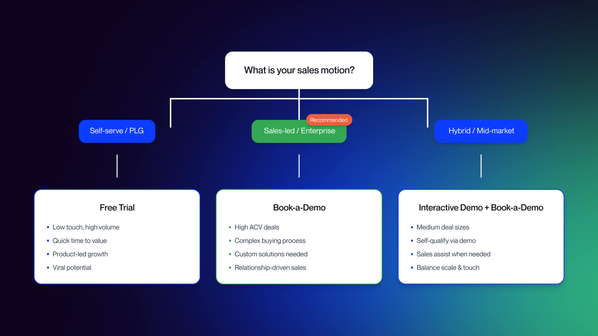
This is by far the most important decision you will make before building out each component of your demo page. Therefore, it should only need to be made at this point and never again throughout your overall strategy.
- The Book-a-Demo motion is correct if you have
- A high ACV (average contract value)
- A complex product
- Multiple stakeholders are buying from you
- You are in an area that is heavily regulated (such as Enterprise SaaS, infrastructure products, and/or compliance-based solutions)
In all cases the demo represents the sale.
The Free Trial motion is correct for self-service product-led growth companies with a low ACV, easy onboarding. Also, it’s for individual buyers who can determine the value of a product through their own evaluation process without human interaction. The free trial represents the sale.
Using interactive demo tools such as Storylane, Navattic, Reprise, or other similar tools embedded directly onto your demo page allows you to effectively reach mid-market technical buyers. Interactive demo tools also allow visitors to self qualify early in the funnel and pass along the warmer lead to your sales team. Therefore, they work well as a hybrid. They should be placed on both product and pricing pages. The book-a-demo form is utilized for the highly qualified buyer at the bottom of the funnel.
By 2026, most all modern B2B SaaS use some form of hybrid. A demo page is just one piece of an overall demo strategy and not the complete strategy. There isn't one motion that is better than another. It is simply what motion fits into your sales model, your average contract value, and how your customer determines the value of your solution.
12 Best SaaS Demo Page Examples in 2026 (Analyzed Through One Framework)
To make these examples useful, every breakdown uses the same six-point lens: (1) form field count and design, (2) social proof approach, (3) calendar booking integration, (4) persona routing, (5) mobile experience, (6) what works and what is missing.
If you want to apply this framework to your own page, the audit checklist is in S4. For A/B testing your findings, see our roundup of the best CRO tools.
Examples 1-4: Traditional Book-a-Demo Pages
1. Notion (notion.so/contact-sales)
- Form fields: Five standard fields name, work email, company, team size, and intended use. Single-column layout, clean typography, no visual clutter.
- Social proof: Three named customer testimonials positioned below the form, plus links to the Notion community and certified consultants. The testimonials are prominent but short on outcome specifics; they speak to satisfaction rather than measurable impact.
- Calendar booking: Not embedded. Notion follows up via email after submission, which introduces a delay between intent and confirmation.
- Persona routing: None visible on the form itself. The "intended use" field may power back-end routing, but the visitor never sees personalization.
- Mobile experience: Clean and functional. Single-column form translates well to small screens, and the minimal design avoids tap-target problems.
Verdict: The stripped-down approach is disciplined; there is nothing on the page competing with the form. The weakness is the absence of an inline scheduler and outcome-specific social proof. Testimonials saying "we love Notion" are less persuasive than testimonials quantifying what changed.
2. HubSpot (offers.hubspot.com/demo)
- Form fields: A concise sign-up form covering email, company, and contact details. Also includes a marketing blog opt-in checkbox on the same form, a small but notable addition.
- Social proof: HubSpot leans on brand recognition. The page references the size of their customer base but relies more on awareness than specific proof.
- Calendar booking: A popup chatbot deploys alongside the form, giving visitors who are not ready to book a live conversation path. This is a smart fallback for middle-of-funnel visitors.
- Persona routing: The chatbot can collect qualifying information before routing, but the primary form does not visibly segment visitors.
- Mobile experience: HubSpot's pages are mobile-optimized by default. The popup chatbot requires careful mobile sizing if it obscures the form, it creates friction rather than reducing it.
Verdict: The chatbot fallback is genuinely useful. Visitors who want to ask a question before committing to a meeting have a path. The risk is that the chatbot competes with the primary form CTA visitors may engage with rather than convert. The blog opt-in on the demo form is a judgment call: it adds list-building value but slightly dilutes the single-purpose nature of the page.
3. Asana (asana.com/go/demo)
- Form fields: Standard company information fields name, work email, company, role, team size. Five fields, single column.
- Social proof: Benefit-focused copy above the fold makes the value proposition explicit. The greyed-out demo interface visible behind the form functions as visual social proof by letting visitors see the product before they commit.
- Calendar booking: No inline scheduler. Post-submission email follow-up.
- Persona routing: No visible routing based on form inputs, though the role field may drive back-end assignment.
- Mobile experience: The greyed-out product background is a desktop design. On mobile, this either disappears or degrades. The form itself is well-structured for small screens.
Verdict: Showing the product in the background is an underused tactic. It reduces perceived risk by demonstrating that the product exists and has depth without forcing a full-length feature walkthrough. The lack of an inline scheduler is a missed opportunity. High-intent visitors who complete the form are at peak motivation, and asking them to wait for an email follow-up loses some of that momentum.
4. ActiveCampaign (activecampaign.com/enterprise/demo/)
- Form fields: Simple five-field form. Design is functional without being distinctive.
- Social proof: Trust badges are present above and adjacent to the form. However, they appear as generic image assets rather than pulling live data from G2 or Capterra, which reduces their credibility for skeptical buyers.
- Calendar booking: Not embedded. Standard post-form follow-up.
- Persona routing: The page offers an alternative conversion path, a clearly positioned 14-day free trial link for self-serve visitors who are not ready for enterprise engagement. This is smart.
- Mobile experience: Clean and functional. No mobile-specific issues observed.
Verdict: The 14-day free trial alternative is the standout feature. Visitors who arrive on the demo page but are not enterprise-ready have a softer conversion option rather than a dead end. This is a relatively simple tactic that most enterprise demo pages do not offer. The trust badges would perform better as live widgets; a G2 rating that updates automatically carries more weight than a static badge image.
Examples 5-8: Hybrid and Interactive Approaches
5. Figma (figma.com/demo/)
- Form fields: The form is positioned below three demo videos at the top of the page. Field count is standard email, name, company, role.
- Social proof: Product demonstration videos function as the primary social proof. Three videos cover different use cases, letting visitors self-select their context.
- Calendar booking: Not embedded. The page offers three distinct paths: watch a video, request a personalized demo, or sign up for a free Figma account immediately.
- Persona routing: The three-path structure implicitly routes visitors by intent level. High-intent visitors go to the form. Researchers watch videos. Self-serve users sign up directly.
- Mobile experience: Video content at the top of a mobile page can be heavy. The multiple-path structure, while useful on desktop, requires careful visual hierarchy on small screens to avoid decision paralysis.
Verdict: Figma's multi-path approach is the right design for a product with wide awareness and multiple buyer types. The risk is that a high-intent visitor who just wants to book a meeting has to scroll past video content to reach the form. For a purely enterprise motion, this creates friction. For Figma's mixed audience, it is a reasonable trade-off.
6. Zendesk (zendesk.com/demo/)
- Form fields: Zendesk uses progressive disclosure, a stepped question flow rather than a visible multi-field form. Visitors answer one question at a time, which reduces perceived complexity.
- Social proof: Embedded within the step flow, not positioned as a block above the form. This is unconventional and means early-stage visitors may not see proof before they start the flow.
- Calendar booking: Access to product tours and guided demos follows form completion. The demo itself is a guided product tour rather than a live personalized walkthrough.
- Persona routing: The stepped flow allows Zendesk to collect qualification data in a way that feels conversational. Each step adds a piece of data without overwhelming the visitor.
- Mobile experience: Step-by-step flows work well on mobile one question at a time fits naturally on a small screen and avoids the wall-of-fields problem.
Verdict: Progressive disclosure reduces form abandonment anxiety. Visitors who might bounce from a five-field form visible all at once are more likely to answer one question and continue. The trade-off is that the total path to value is longer, which may frustrate high-intent visitors who just want to pick a time. The guided tour at the end is a genuine product preview, not a recorded video, a meaningful differentiator for prospects who want to see real functionality before talking to sales.
7. Heap (heap.io/request-product-sandbox-and-demo)
- Form fields: Standard form with an alternative chatbot path. Visitors can either complete the form or initiate a chat to guide the process.
- Social proof: Brief pain-point copy above the form recaps the problems Heap solves a quick reminder of why the visitor is there in the first place.
- Calendar booking: Heap sets explicit expectations: a one-business-day processing time is prominently stated. This transparency is valuable, but it also introduces a named delay.
- Persona routing: The dual path (form or chatbot) serves different intent levels, though neither path appears to drive visible persona-based routing.
- Mobile experience: Dual-path designs require clear visual hierarchy on mobile so visitors understand their options without confusion.
Verdict: The one-business-day promise is a double-edged choice. Transparency about follow-up timing is good practice. But compared to pages with inline schedulers where visitors pick a slot immediately, a named processing delay creates a gap between intent and commitment. For a product as technical as Heap, some buyers may appreciate the managed handoff. For others, the delay will cost conversions.
8. Hootsuite (hootsuite.com/request-demo)
- Form fields: Five fields with an optional LinkedIn prefill feature. LinkedIn prefill auto-populates name, company, and role data, reducing the manual input required.
- Social proof: Benefit-focused copy and social proof badges positioned near the form. G2 or similar ratings appear as supporting elements.
- Calendar booking: Not embedded. Standard follow-up process.
- Persona routing: No visible routing. The LinkedIn prefill is the primary friction-reduction feature rather than segmentation.
- Mobile experience: LinkedIn prefill may behave differently on mobile depending on whether the LinkedIn app is installed. Worth testing across device types.
Verdict: LinkedIn prefill is an underused tactic on B2B demo pages. It reduces the manual effort required to complete the form, which meaningfully reduces friction especially for visitors on mobile. The caveat is that it requires visitors to have a LinkedIn account and be willing to use it, which works well for professional B2B audiences. The absence of an inline scheduler is the page's main gap.
Examples 9-12: Minimalist and Modern Patterns
9. Databox (databox.com/demo)
- Form fields: One field: email address only. This is the most friction-free demo form in this analysis.
- Social proof: Minimal on the form page itself. The conversion volume this design generates creates a different downstream problem volume without qualification.
- Calendar booking: Not embedded. Email-only forms necessarily create a post-submission qualification step.
- Persona routing: None. Email only means Databox collects nothing else from the visitor at the point of conversion.
- Mobile experience: A single email field is the most mobile-friendly form design possible. Tap, type, submit.
Verdict: Email-only forms maximize raw conversion volume. The trade-off is significant: zero qualification data means the SDR team is responsible for determining fit from scratch after every submission. For a product with broad market fit and a high-volume SDR motion, this can work. For products where sales capacity is constrained and lead quality matters as much as volume, it shifts qualification work rather than eliminating it. There is no universally right answer; it depends on your funnel economics.
10. Remote (remote.com)
- Form fields: Four fields in a popup form triggered by "Book Demo" CTAs throughout the site. Remote has no standalone dedicated demo page; the popup is the entire conversion surface.
- Social proof: The popup context does not accommodate social proof elements. Visitors see the form without the supporting testimony or trust signals that a dedicated page would include.
- Calendar booking: Not embedded. Standard follow-up.
- Persona routing: Not applicable at the popup level, though the CTA that triggered the popup may carry context.
- Mobile experience: Popups on mobile require careful sizing. A four-field form in a popup should render cleanly on small screens; execution depends on implementation.
Verdict: The no-dedicated-page approach keeps visitors in context; they do not leave the page they were exploring to complete a form. This reduces drop-off from page transitions. The trade-off is that the popup cannot include the social proof, expectation-setting copy, or value reinforcement that a dedicated page provides. For visitors who need reassurance before submitting, there is nowhere to get it. For high-intent visitors who have already decided, the popup reduces friction.
11. Qonto (qonto.com/en-de/contact-form/demo)
- Form fields: Short form name, company email, and company details. The form is positioned alongside explicit differentiation from the 30-day free trial.
- Social proof: TrustPilot carousel and App Store rating are prominently featured. This is meaningful for a fintech product where trust is a conversion barrier, not just a nice-to-have.
- Calendar booking: Not embedded.
- Persona routing: The page explicitly explains why someone would book a demo rather than just starting the free trial. This is rare and valuable; it resolves the ambiguity that many visitors face when a product offers both options.
- Mobile experience: TrustPilot carousels need to be tested for mobile autoplay and sizing. The form itself is concise enough to work well on small screens.
Verdict: Qonto's decision to explain the value of the demo over the trial is the standout pattern here. Most products that offer both a demo and a trial leave visitors to figure out the right path themselves. Qonto makes the case that a customized demo is worth the investment of time. The TrustPilot integration provides third-party credibility that vendor-authored testimonials cannot match.
12. Salesforce (salesforce.com/form/demo)
- Form fields: Full persona-based form with an industry dropdown, role selection, and company information. More fields than any other example in this analysis.
- Social proof: Enterprise-focused trust signals, customer logos, security certifications, and compliance badges are appropriate for Salesforce's buyer profile.
- Calendar booking: Persona routing drives the follow-up path. Enterprise visitors may reach a live scheduler; SMB visitors may see a different flow.
- Persona routing: Salesforce's form is the most sophisticated routing engine in this analysis. Industry and role data drives content variations and sales assignment, producing higher-quality SQLs from the qualified visitors who complete the form.
- Mobile experience: Long forms with multiple dropdowns are notoriously difficult on mobile. Industry dropdowns with many options require native select menus or a carousel standard dropdown implementation tends to frustrate mobile users.
Verdict: The Salesforce approach is intentionally high-friction by design the form length pre-qualifies visitors before the SDR engages. This trade-off makes sense for Salesforce's enterprise motion, high average deal size, and sales capacity constraints. It would be wrong for most other companies in this analysis. The persona-routing infrastructure is genuinely impressive, but the mobile experience for a form this long requires dedicated optimization that most teams do not invest in.
What These 12 Examples Have in Common
Several patterns appear consistently across high-performing pages:
Form field count converges on 3-5
The exceptions are outliers Databox at one field and Salesforce at eight or more and both have deliberate strategic rationale. The center of gravity in modern B2B SaaS demo forms is a short, single-column form that asks for the minimum needed to route and follow up.
Social proof is almost always above the fold
Named testimonials consistently appear near the form. Anonymous quotes appear less often. The pages that include third-party review widgets (G2, TrustPilot, Capterra) do so because their buyers need external validation, not just vendor-authored endorsements. Named testimonials with specific outcomes outperform both.
Single-column forms dominate
Multi-column forms create alignment problems on mobile and create a "form wall" visual impression on desktop. Every example in this analysis uses a single-column layout.
Navigation removal is near-universal
The best pages strip or minimize the top navigation bar. Visitors who have arrived at a demo page with the intent to convert should not be one click away from the blog.
What is notably rare: Inline calendar embeds remain underused. Only a minority of examples embed a live scheduler; most rely on email follow-up, which creates a gap between peak intent and confirmed commitment. Mobile-optimized persona routing (radio buttons instead of long dropdowns, progressive disclosure on small screens) is almost absent. Post-submit confirmation page design is uniformly generic, a missed opportunity to reinforce the decision and set expectations for what comes next.
Going Beyond the Form: Interactive Demos and Calendar Booking
The interactive demo category has matured significantly. The major platforms differ in audience, price, and technical complexity:
Interactive Demo Platforms Overview
Storylane starts at $40/user/month with a free tier available. It is designed for cross-functional use, marketing and sales teams can build and deploy product tours without engineering support. Easy capture and fast time-to-demo make it an accessible entry point in the category.
Navattic starts around $500/month at its base tier and is primarily marketing-focused. Navattic tours are typically embedded on product and pricing pages as awareness-stage assets rather than bottom-of-funnel conversion tools.
Walnut starts at approximately $9,200/year and is built for sales-only use cases. It enables highly personalized demos for individual prospects, which requires more setup than the marketing-focused platforms.
Reprise offers custom enterprise pricing and includes sandbox capability, meaning prospects can interact with a live-state version of the product rather than a click-through tour. This requires engineering setup and integration. Reprise reports a 60% conversion lift on demo pages with embedded interactive demos. This is a vendor-claimed figure and should be treated as such it reflects Reprise's customer base and may not generalize to your use case.
Arcade has a free tier and has gained adoption among marketing teams as a lightweight product tour tool. It is the lowest-friction entry point in the category.
Honest framing: interactive demos help when buyers want to explore before talking to sales. But they add platform cost, integration work, and content maintenance. They are not a free conversion lift. If your product changes frequently, maintaining an accurate interactive demo is an ongoing content commitment, not a one-time build. According to Storylane, product-qualified leads (PQLs) from interactive demos convert at higher rates than traditional MQLs but that claim reflects Storylane's customer data, not independent research.
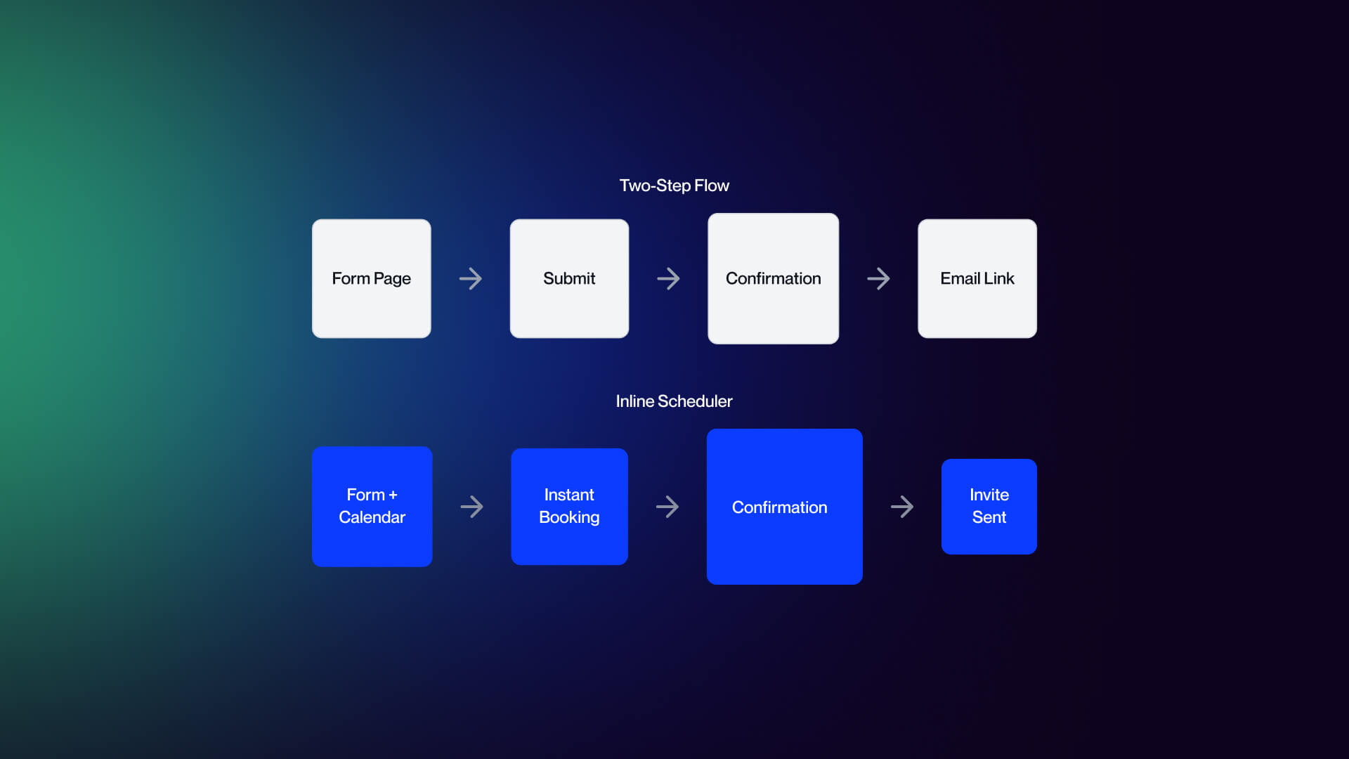
Calendar Booking Integration Patterns
The gap between form submission and confirmed meeting is where intent decays. A visitor who completes your demo form is at peak motivation at the moment of submission. Every hour between that moment and a confirmed calendar invite is time for second thoughts, competing priorities, and cold feet.
Modern demo pages solve this with inline scheduling. Tools like Chili Piper, Calendly, and Default embed a live calendar directly in the post-form experience, where visitors pick a slot in the same interaction as the form submit. The meeting is confirmed immediately. Round-robin routing assigns the appointment to the right rep based on company size, region, or product line.
The alternative, a two-step flow where the form submits to a confirmation page and a calendar link followed by email, is easier to implement but adds friction. The visitor has to take an additional action in a different context, and no-show rates correlate with the gap between intent and confirmed commitment. Specific lift figures vary by source and should be tested in your own funnel rather than assumed from benchmarks.
For implementation guidance on Webflow integrations with scheduling tools, see our Webflow integrations guide.
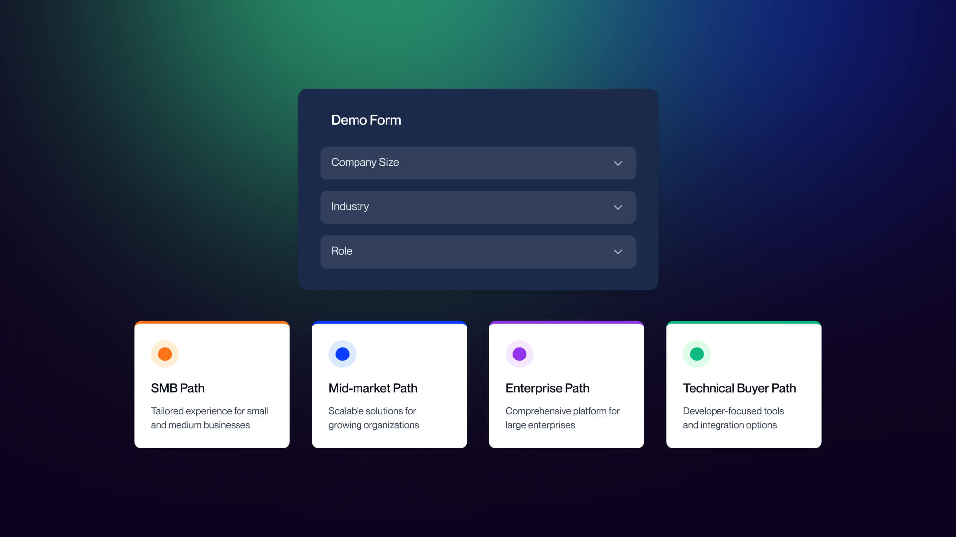
Persona-Based Routing Without Killing Conversion
The Salesforce, HubSpot, and Zendesk examples above all use persona data to route prospects to the right follow-up. The trade-off is real: every additional form field you add to collect routing data reduces conversion volume.
The resolution is asking just enough to route correctly, not enough to qualify the entire opportunity. Company size and role are the minimum viable routing variables; they tell you which team should own the follow-up and which product track is appropriate. Budget, timeline, and buying authority belong in the first sales conversation, not the form.
One implementation note: personal dropdowns are notoriously problematic on mobile. A standard HTML select element with thirty industry options is a friction source on small screens. Better alternatives include simple radio buttons for high-priority segments with an "Other" catch-all, or progressive disclosure that reveals additional routing questions only after the email address is entered. Test on actual devices DevTools emulation does not capture the full experience of thumb-typing into a mobile form.
How to Audit and Improve Your SaaS Demo Page
The same framework used to analyze the 12 examples above works as a self-assessment for your own page.
The 6-Point Demo Page Audit
1. Form field count and design
Are you asking for 3-5 fields? Is the form single-column? Are input fields large enough for mobile tap targets? If you have smart enrichment (Clearbit, Demandbase) available, are you using it to reduce manual fields?
2. Social proof
Is your strongest proof above the fold? Are testimonials named rather than anonymous? Do they reference specific outcomes rather than general satisfaction? If you have G2 or Capterra ratings, are they pulling live data or static images?
3. Calendar booking
Do you have an inline scheduler embedded, or are you relying on email follow-up? Is the scheduler mobile-responsive? Does it display the timezone clearly? Is the styling consistent with your page design?
4. Persona routing
If you route by persona, are you asking for company size and role and nothing more? Are routing fields using mobile-friendly input patterns (radio buttons, progressive disclosure) rather than long dropdown menus?
5. Mobile experience
Have you tested on actual mobile devices, not just browser DevTools? Are your tap targets thumb-sized? Are your input types using native mobile pickers where appropriate (date, phone, select)? Is the page fast on mobile networks?
6. Post-submit experience
Does your confirmation page set clear expectations for what happens next? Does a branded confirmation email arrive within minutes? Does the calendar invite generate automatically? The post-submit experience is often the most neglected part of a demo page and it is the last impression before the meeting itself.
30-60-90 Day Action Plan
Days 1-30: Audit and prioritize.
Run your current demo page against the 6-point framework above. Score each dimension. Identify your biggest gap, most teams will find it is either too many form fields, weak social proof, or the absence of an inline scheduler. Set up A/B testing infrastructure if it is not already in place. Do not start building before you have a baseline.
Days 31-60: Rebuild the core.
Reduce form fields to the minimum needed for routing. Add an inline calendar embed (Chili Piper, Calendly, or Default). Integrate with your CRM and routing tool so that meeting ownership assigns automatically. Upgrade static trust badges to live review widgets. Test the updated page against your baseline. If you’re working within Webflow, a focused Webflow agency can handle both the design and the integration layer without adding technical debt.
Days 61-90: Pilot interactive demo.
Deploy an interactive demo platform (Storylane, Navattic, or Arcade as entry points) on your product page or a high-traffic landing page, not necessarily on the demo page itself. Measure intent signals: time on demo, completion rate, and which features visitors engage with. Use that data to decide whether an interactive embed belongs on the demo page or stays as a mid-funnel asset.
For B2B SaaS teams looking to implement this work in Webflow, Veza Digital specializes in B2B SaaS web design and Webflow development with a focus on demand gen. You can review our portfolio to see how these patterns are applied across different SaaS companies. If you want a second set of eyes on your current page, get in touch, and we’ll walk through it with you.
Frequently Asked Questions
What is a SaaS demo page?
A dedicated landing page where high-intent visitors request a personalized product demonstration. Unlike a homepage or general landing page, a demo page has one job: convert qualified prospects into booked meetings. Visitors typically arrive having already researched the product, so the page should remove friction and get them to a calendar slot quickly.
How many form fields should a SaaS demo page have?
Three to five fields is the standard: name, work email, company, role, and company size. Anything beyond five fields tends to add friction without proportional qualification value. Use progressive profiling or CRM enrichment to capture additional data after the meeting is booked.
Should I use book-a-demo or an interactive demo on my SaaS website?
Both, in most cases. Use interactive demos on product and pricing pages to capture early intent and let visitors self-explore. Use book-a-demo for prospects who need a guided walkthrough. The interactive demo qualifies the visitor; the book-a-demo closes the meeting. Pure book-a-demo still makes sense for high-ACV enterprise sales.
What are the best interactive demo platforms in 2026?
Storylane (starts at $40/user/month, free tier, easy to use across teams) is the most accessible. Navattic ($500/month base, marketing-focused, strong embed analytics). Walnut ($9,200/year minimum, sales-only). Reprise (enterprise pricing, sandbox capability, requires engineering setup). Arcade (free tier, popular for marketing). The right choice depends on the team's technical maturity, budget, and whether you need HTML capture or full product cloning.
How do I integrate a calendar booking tool into my SaaS demo page?
The best modern demo pages embed the calendar inline with the form using Chili Piper, Calendly, or Default. This eliminates the dead time between form submission and meeting confirmation. Round-robin routing assigns the prospect to the right rep based on company size or region. Branded styling, clear timezone display, and mobile responsiveness are essential.
Should the SaaS demo page have navigation?
No. Demo pages are conversion-only surfaces, similar to landing pages. Removing top navigation eliminates exit paths and keeps visitors focused on the form. Keep only a logo (linked to homepage) and footer essentials like privacy policy. Every additional link is a chance to lose the visitor before they convert.
How do I reduce demo no-shows after booking?
Send a branded confirmation email quickly after the form is submitted, follow with a personalized note from the assigned rep within 24 hours, and send a reminder before the meeting. Include a brief agenda and what the prospect should prepare. Make rescheduling friction-free. Specific no-show reduction percentages vary widely by industry and should be tested for your audience.
Should I qualify the visitor on the demo form or let everyone book?
Qualify just enough to route correctly. Ask for company size and role to route to the right rep, but avoid asking for budget, timeline, or buying authority on the form; those are sales call territory. Over-qualification kills conversion rates. Under-qualification wastes AE time. The right balance depends on your sales team capacity and ICP definition.
How important is mobile design for a SaaS demo page?
Critical. A meaningful share of B2B traffic now comes from mobile, even on demo pages. Common failures: field labels disappearing on focus, dropdowns covered by the keyboard, calendar embeds breaking on small screens. Use single-column forms, thumb-friendly tap targets, native date pickers, and test on actual devices, not just Chrome DevTools.
Can I A/B test my SaaS demo page?
Yes. Test one variable at a time: hero headline, form field count, social proof placement, CTA copy, calendar embed style. Use tools like VWO, Optimizely, or Webflow's native A/B testing. Demo pages have lower traffic than landing pages, so tests need longer to reach statistical significance. Focus on changes likely to drive meaningful lifts, not micro-optimizations.