.jpg)
Your SaaS homepage has seconds to make an impression, and it either works or does not work.
Studies show that 94% of first impressions are design-related, and 38% of users will leave a site that looks cluttered or aesthetically unattractive. However, with SaaS, the real problem is not aesthetics, but rather communication. The difference between a homepage converting at 0.8% vs 2.4% is not better visuals, it’s clarity, proof, and reduction of friction.
In 2026, your homepage is no longer a digital brochure, but the primary tool for conversion in your business. It is responsible for explaining your product in less than five seconds, and establishes trust, which helps guide users toward a clear path.
Key takeaway: The best SaaS homepages don’t try to say everything. They say one thing clearly, prove it instantly, show the product in action, and make the next steps obvious.
What Makes a SaaS Homepage Convert in 2026
2026’s leading SaaS homepages aren’t defined by their aesthetic appeal, but by how fast they make sense. Clarity, trust, and a friction-free user experience are the optimal ways of being able to boost conversion rates, and build a strong homepage.
The Evolving Standards of SaaS Homepage Design
SaaS homepage design in 2026 is a very different prospect to what it was even a few years ago. This is largely due to changing user habits, and the fact that buyers are prioritizing scanability, and fast, effective decision-making.
The majority of visitors will land on your homepage with multiple tabs open, and they will often make a judgment in just 5 seconds. As a result, your homepage needs to be able to communicate value instantly or risk your visitors losing interest and going elsewhere.
In other words, you have to raise the bar. According to statistics, 94% of website first-impressions relate to homepage design, with 38% of visitors leaving if they feel a homepage looks unclear, cluttered, or unattractive. SaaS design is not merely about design, but about ensuring your product makes sense, and makes sense quickly.
It’s important at this stage to understand that a homepage is different from both a landing page and a full website, and these are some of the major differences you need to be aware of.
- Your homepage is a roadmap designed to guide different types of users
- A landing page is a single-goal conversion asset
- A full website is a multi-page ecosystem that helps to support the entire user journey and experience
If you want a broader breakdown of full-site structure, check out some of the best B2B SaaS website examples.
Let’s check out a quick comparison:
Homepage vs Landing Page vs Full Website Comparison
Making a distinction here matters because homepage design is uniquely complex. It needs to serve multiple audiences at one time, all of whom will have different intent.
This is where the divergence between enterprise and product-led (PLG) SaaS starts:
- Enterprise homepages focus on navigation. Credibility, and persona routing
- PLG homepages, on the other hand, prioritize elements like speed, simplicity, and instant activation
The best way of thinking about this is to treat your SaaS homepage like a hotel lobby. It plays a key role in the hotel as guests will make an opening judgment about the hotel based on the lobby, so it needs to make a statement instantly. Your homepage does the same job for your website, and your business, and shows what kind of product you’re providing, and gives users confidence they are in the right place.
This means that in 2026, the SaaS homepages that perform the best are not more complex, but are more intentional. They help to reduce cognitive load, boost understanding, and help guide users toward action with as little friction as possible.
Core Design Characteristics of Top-Performing SaaS Homepages
At a peak level, the best SaaS homepages follow a consistent principle: they reduce thinking. All of the elements involved are designed to help users understand value faster, trust the product sooner, and take action with minimal friction.
However, it is important to understand that clarity is perhaps the most important characteristic. If a visitor to your site is unable to determine “What does this do?” and “Is this for me?” within just a few seconds, nothing else on the page is going to matter. Many SaaS homepages fail because they are too slow to communicate with users, leading to hesitation, which is the major killer of conversion.
One fintech SaaS example highlighted this clearly, with 42% of visitors never reaching the hero CTA. Not because they were not interested, but because it took too long for the messaging to land its mark. Once the value proposition was simplified and paired with an interactive demo, activation increased.
This reinforces the principle that clarity is always preferable to cleverness. Visual hierarchy is the way in which this is enabled. Strong homepages deliberately guide attention via typography, spacing, and layout to create a clear path. Headlines are responsible for delivering the core message, subheadings add context, and visuals help to reinforce understanding. There is no element that is unnecessary.
It’s also crucial to understand that white space plays a critical role. It isn’t just the aesthetic that is improved by this, but it also boosts readability and signals confidence. Crowded layouts can become overwhelming, and this is something that can lead to drop off in a big way.
Familiarity also plays a major part in this, because establishing a connection and patterns that users can understand is crucial for providing clear navigation, predictable layouts, and recognizable CTA placements. Focus on familiarity as opposed to trying to reinvent the wheel, and remember that originality in SaaS landing page examples is not about breaking patterns, but it’s about executing them better.
The best-performing homepages are able to flawlessly balance aesthetics with conversion. Design is what helps to attract attention, but conversion happens due to communication. No matter how visually impressive your homepage is, if it fails to explain the product it will always underperform versus a simpler page that is better to communicate value.
In 2026, the best SaaS homepages aren’t the most creative, but they are more understandable.
Key UI Patterns Dominating SaaS Homepages in 2026
While principles like clarity and trust remain constant, the way they are executed evolves. In 2026, the most high-performing SaaS homepages will have a definitive set of UI patterns that shape the way they present their products.
Scroll-triggered storytelling is one of the most noticeable evolutions that can help SaaS homepages guide users through a narrative. For instance, as they scroll, content is progressively revealed, which leads to features unfolding, and messages build momentum. This helps create progression and urgency, making the homepage more of a guided experience instead of something static.
Another key element that ties closely to this is the growth of modular section design. The majority of SaaS businesses can utilize reusable content blocks like testimonials, feature sections, and CTAs to build homepages. This helps to facilitate quicker iteration, more user-friendly A/B testing, and scalable design systems.
But this comes with a trade-off, because while modular design can enhance efficiency, it can also lead to dull, generic pages if it is not customized effectively. Leading SaaS brands can avoid this by layering in unique illustrations, motion, and brand-specific visual language.
Navigation patterns have also undergone an evolution, and sticky navigation with persistent CTAs has become commonplace. The primary action needs to remain visible as users scroll, in order to reduce friction and secure intent.
Layouts are also becoming more intentional, with full width layouts the dominant choice for product-led SaaS businesses. More immersive visuals can become more prominent here, while more contained layouts are more prominent in enterprise scenarios.
There is no question that so-called “opinionated minimalism” is certainly defining visuals in 2026. Black and white foundations that come with a single, bold accent color are becoming examples of the dominant aesthetic. This shifts the focus back to the product itself, whereas more consumer-oriented SaaS brands tend to experiment more with vibrant colors and gradients.
Dark mode has moved from a feature to a complete design choice. A lot of SaaS homepages tend to default to darker themes, conveying technical sophistication and improving visuals.
The use of bento grid layouts makes for another emerging pattern. These are layouts that break more complex products into smaller, more scannable blocks, which allows teams to present multiple features without overwhelming users. Instead of long paragraphs, information is separated into simple and easy-to-digest segments, improving comprehension.
Ultimately these patterns exist because they support the same goal, which is to help users understand the product better and with less effort. The SaaS homepages that perform the best in 2026 are those that combine modern visuals with structural optimization.
Hero Sections and Value Propositions: The First 5 Seconds That Decide Everything
Your homepage is the blueprint for your website’s success, but it cannot function effectively without a strong hero section. This is where conversions are won or lost, and this is why it is crucial to have the most effective hero section possible. It needs to be able to convey value, build trust, and show users a roadmap to become paying customers.
Anatomy of a High-Converting SaaS Hero Section
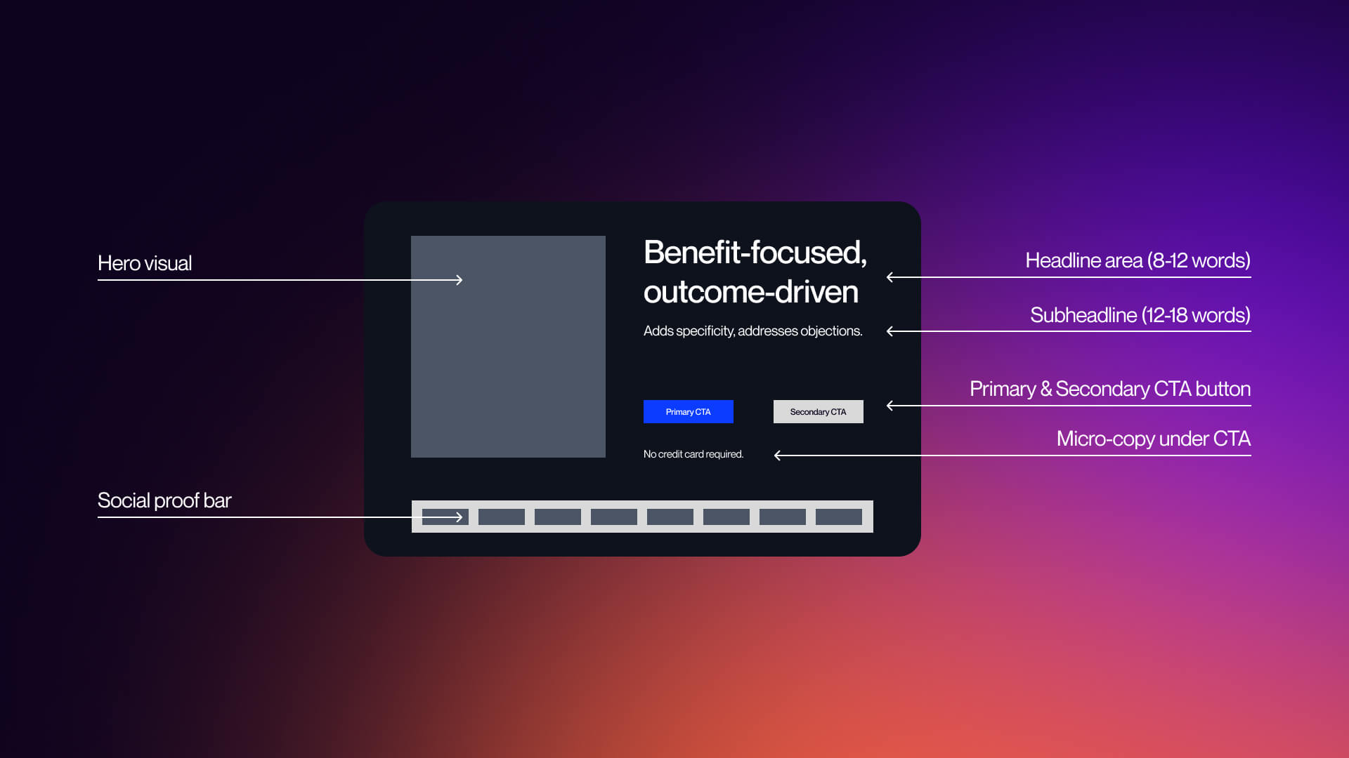
The hero section only has a single job to do, and that is to ensure that the product makes sense. But this is the area in which most SaaS homepages ultimately wind up failing, because they try to say too much, and end up being too vague. Visitors to your site are not searching for creativity; they want clarity instead.
In fact, the majority of the highest performing SaaS hero sections actually follow a fairly common and simple structure:
- One clear headline of 8-12 words
- One subheading of 12-18 words
- One primary CTA
- One visual that shows the product
- One layer of trust
The headline is the most critical element of your hero section, and it needs to indicate an outcome rather than a feature. Strong examples of this include:
- “Get contracts signed 80% faster” (Dropbox Sign)
- “Boost your website conversions by 15% in under 15 minutes (Proof)
- “Deploy AI with confidence” (Distributional)
These work because they address and assess two questions immediately:
- What does this do?
- Why should I care?
Subheadlines are supposed to add context, because this is the optimal place to address objections, explain how things work, and clarify your audience. But it is important to remember that the subheading should never be competing with the headline.
Visuals are another integral component, and another element that has evolved considerably over recent years. In 2026, static illustrations are being replaced with product screenshots, short looping demos, and interactive previews. Instead of imagining the product they want, users need to see it.
Last but not least, your CTA needs to be clear, evident, and immediate. If users need to search for what to do next, this is going to negatively impact your conversion opportunities.
The principle to keep in mind is that you need to focus on one message, one action, and a singular path forward. Deviating from this will only introduce friction.
Crafting Value Propositions That Convert in 2026
SaaS homepages don’t fail as a result of design, but because of unclear or poorly aligned messaging. Indeed, the major difference between high-performing and low-performing homepages will often come down to how the value proposition is conveyed.
The majority of SaaS companies default to more feature-focused language, such as “All-in-one workspace tool” and “AI-powered analytics platform.” However, these are phrases that describe what a product is, which is important, but they don’t touch on why it matters.
The highest-converting SaaS homepages thrive by flipping this and focusing more closely on outcome-driven messaging. This includes things like “Get contracts signed 80% faster” and “Boost conversions by 15% in 15 minutes.”
Value Proposition Formula Comparison
Outcome-driven messaging remains highly effective because it aligns with the way users think. They’re not buying software, but they are buying results.
There are important differences to factor in based on a go-to-market model:
Enterprise SaaS:
- Focus on credibility and reducing risk
- Example: “Trusted by Fortune 500 teams”
- Emphasizes scale, security, and reliability
PLG / Self-serve SaaS:
- Focus on speed and simplicity
- Example: “Set up in minutes”
- Emphasizes instant value and reduced friction
In one case, making a simpler hero message and replacing generic videos with a 15-second interactive demo resulted in increased activation by up to 32% in the first week, even without additional traffic.
It’s clear to see that clarity enhances understanding, which in turn increases trust, and this helps to boost conversion. Ultimately, if your value proposition requires an explanation, it is already too complicated and needs to be simplified. If you want to find out more about deeper optimization frameworks, check out our guide on CRO strategies for SaaS.
CTA: Need a homepage that communicates value in 5 seconds? See how VezaDigital designs SaaS homepages that convert.
CTA Button Design and Placement Strategies
Once the value is clear, you need to make sure the next step is obvious. Keep in mind that CTAs are not just buttons but decision markers that help convert users, and making small changes can have a big impact on long-term conversion rates.
The highest-performing SaaS homepages all tend to follow a clear CTA hierarchy:
- Primary CTA: High-intent action (Start Free Trial, Book Demo)
- Secondary CTA: Lower commitment levels (See Pricing, Watch Demo)
Using these allows you to capture both ready-to-convert users, as well as those who are still evaluating. But copy also plays a massive role in this as well, and weak CTAs, such as “Learn More” and “Get Started” can damage conversion opportunities, while strong CTAs like “Start a Free Trial” and “Try it in 30 Seconds” can be hugely beneficial.
CTA Design Best Practices Comparison
Specificity is the big difference here. Users convert when they understand the precise next steps involved, and micro-copy underneath the CTA can help to reduce more friction. Using copy like “No credit card required” is a great example of removing hesitation at the point of action.
Getting the right copy is crucial, but placement is also integral too. The most effective SaaS homepages place CTAs in the Hero section, after key sections, and in sticky navigation, and data supports this.
Pages with a single, clear conversion goal can achieve 13.5% conversion rates compared with 10.5% for pages that have competing CTAs.
The takeaway here is not to remove choice, but to structure it in the right way. Every CTA you use should guide users forward in the most effective way, rather than distracting them. To get a deeper breakdown of conversion strategy, explore our SaaS CRO services.
Visual Design Systems: Typography, Color, Animation, and Layout in 2026
Visual design in SaaS has evolved beyond aesthetic appeal. In 2026, it now functions as a single system that supports clarity, reinforces trust, and helps shepherd users through the conversion journey. Homepages that perform the best don’t only look good, but they also use layout, color, and typography intentionally, in order to make the product easier to understand for users.
Typography and Color Palette Strategies
Color and typography evolve from decorative elements into essential tools for homepage enhancement.
Typography establishes hierarchy, controlling what users read first, as well as what they gloss over, and what gets ignored entirely. SaaS homepages in 2026 are built on type scale systems, which establish consistent rules for elements including font size, weights, and spacing.
Oversized headline treatments are also becoming more popular, dominating hero sections, and ensuring the core message lands immediately. This is a big part of supporting the 5-second rule, and means that users do not need to search for meaning.
Variable fonts also play a role, and are gaining adoption, with designers using them to fine-tune weight and responsiveness without worrying about increasing load time. This helps to produce more flexible and performance-oriented typography systems.
There’s a clear and concise distinction when it comes to font choice:
- Serif fonts tend to be used in premium or enterprising positioning, which signals authority and sophistication
- Sans-serif fonts, such as Satoshi, Plus Jakarta Sans, dominate SaaS because they improve clarity
The key to remember here is consistency, because typography needs to feel like a system rather than merely a collection of different styles.
Color also plays a prominent part in this, but not in the way that the majority of teams assume. When it comes to high-performing SaaS homepages, color is implemented to help guide action, instead of decorating the interface. Core patterns tend to include:
- Blue - trust and reliability
- Green - action and progress
- Red - urgency
Dark mode is something that has also evolved from a feature into a default design choice. A lot of SaaS homepages now adopt dark interfaces in order to help improve contrast, showcase technical sophistication, and reduce visual strain.
Consistency is essential to the process, and this means it is important to have color systems across all of the sections. Having color usage that doesn’t align can create friction and reduce the perceived quality of the homepage.
For a broader breakdown of emerging patterns, see our guide on web design trends 2026. If you want to build a system from the ground up, our creative design services can help your SaaS team develop scalable visual ecosystems.
Animation and Motion Design on SaaS Homepages
Motion is one of the most crucial elements of SaaS design, but it’s also one of the most misunderstood. The rule of thumb to incorporate here is that motion needs to explain, not entertain. But if it is able to achieve both, that’s even better.
Animation is the ideal way to reduce cognitive overload, helping users understand the way a product works without having to read long explanations. When you utilize animation correctly, you can increase engagement and accelerate time to value.
Many of the most prominent high-performance motion patterns include:
- Lottie micro-interactions - these are lightweight animations used to demonstrate features or UI states
- Scroll-triggered reveals - content appears progressively, pacing information
- Product demo animations - short loops or interactive previews
These replace static screenshots because they show behavior, not just appearance. But there is a critical trade-off involved here; performance.
Animation Performance Impact Table
No matter how visually impressive your homepage looks, if it loads slowly it will always struggle and underperform. Here are some of the key data points:
- 1-second delay on mobile can result in conversion reductions of up to around 20%
- Heavy animation also increases load time significantly
- Long loading sequences of 6-seconds+ can see an immediate drop-off
Too many SaaS teams get this wrong because they optimize for visual impact instead of focusing on user experience. Some of the best-performing homepages find a great way of being able to balance both, and they find a way of being able to use motion selectively.
This includes micro-interactions, product demos, and more complex animation systems, and shifting to product-first motion is also important. Instead of abstract animations, SaaS brands are focusing more closely on real UI interactions, real workflows, and real use cases, aligning with broader business insights.
Indeed, the strongest SaaS homepages combine real people, real environment, and product UI. This is important because users are buying outcomes instead of software. Motion is integral for helping users visualize this outcome immediately.
Layout, Page Structure, and Section Sequencing
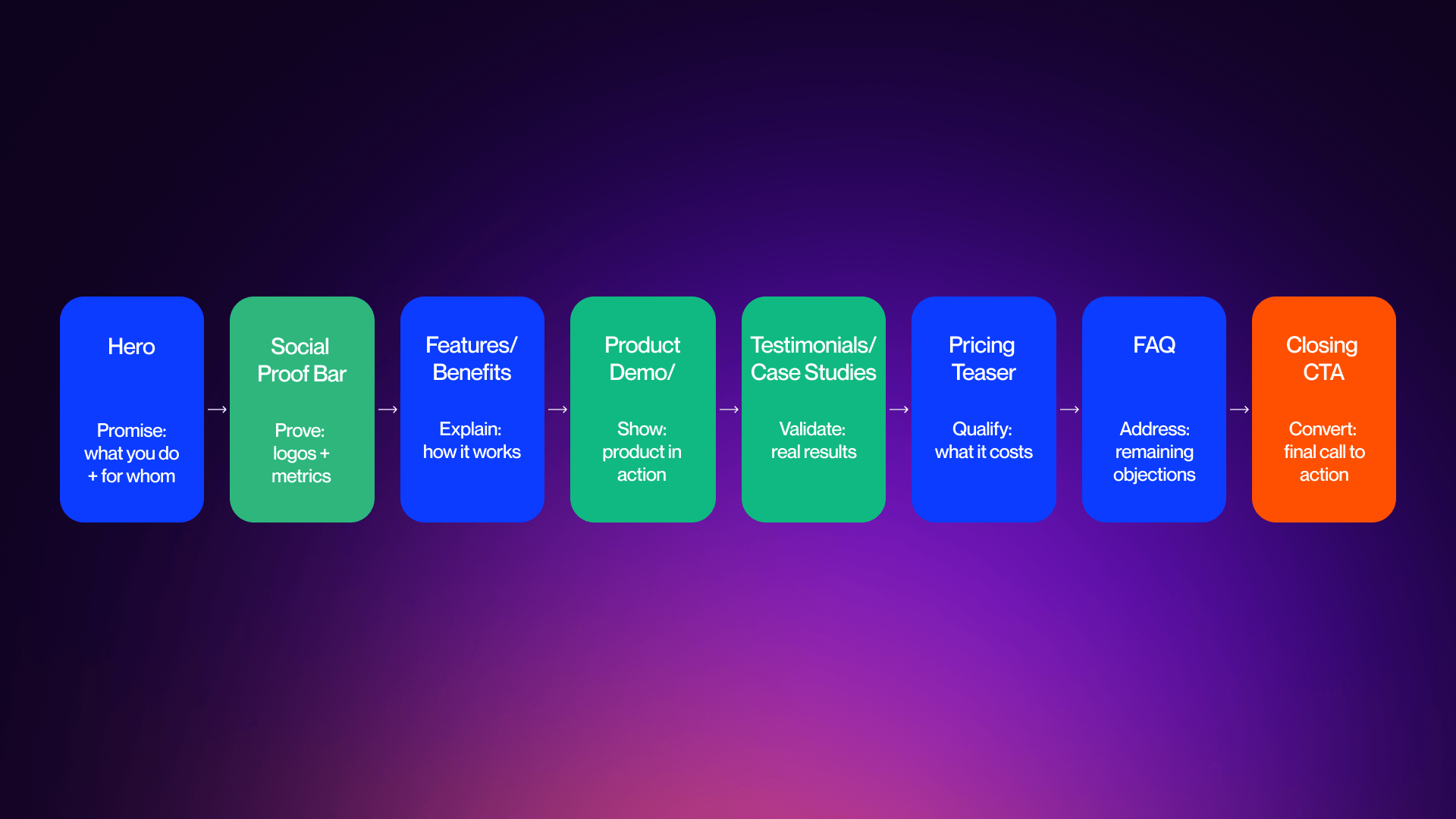
There is no doubt that color and typography help to attract and guide attention, but layout, in many ways, matters more because it determines the flow of the attention. The majority of high-performance SaaS homepages follow predictable structures because they are the best option for conversions.
In most cases, the predictable structure involves a sequence of sections that exist for a reason:
- Hero - exists to communicate value
- Social proof - builds instant trust
- Features - explains the way things work
- Product demo - illustrates the product in action
- Case studies - validates results
- Pricing teaser - qualifies intent
- FAQ - addresses objections
- Closing CTA - helps improve conversions
Standard 2026 Homepage Section Sequence Flowchart
These are not arbitrary factors, but they help to mirror the ways in which users are able to make decisions.
Above-the-fold design is a core part of this process, and means that it’s essential to ensure everything visible is working to communicate value and provide a clear next step for potential customers.
If users can’t understand what your product is and what it provides for them without needing to scroll, they’re unlikely to give your page a chance.
Having clean layouts and consistent spacing throughout is really important for readability purposes, and reducing cognitive overload. This helps create better structure and rhythm across the sections. Mobile makes this even more essential to get right because more than 60% of internet traffic comes from smartphones, so you have to make your page as mobile optimized as possible.
SaaS homepages need to be designed to be mobile-first, as opposed to being adapted after the fact. As such, this means clear vertical hierarchy, fast-loading assets and minimal clutter are essential for achieving this.
What’s more, layout differences between SaaS models are growing in prominence, which has meant that many enterprise SaaS homepages have longer pages and a focus on persona-based navigation. However, PLG / self-serve SaaS homepages tend to favor shorter pages with minimal navigation required, and a product-first approach.
These differences are not stylistic, but they reflect different buyer journeys. While Enterprise buyers need validation and depth, PLG users require speed and simplicity.
The most effective SaaS homepages align structure with intent. In the end, layout is about helping to guide decisions as opposed to focusing solely on design.
Social Proof, Product Showcase, and Trust-Building Design Patterns
Social proof and building trust are core components of reducing user doubt and proving value. It’s important to understand that visitors don’t choose to convert to paying customers because they understand your product, they do it because they trust your product, and your business.
Customer Logos and Social Proof Placement
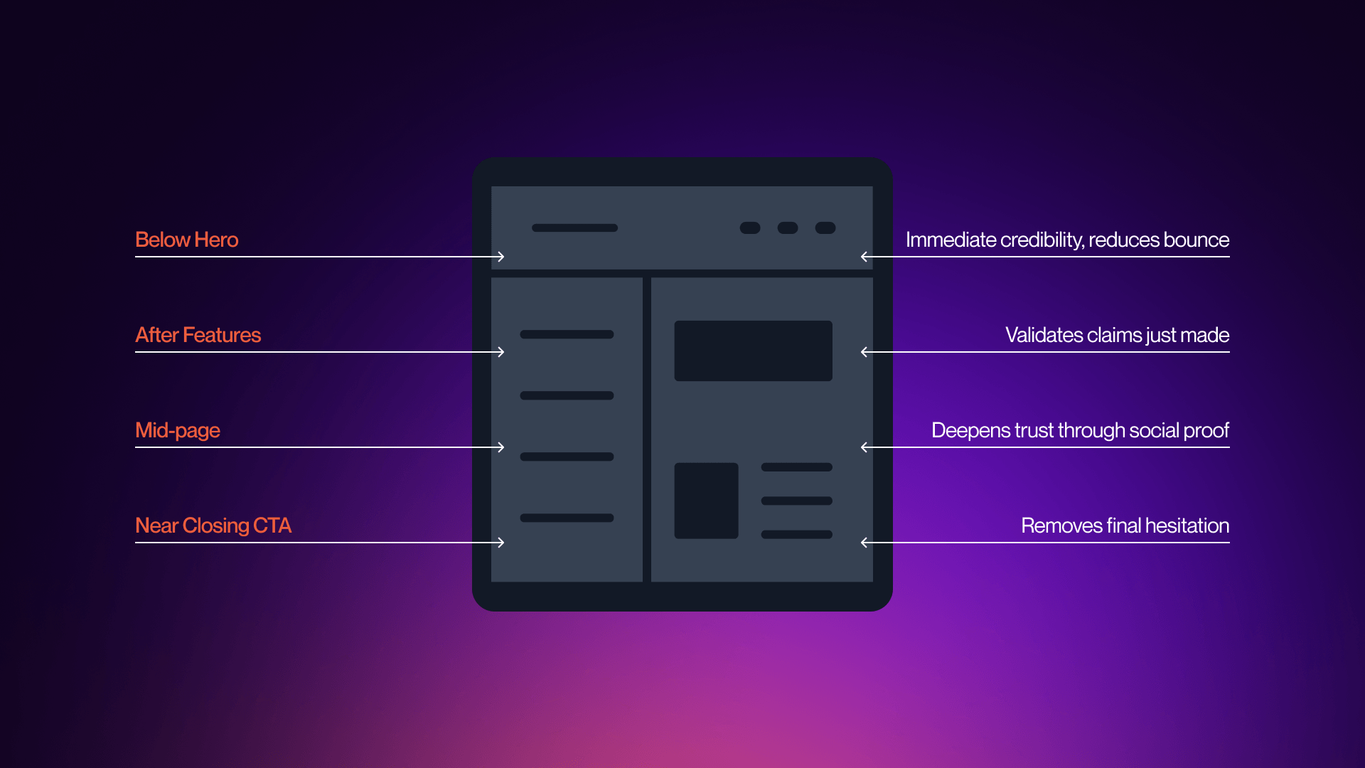
Customer logos are one of the quickest ways to boost your business credibility as they show that other well-known brands value your products, and, more importantly, that they trust you as a professional business.
The highest-performing SaaS homepages will place logos directly below the hero section, which is the optimal position to place them. This is vital because it reinforces trust immediately at the point in which visitors are evaluating your value proposition.
This is essential because it allows users to see validation before they explore features or scroll on the homepage.
- Monday.com is a great example of this approach, showcasing enterprise logos like Coca-Cola and Canva just beneath the headline.
The messaging here is simple and clever, conveying the message companies you already trust also trust us.
On the other hand, placing logos in the middle of the page serves an altogether different purpose. Instead of simply establishing initial trust, this placement helps to provide validation. Once users understand what your product is all about, logos help to reinforce that trusted sources also believe in your product.
Social Proof Placement Patterns Diagram
Another essential component is design treatment, which is an integral part of SaaS homepage planning. The majority of homepages use grayscale logos for minimalism to avoid overwhelming users. Subtle animation is also an effective way to introduce color, but it’s important to be restrained; logos need to support the message you’re trying to convey, not compete with it.
Trust signals combine with logos to strengthen their impact, and statements such as “25,000+ businesses use Proof” help to build trust better through measurable proof.
The best homepages don’t rely on a single source of trust, but instead they layer them with logos and numbers to help reduce risk without the need for additional visual clutter.
Testimonials, Case Studies, and Review Platform Integration
Logos are great for establishing credibility as a business, but if you really want to deepen credibility, testimonials are the way to do it. They determine whether your product actually works.
Generic testimonials are the best way to get lost among the competition, and this is why you need to avoid generic testimonials. Instead of this, you should be focused on using specific, outcome-driven testimonials from real customers.
Shorter quotes work well when placed next to conversion points, because they are easy to scan, while longer testimonials thrive in the mid-page sections once engagement has already been achieved.
In 2026, video testimonials have become more commonplace, particularly when it comes to enterprise-level SaaS. This is because they provide a level of authenticity that even the best text is simply unable to provide. But you need to remember to limit video use in case it slows the page down.
Aligning testimonials with specific audience segments helps to improve relevance without increasing volume, making it the optimal choice for leading SaaS homepages.
You can add greater validation by integrating with third-party platforms like G2 and Trustpilot, and security badges and compliance certificates do a similar job.
The best and most effective approach for your homepage would be a cumulative approach, combining logos, testimonials, and review platforms in order to boost familiarity, narrative proof, and validation.
Feature Sections and Product Demo Presentations
Establishing trust is all well and good, but users also need to understand how your product works, and feature sections and product presentations are the way this is achieved.
Traditionally, SaaS homepages used to rely heavily on static screenshots and feature lists, with a lack of dynamic features. In 2026, this is not enough to stand out as a modern business, because users expect to see the product being demonstrated.
Typically, feature sections can be structured in one of two ways, both of which can be effective provided they are clear and relevant. The first approach is a tab-based layout, which allows users to explore in their own time, and keeps the page more compact. This tends to be the most common type of feature section. The second type is scrolling narrative, which guides visitors through a linear story, each step bringing greater understanding.
Whichever option you choose, visual presentation is imperative, and high-performing pages are able to combine contextual screenshots with accompanying concise descriptions. Isolated interfaces give way to workflows, showcasing how the product is actually used.
2026 is showing a much more prominent shift toward interactive product demos. SaaS companies are allowing users to engage directly with products as opposed to simply imagining how they might work. Stan Vision reports that replacing a generic product video with an interactive demo increased activation by 32% in a week. It’s clear that demonstration converts more effectively than explanation.
Annotated screenshots can also be effective by highlighting specific elements within the UI, and guiding user attention without overwhelming them. Device frames and browser mockups contextualize the products, making them feel more tangible.
The plan here is to reduce perceived risk, and the more effectively users can see how your product works, the more they can connect with it, and the less assumptions they need to make. This helps improve conversions and evaluate cost and value, and you can find out more about this by checking out our guide on best SaaS pricing page examples.
CTA: Ready to turn your homepage into a conversion engine? Our Webflow agency builds SaaS sites that drive pipeline.
Pricing Teaser Integrations on the Homepage
Pricing is a complex element of SaaS homepage design because of the fact that there is no one-size-fits-all approach. However, there are definitely notable patterns based around business models.
Pricing teasers directly on the homepage has become a common element for product-focused SaaS homepage design. These sections often serve to highlight the different plans available, as well as clear and concise CTAs that lead to full pricing pages. As a modern business, the best approach is not to try to force users to make a decision, but rather to provide enough information so that users are able to self-qualify and arrive at a decision organically.
You have to maintain transparency throughout the user experience, as this helps increase trust, reduce friction, and provide greater clarity for cost and value. This is integral for lower-cost products where speed of decision-making is crucial for providing competitive advantage and securing market share.
Enterprise SaaS takes a rather different approach, where pricing details are sometimes held back behind Contact Sales CTAs. This is completely intentional. Enterprise deals are often layered and complex, and pricing is dependent upon factors such as scale, customization, and support. By holding back pricing details, enterprises can help guide potential customers through conversations where value can be illustrated more effectively, and pricing can be determined to suit individual cases.
There is a trade-off here that is important to keep in mind. Transparent pricing helps to develop trust and filters out those visitors who are unqualified. Hidden pricing is more flexible, but can cause friction and bottleneck for those seeking fast answers.
Pricing teasers that are the most effective avoid overwhelming users. They give enough information to educate, but not too much that it’s confusing. When you implement these teasers correctly, they bridge the gap between exploration and decision, and help to guide users toward the necessary next steps without trying to force commitment too early in the process.
The Best SaaS Homepage Design Examples of 2026 and What Makes Them Convert
Enterprise SaaS homepages don’t just exist to explain a product, but they are designed to handle complexity. The most successful homepages guide multiple stakeholders through a step-by-step process to aid decision-making, so they tend to be longer, and more trust focused as a result.
Enterprise SaaS Homepage Examples
Stripe is one of the cleanest examples of strong technical positioning. The site’s homepage conveys sophistication instantly via developer-first language, and the strong purple color scheme, providing a smart aesthetic. The hero has a focus on infrastructure as opposed to features, and the rest of the page introduces capabilities gradually. Consistent yet subtle signals help to reinforce trust, and the primary CTA reflects longer sales cycles.
Figma on the other hand works effectively by combining persona-based routing with design clarity. The homepage helps users to identify themselves quickly, while the hero communicates speed and collaboration. Modular sections also work well by introducing features without overwhelming the user. Navigation supports exploration, while CTAs strike a balance between access to products and more in-depth discovery.
HubSpot provides the framework to manage multiple products without compromising on clarity. The homepage’s modular sections help to introduce tools progressively, and let users navigate based on their goals. Social proofing is layered throughout, enhancing credibility, and resulting in a guided page that still feels expansive.
Notion is the perfect example of how well clarity-driven messaging can work. The “One workspace. Zero busywork” headline does a great job of conveying value. The homepage combines this simplicity with informative product visuals. It works by focusing on measurable outcomes, instead of overwhelming with features.
Slack is all about immediacy. Its homepage provides a clear, concise, and benefit-driven hero, complemented by a “Try For Free” CTA. Social proof shows up early, and the remainder of the page shows real-life use cases as a way of reinforcing value. It’s simple yet effective, with disciplined execution.
These are all excellent examples of strong homepages that showcase variety, but they also have similar patterns. Enterprise SaaS homepages are reliant on layered trust signals, structured navigation, and guided progression, and are designed to reduce risk. A breakdown of the best B2B SaaS website examples is a great way of finding out more.
Enterprise vs PLG Homepage Architecture Comparison
Self-Serve and PLG SaaS Homepage Examples
Product-led growth SaaS homepages work under the constraint of speed. They don’t guide users through a long evaluation process, but, instead are focused on connecting user and product as fast as possible.
Dropbox Sign is a great example of successful outcome-driven messaging. The homepage has a strong and specific headline that focuses on speed, and then is followed by a free trial CTA above the fold. There is minimal structure here, and almost zero friction between the process of understanding and being empowered to take action.
Canva is an even more prominent example of this, prioritizing instant access, with an emphasis on instant usability and one-click signup. Instead of trying to explain the different features in detail, Canva’s homepage gives a visual demonstration of outcomes, helping users to envisage their success without having to read.
Proof leads with the trust angle, and its homepage contains quantitative validation, which improves and boosts credibility before introducing features. This is a reversal of the traditional structure, and is ideal for products focused on conversion.
The thing that separates the strongest PLG homepages is not merely simplicity, but also immediacy. In these pages there’s no gap between understanding and action. The product is visible in seconds, and the primary CTA contains zero friction, with the path to value clear and open. Users can interact with the product directly via the homepage, transforming traditional marketing funnels into a single step. High-performing PLG design in 2026 is focused on reducing the gap between interest and experience. Visitors being able to see and feel value quickly requires less persuasion on your end, and boosts the chances of converting.
Design Inspiration Takeaways and Evaluation Framework
It’s clear to see an emerging set of principles within individual design frameworks. High-performing SaaS homepages work best because they are not defined by style but by a focus on strong structure and clarity, which feel consistent across different examples.
The pages that operate the most effectively are those that are able to communicate value in seconds, reinforce trust early in the process, and guide users toward clear and decisive action. Product visibility is more important than abstract messaging, and sections are intentionally ordered to match the way in which users would naturally make their decisions.
Use the following framework to help you evaluate your homepage:
- Does your hero section pass the 5-second test?
- Do you have clear social proof early on?
- Is your product clearly shown and demonstrated as opposed to just being described?
- Have you included one primary, action-oriented CTA?
- Does the page follow a logical section sequence?
- Are you adequately optimized for mobile?
- Have you layered trust signals throughout your page?
SaaS Homepage Audit Checklist Table
The important goal here is not to replicate other SaaS websites, but rather to understand why they make the decisions they do, and the logic behind them. Inspiration can come from identifying patterns and applying them to your own product, audience, and positioning.
Planning for the future, your SaaS homepage design needs to evolve toward personalization and greater interactivity. AI-driven content, adaptive messaging, and embedded product interactions close the gap between browsing and using products.
The execution is what transforms ideas into reality. No matter if you are refining an existing homepage or looking to rebuild from the ground up, design and development platforms are crucial for this. If you want to implement these principles, check out our web design services, or get in touch with our Webflow agency team to talk about your project.
FAQs
Q1. What makes a good SaaS homepage?
The best SaaS homepages can explain their value in less than five seconds, illustrate the product clearly, and place social proof early on the page. They also use a single strong CTA and focus on prioritizing trust, clarity, and reducing friction as opposed to solely fixating on aesthetics.
Q2. How long should a SaaS homepage be?
The answer here depends on your model. PLG homepages are typically shorter and aimed at trial conversion, but enterprise homepages are longer in order to support multiple personas and address pain points to help users make decisions ahead of time.
Q3. What should be in a SaaS hero section?
A SaaS hero needs to include benefit-driven headlines, a supporting subheading, product visuals, a primary CTA, as well as early trust signals. Visitors should be able to understand what your product is and who it is aimed at right away.
Q4. Should a SaaS homepage have pricing?
Typically, PLG and self-serve SaaS homepages have transparent pricing which builds trust and helps users qualify quickly. Enterprise SaaS thrives by using a pricing teaser approach which relates to more complex buying journeys.
Q5. What is the best section order for a SaaS homepage?
The hero section is the most powerful, and so the sequence should go… hero, social proof, features, product demo, testimonials, then pricing teaser, FAQs, and finally the closing CTA. This works so well because it mirrors the way that users choose to evaluate products: understanding, trust, exploration, validation, and finally the decision-making.
Q6. How important is social proof on a SaaS homepage?
This is an integral part of the process when developing a strong SaaS homepage. Social proof works to reduce perceived risk, as well as building trust more effectively than copy alone. The best homepages have logos, metrics, and testimonials placed early on, as opposed to burying them further down the page.
Q7. Should I use interactive demos on my SaaS homepage?
Absolutely, as long as your product is visual. Interactive demos can help users gain a greater understanding of the product much quicker than static screenshots do. This is incredibly effective for being able to explain workflows and improve activation.
Q8. What font should I use for a SaaS homepage?
Using fonts that focus on clarity and hierarchy is crucial. For SaaS, sans-serif fonts tend to be the best, while serif fonts are well suited to more premium positioning. Consistency and readability are by far the most important elements of a strong font.
Q9. How do enterprise SaaS homepages differ from PLG homepages?
Enterprise homepages tend to be longer and more layered, because they need to deal with serving multiple stakeholders. PLG homepages need to be shorter, more focused, and designed for instant action.
Q10. What animations work on SaaS homepages in 2026?
There are many different types of animations to consider when trying to find the best option for your SaaS homepages in 2026. You should be focusing on the animations that are able to explain your product effectively, instead of simply acting as decoration. Focus on things like product demos, micro-interactions, and scroll reveals, and make sure to avoid anything that slows down the page or damages Core Web Vitals.
Q11. What is the best platform for building a SaaS homepage?
Webflow is one of the stand out choices when looking for the best platform to build a SaaS homepage. Design flexibility, responsive control, and CMS-driven sections are just some of the hallmarks that make Webflow a leading option for your SaaS homepage.
Q12. How often should I redesign my SaaS homepage?
How often you should redesign your website depends on how happy you are with the job it’s doing, and how effectively it’s able to communicate with users. Many businesses will redesign their homepages on average around once every 12-18 months, but long-term optimization needs to be consistent.