.jpeg)
The pricing page is a specific page on a website on which users decide whether to buy your services or products, or which plan to choose. Even though pricing pages may seem simple, their structure affects conversion rate and revenue, usually, more than most other pages on the website.
The pricing page is often the last page the user visits before booking a call. Your goal is to is to remove friction, communicate plan differences clearly, and explain the pricing logic..
This guide explains the logic behind the pricing page so you can know how to apply layouts, grouping, hierarchy, and decision cues on your own website.
Quick Answer
Best SaaS pricing page examples: Slack, Notion, Linear, Figma, and Stripe lead with exceptional pricing page design. The best SaaS pricing pages share common traits: 3-4 clear plans, visual plan comparison, highlighted "recommended" tier, transparent pricing, strong CTAs, and trust elements. Great pricing pages make choosing easy - they communicate value clearly, reduce decision anxiety, and guide visitors toward the right plan with strategic design.
Abstract
The pricing page should be clear, show plan differences, explain pricing, and make it understandable which plan is a good fit for which customer. This guide explains how pricing pages work and how to make smart choices when designing them.
Veza Digital builds high-converting SaaS websites in Webflow. It’s one of the best website builders for B2B SaaS when consistency and scalability matter. We’ve studied what works on pricing pages across hundreds of B2B SaaS companies and distilled it into actionable insights.
Quick-Reference: Pricing Page Examples
Pricing Page Essentials:
Must-haves:
- 3-4 clearly differentiated plans
- "Most popular" or "Recommended" highlight
- Transparent pricing (or clear "Contact sales")
- Feature comparison (table or list)
- Strong, contrasting CTAs
- Trust signals (logos, testimonials)
Avoid:
- More than 5 plans (decision paralysis)
- Hidden pricing without reason
- Feature lists without context
- Generic CTAs ("Submit", "Buy")
- No social proof
Introduction to SaaS Pricing Pages
A SaaS pricing page is where someone decides if they're ready to pay and which plan they want. Often, people landing on this page already know what the product does, its features, and its benefits.
The questions at this point are:
- How much will this cost me?
- Which plan suits my needs?
- Is it actually going to be worth it?
The structure and design of your pricing page can directly change your conversion rate and how long people will stay as customers. Organizing your plans will increase the number of people choosing the right one for them. If the pricing page doesn't clearly communicate the pricing, or if it's designed poorly, people get confused or might choose the wrong plan.
Pricing pages are key to growing your business without involving a salesperson. Users should be able to subscribe on their own because the page answers their questions. If it doesn't, they might hold off on subscribing, leave, or ask for more info.
Because this page influences which plans users choose and how they onboard, it directly affects monthly and annual revenue. This ties into why B2B SaaS websites should prioritize SEO, since stronger visibility brings more high-intent visitors to these pricing decisions.
The pricing page is unique. It shows choices, explains what's different, clears up confusion, and points users to the next step.
Importance of SaaS Pricing Pages
This is the most important page for a SaaS website. People who visit it are the ones ready to make a purchase. In terms of revenue, it directly changes your conversion rate.
On the pricing page, users:
- Compare plans
- Decide whether the cost is worth it
- Look at ways to upgrade in the future
- Confirm whether they trust you
What makes a strong pricing page?
Many great pricing page examples share the following traits:
Remember, design isn't about trying to trick users. It's about giving them the support they need to make a decision, and that's rooted in the structure of the page.
Key Elements of a Great SaaS Pricing Page
Strong pricing pages usually have:
- Design that focuses on what's important: Prioritize clarity over decoration.
- Plans that make sense: Explain in a way that works for the customer.
- Easy to understand: Use visual hierarchy to surface critical information first.
- Works on phones: Make sure the page looks good on mobile devices.
- Loads fast: Ensure that the page is loading fast.
- Accessible: Everyone can use it, including people with disabilities.
Having these features on your pricing page ensures that users:
- Get the information they need quickly
- Compare options without scrolling (if possible)
- Know what to do next
- Find help or contact someone easily
An effective pricing page removes any doubts. It provides organized choices, is easy to compare, and lets users move forward without any trouble.
Essential SaaS Pricing Page Elements
Element Hierarchy
Recommended Layout Structure
Teams using Webflow development services often rely on this layout because it keeps pricing decisions simple and structured.
Key Structural Principles
- Keep comparison possible above the fold on the desktop.
- Make the price the most visually dominant element in each card.
- Highlight one plan without hiding alternatives.
- Group features by outcome (collaboration, security, support, etc.).
- Place trust elements near CTAs to reinforce action.
- Ensure cards stack cleanly on mobile with easy-to-tap buttons.
This structure prioritizes clarity, comparison, and guided decision-making while minimizing friction.
Best Practices for SaaS Pricing Page Design
Most SaaS pricing pages use similar design building blocks. The idea is to make things as easy as possible for the person exploring the page. Your role is to help them compare their options and guide them to what they should do next.
Structure, clarity, and giving people what they need to decide are the key features.
Clarity and Simplicity in Pricing Information
Prices need to be easy to read. When trying to keep the site clear, make sure the pricing page has:
- One price for each plan
- Explain how they'll be billed (monthly or yearly)
- No surprise fees
- Clear rules (users, storage, usage)
Avoid complex pricing that requires explanation to understand. . If the price changes based on usage, show the base price and how extra fees work.
Pricing page language best practices:
- Easy plan names
- Talk about what users get, not just features
- Avoid inside jokes or complicated terms
- Use specific numbers rather than vague or general descriptions
A user should understand in seconds which plan fits their needs and why.
Structuring Pricing Tiers and Plans
For most SaaS companies, three or four options are most effective. The most effective approach is the Goldilocks Strategy:
- Typically, there are three to four plans
- You want most people to pick the middle plan
- The entry plan limits advanced features
- The best plan shows the full value
Each option should be clearly different. Those differences need to be based on things that matter, such as:
- How many users does the plan has
- Which features do you get to use
- How much they can use the product
- What level of support do you get
If you want to help people make the right choice even more, emphasize the plan that should be the correct fit:
- Making it stand out visually
- Labeling it "Most Popular."
- Making the option slightly larger
- Using a stronger call to action
Make the middle plan seem like the best choice, but don't hide the others.
Visual Design and Layout
The layout should be intentional, clear, and easy to navigate.
In practice, it should look like this:
The best visual design and layout practices include:
- The recommended plan should stand out
- The price should be easy to spot
- The call to action should be easy to see
- Features should be easy to read
Make sure it works seamlessly on mobile devices:
- Options should stack on top of each other
- It should be easy to switch between monthly and yearly payments
- Buttons should be easy to tap
Everything should look consistent. The pricing page should use the same design, simple lines, balance the white space, and use brand colors.
Note: Users should have options without too much scrolling.
Build Trust with Proof and Testimonials
Trust increases when credibility signals are visible, and you achieve that when you:
- Use your branding that users already recognize
- Include specific testimonials and trust signals
- Share numbers that show how you've delivered results
- Use real names and photos
If you want to see real examples of this in action, you can browse our case studies.
Trust Signal Table
Calls-to-Action (CTA) Buttons and Conversion Optimization
Every plan should have a clear next step, and you achieve this by integrating CTAs. Take a look at the table below to see how to implement the best CTA practices for pricing pages.
CTA copy patterns:
SaaS Pricing Page Best Practices
Clarity & Simplicity
Plan Structure
Visual Design
Trust Building
CTA Optimization
What to Avoid
Note: Best practices are guidelines, not strict rules. Validate decisions with data, A/B testing, and user feedback. Start with these fundamentals, then refine based on audience behavior and product positioning.
Examples of the Best SaaS Pricing Pages
Strong pricing pages follow consistent structural principles, but execution varies by product type, audience, and pricing model. You see similar patterns across the best B2B SaaS websites, where clarity and structure drive decisions. The companies below demonstrate different approaches while maintaining clarity and support.
Notable SaaS Companies with Exceptional Pricing Pages
Several SaaS companies consistently demonstrate clear, structured pricing design.
Quick Comparison
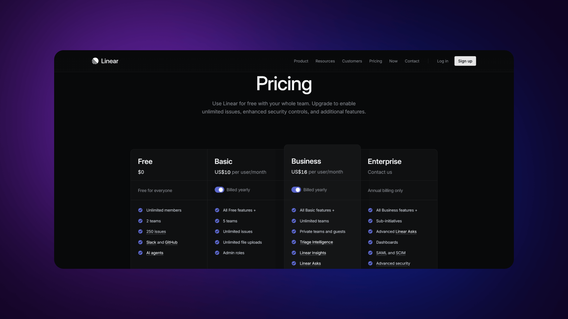
Slack (slack.com/pricing)
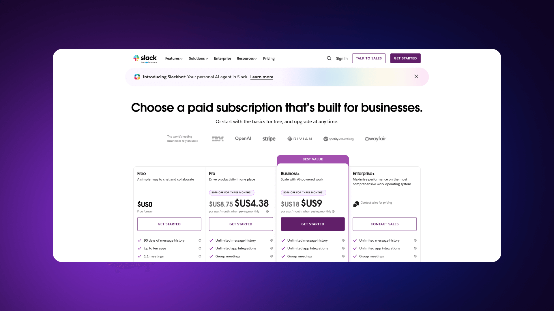
Slack uses four clearly defined tiers. Pricing is presented per user, with monthly and annual billing visible through a toggle. A detailed feature comparison table appears below the plan cards, grouped logically by category. The Enterprise plan has a distinct “Contact sales” CTA, separating it from self-serve options. The structure makes it easy to understand upgrade paths.
What Works:
- Features grouped by category for clarity
- Strong differentiation between mid and enterprise tiers
- Annual savings are clearly shown
- Clear upgrade path toward Enterprise
Notion (notion.so/pricing)
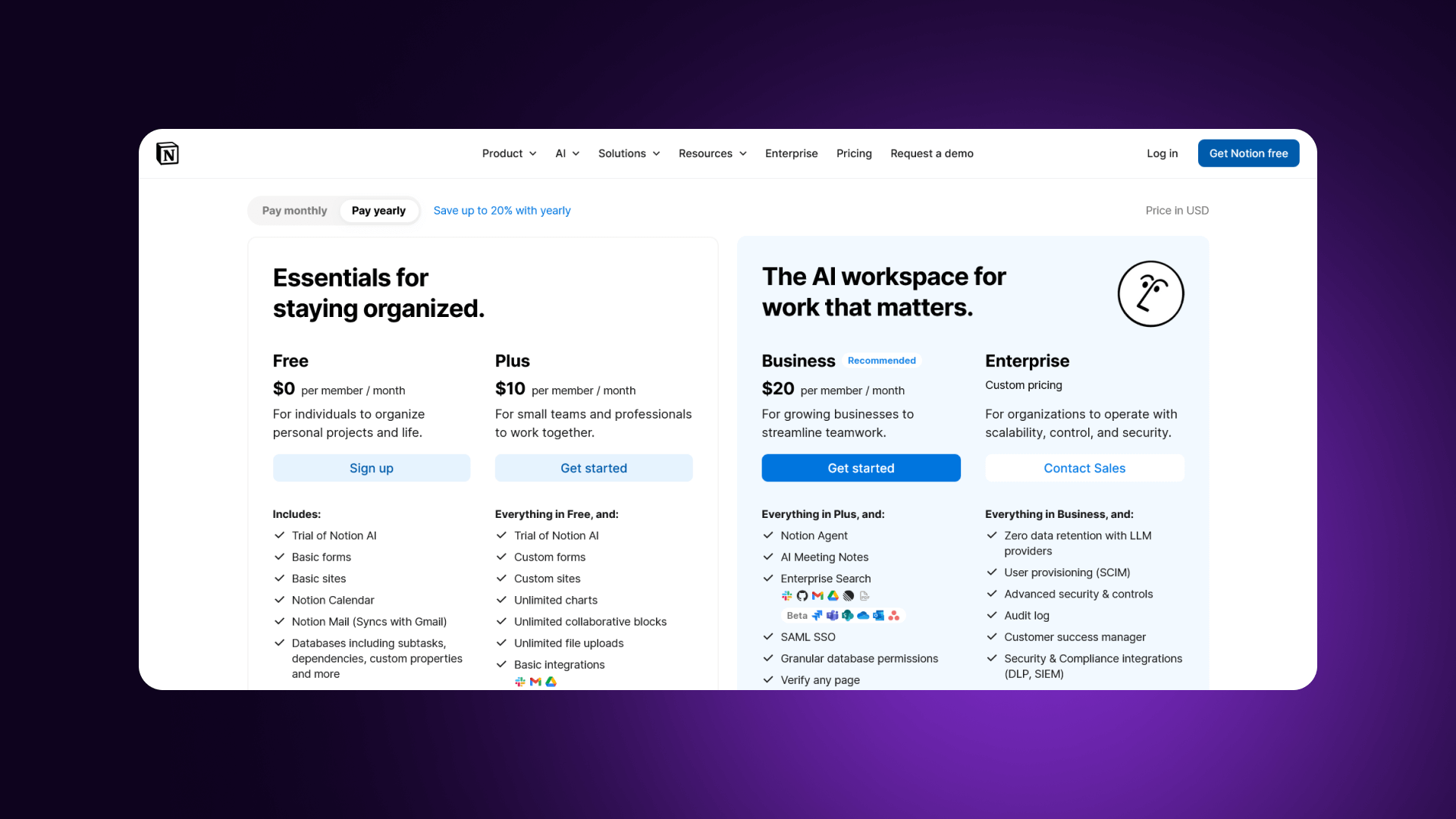
Notion uses a clean layout with minimal visual noise. There are four tiers, including a generous free option. Differences between plans are straightforward and focused on collaboration limits and advanced controls. The comparison table is simple and easy to scan. The page emphasizes clarity over density.
What Works:
- Generous free tier accelerates adoption
- Extremely scannable cards
- Logical progression of collaboration features
- Savings messaging is clearly visible
Linear (linear.app/pricing)
Linear presents three focused plans. The layout uses generous whitespace and restrained typography. Each tier clearly communicates who it is for and what changes as pricing increases. The simplicity reinforces confidence in the model.
What Works:
- Focused 3-tier structure reduces friction
- Strong whitespace and typography
- Value communicated succinctly
- Design reinforces product positioning
Figma (figma.com/pricing)
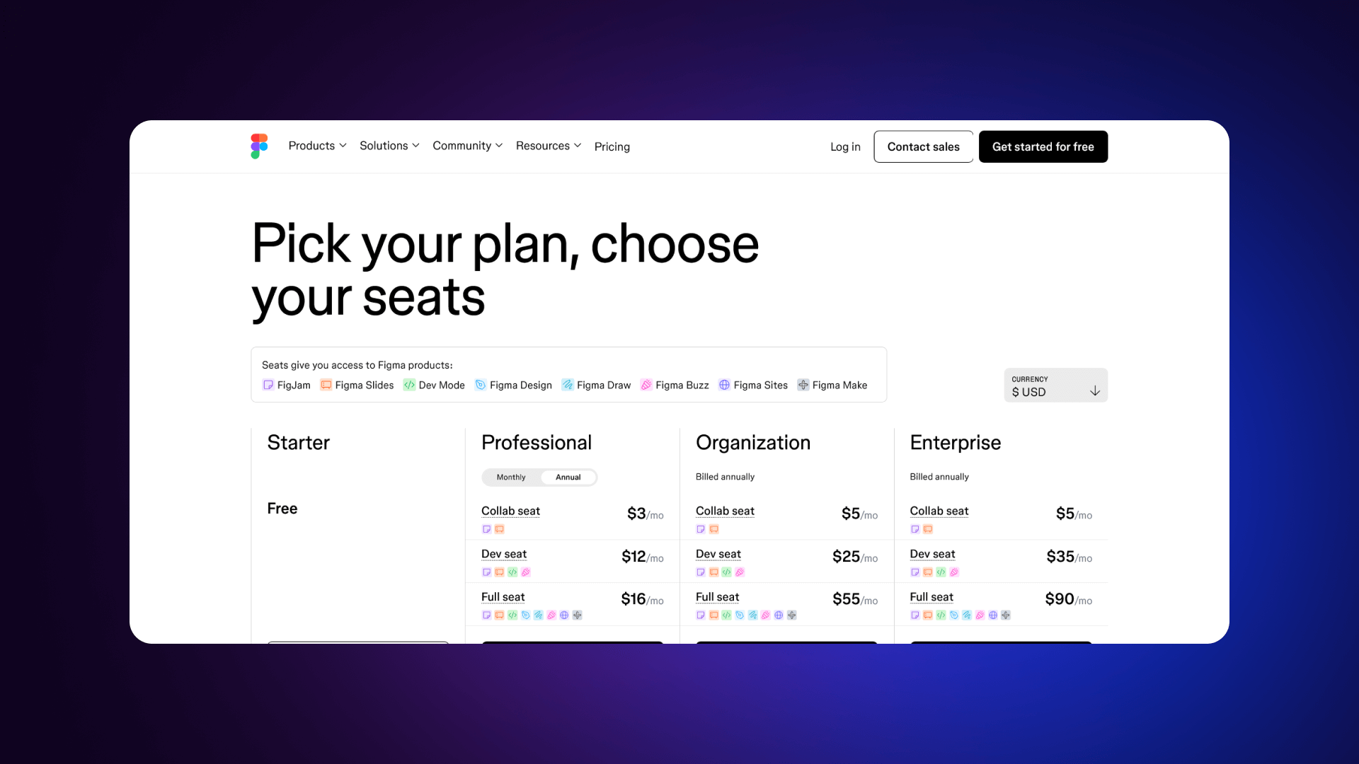
Figma structures pricing around editor-based access. Visual hierarchy is strong: pricing is prominent, and differences between viewer and editor roles are clear. Trust elements are integrated without clutter. The design aligns with its product audience.
What Works:
- The distinction between editors and viewers is clear
- Visual hierarchy guides toward the mid-tier
- Logical scaling for teams
- Enterprise features are clearly separated
Stripe (stripe.com/pricing)
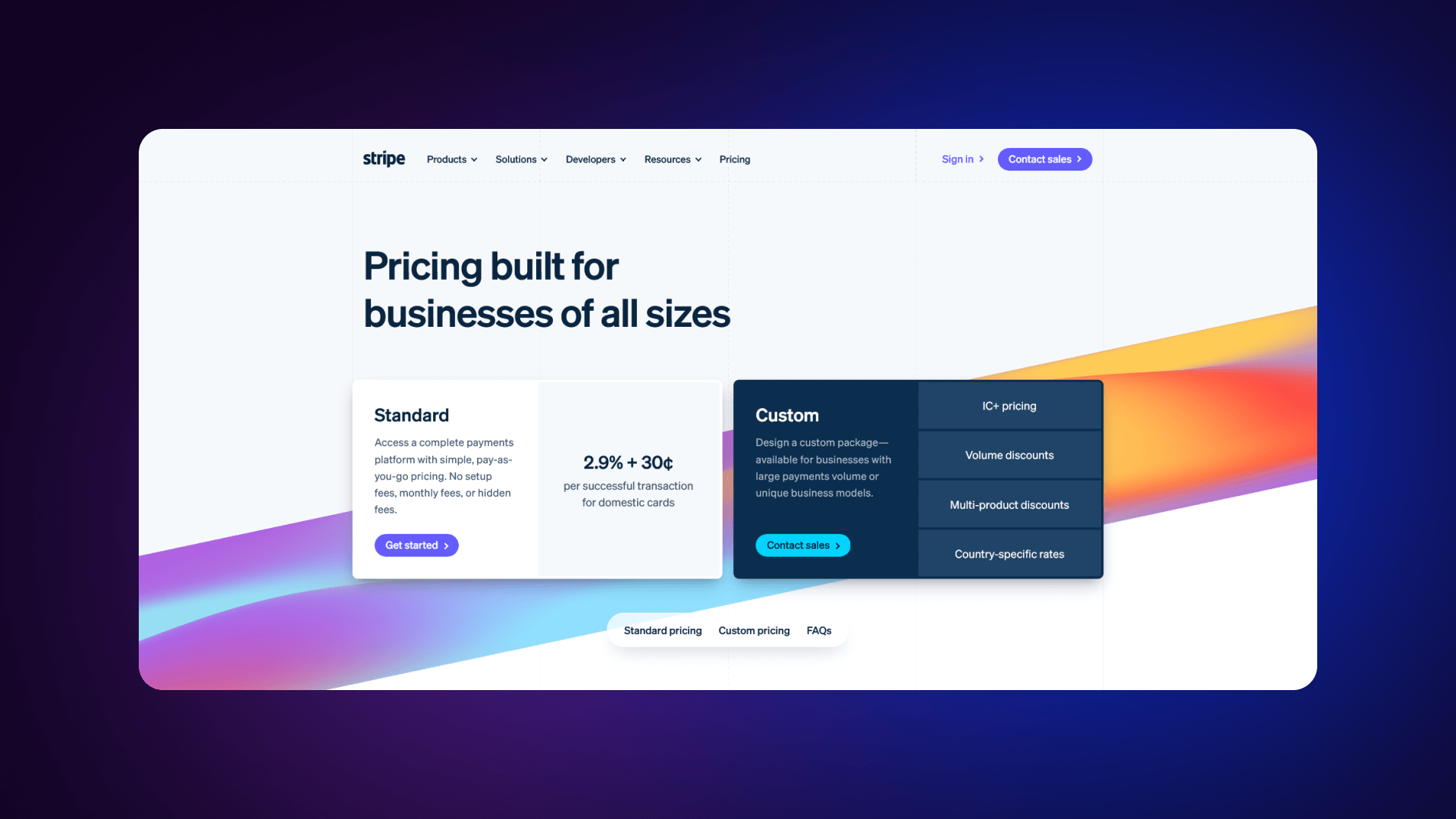
Stripe uses usage-based pricing with exact transaction percentages displayed clearly. Volume discounts are explained without hiding thresholds. The structure is developer-focused, direct, and transparent.
What Works:
- Exact transaction percentages displayed
- Volume pricing explained clearly
- No hidden thresholds
- Appeals directly to technical decision-makers
Feature Comparison Tables and Plan Highlights
Feature comparison tables are critical when pricing differences are nuanced.
Effective tables:
- Group features by category (e.g., collaboration, security, support)
- Use checkmarks with brief text
- Highlight key differentiators
- Remain scannable without dense paragraphs
Strong tables emphasize meaningful differences. They avoid listing every internal feature and instead focus on:
- Usage limits
- Advanced controls
- Reporting
- Security features
- Support levels
Plan highlighting should support comparison, not distort it. Visual cues such as subtle color shifts, badges, or emphasis around the recommended tier help guide selection without hiding alternatives.
Check how the biggest companies stand with this:
Note: These companies succeed because they prioritize clarity over creativity. Their pricing pages are structured for conversion first, aesthetics second.
Transparency and Value Communication
Transparent pricing reduces hesitation. For example, Stripe displays exact transaction percentages rather than ranges. Webflow shows clear per-site pricing. Linear uses simple per-user costs without layered conditions.
Value communication often includes:
- Clear annual savings calculations
- Per-user vs. total team cost clarity
- Explanation of what changes at higher tiers
- Context around when to upgrade
Companies that excel in transparency:
Transparent layout signals confidence. When cost, limits, and upgrade logic are clear, users make faster decisions and choose plans that match their needs.
Key Design Elements for SaaS Pricing Pages
Pricing pages work when the structure supports decision-making. The layout, feature presentation, trial logic, and enterprise positioning must align. Each element should serve a strong purpose: explain value, differentiate plans, clarify the offer, and move users forward.
Pricing Page Layout and Structure
A structured layout improves clarity.
Best practices include:
- Enable comparison without excessive scrolling (desktop)
- Keep card heights consistent
- Use clear visual grouping
- Maintain logical top-to-bottom flow
Users should understand options quickly before diving into details.
Highlighting Plan Features and Benefits
The feature presentation should support plan comparison.
Follow the next guidelines:
- Lead with outcomes, not internal feature names
- Use icons for faster scanning
- Add tooltips for clarification when needed
- Group features by category
Also, visual techniques improve readability, including:
- Checkmarks for included features
- Dashes or muted text for exclusions
- Icons for feature types
- Subtle color coding for categories
Avoid listing every internal capability. Focus on what changes between tiers and what matters for decision-making.
Trial Options and Freemium Models
How trials are presented affects signup rates.
Trial best practices include:
- No credit card required when possible
- Clear trial length
- Clear post-trial outcome
- Simple signup process
Freemium plans require a careful balance.
You can achieve that by:
- Defining limits clearly (users, features, usage)
- Making the upgrade path obvious
- Delivering real value in the free tier
- Avoiding reducing the incentive to upgrade
Users should know exactly what they receive and what changes when they move to paid.
Enterprise Plans and Custom Pricing
Enterprise plans require a different presentation.. To make your enterprise pricing plan work, include:
- Security and compliance capabilities
- Dedicated support
- Custom integrations
- Volume discounts
- SLA guarantees
Also, you need to encourage enterprise inquiries:
- Surface enterprise-only features clearly
- Display recognizable enterprise customers
- Provide an easy contact option
- Set expectation for response time
Enterprise sections should signal scale and capability while keeping the path to contact simple and visible.
Pricing Page Design Elements & Patterns
Layout Patterns
Plan Card Anatomy
Visual Hierarchy Techniques
Recommended Plan Highlighting
Feature Comparison Table Design
Mobile Optimization
Color Usage
Typography
Note: Design should support decision-making, not showcase creativity. Every visual choice must help the user compare, understand, and act without confusion.
Strategies for Optimizing SaaS Pricing Pages
Alt: Strategies for optimizing SaaS pricing pages.
Optimization improves conversion rate, plan distribution, and revenue per visitor. Changes should be measured, not assumed. The goal is to clarify value and guide users toward the correct tier using data.
A/B Testing and Conversion Rate Optimization
A/B testing helps pinpoint which structural changes lift performance. Also, it shows which method works best when you adjust a single variable at a time or define a clear metric. Use an adequate sample size and let each test run long enough to filter out early bias. .
Some of the most common high-impact tests are:
- Defaulting to annual billing
- Reordering plan cards
- Adjusting CTA wording
- Showing or hiding detailed comparison tables
Small structural changes can shift plan selection and overall revenue.
Leveraging User Feedback for Improvements
Qualitative feedback reveals friction that metrics alone cannot explain. Conversion rates may show a drop, but they do not explain why users hesitate or leave. Direct feedback helps identify where clarity breaks down and where expectations are misaligned.
Common feedback sources include:
- Exit surveys
- Session recordings
- Heatmaps
- Support tickets
- Sales team insights
These inputs often reveal repeated confusion about features, unclear billing terms, objections tied to pricing, or uncertainty around upgrade triggers. Scroll depth and session recordings can also show where users stop engaging with the page.
Improvements should follow a consistent review cycle. Combine quantitative data, such as conversion rate and plan distribution, with qualitative signals from users. Prioritize fixes that remove confusion before testing visual changes. Optimization is ongoing. As features, positioning, and customer segments evolve, the pricing page should evolve with them.
Case Studies of Successful SaaS Pricing Pages
Several SaaS companies demonstrate how focused pricing decisions influence growth and conversion.
For example, Basecamp simplified its pricing to a single core plan, reducing comparison friction and increasing clarity. Buffer made its pricing fully transparent, which strengthened trust with its audience. Notion introduced a generous free tier, accelerating user acquisition and product-led growth. Linear focused on a clean, minimal pricing layout aligned with its product experience.
Across these examples, consistent patterns emerge:
- Simplification increases conversions
- Transparency builds trust
- A clear hierarchy improves plan selection
- Continuous testing improves performance
Successful pricing pages are not accidental. They are structured intentionally and refined over time based on user behavior and feedback.
Pricing Page Optimization Strategies
A/B Testing Priorities
Test Prioritization Matrix
Key Metrics to Track
Successful A/B Test Examples
User Feedback Methods
Common Issues & Solutions
Optimization Cycle
Quick Wins
Note: Optimization is continuous. The best pricing pages are the result of dozens of tests, not a single design session.
Conclusion
A pricing page determines whether users convert and which plan they choose. Its structure, clarity, and trust elements directly affect revenue outcomes. When pricing is easy to understand, and comparison is straightforward, users decide faster and with more confidence.
Recap of Best Practices and Examples
- Clarity reduces hesitation
- 3-4 plans are typically optimal
- Guide users toward a defined target plan
- Trust signals reinforce decisions
- Strong CTAs enable action
- Mobile usability matters
Example takeaways:
Final Thoughts on Creating Effective SaaS Pricing Pages
Start with clarity. Define tiers clearly, differentiate them meaningfully, and make pricing transparent. Design the page to support comparison and reduce uncertainty. Test changes continuously and review performance regularly.
Your pricing page is your most important revenue page. Invest in getting it right. Study the best examples, apply the principles, and continuously optimize based on data. If you need help building a high-converting pricing page in Webflow, we're here.
Ready to build a pricing page that converts?
You can work with Veza to build a pricing page that’s structured for conversion
SaaS Pricing Page Pre-Launch Checklist
Structure & Content
Design & UX
CTAs & Conversion
Trust & Social Proof
Pricing Presentation
Technical & Analytics
Accessibility
Final Review
Post-Launch
Veza Digital Recommendation:
"Your pricing page is your most important revenue page. Before launch, verify every element supports the goal: helping visitors choose the right plan and convert. After launch, continuously test and optimize."
FAQ - Frequently Asked Questions
What makes a good SaaS pricing page?
A good SaaS pricing page presents clear tiers, transparent pricing, and simple comparison. Users should understand cost, limits, and differences within seconds. It includes a recommended plan, visible CTAs, and trust elements such as testimonials or logos. Feature lists are structured by category, not overloaded. Billing terms are explicit, and upgrade paths are obvious. The page reduces confusion and supports decision-making without requiring additional explanation.
How many pricing tiers should a SaaS have?
Most SaaS companies perform best with three to four tiers. Three plans create a clear middle option, while four allow segmentation without overwhelming users. Too many plans increase decision fatigue. Too few can limit segmentation. A common structure includes Free/Starter, Growth/Pro, Business, and Enterprise. The middle tier typically drives the majority of conversions.
Should I show pricing or hide it?
In most SaaS categories, showing pricing builds trust and reduces friction. Hiding pricing behind “Contact us” increases sales effort and slows self-serve growth. Transparent pricing works best for product-led models and standardized plans. Enterprise-heavy solutions may require custom quotes, but even then, clear starting points improve trust.
What's the best layout for a pricing page?
Side-by-side cards work best for three to four plans. A comparison table below the cards supports feature-heavy products. On mobile, cards should stack vertically. The layout should allow quick comparison without excessive scrolling. Price, key differentiators, and CTAs must remain visually prominent.
Should pricing be monthly or annual by default?
Defaulting to annual billing can increase upfront revenue, especially when savings are clearly shown. However, this should be tested. Some audiences prefer monthly flexibility. Display both clearly and make the billing toggle obvious. Transparency matters more than default selection.
How do I highlight the recommended plan?
Use visual emphasis such as a subtle background color, badge (“Most popular”), or slightly larger card. Strengthen the CTA compared to other plans. The highlight should guide selection without hiding alternatives or distorting comparison.
How do I increase pricing page conversion?
Improve clarity first. Simplify tiers, clarify limits, and strengthen CTAs. Add trust signals near decision points. Test billing defaults, CTA copy, and plan order. Review user feedback to identify confusion. Remove unnecessary detail before adding new elements.
Should I offer a free trial or freemium?
Free trials work well when users need product access before committing. Freemium works when the product provides standalone value with clear upgrade triggers. The choice depends on product complexity and cost structure. Clearly define limits and next steps in both cases.
What CTAs work best on pricing pages?
Use direct, action-based language. Examples: “Start free,” “Start free trial,” “Get started,” or “Contact sales” for enterprise. Each plan should have its own CTA. The primary action must stand out visually and be easy to tap on mobile.
How do I present enterprise pricing?
Use a dedicated enterprise card labeled “Custom” or “Contact us.” List enterprise-only features such as security, integrations, and dedicated support. Show recognizable enterprise logos if available. Provide a clear “Contact sales” CTA and keep the path to inquiry simple.
Should I show a feature comparison table?
If plans differ across multiple features, a comparison table improves clarity. Group features logically and keep the layout scannable. If differences are minimal, plan cards alone may be sufficient. Avoid overwhelming users with internal feature lists.
How often should I A/B test my pricing page?
Review performance quarterly at a minimum. Run structured A/B tests when traffic volume allows statistical significance. Focus on high-impact variables such as billing defaults, plan structure, and CTA wording. Optimization should be continuous as products and positioning evolve.