.jpeg)
Abstract
Most B2B landing page example articles fail in one of three core ways. Firstly, they show Salesforce and Slack screenshots as inspiration. Secondly, they organize examples by industry, when readers search by conversion goal. Thirdly, they build a strong theoretical framework without showing pages you can benchmark against. This article aims to explore and fix all three issues.
We organized these examples by the job the page needs to do: request a demo, drive a free trial, support an ROI conversation, or win a competitor comparison. This is a structure that mirrors how B2B SaaS teams build their landing pages internally. You know if you need a demo page or a calculator page; the industry is less important than the conversion motion.
Every example below is scored against the same 5-point framework: Hero Clarity, Trust Architecture, Form Friction, Proof Placement, and Conversion Path. We also include Webflow implementation guidance, examples we don’t recommend, and reusable component patterns found across B2B SaaS web design services projects for growth-stage SaaS teams.
The goal here is to leave with clear answers to the questions, which landing pages should you study for the page you need to build? And how should you go about implementing the pattern?
The 5-Point Framework We Use to Evaluate Every B2B Landing Page
The majority of B2B landing pages are evaluated emotionally: whether things are modern, clean, enterprise, or high-converting. That isn’t useful if you’re trying to improve performance. Instead, we use a consistent 5-point framework that measures clarity, trust, friction, proof, and conversion structure across all of the pages in this article.
Why B2B Landing Pages are Different
B2B landing pages fail when they’re treated like simplified homepage design exercises as opposed to decision-making environments.
A B2C landing page typically persuades one buyer. However, a B2B landing page often needs to persuade multiple people at the same time. This could be the champion researching vendors, the operator who uses the product, the technical evaluator checking risk, and the budget holder approving spend. Gartner commonly cites B2B buying groups in the 6-10 stakeholder range, which changes the job of the page completely.
The page isn’t simply explaining a product, it’s helping the visitor build internal confidence and justify the next step to other stakeholders.
That’s also why B2B conversion rates are lower. Per Unbounce, B2B SaaS landing pages convert at 3.8%, much lower than the all-industry standard of 6.6%. When conversion rates are constrained like this, every structural decision you make matters. This includes headline clarity, CTA hierarchy, form depth, proof placement, page speed, and mobile usability.
The leading B2B landing pages aren’t only visually polished. They reduce uncertainty at every stage of the evaluation process. Many of the patterns we note across the best B2B SaaS websites often tend to be trust and clarity systems disguised as design systems.
Why We Organize by Conversion Goal, Not by Industry
The majority of the “best B2B landing page” articles organize examples by vertical: SaaS, fintech, healthcare, education, and cybersecurity.
That sounds logical until you start building actual landing pages. In practice, the conversion goal shapes the page more than the industry does. A healthcare SaaS demo request page and a fintech SaaS demo request page typically share more architectural DNA than two healthcare pages trying to accomplish different things. The structure of a free-trial signup page is fundamentally different from the structure of a comparison page or an ROI calculator.
That’s why this article is organized around conversion motion:
- Demo request
- Free trial/signup
- ROI calculator
- Comparison/competitor evaluation
- Content/resource capture
The reader already knows what page they need to ship. The useful question isn’t considering “What does healthcare SaaS design look like?” Instead, the question you should be asking is “What does a high-converting demo page look like for a growth-stage B2B SaaS company?”
Drawing this distinction is important because the wrong structure creates instant friction. Trial pages need speed and low commitment. Demo pages need trust and expectation-setting. Calculator pages require credibility and transparent assumptions. Comparison pages need to focus on honesty as opposed to hype.
This is also why modern B2B SaaS web design services increasingly focus on modular conversion architecture instead of static page templates. The highest-performing B2B SaaS teams build reusable systems that support different conversion goals without rebuilding the entire experience every quarter.
The same also applies to Webflow development services. CMS-driven variants, reusable proof blocks, modular CTA systems, and scalable comparison templates matter more than isolated one-off pages.
The 5-Point Framework: Hero Clarity, Trust Architecture, Form Friction, Proof Placement, Conversion Path
Every example in this article is scored against the same 5-point framework. The goal here is consistency. The majority of landing pages collapse into vague and non-actionable adjectives such as “modern” or “high-converting.”
Instead, these five dimensions are actionable:
1. Hero Clarity
The hero section needs to identify the user, the outcome, and the next step all within a single screen. Strong B2B landing pages reduce interpretation work immediately; visitors need to understand who the page is for, what changes once the product is used, and what action they should take.
2. Trust Architecture
Trust signals matter most where hesitation appears, not buried in one logo wall halfway down the page. Strong pages distribute proof intelligently, with customer logos near the hero, security badges near forms, implementation proof close to pricing, and testimonials near commitment moments.
3. Form Friction
Most B2B landing pages request too much information too soon in the process. High-performing pages collect only what they need for routing and qualification. Deeper discovery comes later during the sales process, and not inside a 10-field form.
4. Proof Placement
Proof only works when it answers a decision question at the right moment. The pages that work best place testimonials, metrics, screenshots, and case-study references directly beside the hesitation they resolve. Proof placement is timing, rather than decoration.
5. Conversion Path
The page needs to have one dominant action with secondary actions clearly subordinated. Mixed CTA hierarchy is one of the most common conversion problems we see in B2B SaaS audits. Demo, free trial, and content download should not compete equally on the same screen.
The framework below is the same structure we use during the conversion rate optimization audits for B2B SaaS landing pages and campaign builds.
Running this framework across a B2B SaaS site is most of what we do. See our web design services.
Demo Request Landing Pages (3 Examples Worth Modeling)
The best demo request pages don’t sell the product directly. They sell the value of the conversation that happens after the form submission. That distinction matters because demo pages tend to target mid-funnel buyers who already understand the category and now evaluate implementation fit, workflow compatibility, and vendor credibility. Our SaaS landing page deep dive reveals more.
What a Great Demo Request Page Has to Do
A strong demo request helps visitors answer very specific questions, such as “Is this worth spending time on with my team?”
This is why the leading pages focus less on feature explanation and more on setting expectations. Buyers need to understand what the session covers, who it’s for, and what happens next. Unicorn Platform’s landing-page framework nails this part. Demo pages perform best when they emphasize business outcomes, implementation fit, and next-step clarity as opposed to generic product marketing.
The most common failure modes tend to be fairly consistent, including:
- Generic headlines paired with aggressive forms
- Positioning the session like a sales ambush rather than a working conversation
- Demo CTAs that lack explanation of what the meeting is about
- Requesting deep qualification before trust is developed
Transparency is far better, and you can achieve this by explaining the outcome, the process, and who the session is designed for.
We see this repeatedly across enterprise SaaS projects and internal audits, and you can see our recent work for examples of some of the strongest demo pages that reduce uncertainty before qualification.
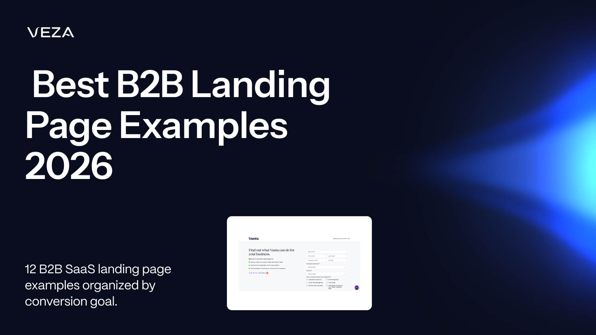
Recommended: Vanta - Demo for a Specific Compliance Goal
Vanta’s demo experience works because it’s extraordinarily specific about who the page is for and what operational outcome the buyer tries to achieve. The page targets security and compliance leaders at SaaS companies and frames the conversation around concrete compliance milestones like SOC 2 readiness rather than generic security automation.
That specificity strengthens nearly every layer of the page.
- Hero Clarity: 5/5 - The page identifies the audience, framework, and outcome right away.
- Trust Architecture: 5/5 - Compliance signals are integrated naturally across the experience, rather than just isolated to one logo block.
- Form Friction: 4/5 - The form asks for size of the company as well as framework information, but both of these fields support qualification directly.
- Proof Placement: 5/5 - Customer logos, audit credibility, and trust indicators are close to commitment moments.
- Conversion Path: 5/5 - A dominant CTA with almost no competing actions.
The biggest lesson to follow here is naming both the user and compliance frameworks explicitly. Many B2B SaaS pages are too abstract because they’re concerned about narrowing their audience. Vanta does the opposite of this, and is more credible as a result.
From a Webflow perspective, this is something that can be highly implemented. Most of the architecture here is reliant on native layout patterns, reusable proof sections, and structured CMS-driven content blocks.
Recommended: Gong - A Demo Page That Sells the Conversation
Gong’s demo page works because it treats the demo itself as part of the overall product experience.
The majority of B2B demo pages assume that the buyer already understands what happens once form submission is completed. Gong works by removing this ambiguity directly, and the page explains what is covered during the sessions, who joins from Gong’s team, and what the prospect needs to bring to the conversation.
The result is a collaborative session as opposed to a sales pitch.
- Hero Clarity: 5/5 - Gong clearly positions the value of the session.
- Trust Architecture: 4/5 - Strong customer logos helps create credibility.
- Form Friction: 4/5 - The form is heavier than product-led SaaS examples, but is definitely more appropriate for higher-investment sales motion.
- Proof Placement: 5/5 - Customer quotes and business-impact proof lie close to the form and CTA sections.
- Conversion Path: 5/5 - Clear hierarchy with a single, dominant conversion action.
The key important pattern here sets the expectation. This means to explain what the meeting actually contains. Buyers are considerably more likely to commit time when the session feels operationally useful, as opposed to promotional.
Webflow implementation difficulty is moderate. The majority of layout and proof systems are straightforward, but embedded videos and richer personalization layers need additional integrations or custom codes.
Also Consider: Drata - Industry-Specific Demo Variants
Drata utilizes one of the most scalable patterns in this article: industry-specific demo variants developed from a shared structural system.
The core template here remains consistent, but terminology, proof, compliance references, and customer examples are adaptable based on the industry path the visitor selects. SaaS, fintech, and healthcare buyers all see versions calibrated to their operational mandates.
- Hero Clarity: 5/5 - Messaging is instantly more relevant once the context changes.
- Trust Architecture: 5/5 - Industry-specific proof improves credibility substantially.
- Form Friction: 4/5 - Qualification is relatively lightweight.
- Proof Placement: 5/5 - Compliance and customer references stay in alignment.
- Conversion Path: 4/5 - More navigational complexity because of variant structure.
This Webflow-friendly implementation pattern works because CMS Collections handle variant swapping naturally. The difficult element here is operational consistency. Maintaining multiple high-quality vertical variants needs strong content governance and updates across the entire system.
Free Trial and Self-Serve Signup Pages (3 Examples Worth Modeling)
The leading self-serve signup pages reduce the distance between curiosity and product value. Unlike demo pages, trial pages don’t justify a conversation, but instead they justify immediate exploration. The quicker a visitor is able to understand the workflow and experience a product firsthand, the stronger the page is able to perform.
What a Great Trial Signup Page Has to Do
Strong trial pages make time-to-value feel short and predictable. Too many B2B SaaS signup pages fall short because they treat it like a compressed homepage rather than a guided onboarding decision. Common problems here are incredibly consistent:
- Feature dumps with no workflow context
- Hidden pricing that causes pricing anxiety
- Trial CTAs competing with demo CTAs on the same screen
- Signup flows feel operationally expensive before product exploration begins
This discipline comes in the form of commitment clarity. Choose a motion and fully support it. Either the page is designed for self exploration, or sales-led qualification. Trying to support both of these equally tends to result in weakening both.
The best trial pages remove ambiguity, as well as showing products visually, explaining how users can reach value, and minimizing signup friction. For this reason, product-led SaaS pages tend to outperform aesthetically better landing pages, and make the next stage feel simple.
Recommended: Linear - Trial as the Product Demo
The Linear homepage and signup flow works because the trial functions as the product demo.
The page shows the product instantly, targets a specific audience, and keeps the signup path friction-free. Rather than expecting visitors to schedule time with sales, Linear allows the interface, interaction model, and signup speed to sell the experience directly.
This creates unusually strong alignment between messaging and onboarding.
- Hero Clarity: 5/5 - The audience and workflow are instantly recognizable.
- Trust Architecture: 5/5 - Named customers like OpenAI, Coinbase, Ramp, Vercel, and Cash App have appeared in Linear marketing.
- Form Friction: 5/5 - Email-first signup with no unnecessary qualification layer.
- Proof Placement: 4/5 - Product visuals carry the burden of proof directly.
- Conversion Path: 5/5 - A single dominant action with no competing CTA hierarchy.
The biggest lesson is message discipline. Linear doesn’t overload the screen with conflicting ideas. Instead, each section communicates a single workflow, benefit, or interaction plan before moving forward.
What’s difficult is trying to replicate motion polish. A lot of Linear’s perceived quality is derived from transitions, timing, spacing, and interaction restraint. Teams trying to replicate this style without strong interaction discipline often wind up with pages that feel overloaded and distracting.
Many structural patterns are highly implementable in Webflow, but execution quality remains a challenge. Sophisticated animation systems need careful Webflow Interactions work, performance testing, and restraint.
Recommended: Vercel - Product-Led Signup With Docs as Navigation
Vercel’s signup path works due to product experience beginning before the account begins.
Primary CTA sends visitors directly to further action rather than into a qualification layer. For developer audiences, this works because the product itself is proof. Furthermore, the distance between initial page visit and the first meaningful product interaction is short.
Navigation structure is crucial here, while documentation is treated as a primary product surface as opposed to an afterthought, signalling confidence and aligning with how buyers evaluate tooling.
- Hero Clarity: 5/5 - Immediate understanding of what the platform does and who it’s for.
- Trust Architecture: 5/5 - Massive customer logo ecosystem reinforces platform legitimacy.
- Form Friction: 5/5 - Low-friction onboarding path.
- Proof Placement: 4/5 - Product ecosystem and developer adoption serve as proof layers.
- Conversion Path: 5/5 - Direct path from landing page to deployment.
The strongest pattern to copy is docs-as-product philosophy. For technical audiences, transparent documentation builds greater long-term trust.
From a Webflow perspective, the marketing-layer architecture is simple and straightforward. Interactive product experiences and deployment flows generally need deeper integrations, APIs, and embedded tooling that operates beyond native Webflow capabilities.
Also Consider: Cal.com - Open Source as the Primary Trust Signal
Cal.com’s signup flow works well because the positioning serves as proof.
The page leads with its open-source identity, creating trust mechanism competitors can’t easily imitate because the proof is operational rather than purely marketing-driven.
The signup structure is also unusually clear. Visitors immediately understand the difference between the hosted product path and the self-hosted path.
- Hero Clarity: 4/5 - Strong positioning, though slightly more developer-oriented.
- Trust Architecture: 5/5 - Open source acts as a built-in credibility system.
- Form Friction: 5/5 - Lightweight onboarding and clear pathway selections.
- Proof Placement: 4/5 - Community traction and GitHub activity reinforce legitimacy.
- Conversion Path: 4/5 - Dual-path structure introduces slightly more navigational complexity.
The lesson to copy is positioning-led differentiation. Cal.com leads with what makes them different, as opposed to leading with feature comparison.
However, it’s important to keep in mind that this pattern only works when operational reality supports it. “Open source” works as proof because it's verifiable. Positioning claims without underlying substance will collapse instantly in technical audiences.
ROI Calculator and Sales Tool Landing Pages (3 Examples Worth Modeling)
The best ROI calculator pages help buyers reach a decision internally before entering the sales process. Calculator pages exist to support evaluation logic. The visitor isn’t worrying whether the product looks good, but whether they can defend the investment to finance or leadership.
What a Great ROI Calculator Page Has to Do
Strong ROI calculator pages make the underlying assumptions visible.
That matters because most B2B buyers have seen enough inflated “savings calculators” to distrust black-box outputs immediately. The strongest pages tend to be operational as opposed to promotional. They request inputs buyers can answer, explain where the math comes from, and provide output that feels actionable.
The most common failures are also predictable:
- Calculators with no transparent assumptions
- Outputs hidden behind form gates
- Unrealistic savings projections
- Input requirements buyers can’t estimate themselves
- Calculators positioned as gimmicks as opposed to buying tools
The distinction here is that the calculator serves as a value exchange. Buyers came for the output rather than the lead form. Pages that force qualification before delivering the number typically creates unnecessary friction and lower completion rates.
The best implementations treat the calculator as part of the sales process and not a lead-generation trick.
Recommended: Mutiny - Calculator That Treats the Buyer as an Operator
Mutiny’s calculator experience works because it assumes the visitor is already well-versed in understanding operational marketing metrics.
The calculator moves away from asking vague questions toward a focus on inputs marketing operators can realistically estimate:
- Monthly website traffic
- Average deal size
- Conversion rate
- Pipeline impact
This gives the experience greater credibility. Mutiny also gives the output before introducing deeper qualification. The calculator here is the primary value, while the form becomes a secondary follow-up mechanism.
- Hero Clarity: 5/5 - The page communicates exactly what the calculator helps estimate.
- Trust Architecture: 4/5 - Strong SaaS positioning and operator-focused framing reinforce credibility.
- Form Friction: 5/5 - Calculator-first, form-second structures work by minimizing resistance.
- Proof Placement: 5/5 - Revenue and pipeline framing is close to calculation output.
- Conversion Path: 5/5 - One dominant interaction path from input to result.
The strongest pattern to copy is output-first sequencing. Delivering value before requesting information creates a deeper level of trust.
From a Webflow perspective, this is a fairly complex pattern. Page architecture is simple, but the calculator typically requires custom JavaScript or embedded calculation tooling layered into Webflow’s frontend.
Recommended: Default - Net-Savings Framing Instead of Vanity ROI
Default’s calculator approach works because it frames ROI in an honest way.
The page acknowledges that the majority of companies already pay for manual processes and overlapping tools, rather than assuming the buyer is starting from scratch. The calculation focuses on net savings, and this positioning choice dramatically improves credibility.
- Hero Clarity: 4/5 - The calculator intent is clear but framed more financially.
- Trust Architecture: 4/5 - Real operational framing makes the math more believable.
- Form Friction: 4/5 - More qualification introduced during the flow.
- Proof Placement: 5/5 - Named teams and operational examples reinforce calculation legitimacy,
- Conversion Path: 4/5 - Strong progression.
The key lesson is expectation calibration. Many ROI pages overstate upside so aggressively that output can lose credibility. Default’s framing is successful because it’s close to how operators internally evaluate software purchases.
Layout systems, input flows, and output sections are natively manageable , while financial calculation logic needs custom scripting.
Also Consider: Apollo - ROI Logic Embedded into the Pricing Conversation
Apollo takes a more lightweight approach by embedding ROI logic directly into broader pricing and value conversations. This is typically the best implementation strategy for products with simpler economics.
Instead of interrupting the buying flow with standalone experiences, Apollo integrates lightweight savings and efficiency framing alongside pricing, outbound volume, and workflow discussions. The buyer has enough math to justify evaluation.
- Hero Clarity: 4/5 - Strong pricing and workflow framing.
- Trust Architecture: 4/5 - Product adoption and workflow scale reinforce legitimacy.
- Form Friction: 5/5 - Minimal interruption to the process.
- Proof Placement: 4/5 - ROI framing appears naturally alongside value discussion.
- Conversion Path: 4/5 - Smooth progression from pricing evaluation to product consideration.
Restraint is the strongest pattern to copy, but not every SaaS product needs a standalone calculator page. A simple economic model means that embedding lightweight ROI framing often creates a cleaner buying experience.
From a Webflow perspective, this is easy to implement. Much of the structure here is reliant on standard CMS sections, pricing layouts, and lightweight interaction logic.
Comparison and Competitor Landing Pages (2 Examples Worth Modeling)
The leading comparison pages don’t focus on the weaknesses of their competitors, and instead focus on why buyers are evaluating both products. That honesty is crucial because comparison-page visitors evaluate by validating tradeoffs.
What a Great Comparison Page Has to Do
The best comparison ages reduce uncertainty without defensiveness. A lot of the buyers arriving on the comparison page are already au fait with their competition. In many cases, they may have also used competing products., which changes how persuasion works. Positioning things too aggressively can lower credibility.
The strongest comparison pages focus on the right fit as opposed to domination, and they explain:
- Where competing products excel
- Where their own product stands out
- Which workflows, teams, and operating styles each platform most effectively supports
- What tradeoffs the buyer is making
The most common failure modes are also consistent:
- Pretending the competitor has no meaningful strengths
- Feature-parity tables with no strategic context
- Hiding “who this product is not for”
- Comparison pages that read more like SEO pages
The main principle here is that honesty improves persuasion. Buyers expect a degree of bias on comparison pages. Acknowledging tradeoffs makes the process more believable.
Recommended: Linear vs Jira - Honest Comparison That Names Tradeoffs
Linear’s comparison pages function so well because they acknowledge what Jira manages to do so well.
This page doesn’t pretend Jira is a weak product, but positions it as a market leader for enterprise customization, permissions, and deeply configurable workflows while positioning itself around speed, clarity, and design quality. By appreciating the strengths of Jira (even as a competitive product), this framing drastically improves trust.
- Hero Clarity: 5/5 - Comparison intent and target audience is instantly clear.
- Trust Architecture: 5/5 - Acknowledging Jira’s strengths makes positioning more credible.
- Form Friction: 5/5 - Evaluation flow is lightweight and simple to navigate.
- Proof Placement: 5/5 - Workflow comparisons and operational tradeoffs appear where evaluation questions emerge.
- Conversion Path: 5/5 - One clear narrative with a lack of conversion clutter.
The most essential pattern to copy here is tradeoff transparency. Buyers know competitors have strengths, and pretending they don’t weakens an organization’s position instantly.
Linear avoids common comparison-page mistakes, and instead frames the comparison around operating philosophy and workflow experience first.
From Webflow’s perspective this is very easy to implement. CMS Collection-driven competitor pages are among the strongest scalable Webflow architecture because the structural template stays consistent across variants.
Recommended: Hightouch vs Census - Category Co-Existence Instead of Zero-Sum Positioning
Hightouch and Census both take a more mature approach to comparison positioning because both understand and acknowledge that buyers are still coming to terms with the reverse-ETL category.
The pages focus on explaining:
- What reverse-ETL actually is
- Why the category exists
- How operational data sync workflows function
- Where implementation approaches differ
These are some of the core strengths across both:
- Hero Clarity: 5/5 - The buyer understands the category and comparison.
- Trust Architecture: 4/5 - Educational framing boosts credibility significantly.
- Form Friction: 5/5 - Minimal interruption to the evaluation flow.
- Proof Placement: 5/5 - Product distinctions appear alongside operational use case explanations.
- Conversion Path: 4/5 - Slightly more educational complexity.
The strongest lesson lies in category-first positioning. When buyers are learning a category, they will respond more favorably to comparison pages that are educational and informative.
This is a structure that also remains highly implementable in Webflow. CMS-driven comparison systems, reusable comparison blocks, modular FAQ sections, and scalable proof components make competitor-page expansion simple without the need to rebuild page architecture.
How to Implement These Patterns in Webflow, What Not to Copy, and Where to Start
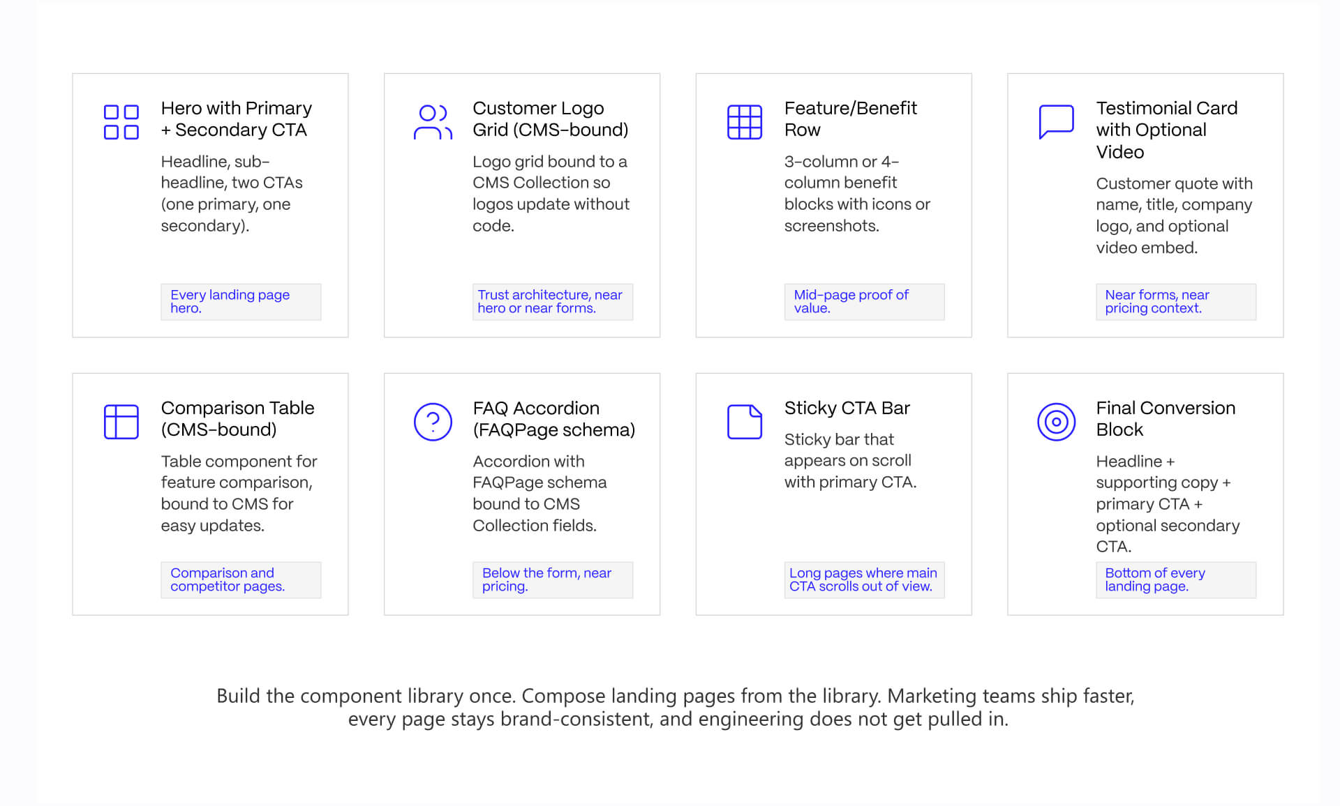
The strongest B2B landing pages are those that stretch beyond merely one-off builds. The majority of high-performing SaaS teams operate using reusable systems that allow marketing teams to launch, test, and iterate without rebuilding page structure. Webflow works particularly well because CMS, component structure, and interaction systems support modular conversion architecture.
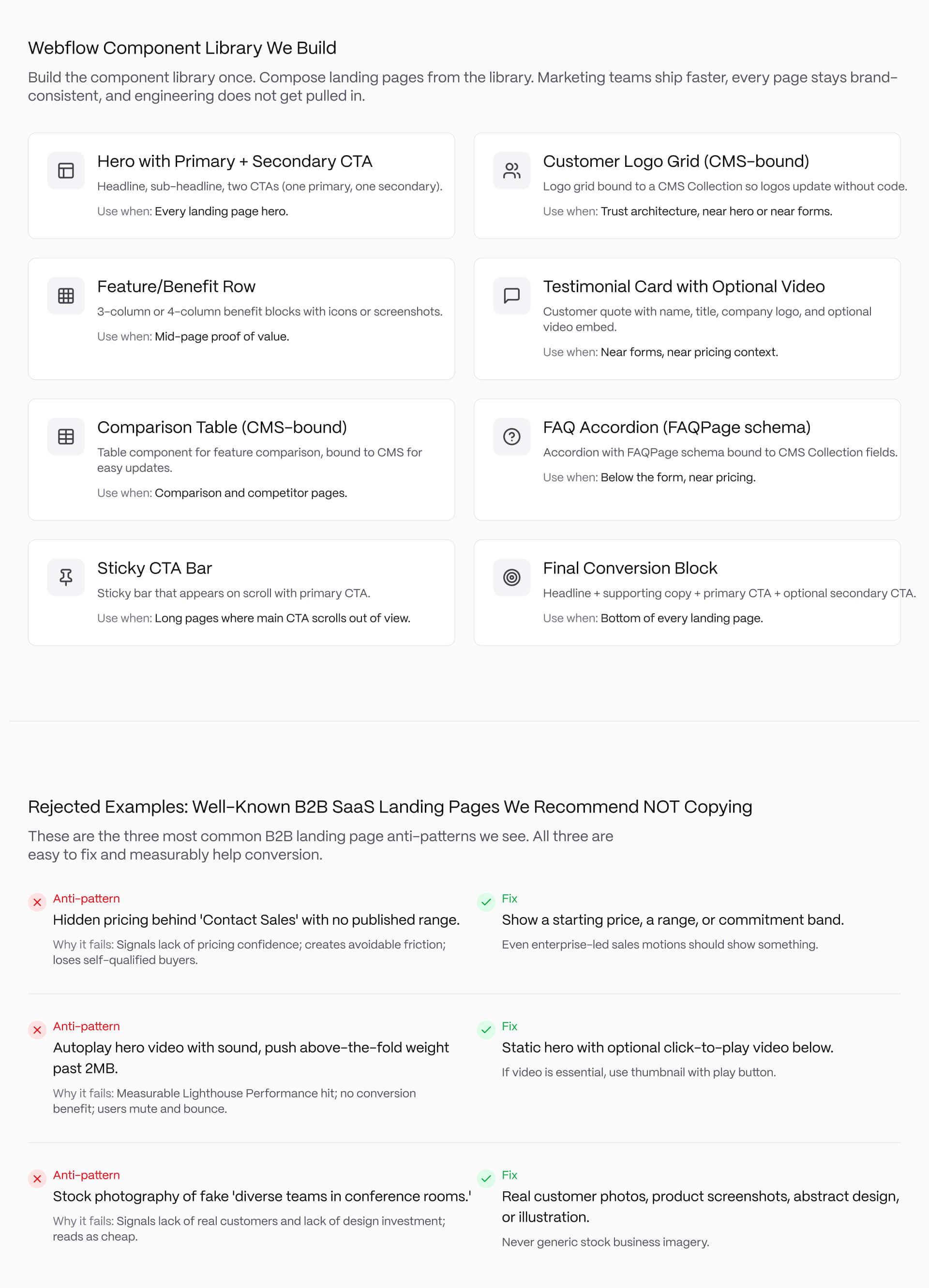
Webflow Component Library We Build for B2b SaaS Landing Pages
The most scalable B2B SaaS landing pages need to rely on reusable conversion components, instead of completely customised layouts, whenever a new campaign launches.
Our Webflow component library typically consists of:
- Hero section with a primary and secondary CTA
- Customer logo grid bound to CMS Collections
- Testimonial cards with optimal video embeds
- Feature and benefit rows
- CMS-driven comparison tables
- FAQ accordions connected to GFAQPage schema
- Sticky CTA bars
- Final conversion blocks
Operational flexibility is the crucial point here. Marketing teams need to assemble landing pages without having to introduce engineering into each update.
This is so important because the majority of landing page performance issues stem from iteration challenges. That’s why reusable systems need to be able to reduce production friction while keeping experience structurally consistent across trial pages, demo page, comparison pages, and calculator flows.
This component structure also boosts governance. Proof blocks, spacing systems, CTA hierarchy, schema markup, and responsive behavior remain consistent despite messaging changing between campaigns.
It is here that Webflow development services become operationally valuable. The top performing systems are generally modular, CMS-driven, and designed specifically for ongoing iteration.
Building these patterns into a Webflow site is its own skillset. See how we build.
Webflow Interactions: Where Motion Helps and Where It Hurts
Motion works best when it helps guide attention instead of demanding attention. Subtle interaction systems improve landing-page readability because they reduce cognitive overload during the initial scan process. Content can enter progressively instead of forcing visitors to process visual elements simultaneously.
Decorative motion is the process where teams get into trouble.
Heavy parallax effects, layered scroll narratives, autoplay animations, and interaction-heavy hero sections typically create three problems:
- Slower perceived performance
- Weaker CTA focus
- Increased cognitive fatigue
This can be highly damaging, especially for B2B landing pages where buyers already process technical information, pricing logic, and stakeholder risk right simultaneously.
Per internal testing across B2B SaaS redesign projects, removing decorative interaction layers from overloaded landing pages helps improve Lighthouse Performance scores while simplifying the conversion path.
The crucial distinction is intentionality. Motion needs to reinforce hierarchy and flow, rather than demonstrating technical capability.
This is especially important when teams start implementing this in Webflow, because of the fact that Webflow Interactions make sophisticated animation systems more accessible, but there is a temptation to overuse them.
The broader implementation stack matters as well, and teams that are too reliant on animations, analytics layers, embedded tools, and personalization systems need to evaluate the way integrations impact page speed and conversion performance. Veza Digital’s guide to must-have Webflow integrations for marketing websites is a useful starting point for assessing performance and operational complexity.
Rejected Examples: Well-Known B2B SaaS Landing Pages We Recommend NOT Copying
The quickest way of being able to improve B2B landing pages is by removing the unnecessary frictions.
Three anti-patterns appear repeatedly across otherwise well-funded SaaS websites:
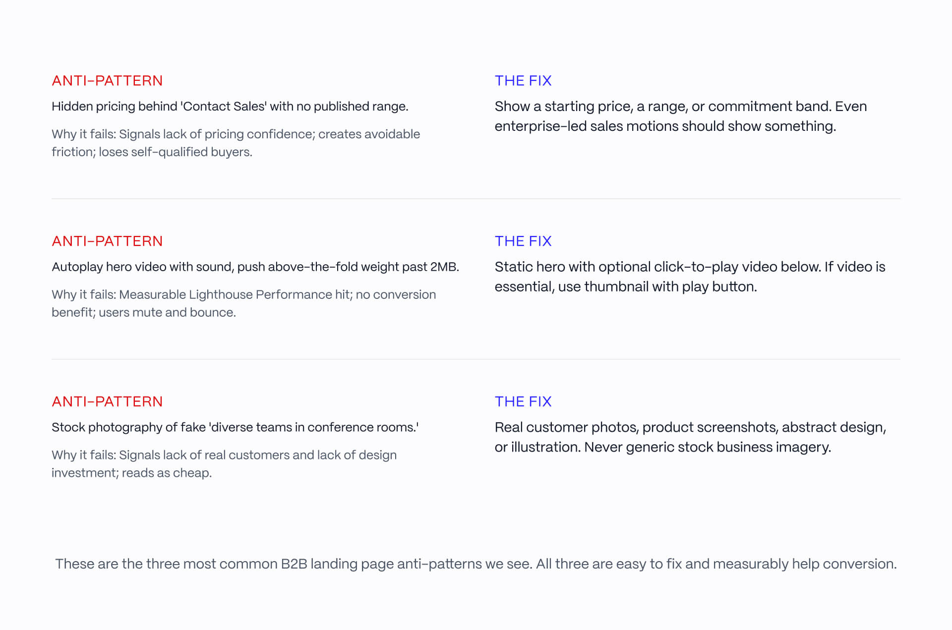
Pattern #1: “Content Sales” With No Pricing Context
Some enterprise SaaS companies continue to hide their pricing behind “Contact Sales” CTAs, without even providing a starting range.
The problem here is uncertainty, because buyers tend to interpret fully hidden pricing as qualification friction, pricing insecurity, or aggressive sale qualification.
Fortunately, there is a simple fix here: publish a starting price, a minimum commitment range, or an implementation band, even if final pricing varies.
Pattern #2: Autoplay Hero Videos and Heavy Above-the-Fold Motion
A lot of SaaS pages make the mistake of overloading the hero section with layered interactions, oversized animated assets, and autoplay videos that force above-the-fold weight past performance thresholds that are deemed acceptable.
The conversion benefit is typically minimal while performance cost is measurable. A stati-first hierarchy is the better option. This includes:
- Lightweight visuals
- Optional click-to-play demos
- Compressed motion systems
- Interaction restraint
Pattern #3: Generic Stock “Business Team” Photography
Stock photography is one of the most effective ways to reduce credibility on B2B SaaS landing pages.
Buyers who seek to evaluate operational software should expect:
- Product visuals
- Implementation screenshots
- Dashboards
- Workflows
- Customer evidence
- Or original illustration systems
Generic “conference room” photography communicates the opposite. It suggests the company lacks either confidence in its products, or that they have real customer proof.
The stronger pattern here is always real interface context, actual customer workflows, or abstract visual systems designed around the product narrative.
Starting Checklist: How to Run This Process on Your Page
Most B2B SaaS landing-page rebuilds become complex because teams try to solve positioning, onboarding, SEO, brand refresh, and campaign architecture.
The easier process usually works better.
1. Pick one conversion goal
Don’t combine demo requests, free trials, and downloadable content equally on the same page.
2. Score the currency page against the 5-point framework
Determine whether the biggest weakness lies in clarity, trust, friction, or proof placement.
3. Pick the closest matching example from this article
Study the structure rather than copying the visual style.
4. Build using reusable Webflow component patterns
Component systems scale faster and more efficiently than isolated page designs.
5. Ship and measure quickly
A lot of performance improvements come from iteration speed as opposed to a single perfect launch.
The discipline is consistency. The best performing landing pages are typically the result of repeated structural improvements, rather than dramatic redesigns.
If you’re looking to rebuild or evaluate a B2B SaaS landing page system, talk to our team.
The best B2B SaaS landing pages do one thing well, not five things adequately.
Pick a conversion goal, score against the 5-point framework, model the right example, and build it in Webflow with components that compose. That is most of the work. We do this across B2B SaaS clients every week. If you want help, or you would rather hand the whole rebuild to a team that has shipped this pattern many times, talk to us.
FAQs
What makes a good B2B landing page in 2026?
A good B2B landing page passes 5 tests: Hero Clarity (names the user, outcome, and next step in one screen), Trust Architecture (credentials placed where hesitation appears), Form Friction (asks only for routing essentials), Proof Placement (proof near decision moments), and Conversion Path (one dominant action). The best B2B landing pages do all 5. Most miss on at least 2.
How is a B2B landing page different from a B2C landing page?
B2B landing pages serve buying groups of 6-10 stakeholders evaluating the same page, so they need to address technical evaluators, end users, and budget holders simultaneously. Conversion rates are lower (typical B2B SaaS converts 2-5% vs B2C 5-10%+) because the commitment is higher. Trust signals, proof, and risk reduction matter more than urgency or emotion.
What conversion rate should I expect from a B2B landing page?
B2B SaaS landing pages typically convert 2-5% on cold traffic and 5-15% on warm or retargeted traffic, per Unbounce conversion benchmark report (NEEDS SOURCING for current year). Top performers reach 10-20% on optimized demo or trial pages. The single biggest variable is traffic quality, not page design. A 3% conversion on qualified traffic outperforms a 10% conversion on unqualified traffic every time.
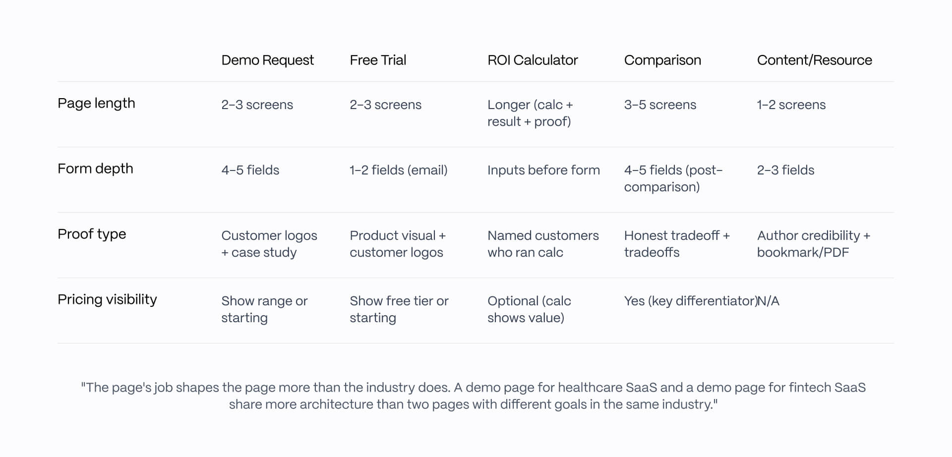
Should I organize my landing pages by industry or by goal?
By goal. Most B2B SaaS marketing teams build pages around conversion goals (demo, trial, calculator, comparison) rather than industries. A demo page for healthcare SaaS and a demo page for fintech SaaS share more architecture than two pages with different goals in the same industry. Industry can be a secondary variant inside a goal-organized page system.
How many form fields should a B2B landing page have?
Only the fields you need to route the lead. For most B2B SaaS demo requests, that means name, work email, company name, and one routing field (company size or industry). Asking for phone number, role, and timeline on first contact reduces conversion without improving lead quality. Use progressive qualification: collect minimum at first touch, deeper detail in follow-up.
Should pricing be visible on a B2B landing page?
Yes for most B2B SaaS, with one narrow exception. Hidden pricing signals "we are not confident in our pricing" or "we extract maximum value per deal," both of which hurt conversion. Even enterprise-led sales motions should show a starting price or commitment range. The exception is true bespoke deals (custom platforms, services), where a price range is more honest than a number.
Can I build these landing pages in Webflow?
Yes. Webflow handles the patterns shown in this article natively: Hero with CTAs, customer logo grid, testimonials, comparison tables, FAQ accordion, sticky CTA, conversion blocks. ROI calculators usually need custom code. Industry variants are well-suited to Webflow CMS Collections. Webflow Interactions handles scroll animations natively, but use motion judiciously - it usually hurts landing page conversion when overdone.
How long should a B2B landing page be?
It depends on the conversion goal. Demo request pages: 2-3 screens (hero + proof + form). Trial signup pages: 2-3 screens (hero + product visual + signup). ROI calculator pages: longer (calculator + result + proof + form). Comparison pages: 3-5 screens (positioning + comparison table + proof + form). Length should match commitment: higher-commitment actions deserve more proof.
How often should I rebuild a B2B landing page?
Iterate quarterly, rebuild every 12-18 months. Most B2B SaaS landing pages drift over time as messaging shifts and components proliferate. A quarterly review catches drift; a full rebuild every 12-18 months catches accumulated drift that quarterly iteration cannot fix. Rebuild triggers: major positioning change, ICP change, conversion rate decline over multiple quarters.
What is the most common B2B landing page mistake?
Mixed CTAs. The most common failure we see across client audits is a page trying to drive demo, trial, and content download from the same hero screen. Each of these is a different commitment level for a different buyer stage. The fix: pick the dominant conversion goal for the page and make secondary actions visibly subordinate. Mixed CTAs reduce conversion on every goal.