.jpeg)
Your SaaS landing page is likely to be the single most important piece of marketing that your business will ever use. When a potential customer clicks on an advertisement, they are immediately interacting with your landing page.
This is the moment when their interest in your product can turn into pipeline value or disappear for good. Most companies, however, ignore this aspect of their marketing efforts.
Abstract
Only 3.8% of SaaS landing pages convert (the median) vs an overall industry average of around 70%. As such, most organizations are spending money on visitors who don’t convert due to poorly written messaging and a poorly designed layout. By creating clarity and providing social proof in their messaging, organizations can achieve double or triple conversion rates while spending no additional money.
With over 41,000 pages of data, along with recent trends including AI personalization, there are three main areas of focus when it comes to high-converting landing pages:
- Singular Focus: Pages with one objective convert at 13.5% (vs. 10.5%)
- Simple Language: Writing at a 5th-7th grade level yields a 12.9% conversion rate (vs. 2.1% for complex copy)
- Trust Cues: Strategic placement of social proof throughout the page
Quick Comparison Table - SaaS LP vs. Generic LP
What Makes a SaaS Landing Page Design Truly Effective

The typical high-performing SaaS landing page is designed based on the predictable user behavior. People scan, filter, and make decisions quickly. When the page does not assist the process, users will leave.
Defining the Anatomy of a High-Converting SaaS Landing Page
There are six key parts to high-converting SaaS landing pages.
- Hero section
- Features and benefits section
- Social proof
- Pricing or primary CTA
- FAQ and objection handling
- Closing CTA
Optimizing these sections is a core part of our SaaS CRO services.
Also, SaaS landing pages exist under a unique set of conditions unlike e-commerce sites:
- Longer Decision Times - You're not selling products. You're selling a way to alter existing workflows.
- Different Conversion Goals - The ultimate conversion goal is typically "start trial" or "schedule demo", not "buy now."
- More Influencers Involved (Especially in B2B environments) - One person may sign up for your software/service, but several influence the decision.
Given these different circumstances, it’s clear why average conversion rates for SaaS landing pages are low, at around 3.8%.
Conversion Benchmark Infographic
Core Design Principles Behind the Best SaaS Landing Page Examples
After you achieve a solid structure, there are several ways to achieve strong performance. Most successful SaaS Landing pages follow just a few design principles to help create more conversions.
1. Simplicity and white space
Busy pages aren’t an option since the user may get confused from too many elements fighting for attention.
Effective pages remove friction:
- Less choices
- More clean layouts
- Clear separation between sections
It does not mean there should be no design at all. Just controlled design where every element has a purpose.
2. Visual hierarchy that guides action
Users don’t read Landing pages top to bottom. They scan.
Create a good hierarchy by answering three questions in order:
- What is this?
- Is it relevant to me?
- What should I do next?
This can be done using:
- Headline size and placement
- Contrast on CTAs
- Section spacing
- Use of imagery to direct attention
If users have to look for their next step, conversion rates drop. By implementing the right CRO strategies for SaaS, you can turn traffic into a pipeline.
3. Consistent brand language
In the SaaS industry, trust is tied to being consistent. If the tone changes between sections or if the visual style feels fragmented, users notice.
Successful pages have:
- A consistent voice
- Key ideas repeated in phrases
- Elements are visually aligned across components
This builds familiarity, which reduces friction.
4. Balance between aesthetics and clarity
While design should support understanding, it shouldn't compete with it. Many teams get caught up pushing to create visually impressive layouts while losing clarity in the process. Animation, gradients, and complex layouts alone don’t increase conversions.
5. The rise of bento grid layouts
One notable shift in 2026 was the increased use of bento-style grids. These grid systems break content into modular card-like units.
Why they work:
- Easier scanning on mobile devices
- Content is clearly separated so ideas aren’t confused
- Flexible structure makes it easier to present complex products
Instead of large blocks of text, users receive small units of information. Modern creative design services are increasingly using bento-style grids for modularity.
Value Proposition as the Cornerstone of SaaS Landing Page Design
A company's value proposition is the most critical factor that will drive conversions, more than design, animation, or even social proof. The value proposition must instantly communicate why the user should care about your product.
The best SaaS landing pages follow a three-part formula
- What you get
- Why it matters
- How it works
Clarity Over Cleverness
A good piece of copy provides the visitor a benefit (an outcome) as opposed to a feature (a technical specification).
- Example of Feature-Focused Copy: "Automated workflow management with advanced integration options."
- Example of Benefit-Focused Copy: "Save hours automating your recurring tasks."
Successful brands such as Amie, Shopify, and Notion are clear that speed and simplicity are key.
How to Implement These Strategies
- Headline: Develop it in one simple sentence.
- Language: Eliminate all internal jargon.
- Focus: Convert features into user experience (outcome-based) statements.
Five Second Rule: If an outside person cannot determine what your page is communicating within five seconds of looking at it, then that page will not convert. While many Webflow templates offer a head start, custom layouts perform best.
Hero Section Design: Headlines, Visuals, and CTAs That Convert
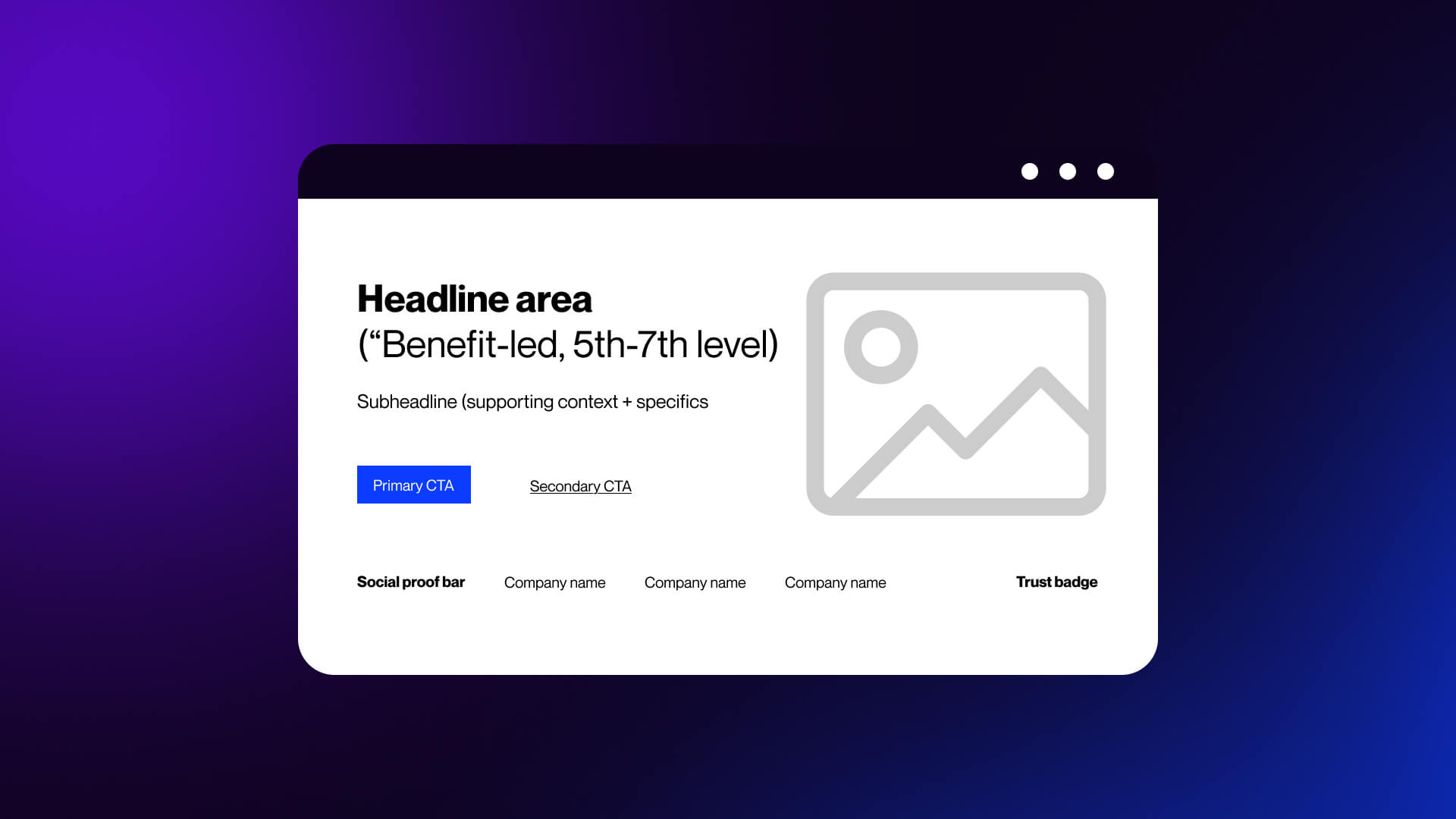
Looking at B2B SaaS website examples, we see that a hero section is one of the most important parts of Saas landing page. It's where a visitor decides whether to engage with your website.
Best SaaS landing pages utilize their hero sections as conversion tools through three interrelated components: a clear headline, an effective image, and a focused CTA.
Headline Strategies That Capture Attention Immediately
The most common reason why SaaS headlines go wrong is because it's too concerned with being impressive instead of being easy to understand.
Good SaaS headlines work oppositely; they're transparent, focused on results, and simple to read.
Here are the key elements that always work:
- Clarity over cleverness
- Concrete outcomes over vague promises
- Outcome-focused rather than feature-focused
Some of the strongest SaaS examples use these elements:
- Better Stack: “The most reliable uptime monitoring.”
A straightforward statement clearly identifying categories.
- Magical: “12x Faster Revenue Recovery”
Measurable results that are easy to understand.
- Amie: “Within 47 seconds.”
Tangible timeframe with a solid expectation for users.
Sometimes, you have to sound more technical, especially if you're speaking to a B2B SaaS audience.
For example, if you are writing a headline for Figma, use phrases like “from prompt to finish product via code and design,” which describes an end-to-end process from idea to finished product. This way the headline is tailored to their audience, while remaining very brief and easy to read.
Here is a simple tool to help create quality SaaS headlines:
1. Can someone outside of your company understand it within 5 seconds?
2. Is it describing an outcome or a feature?
3. Are there words that could be removed without removing its value?
If you have said yes to number three, remove those words.
Visual Design Elements in the Hero Section
There has clearly been an increase in the way SaaS companies are designing hero visual elements for their websites over the past couple of years.
Prior to 2026, most SaaS sites included either some form of abstract 3D graphics or illustration-based visuals as part of the hero section. Today this type of design is slowly becoming less popular as companies begin to see stronger results from showing the actual product early and clearly.
1. Product screenshots and UI previews
Include product screenshots or UI previews. Realistic depictions of the user interface (UI) create immediate clarity around:
- What the product looks like
- How complex the product appears.
- If the product will fit into the users' current workflow.
This is especially important for B2B tools, because users often convert based on whether they feel a tool is too complex to implement successfully.
2. Embedded demos and guided previews
Include embedded demos or guided previews. Many top-performing SaaS pages today have incorporated various forms of interactive visuals within the hero area of their site, including:
- Short video demos
- Interactive product tours
- Click-through previews inside the hero
These types of visuals take the place of static screenshots by providing the user with an experience rather than just explaining what features are available.
3. Purposeful use of color
Color should be used strategically; both to draw attention to areas you want to highlight and to shape the user's perceptions.
- Using high-contrast colors to make buttons stand out
- Using muted background colors to allow the users to focus on the important content
- Establishing a consistent palette across multiple pages
Using random or highly aggressive colors can create friction with your users and detract from clarity and usability.
4. Motion that supports understanding
Animation can certainly help enhance a user's understanding of a concept. However, it must add value.
Examples of effective animation include:
Effective use:
- CTA hover effects that confirm interactivity
- Subtle transitions that reveal content
- Product animations that show workflows
Ineffective use:
- Decorative motion with no purpose
- Constant movement that distracts from the message
A simple rule: if the animation doesn’t help the user understand something faster, remove it.
5. From illustration to product-first design
Illustrations still have a place, especially for abstract concepts. But for most SaaS products, showing the interface wins.
Users trust what they can see. Our web design services focus on clear, balanced layouts that put clarity first.
Hero Section CTA Placement and Design
Even with a strong headline and visual, conversion depends on one thing: the action you ask users to take.
The best SaaS landing pages remove friction at this step.
1. One primary CTA above the fold
High-performing pages focus on a single action:
- Start free trial
- Book a demo
- Create account
2. Minimal form fields
Every extra field reduces the completion rate. Shopify asks for one thing: email, and many SaaS companies follow the same pattern. The idea is simple: start now, collect details later.
This approach, often used by tools like Woodpecker, lowers the barrier to entry. Users commit faster when the initial step feels small.
3. Specific CTA copy
Generic buttons underperform.
Compare:
“Sign Up”
“Get Started in 30 Seconds”
The second sets a clear expectation and reduces uncertainty.
- Better Stack uses time-based CTAs effectively.
- Notion keeps it simple and direct.
- Monday.com emphasizes ease of setup.
- ActiveCampaign highlights immediate value.
The pattern is consistent: clarity beats creativity.
4. Strong visual contrast
Your CTA should stand out without overwhelming the page.
Key elements:
- High contrast color against the background
- Clear button size
- Enough spacing around it
If users have to search for the button, conversion drops.
5. Dual CTA for mixed intent
Not every visitor is ready to commit.
A common pattern is:
Primary CTA: “Start Free Trial”
Secondary CTA: “Watch Demo”
This works well for SaaS with longer decision cycles. It captures both:
- High-intent users ready to act
- Lower-intent users who need more context
6. Friction-reducing signals
Small details can significantly improve conversion:
“No credit card required”
“Takes 30 seconds”
“Cancel anytime”
These address common objections before they block action. A strong hero section does three things in sequence:
- States a clear outcome (headline)
- Shows the product or experience (visual)
- Offers a low-friction next step (CTA)
If any of these are weak, the entire section underperforms.
Messaging, Copy, and Typography Across Top SaaS Landing Pages
Design draws attention, copy closes the gap between interest and action. If the message is weak, no layout or animation will compensate for it.
High-performing SaaS landing pages treat copy as a system. Every line moves the user forward, from first impression to decision.
Writing Page Copy That Converts in SaaS Landing Pages
There’s a clear pattern in the data: simpler copy performs better.
Pages written at a simple reading level convert at 12.9% More complex, “professional” language drops to 2.1%
That difference isn’t subtle since the clear language reduces cognitive load. Users don’t need to interpret or translate what you’re saying. They understand it immediately and can decide faster.
Length matters too.
Best-performing SaaS landing pages tend to fall within:
- 250-725 total words
- 50-140 moderately complex words (three or more syllables)
This balance gives you enough space to explain value without overwhelming the reader.
From features to outcomes
Most SaaS teams default to feature lists:
“Advanced analytics dashboard”
“Automated workflows”
“Seamless integrations”
These describe the product, not the result.
Benefit-driven copy reframes this:
“See what’s working without digging through reports”
“Save hours by automating repetitive tasks”
“Connect your tools in minutes”
A strong example:
Deel highlights a “67% ROI” based on a Forrester study.
This answers the question decision-makers care about: is this worth it?
The best copy structure
Effective SaaS landing pages follow a predictable narrative that matches how people evaluate decisions.
A simple structure:
- Problem: Identify the issue the user is dealing with (Example: “Manual reporting slows your team down”)
- Agitation: Show the cost of not solving it (lost time, errors, missed opportunities)
- Solution: Introduce your product as the fix and keep it clear and grounded.
- Proof: Back it up with data, testimonials, or case studies
- CTA: Give a clear next step
This flow keeps the page focused. Each section builds on the previous one.
Copy Readability vs. Conversion Rate Chart
Typography Choices in Award-Winning SaaS Landing Page Designs
Typography does more than make text readable. It shapes how the message is perceived.
In 2026, SaaS design has shifted away from purely neutral typography. There’s more personality, more contrast, and more intentional use of type as a visual tool.
1. Strong hierarchy for scanning
Users don’t read linearly; they scan headings, subheadings, and key phrases.
Good typography makes this easy:
- Large, clear headlines
- Smaller supporting text
- Consistent spacing between sections
This hierarchy guides attention without effort.
2. Display fonts paired with clean body text
A common pattern:
- Bold, expressive font for headlines - to grab attention
- Simple sans-serif for body copy - for readability
3. Larger type, fewer words
Another shift: fewer words per section with a larger type works for two reasons:
- Easier to scan on mobile
- Forces clarity in messaging
If a sentence looks too long in large type, it probably needs to be simplified.
4. Expressive styles and visual layering
Typography is no longer flat, and many SaaS pages now use:
- Subtle gradients on text
- Layered headings over visuals
- Motion in headline transitions
Used carefully, this adds emphasis without hurting clarity.
5. Typography as part of brand identity
Fonts communicate the tone of the brand:
- Geometric sans serifs feel modern and technical
- Serifs add authority and structure
- Rounded fonts feel approachable
Your typography should match your positioning.
This is where design and brand work overlap. If you’re building a consistent visual identity, typography choices should align with your broader creative direction, not just the landing page. That’s a core part of strong brand identity design.
Messaging Consistency From Headline to Footer
One of the most common issues in SaaS landing pages isn’t weak copy, but inconsistent messaging. The headline promises one thing. The rest of the page drifts.
Strong pages stay aligned. Take Notion: “one workspace. zero busywork” is repeated across features, headings, CTAs, and supporting copy. Each section adds detail, but the core idea stays the same.
Microcopy plays a bigger role than most expect.
Button labels, form text, and small notes like “No credit card required” reduce friction and reinforce the message.
Consistency also starts before the page.
If an ad promises “Automate your reporting in minutes,” the landing page must match that. If it shifts to technical language, users leave.
Common failure pattern:
- Simple, clear hero
- Technical, complex sections
- Vague CTA
This creates doubt and lowers conversion.
Quick check:
- Does every section support the same core idea?
- Is the language consistent throughout?
- Does the CTA match the initial promise?
Strong pages keep messaging simple, outcome-focused, and consistent from start to finish.
Social Proof and Trust Signals: Building Conversion Confidence
Users don’t buy because your product looks good, but because they trust it.
In SaaS, trust carries more weight than in most industries. You’re asking for ongoing commitment time, data, and budget, and social proof exists to remove hesitation.
Using Testimonials Effectively in SaaS Landing Pages
“Great product” or “helped our team” doesn’t reduce risk. It reads like marketing copy, not real feedback.
High-performing testimonials follow a simple rule: specific outcomes beat general praise.
Compare:
“This tool is amazing”
“We reduced onboarding time by 45% in two weeks”
The second gives the user something concrete to evaluate.
The best SaaS testimonials usually have:
- A clear result (time saved, revenue gained, cost reduced)
- Context (team size, industry, use case)
- A real person (name, role, company)
Examples:
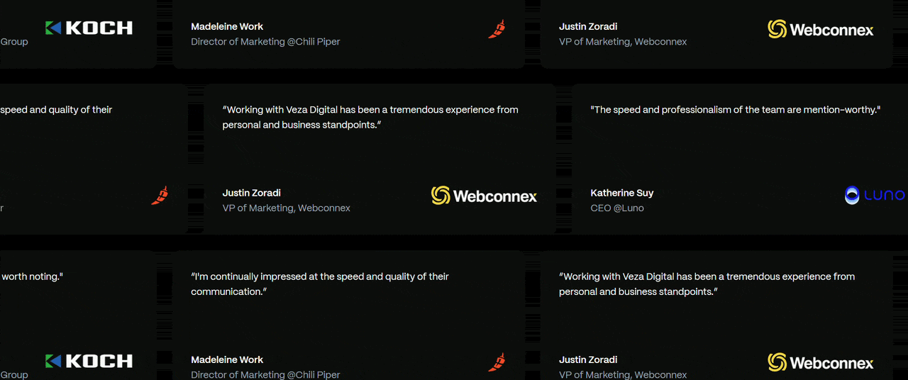
Better Stack uses real quotes pulled from public platforms like Twitter, often tied to named users. That adds authenticity. Deel reinforces testimonials with validated data, like ROI figures from third-party studies.
Strong testimonials don’t just say the product works. They show how and for whom.
Video is becoming more common.
Short clips, screen recordings, or combined formats build more trust because they’re harder to fake and add context.
You don’t need all the video, but at least one strong visual proof element helps.
Placement matters as much as content. Distribute testimonials across the page:
- After features (to validate claims)
- Before pricing or CTA (to reduce hesitation)
- Near forms (to push action)
Each testimonial should answer one question:
“Has this worked for someone like me?”
Client Logos and Case Studies as Trust-Building Design Elements
Logos are one of the fastest ways to build credibility. Users recognize them, and that recognition builds trust instantly.
Familiar brands signal that the product is established, vetted by others, and safe to consider. That’s why placing logos near the top works so well. It reinforces credibility before users even start scrolling.
Good logo sections are:
- Clean and evenly spaced
- Low-contrast so they don’t compete with CTAs
- Easy to scan
Avoid:
- Too many logos (visual noise)
- Poor alignment or sizing
Use a curated set of recognizable brands.
Trust Signals Beyond Testimonials and Logos
In 2026, one form of proof isn’t enough. Users expect multiple signals before they commit. Each one reduces perceived risk from a different angle.
1. Security and compliance indicators
For many SaaS products, especially in B2B, security is a blocking concern.
Common trust elements:
- SOC 2 compliance
- GDPR readiness
- Data encryption statements
- Security certifications
These don’t need to dominate the page. But they should be visible where users expect them, often near:
- Forms
- Pricing sections
- Footers
2. Review platform ratings
Third-party validation carries more weight than internal claims.
Common integrations are:
- G2 ratings
- Capterra reviews
- Trustpilot scores
Instead of linking out, many SaaS pages now embed:
- Star ratings
- Review counts
- Award badges
This keeps users on the page while still providing external proof.
3. Data-driven credibility
Numbers build confidence fast.
Examples:
“15,000+ teams use this product”
“2 million workflows automated”
“99.99% uptime”
These signals answer:
How many people trust this?
Is it stable?
Is it proven?
The key is to keep them specific and believable.
Navigation, Layout, and Section Sequencing for Maximum Conversions
Structure shapes how users move through your page. It decides what they see, in what order, and how quickly they reach a decision.
Strong SaaS landing pages don’t leave this to chance. Navigation is controlled, sections are sequenced intentionally, and layout supports the flow instead of interrupting it.
Navigation can either guide users forward or give them ways to leave. Fewer options tend to convert better because they reduce distraction.
For focused landing pages, the goal is simple: one message and one action. Full navigation menus introduce competing paths like blog, docs, or company pages, which pull users away. That’s why many pages remove navigation entirely or reduce it to a few essential links.
Navigation also works as part of the flow, not just a header. Common patterns include:
- Sticky header with a visible CTA
- Anchor links that scroll to sections instead of new pages
- Navigation that highlights sections or emphasizes the CTA during scroll
There’s a trade-off. In more complex or enterprise products, removing navigation can reduce trust. In those cases, a minimal, clear menu works better.
The goal is simple: remove unnecessary choices without making the page feel incomplete.
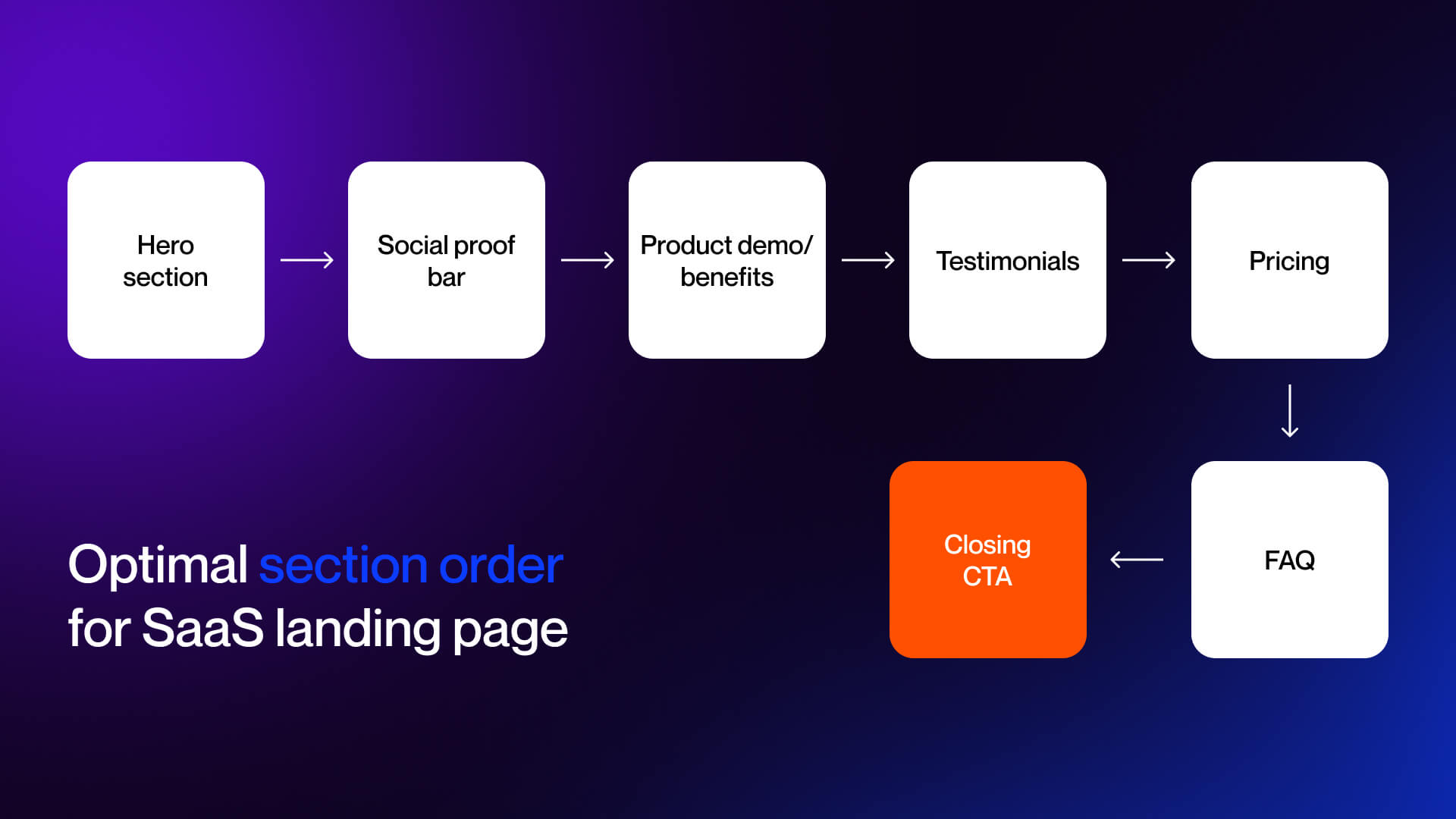
Section-by-Section Layout Breakdown of Top SaaS Landing Pages
High-performing SaaS landing pages follow a consistent sequence. Not because it’s a template, but because it aligns with how users evaluate products.
A common structure:
- Hero section
- Clear value proposition + primary CTA
- Social proof bar
- Logos or quick credibility signals
- Features and benefits
- What the product does and why it matters
- Product demo or preview
- Show how it works
- Testimonials
- Validate claims with real outcomes
- Pricing or primary offer
- Present options or next step
- FAQ section
- Address objections
- Closing CTA
- Reinforce value and prompt action
This sequence maps directly to user intent:
Understand - Evaluate - Trust - Decide
Why sequencing matters
If sections are out of order, friction increases.
Example:
- Showing pricing before explaining value
- Presenting testimonials before users understand the product
- Dropping technical details too early
Each misstep forces users to work harder to understand the offer.
Layout patterns in 2026
Strong pages remove that effort by guiding users step by step.
A few layout approaches show up across most SaaS landing pages.
Split layouts place text and visuals side by side, so users can read and see the product at the same time. This reduces long blocks and keeps attention balanced.
Bento grids break features into small, modular blocks. This makes content easier to scan and works well for products with multiple use cases.
Modular systems rely on reusable components like feature blocks, testimonials, and CTAs. This keeps design consistent and makes updates easier.
Most pages combine single-column and multi-column layouts. Single-column supports flow, while multi-column works for comparisons and structured content.
Spacing controls how the page feels. Clear separation between sections and enough empty space make the content easier to process.
Common patterns:
- Split sections for text + visuals
- Bento grids for features
- Reusable component blocks
- Mix of single and multi-column layouts
Pricing Page Integration Within SaaS Landing Page Design
Pricing is where users decide to move forward or hesitate. How it’s presented directly affects conversion. Reviewing SaaS pricing page examples shows that clarity beats complexity, while too many options slow down decisions.
Common patterns include:
- 3-4 tiers with one highlighted plan
- Clear side-by-side comparison
- Visible monthly vs annual pricing
Clarity matters more than presentation. Users should understand cost, savings, and what’s included without effort. Hidden pricing creates friction and lowers trust.
Short supporting lines help remove hesitation. Phrases like “No credit card required” or “Cancel anytime” handle common concerns at the decision point.
There are two common approaches: show full pricing on the page for faster decisions, or provide a summary with a link for more complex products.
CTA Strategy: Design, Placement, and Friction Elimination
Calls to action are the final step where users convert. Pages fail not from traffic or design but from hesitation at this moment. Strong CTAs remove doubt, making the next step clear, simple, and low-risk.
CTA Button Design Best Practices in Top SaaS Landing Page Examples
Effective CTAs rely on four key principles:
- Use color contrast to make the button stand out without overwhelming the page, neutral backgrounds with a single accent color work best.
- Write a copy that sets clear expectations, combining the action, value, and effort or time signal; first-person phrasing like “Start my free trial” can increase engagement.
- Ensure size, spacing, and visibility support quick recognition and easy interaction, especially on mobile with thumb-friendly placement and adequate separation from other elements.
- Continuously test variations in copy, color, and placement, treating the CTA as an evolving element within broader conversion optimization.
Strategic CTA Placement Throughout the SaaS Landing Page
CTA placement is about timing user action. Ask too early and they aren’t ready; too late and you lose momentum.
High-performing pages follow four principles:
- One primary goal with multiple opportunities is to repeat the same action across the page so every button points to the main conversion.
- Map CTAs to scroll depth, top-of-page CTAs for high-intent users, mid-page for evaluation, near social proof for validation, pricing for decisions, and a closing CTA for final push.
- Use primary versus secondary CTAs, primary dominates visually while secondary options like “Watch Demo” guide earlier-stage users without splitting attention.
- Implement sticky or scroll-triggered CTAs, keep the next step visible or appear when engagement indicates readiness, reducing friction and keeping action accessible.
Reducing Friction Through Form Field Design and UX Decisions
Forms are where conversions fail, even with strong CTAs. Every extra field or step increases drop-off.
- Keep forms simple: fewer fields boost completion, as seen with Shopify’s single-email entry. Use progressive disclosure, collect essentials first, details later, to reduce friction.
- Signal effort and time clearly, like “Get started in 30 seconds” or “Instant access.”
- Reduce financial risk with free trials, “no credit card required,” and clear cancellation policies near the CTA.
Conversational or AI-driven forms in 2026 guide users naturally and adapt to input, lowering perceived effort. Minor design choices, privacy statements, minimal inputs, distraction-free layouts, instant confirmation, and also reduce hesitation.
Finally, alignment of CTA design, placement, and friction reduction drives conversions without changing traffic or the product.
Visual Storytelling: Product Demos, Screenshots, and Feature Narratives
Seeing is believing. In SaaS, visuals communicate what words cannot: workflows, UI behavior, and product value. The best landing pages leverage imagery and interactivity to reduce uncertainty and make features tangible.
Using Product Screenshots and UI Design to Showcase SaaS Features
Screenshots remain one of the most effective ways to illustrate a product.
Top SaaS pages use:
- Annotated screenshots: Callouts highlight key interactions or outcomes.
- Device frames: Laptops, tablets, or phones contextualize the product.
- Drop shadows or subtle motion: Adds depth without distraction.
- Zoom-in effects: Direct attention to critical UI elements.
Static vs animated previews are a key distinction:
- Static screenshots communicate clarity and simplicity
- Animated or GIF previews show workflow and interactivity
Example:
Airtable creates dedicated landing pages per product. Minimal hero copy leads into clear, annotated product screenshots, showing functionality immediately below the CTA. This design reduces friction by letting users understand the product visually before signing up.
You can see how we apply these visuals in our portfolio.
Product visuals serve two purposes:
- Reduce uncertainty: Users see exactly what they’re getting.
- Build confidence: Clear, polished screenshots signal professionalism and reliability.
Interactive Product Demos as a Landing Page Design Element
2026’s standout trend is interactive demos embedded directly on the landing page.
Companies like Amplitude, Forest Admin, and Zendesk use tools like Guideflow to deliver guided product tours.
Users experience workflows, see real screens, and understand product behavior in seconds.
Benefits:
- Higher engagement and longer time on page
- Immediate experiential proof that builds trust
- Reduces cognitive load by showing, not explaining
Design considerations:
- Demos must not disrupt page flow
- Embed within feature sections instead of using intrusive pop-ups
- Keep interactivity lightweight to avoid performance or accessibility issues
Data shows interactive demos can lift conversions significantly. Users who engage with product previews are more likely to start a trial or request a demo compared with those who only view static screenshots.
Visual Storytelling Through Design Sequences and Feature Sections
Beyond single images or demos, landing pages now use scrolling narratives to guide users through product value.
Key patterns:
- Before-and-after visuals
- Show chaos or pain points on one side, product solution on the other
- Helps users immediately grasp the transformation
- Split layouts
- Text and visuals share space equally
- Communicates complex workflows without overwhelming
- Integrated feature sections
- Combine copy, imagery, and layout
- Reinforce the benefit of each feature rather than listing capabilities
Examples:
- Notion: Shows a scrolling narrative from a disorganized workspace to a structured solution.
- Figma: Shows collaborative design through real-time screen previews.
- Monday.com: Uses split layouts to illustrate workflow improvement with each feature.
Overcoming Objections: FAQ Design, Risk Reversal, and Final Conversion Triggers
Even after engaging visuals and clear messaging, users may hesitate. FAQ sections and final conversion cues bridge that gap.
Designing FAQ Sections That Address Real User Objections
FAQ sections serve as preemptive objection handlers.
Placement:
- After pricing
- Before the final CTA
Design:
Accordion or expandable format is standard
Keeps the page visually clean while providing access to details
Best practices:
- FAQ copy reinforces the value proposition
- Focus on actual user concerns rather than generic questions
- Include metrics or proof points when possible
Data reinforces their importance: 48% of website visitors exit the main landing page without further interaction. FAQs catch those about to bounce by answering the questions that block conversion.
Design Details That Reduce Hesitation and Build Final Conversion Confidence
Users act based on perceived risk. Effective SaaS landing pages use visuals and interaction to reduce that risk and build confidence.
Key approaches include:
- Money-back guarantees or free-trial offers placed near CTAs
- Competitor comparisons highlighting value or cost advantage
- Subtle visual cues like checkmarks, progress bars, or security locks
- Transparent pricing combined with immediate access
- Screenshots, interactive demos, and narrative layouts to make the product tangible
- FAQs and risk-reversal elements that remove last-minute doubts
Each element reinforces trust and guides users smoothly to conversion.
The Best SaaS Landing Page Examples of 2026 and What Makes Them Convert
Strong SaaS landing pages follow a clear structure, explain value quickly, reduce uncertainty, and guide users toward a single action. The examples below show how leading companies apply these principles in different ways, depending on their audience and product model.
B2B SaaS Landing Page Design Examples Worth Studying
Notion
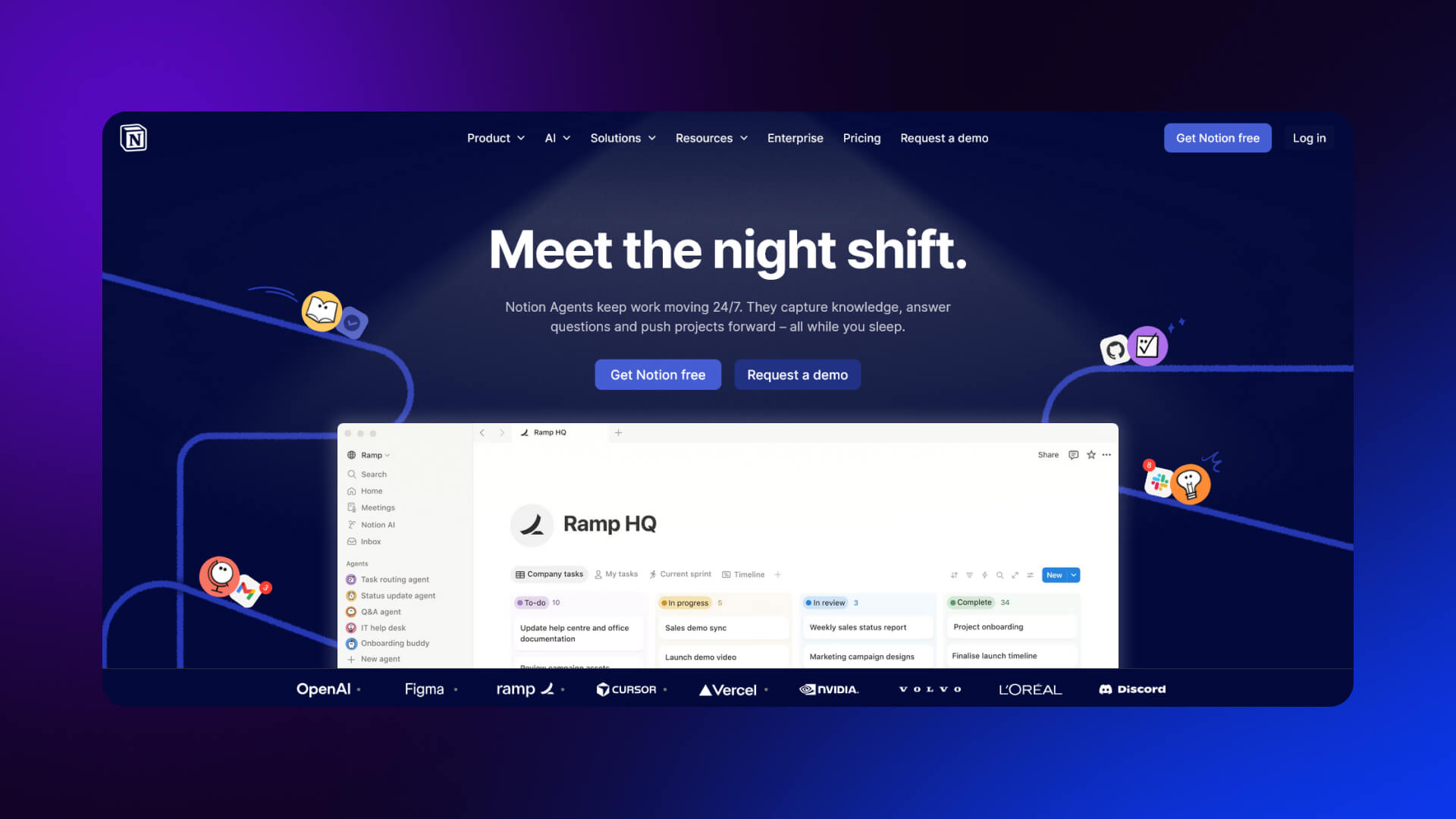
What works well:
Notion’s landing page is built around clarity. The hero section is simple: a clear headline, a short explanation, and a product preview that shows exactly how it works. The copy avoids technical language and focuses on outcomes like organization and collaboration.
Design decisions that convert:
- Clean layout with strong visual hierarchy
- Product UI shown immediately in the hero
- Social proof from well-known companies placed early
- Clear primary CTA (“Get started”)
Takeaway:
Show the product early. Let users see what they’re getting before asking them to act.
Figma (Enterprise)
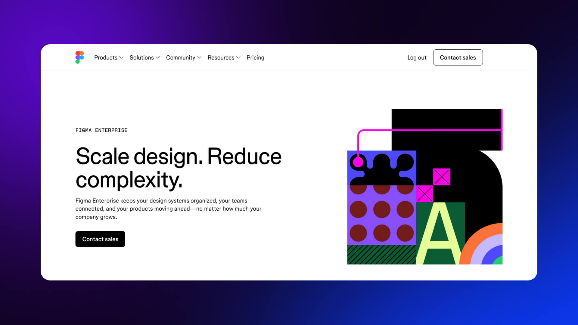
What works well:
Figma’s enterprise page shifts from product features to business outcomes. It focuses on scalability, security, and collaboration across teams.
Design decisions that convert:
- Strong headline focused on team efficiency
- Dedicated sections for security, admin control, and integrations
- Case studies embedded within the page
- Prominent “Contact sales” CTA instead of self-serve signup
Takeaway:
For enterprise buyers, emphasize process, reliability, and scale not just features.
Monday.com
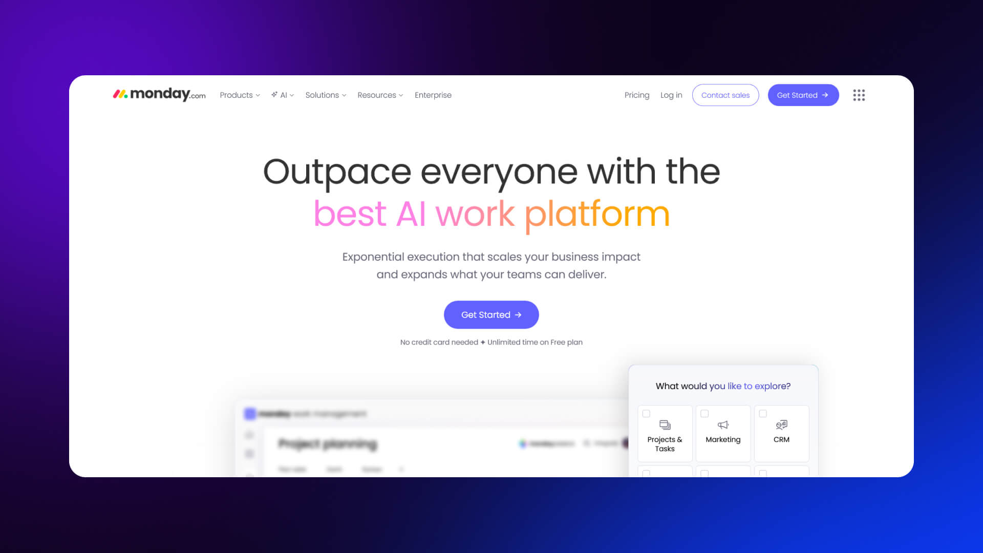
What works well:
Monday.com uses a highly visual approach. The page is interactive, with animations that shows workflows and use cases.
Design decisions that convert:
- Color-coded UI previews that simplify complexity
- Multiple use-case sections (marketing, sales, dev teams)
- Frequent CTA repetition throughout the page
- Logos of recognizable companies for trust
Takeaway:
Break down complex products into simple visual workflows tied to specific roles.
Better Stack
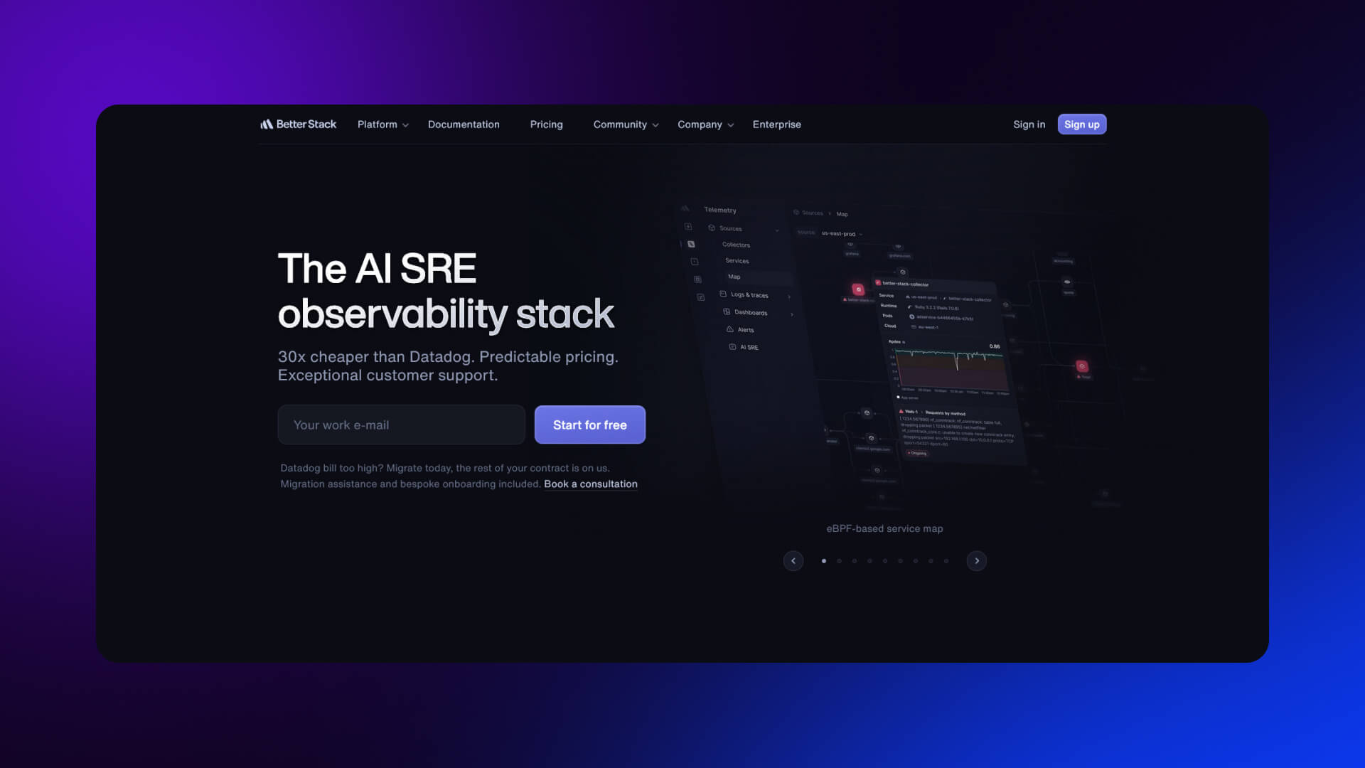
What works well:
Better Stack focuses on technical credibility. The landing page is direct and product-heavy, appealing to engineers.
Design decisions that convert:
- Clear explanation of what the tool replaces or improves
- Real screenshots instead of abstract visuals
- Performance claims backed by metrics
- Minimal but precise copy
Takeaway:
For technical audiences, clarity and proof outperform polished marketing language.
ActiveCampaign
What works well:
ActiveCampaign balances features with outcomes. It connects automation capabilities to business growth.
Design decisions that convert:
- Benefit-led headlines (“Drive growth with automation”)
- Customer testimonials and case studies integrated throughout
- Layered content: quick overview first, deeper detail below
- Demo-focused CTA
Takeaway:
Use progressive disclosure, start simple, then offer depth for users who need it.
Deel
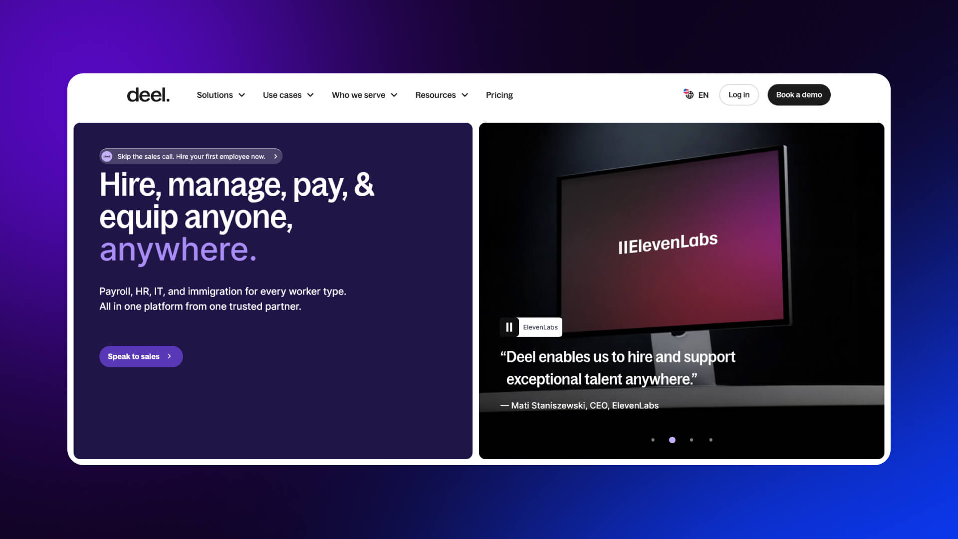
What works well:
Deel builds trust through clarity and authority. The page explains a complex service in a structured way.
Design decisions that convert:
- Strong headline focused on global hiring
- Step-by-step explanation of how the product works
- Compliance and legal credibility emphasized
- Enterprise logos and global stats
Takeaway:
When selling complex services, structure reduces friction. Show the process clearly.
Common B2B Patterns Across These Examples
- Demo or “Contact sales” CTAs dominate
- Enterprise logos appear early to build trust
- Case studies are embedded within the page, not separate
- Pages are longer, with deeper content for decision-makers
For a broader look at full-site strategies, see
B2C and Self-Serve SaaS Landing Page Design Examples
B2C and self-serve SaaS products follow a different approach. The goal is faster activation, not extended evaluation. These pages are shorter, more emotional, and focused on immediate action.
Shopify
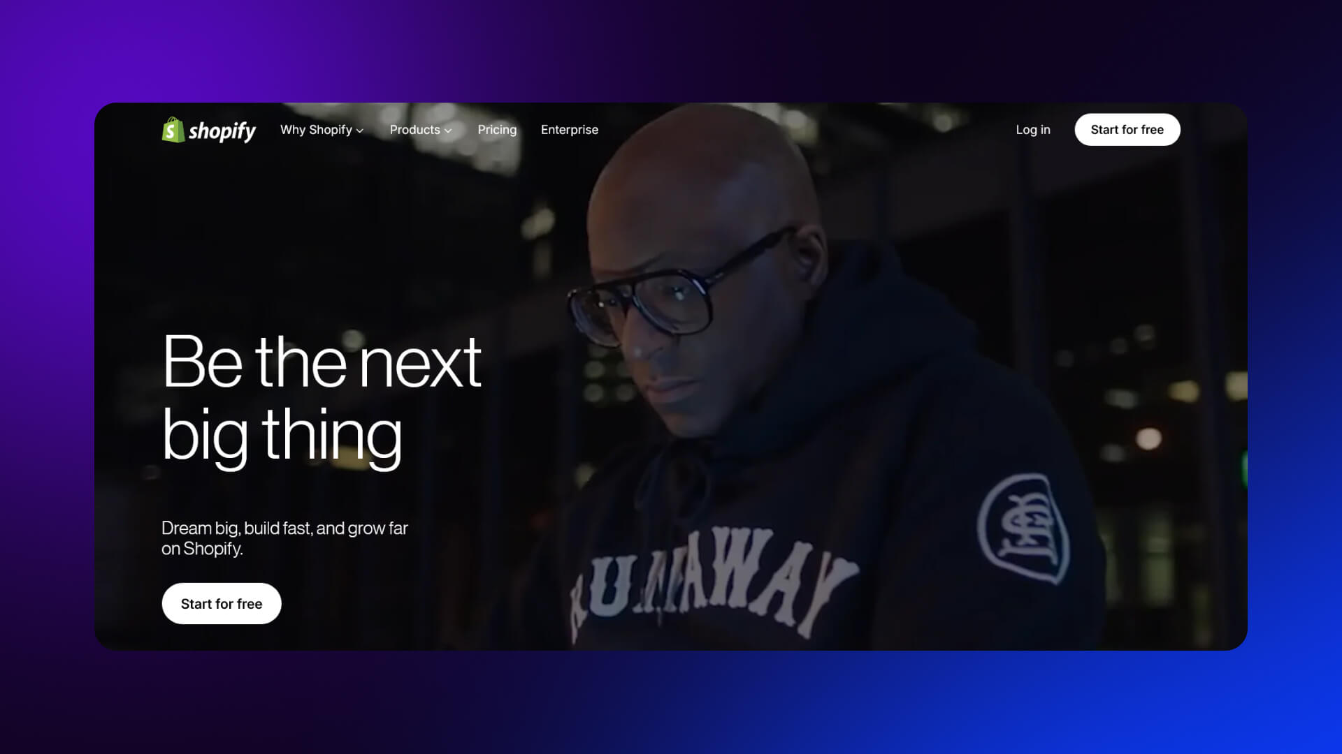
Shopify’s landing page is built for quick conversion. The headline focuses on starting a business, not software features.
- Short, direct messaging
- Email-only signup in the hero
- Minimal friction to start
- Strong aspirational tone (“Start your business”)
Canva
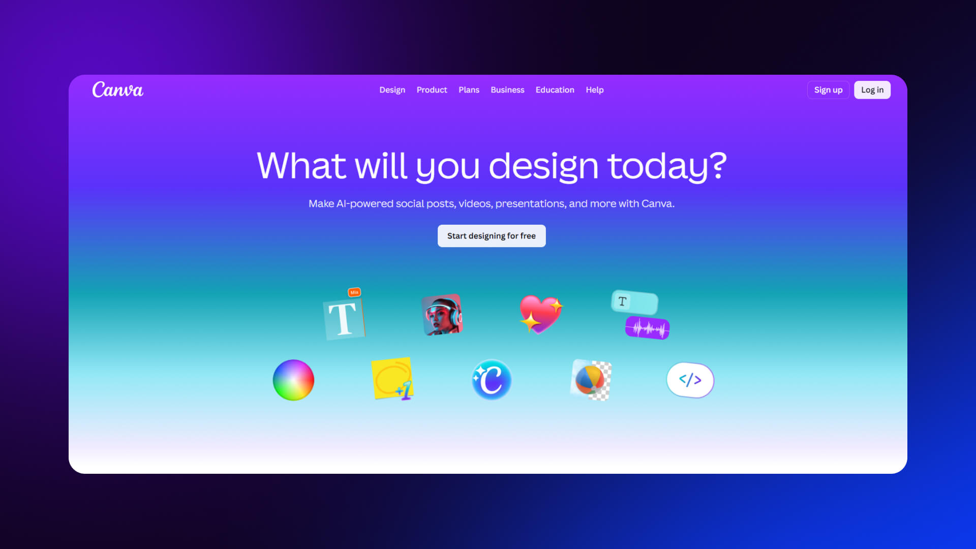
Canva emphasizes ease and creativity. The page is highly visual and immediately interactive.
- Visual-first layout with templates and examples
- One-click signup options
- Focus on outcomes (design anything quickly)
- Minimal explanation needed
Amie
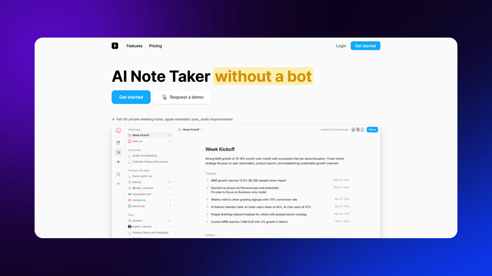
Amie uses personality and design to stand out.
- Playful visuals and motion
- Minimal text, focused on feel and experience
- Clear single CTA
- Strong brand identity
Aragon AI
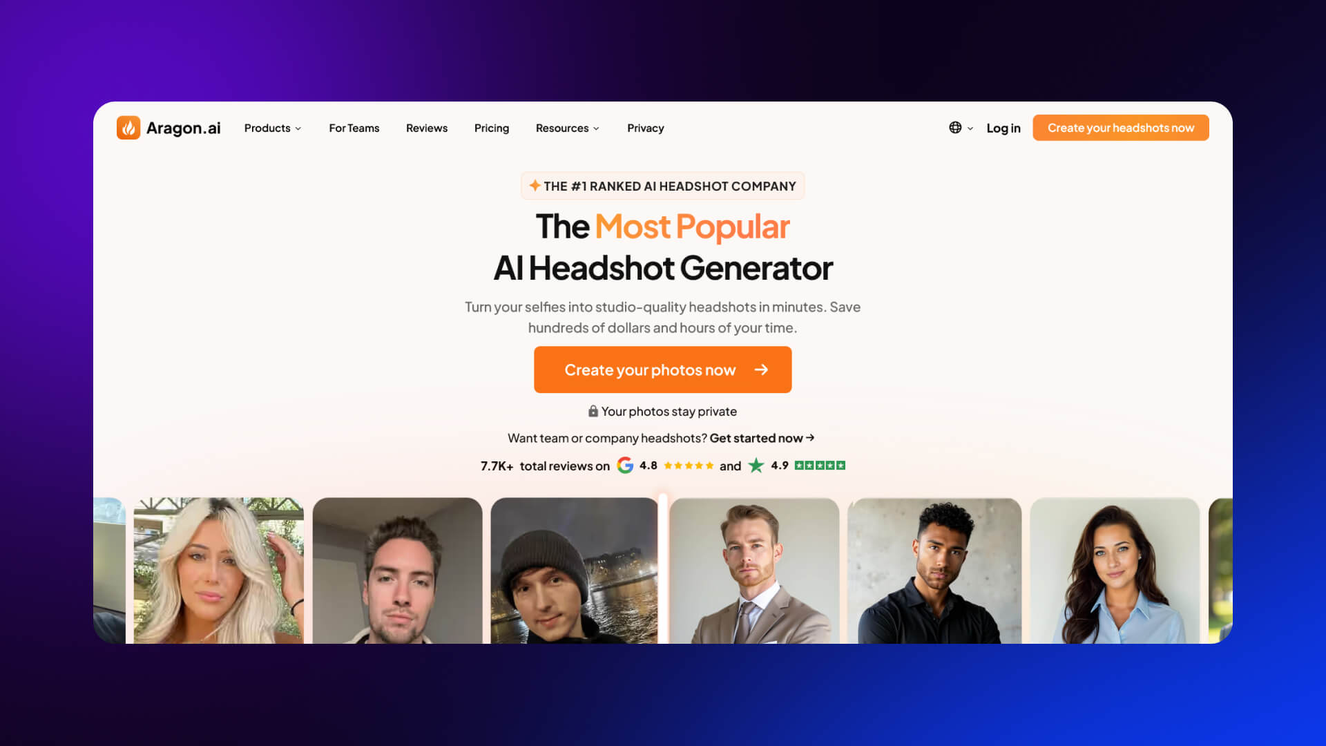
Aragon AI focuses on transformation.
- Before-and-after visuals as proof
- Immediate value proposition
- Fast onboarding flow
- Strong emphasis on results, not process
Key Differences: B2C vs B2B
Design Inspiration Takeaways and Actionable Patterns
Across all examples, a few patterns appear consistently. These are reliable indicators of high-performing SaaS landing pages.
Core Patterns
1. Single-goal focus
Each page is built around one primary action. Secondary options exist but don’t compete.
2. Benefit-led headlines
Headlines are simple and outcome-focused. They avoid technical detail and stay easy to read.
3. Layered trust signals
Trust is built in stages:
- Logos
- Testimonials
- Case studies
- Metrics
4. Progressive disclosure
Start with a simple overview, then add detail for users who scroll.
5. Visual proof
Screenshots, demos, or real outputs reduce uncertainty.
6. Strategic CTA placement
CTAs appear:
- In the hero
- After key sections
- At the end
A Simple Evaluation Framework (CLEAR)
Use this to assess any SaaS landing page:
- Clarity - Is the value obvious within seconds?
- Layout - Is the page easy to scan and follow?
- Emotion - Does it connect with the user’s goals or pain points?
- Action - Is the next step clear and easy?
- Relevance - Does the content match the target audience?
How to Take Inspiration Without Copying
Good design patterns are reusable, therefore:
- Focus on structure, not visuals
- Adapt messaging to your audience
- Keep your brand voice consistent
- Avoid copying layouts without understanding why they work
The goal is to apply principles, not replicate designs.
Why Webflow Fits These Patterns
You can create high-converting landing pages with Webflow and put these strategies into action:
- Full visual design control for pixel-perfect layouts
- CMS flexibility for case studies and dynamic content
- A/B testing with Optimize to improve results
- Component-based systems for faster, scalable iteration
This combination allows teams to move quickly while maintaining consistency.
If you’re planning to apply these patterns to your own product, get in touch with our team today.
FAQ
What is a SaaS landing page?
A SaaS landing page is a standalone webpage designed to convert visitors into trial users, demo requests, or subscribers. Its purpose is to communicate the product’s value clearly, highlight social proof, and guide the user toward a single, well-defined action.
What is a good conversion rate?
The median conversion rate for SaaS landing pages is about 3.8%. Pages that exceed 10% are generally considered strong performers, while those hitting 15% or higher are exceptional. Email-driven campaigns can sometimes reach 20% or more.
What makes a landing page high-converting?
High-converting pages focus on one main action, use simple, outcome-focused language at a fifth-to-seventh grade reading level, and reinforce trust with social proof. Forms are kept minimal, and calls-to-action are clear and prominent. Deviating from these principles, adding multiple CTAs or complex copy, tends to reduce conversions.
How many words should it have?
SaaS landing pages perform best with 250 to 725 words. This range allows enough space to explain the product’s value without overwhelming the reader. Self-serve products often require shorter pages, whereas enterprise pages may extend longer to qualify potential leads.
Should it have navigation?
For maximum conversions, removing navigation is usually best. Minimal or no navigation keeps users focused on the primary action. In enterprise contexts, light anchor links or sticky headers may be included to provide orientation without creating distractions.
What makes the best CTA?
The most effective calls-to-action are clear, specific, and outcome-oriented, with language that sets expectations and reduces hesitation. Buttons placed strategically, phrased in the first person, and requiring minimal commitment tend to outperform generic or complex CTAs.
How important is mobile design?
Mobile design is essential. Most visits, between 79 and 83 percent, come from mobile devices. Designing with a mobile-first approach, making CTAs easy to reach with a thumb, and keeping forms simple ensures users can act quickly. Desktop visitors convert slightly better, but mobile optimization remains critical.
What social proof works best?
The strongest social proof is layered, combining client logos, testimonials with specific results, ratings from third-party platforms, and user statistics. One type of proof alone is insufficient; effective SaaS pages distribute trust signals throughout the page to build confidence gradually.
Should I use interactive demos?
Yes. Embedding interactive or guided demos allows visitors to experience the product directly, increasing engagement and reducing uncertainty. Users understand the product’s workflows and value faster, which improves the likelihood of starting a trial or booking a demo.
How does AI personalization affect conversions?
AI personalization improves relevance by tailoring content, messaging, and recommendations to individual users. This increases engagement and ensures visitors see information most likely to influence their decision, boosting overall conversion rates.