.jpeg)
When building health tech websites, the primary customer isn't the patients sitting in waiting rooms. They're procurement directors, CMOs, clinical leads, and investors ready to compare.
Many “best practice" roundups covering health care websites miss that. They show examples of hospital home pages and patient portal sites at clinics. But these don't show what drives them. While these can serve as sources of inspiration, they may not help with your digital health SaaS business, medtech product development firm, or your health IT platform looking to sell to large enterprises.
We evaluated nine different health tech company websites based on three company types:
- Digital health SaaS platforms.
- Medtech products and companies.
- Health IT infrastructure brands.
Each example was reviewed for conversion structure, positioning clarity, buyer navigation, and design of trust signals, while briefly reviewing aesthetics. We also mentioned three examples of established players in health care as examples of what not to draw upon for inspiration when developing your health care website.
Finally, we provided a 5-question diagnostic tool that allows you to quickly determine if your health tech marketing team has the necessary resources for successful website launch.
What Health Tech Website Design Is and Why Hospital Examples Are the Wrong Benchmark
Most health care marketing teams look at either Mayo Clinic or Cleveland Clinic Websites when preparing for a new website. Then the team says, "We want a Website that is similar to theirs, but we want to make sure it has our branding."
Using reputable health care examples such as Mayo Clinic and Cleveland Clinic is not bad. Both have large budgets, and websites designed for different buyer personas. At the same time, both have different conversion intentions from what a B2B SaaS organization will experience.
A clean, professional-looking health tech website is what you get when using them as inspiration. However, a clean, professional-looking heath tech website that doesn't help achieve the conversion action is missing the point. The same principle applies to every B2B SaaS website, regardless of which industry you operate in.
The main thing to keep in mind about building a health tech website is that two opposing aspects of web design. Both are necessary for each other, but cannot exist independently of one another. Those are conversion architecture and regulated Industry credentialing.
As an example, a generic SaaS homepage could never provide the clinical credibility that health care buyers require. On the other hand, a website that looks clean may appear credible to a health care buyer; however, it lacks the conversion-oriented architecture that B2B buyers are used to.
The B2B Buyer Problem That Patient-Care Sites Were Never Built to Solve
Approximately 77% of patients search for information online before making an appointment. This statistic explains how people act when it comes to their medical treatment. But this fact has nothing to do with the problem this article addresses.
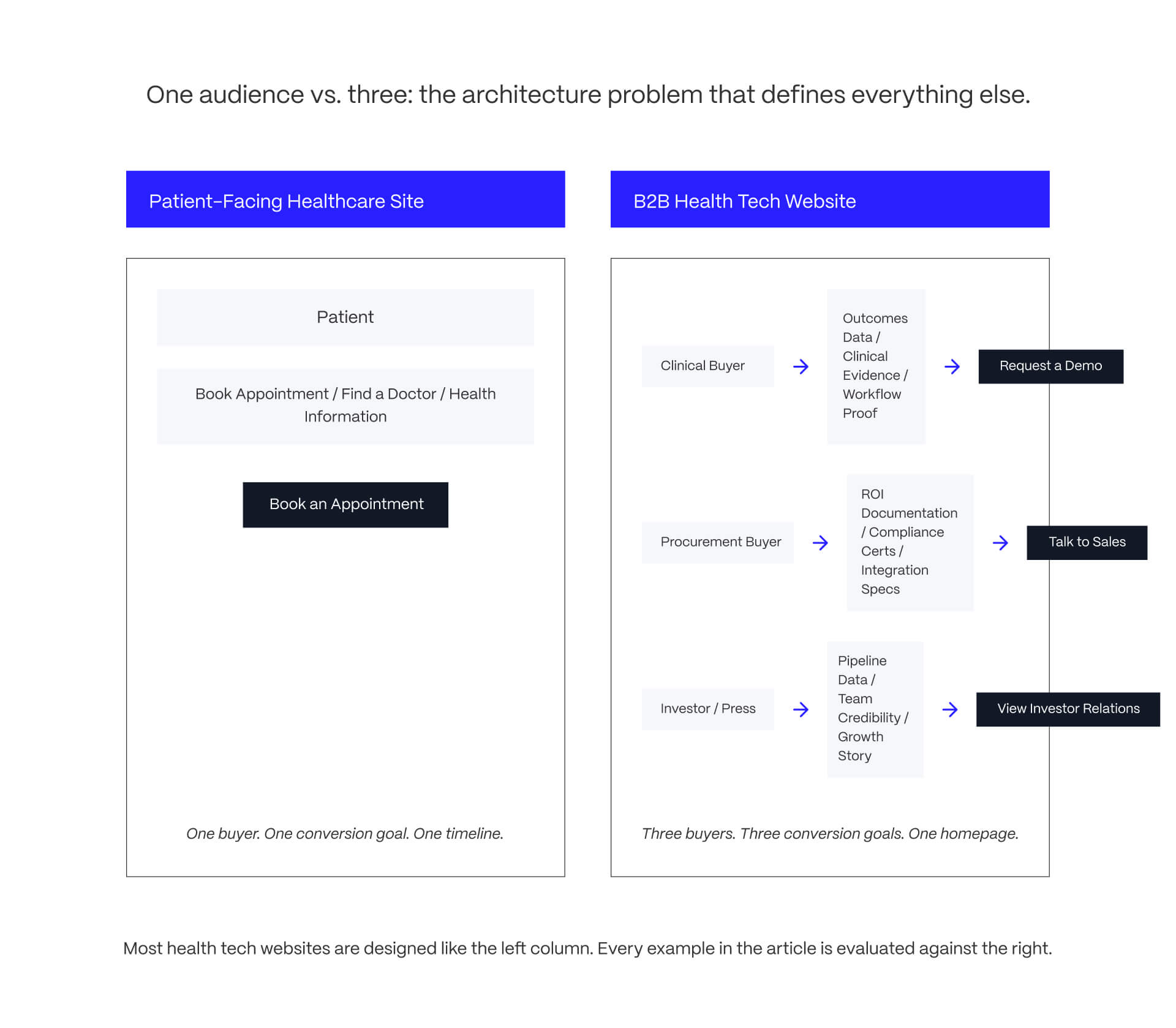
A hospital homepage converts patients into appointment bookings. The buyer has already made a decision whether they want to purchase from you or not. They have made the decision personally and the conversion goal will be completed in less than one week.
A digital health SaaS homepage converts procurement directors with 6-to-18-month buying cycles, clinical leads evaluating workflow fit, and investors assessing market position.
All three of these buyers have different structural conversion objectives than those of a patient-care website which was never developed for.
The formula:
- Identify the type of buyer.
- Identify the conversion objective.
- Design the website to meet the needs of both.
Three Simultaneous Audiences, Three Conversion Goals: The Architecture Problem
- About 77% of the individuals searching online prior to scheduling appointments. While this statistic shows us what we are doing on a personal level (how we use technology) it doesn't tell us anything about the problem that is addressed in this article.
- A hospital home page converts patients into appointment bookings. A buyer has already decided if he/she wants to purchase from you or not. He/she made that decision on their own and will complete the conversion process in less than one week.
- A digital health SaaS homepage converts procurement directors with 6-to-18-month buying cycles, clinical leads assessing workflow fit, and investors evaluating market position. All three of these buyers have different structural conversion objectives than those of a patient-care website which was never developed for.
The formula:
- Identify the type of buyer.
- Identify the conversion objective.
- Create your website to meet both needs.
Regulatory Confidence Is a Design Decision, Not a Badge in the Footer
The typical credentials of most health tech sites today include: FDA Clearance Marks, SOC 2 badges, HIPAA Compliance Statements, and Peer-Reviewed Citation Counts. All competitors have these. What makes a health tech site stand out is the way and where clinical evidence and regulatory information appear in the content hierarchy.
The best examples of this are when the clinical outcomes data for each product is integrated directly into the product story (e.g., named hospital partnerships w/ outcome numbers, peer-reviewed cite link on product pages, FDA clearance info displayed in Hero/Features area vs. below Privacy Policy). Any regulation or compliance information referenced from a company's own website should be considered VENDOR CLAIMS until verified by a third party publication/database.
For more context on the design decisions driving strong health tech websites in 2026, see Veza Digital's health care web design trends analysis.
If your health tech website is missing clear positioning or buyer navigation, see how Veza Digital approaches this problem for B2B SaaS companies at /work.
Digital Health SaaS Platform Website Examples
The digital health SaaS company is facing the biggest challenge of all when it comes to their home page compared to other types of health tech. In order for them to be successful with establishing clinical credibility; showing the depth of their products; they also need to showcase the value clearly enough so that someone who has never seen their solution before can understand what their offering provides without having to see a demonstration. Of these three examples, most do a good job on each of these fronts.
Klara: Patient Communication SaaS with Sharp B2B Positioning
Klara is a patient communication platform sold to health care practices, not directly to patients. The homepage gets this right immediately: the hero addresses practice administrators and care teams, not the patients who ultimately use the product. That is the first positioning clarity test for any dual-audience SaaS, and Klara passes it.
The navigation reflects a practice administrator's decision journey. Demo access is surfaced early, the CTA copy is oriented toward practice operators rather than generic action language, and the dual-audience problem is handled by foregrounding practice benefits while explaining patient-facing functionality as an outcome of the practice's decision, not the primary hook.
One honest limitation: social proof leans heavily on testimonials rather than quantified outcomes data. A procurement buyer evaluating Klara against competitors would benefit from efficiency metrics alongside customer quotes. Verify Webflow build status via BuiltWith before publication. All product capability claims are VENDOR-CLAIMED from klara.com.
For more on how strong SaaS teams structure homepage hierarchy, see SaaS homepage design examples.
Garner Health: Employer Navigation Platform with Data-First Trust Architecture
Garner Health sells to employers and health plans, directing employees toward high-quality physicians through a concierge navigation model. Their buyer is an HR or benefits director who has never heard of the brand and needs to justify the spend to a CFO.
The site addresses the brand awareness problem directly: specific trust signals appear above the fold, and the value proposition translates for a procurement buyer without requiring them to decode benefits-industry language first. The standout conversion element is how Garner presents outcomes data. Named health plan partnerships and specific cost-reduction claims give a skeptical benefits director something concrete to reference rather than a vague efficiency promise.
Flag any funding, customer base, or clinical outcomes claims as VENDOR-CLAIMED unless sourced from an independent press release or peer-reviewed publication.
Nuvation Bio: Pre-Commercial Biotech Built for Investor and Clinical Audiences
Nuvation Bio is a clinical-stage oncology company with no commercial product to sell. Their conversion goal is not a demo request. It is investor credibility, clinical partner interest, and oncology KOL engagement.
The pipeline table communicates trial status clearly enough that an institutional investor can form a view without reading a 40-page regulatory filing, while remaining precise enough that a clinical oncologist can evaluate trial design. The most transferable lesson for early-stage health tech companies: the site makes the growth story visible through pipeline depth and named institutional partners without making product promises the company cannot yet keep. Pipeline status and trial data are VENDOR-CLAIMED unless sourced from clinicaltrials.gov or SEC filings.
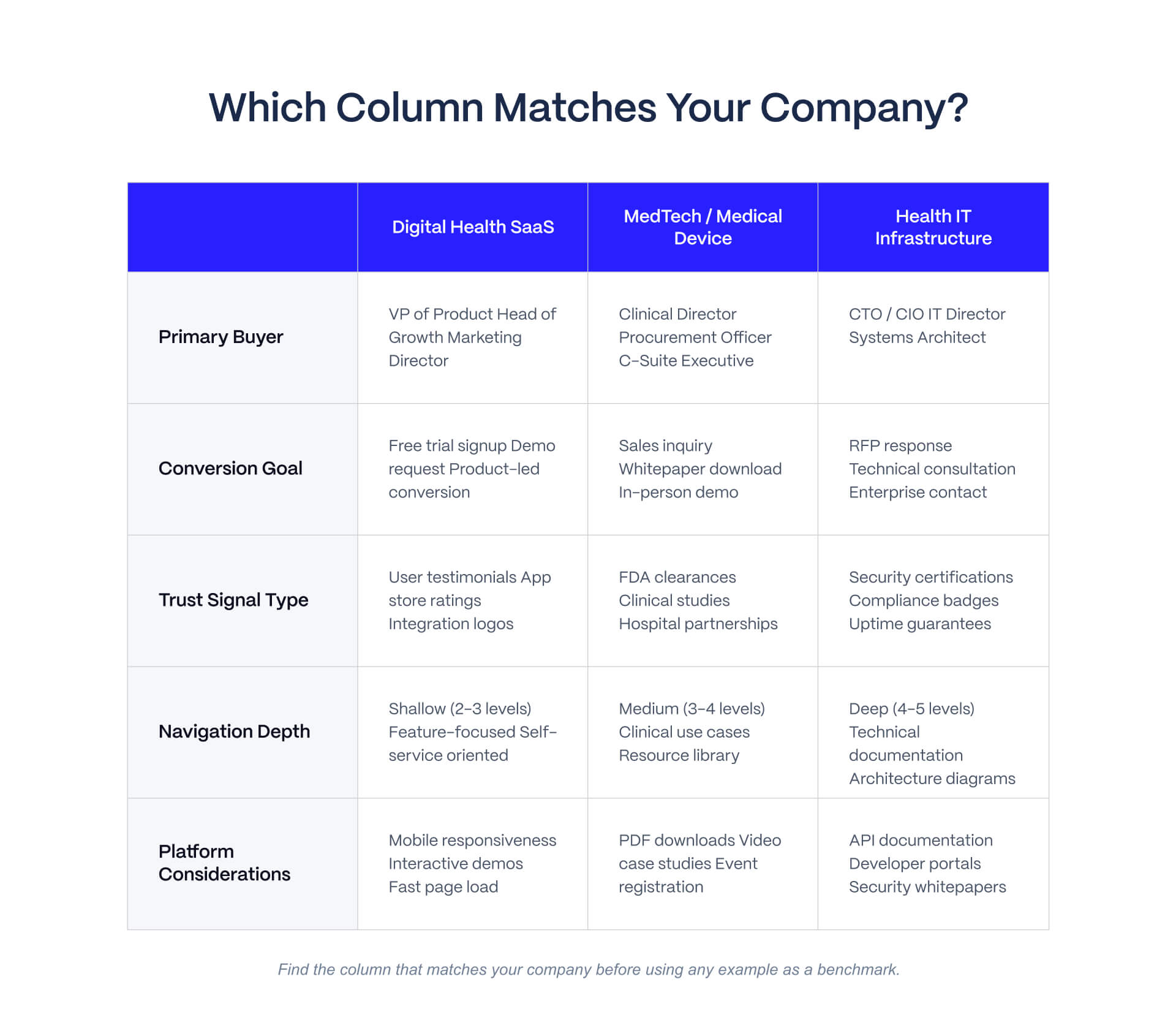
[Asset 2: Company-Type Comparison Matrix - Digital Health SaaS / MedTech-Device / Health IT Infrastructure across five dimensions: primary buyer, conversion goal, trust signal type, navigation depth, platform considerations]
MedTech and Medical Device Website Examples
Medtech websites face a challenge SaaS sites do not: the product is physical, the buyer is clinical and procurement-driven simultaneously, and regulatory context shapes every product claim. The three examples below demonstrate how to handle product complexity without overwhelming the first-time visitor.
Intuitive Surgical: Enterprise Surgical Robotics with Layered Stakeholder Navigation
Intuitive Surgical is the benchmark for enterprise medtech website architecture. The navigation simultaneously serves surgical teams (outcomes data, training resources), hospital procurement (economic analysis, ROI tools), and investors (financials, pipeline). That multi-audience routing without a confusing homepage requires structural decisions most medtech sites avoid making.
The mega-menu navigation handles a massive product and content surface by grouping content around buyer type rather than product feature. A surgical team lands in a different content environment than a hospital CFO, despite entering through the same homepage. Named hospital adoption statistics and published clinical study counts appear integrated into the product narrative, not sequestered in a compliance section.
Honest limitation: the site's scale may not translate well as inspiration for a smaller medtech company targeting health systems that cannot afford enterprise robotics. Navigation depth that works for Intuitive can overwhelm a company with a narrower product. Claims about da Vinci procedures, outcomes, or market share are VENDOR-CLAIMED from intuitivesurgical.com or NEEDS SOURCING from independent clinical publications.
Butterfly Network: Hardware and Software Storytelling in One Scroll
Butterfly Network makes a handheld ultrasound device with embedded AI diagnostics software. The homepage leads with the clinical outcome rather than the product category, which is the right framing decision: what the device makes possible is more compelling than how it works.
The site cleanly separates two buyer journeys. An individual clinician purchasing a device follows a different path from a hospital procurement and clinical IT team evaluating a platform deployment. These paths diverge in the navigation without forcing both buyers through the same funnel. Peer-reviewed clinical evidence appears integrated into the product story rather than in a separate research section, placing clinical credibility exactly where a skeptical buyer needs it. Butterfly claims diagnostic-quality images in under 30 seconds. [VENDOR-CLAIMED: butterfly-network.com] Any cited peer-reviewed studies should be flagged VERIFIED from the linked publications.
Tempus AI: Precision Medicine Platform Bridging Clinical and Commercial Audiences
Tempus AI sits at the intersection of genomics, clinical data, and AI diagnostics, serving oncologists, life sciences biopharma partners, and health systems simultaneously. The site handles this three-way audience problem with explicit buyer routing in the primary navigation rather than attempting to serve all three from a single hero.
The AI positioning is concrete rather than generic. Where many health tech companies claim AI capabilities without specifying what the AI does or for whom, Tempus names the clinical application, the data source, and the partner context. health care buyers in 2026 are actively skeptical of AI claims after years of over-promising in the category. Specificity is the credibility signal. AI capabilities and clinical partnership claims are VENDOR-CLAIMED from tempus.com. Published clinical evidence should be flagged VERIFIED from the linked sources.
If the sites above are the benchmark you want to reach, Veza Digital builds Webflow websites for B2B SaaS and health tech companies that need the same conversion architecture and positioning clarity. Talk to our team.
Health IT and Infrastructure Website Examples
Health IT buyers (CIOs, CMIOs, IT procurement leads) are analytically sophisticated and skeptical of vendor-generated performance claims by default. These sites need to qualify buyers quickly and route them to the right content path without friction.
athenahealth: Practice Management SaaS That Leads with Radical Simplicity
athenahealth sells complex EHR and practice management software to practices ranging from solo practitioners to large health systems. Their homepage avoids the feature-overwhelm problem endemic in health IT: minimal top navigation (three primary links, three secondary login paths), prominent search, and value proposition copy that speaks to practice administrators rather than IT compliance teams.
The buyer qualification logic is what distinguishes it. The hero does not segment buyers with an explicit "Are you a solo practice or a health system?" choice, which creates friction. Instead, the value proposition is framed at an abstraction level that allows both buyer types to self-identify and navigate from there. The site trusts the navigation to handle segmentation.
The conversion lesson: in a category where complexity anxiety is a real purchase barrier (EHR systems have a documented reputation for difficult implementation and high switching costs), navigation simplicity is a trust signal, not just a UX preference. All product capability claims are VENDOR-CLAIMED from athenahealth.com.
Veeva Systems: Enterprise Life Sciences Platform with Complex Navigation Done Right
Veeva Systems serves pharmaceutical and biotech companies across clinical, regulatory, and commercial operations with multiple application lines. The navigation challenge is significant: multiple buyer types across multiple product families without collapsing into a confusing enterprise software directory.
The site uses product family groupings that map to organizational functions rather than technical feature categories. A regulatory affairs buyer finds the relevant product line without needing to understand Veeva's internal taxonomy first. Named clients and specific adoption figures appear above the fold rather than generic trust badges. These are procurement-ready proof points.
One honest critique: the site's depth may feel inaccessible to a mid-size biotech evaluating Veeva for the first time. The content assumes familiarity with enterprise life sciences software categories that a smaller buyer may not have. Customer count and market position claims are VENDOR-CLAIMED from veeva.com. Analyst coverage claims are NEEDS SOURCING.
For context on how enterprise health IT companies handle pricing transparency and buyer qualification, see SaaS pricing page examples.
Health Tech Website Examples We Reviewed and Did Not Recommend
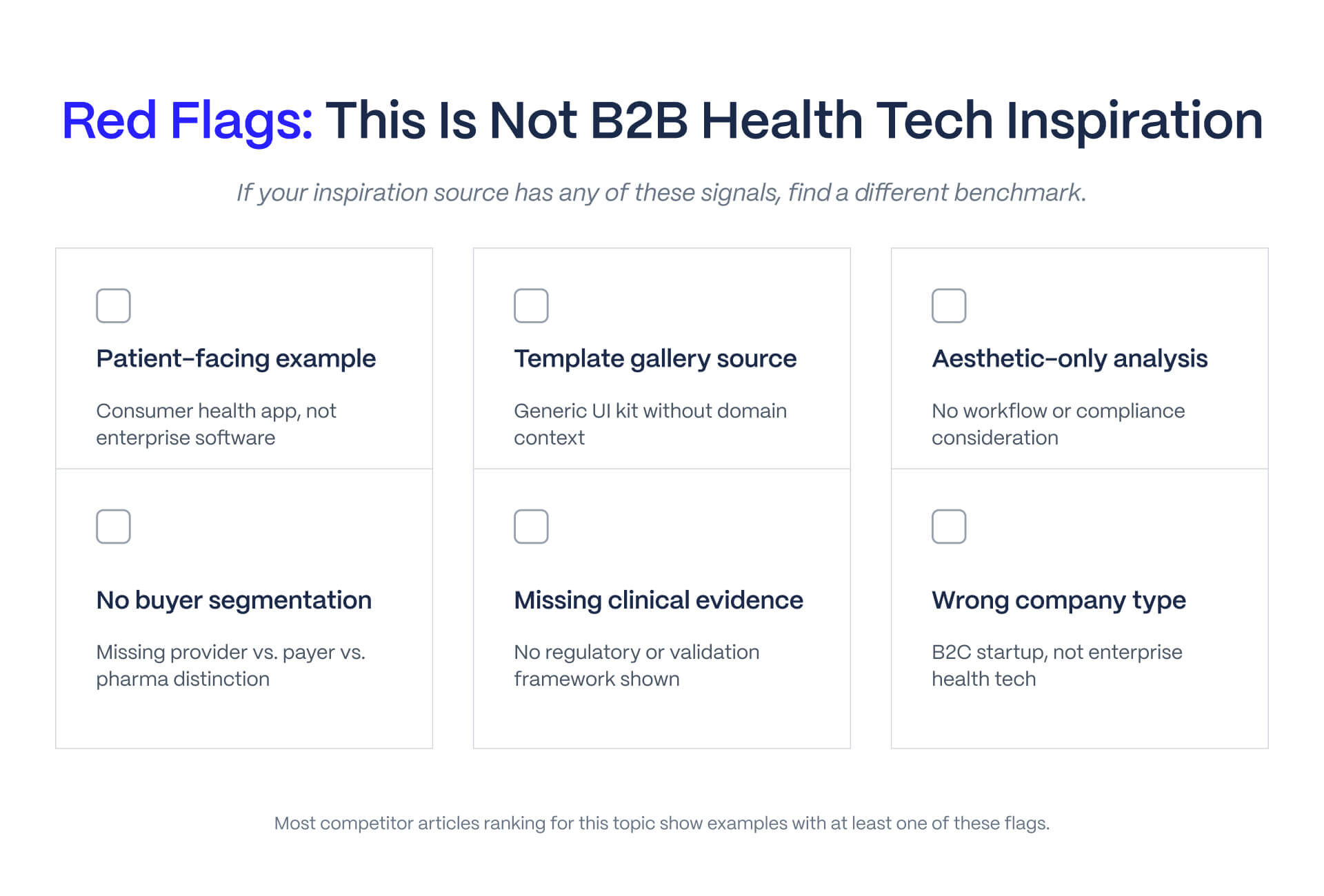
The preceding examples were the result of genuine evaluation. Part of that process was identifying sites that show up regularly as health tech design inspiration but should not be used as B2B health tech benchmarks.
Why Mayo Clinic, Cleveland Clinic, and Hospital Sites Are Wrong Benchmarks for B2B Health Tech
Mayo Clinic and Cleveland Clinic are excellent hospital websites built for a specific purpose: converting patients into appointment-bookers. The buyer is emotionally motivated, the decision is personal, and the conversion timeline is same-day.
A digital health SaaS homepage converts enterprise procurement teams with 12-month buying cycles. It must surface clinical evidence for one buyer type, ROI documentation for a second, and growth story credibility for a third. Those are categorically different design requirements.
Here is the specific mismatch: Mayo Clinic correctly leads with warmth, reassurance, and accessible health information. For a patient researching a diagnosis, that is right.
For a procurement director evaluating a health IT platform, that design language signals consumer product rather than enterprise software. It undermines technical credibility before the visitor has read a word. Copying Mayo Clinic's homepage structure for a B2B health tech SaaS does not build enterprise trust. It creates the wrong first impression for the wrong buyer.
Why Framer Template Galleries and Mockplus Roundups Are Not Real Health Tech Examples
Multiple SERP competitors present Framer Marketplace templates or Mockplus prototypes as health tech website design examples. These are not real company websites. They have no buyer data behind them, no conversion optimization, and no competitive positioning.
The specific characteristic that template galleries cannot replicate by design: buyer-specific navigation. A real health tech website earns its navigation structure through decisions about who the buyers are, what proof they need, and how to route them. A Framer template has none of that strategic work behind it. It has aesthetic choices, which are useful references for visual direction and nothing else. For conversion architecture and positioning clarity, real company analysis is the only valid reference. That is what the examples in this guide represent.
How to Evaluate Your Own Health Tech Website Before a Rebuild
By this point, most health tech marketing leads and founders have started mentally comparing the examples above to their own website. The framework below gives that comparison structure. These five questions map directly to the criteria used throughout the guide and are designed to be answerable in 15 minutes with your current site open.
.jpg)
The 5 Questions Every Health Tech Marketing Team Should Answer About Their Own Site
Q1 (Multi-Stakeholder Navigation): When a clinical buyer lands on your homepage, can they find outcomes data or clinical evidence within 30 seconds without scrolling?
Q2 (Buyer Routing): Does your navigation give a procurement director a direct path to ROI documentation and compliance information within two clicks from the homepage?
Q3 (Positioning Clarity): Can a first-time visitor who has never heard of your company describe what you do, who your buyer is, and what makes you different within 10 seconds of landing?
Q4 (Trust Architecture): Is your clinical evidence, regulatory clearance data, or outcomes research integrated into the product narrative, or is it in the footer next to your HIPAA badge?
Q5 (Conversion Paths): Do you have at least three distinct conversion paths (demo or trial request, content or resource download, enterprise or sales contact) accessible from the homepage without scrolling?
For reference on how strong SaaS teams structure conversion paths, see SaaS landing page design examples.
If you answered no to two or more of those questions, your website is losing qualified buyers before the first conversation. That is the rebuild signal.
Rebuild or Optimize: How to Read the Signals
Most health tech website projects that start as optimization efforts turn into rebuilds once positioning is examined.
Rebuild signals: new funding round requiring updated market positioning, ICP or product pivot in the last 12 months, platform limitations blocking marketing team speed, or a conversion rate drop without a corresponding traffic drop. Optimization work on individual pages will not solve these structural problems.
Optimization signals: navigation and positioning are sound but specific high-traffic pages are underperforming, or technical SEO gaps are the primary issue without structural problems underneath. If you can draw a clear line from a specific page's underperformance to a fixable element, optimize. If the site no longer reflects what the company actually does or who it serves, rebuild.
When the signals point toward a rebuild, the right next step is mapping scope, timeline, and platform fit with a team that has done this before. Veza Digital's Webflow work for B2B SaaS companies covers the range of what that looks like in practice. If it is time to scope a project, start here.
Your health tech website should work as hard as your sales team.
If the sites above are setting a standard your current website does not meet, the gap is usually in positioning clarity, buyer navigation, or conversion architecture. These are solvable problems, but they require a strategic rebuild, not a visual refresh. Veza Digital designs and builds Webflow websites for B2B SaaS and health tech companies that need sharper positioning, cleaner UX, and websites that support pipeline growth rather than just looking good in a board deck.
Frequently Asked Questions
What makes a good health tech website design?
A strong health tech website does three things well: it makes the buyer's problem and the company's solution clear within the first 10 seconds, it routes different buyer types (clinical, procurement, investor) to the right content path without friction, and it builds regulatory and outcomes credibility through design structure rather than badge placement alone. Visual aesthetics matter, but they are downstream of positioning clarity and conversion architecture. A beautiful health tech website that fails to qualify buyers is an expensive business card.
How is health tech website design different from health care website design?
General health care websites serve patients looking for appointments, health information, or provider access. Health tech websites serve B2B buyers: hospital procurement teams, health plan executives, clinical leaders, and investors. The buyer journey is longer, the evaluation criteria are more complex, and the conversion paths need to handle multiple simultaneous stakeholder needs. Designing a health tech website like a patient-care site produces a website that looks credible but fails to convert enterprise buyers.
What are the best health tech website design examples in 2026?
Strong B2B health tech examples include Klara (digital health SaaS with sharp practice-buyer positioning), Butterfly Network (hardware and software storytelling in one product narrative), athenahealth (health IT SaaS leading with radical simplicity), and Tempus AI (AI-native precision medicine bridging clinical and commercial audiences). Each demonstrates multi-stakeholder navigation and conversion architecture that most health care websites do not attempt. Avoid using hospital sites like Mayo Clinic as B2B health tech design benchmarks. They were built for a different buyer and purpose.
Should a health tech company use Webflow for its website?
Webflow works well for health tech SaaS and medtech companies where marketing teams need to update content, ship landing pages, and iterate on positioning without engineering dependencies. It is less suited for companies with heavy patient-portal functionality, complex back-end integrations, or enterprise CMS requirements that need deep customization. For most digital health SaaS companies at seed through Series B, Webflow's balance of design quality, marketing team control, and technical performance makes it a strong fit. [NEEDS SOURCING: verify specific capability claims at webflow.com before publication.]
What design elements build trust on a health tech website?
Trust in health tech websites comes from clinical outcomes data presented with methodology context, named and verifiable hospital or health system partnerships, regulatory clearance signals integrated into product pages rather than isolated in the footer, and social proof matched to the specific buyer type (peer-reviewed citations for clinical buyers, ROI case studies for procurement leads). Generic trust badges and stock medical photography are expected by all visitors and create no differentiation.
How do I improve conversion on a health tech website?
Start by auditing your three primary conversion paths: demo or trial request, resource download, and enterprise or sales contact. Most health tech websites have one visible CTA and bury the others. Multi-stakeholder navigation with explicit buyer routing in the hero, clinical evidence within the first two scrolls, and a demo path accessible without navigating to a separate page will improve qualified lead conversion more than a visual redesign alone. [NEEDS SOURCING for specific conversion rate benchmarks before publication.]
What platform do most health tech SaaS companies use for their websites?
Health tech SaaS companies use a range of platforms. Webflow has grown among digital health startups and growth-stage companies because it gives marketing teams direct control over design and content without engineering dependencies. Enterprise health IT platforms often use custom CMS or Drupal for complex content governance. Platform choice should match team ownership: if marketing owns the site and needs to ship independently, Webflow is the right fit. If a dedicated engineering team manages the stack, a headless CMS gives more flexibility. [NEEDS SOURCING for market share data before publication.]
How much does it cost to design a health tech website?
Cost varies by scope, platform, and team structure. A Webflow design-and-build for a health tech SaaS company with 8-15 pages, custom animations, and a CMS typically runs between $25,000 and $80,000 depending on the agency and complexity. Enterprise health IT platforms with complex integrations can exceed $150,000. Template-based builds cost less but require trade-offs in positioning differentiation and conversion architecture. [NEEDS SOURCING: verify these figures or remove before publication.]
Does HIPAA compliance affect health tech website design?
HIPAA affects website design primarily when the site collects, transmits, or stores protected health information. Contact forms, appointment booking tools, patient login portals, and analytics tracking that captures health-related user behavior can create HIPAA obligations. A health tech marketing website that does not collect PHI directly has fewer compliance design constraints, though HIPAA-adjacent trust signals still matter for buyer credibility. Always consult legal counsel on specific compliance requirements. This is not legal advice.
How do I know if my health tech website needs a rebuild or an optimization?
Rebuild signals: new funding round, product or ICP pivot in the last 12 months, platform limitations blocking marketing team speed, or a conversion rate drop without a corresponding traffic drop. Optimization signals: sound positioning and navigation structure, specific high-traffic pages underperforming, technical SEO gaps without structural problems. Most health tech website projects that start as optimizations turn into rebuilds once positioning is examined. Start with an honest audit before scoping budget.
