.jpg)
Your website navigation is some of the most valuable real estate on a B2B SaaS website. Good website navigation works like airport signage. You don’t need directions to everything the moment you enter the terminal. A handful of decisions relevant to where you’re going next is more than adequate.
Most website navigation best practices tell you what belongs in the menu. This guide starts somewhere else: what does every item you add actually cost?
What Every Navigation Item Costs You
Adding another link to your website navigation might appear free, but it's not. Every new item asks for another decision from the visitor, changes how internal authority is distributed and, when it comes to more complex menus, adds another element the page needs to render.
Three Costs Nobody Adds Up
The first cost to consider here is attention. Using an eleven-item header provides eleven elements for visitors to process before deciding on their destination. If you compare enough B2B SaaS websites worth studying, you’ll find that the strongest navigation structures tend to make that decision easier, instead of advertising every page the company has.
The second cost is link equity. Navigation helps search engines understand the relationship and relative importance of pages across a site. Fewer links mean that internal PageRank is divided between fewer destinations. That is arithmetic, not an SEO hack, and there is no magic number of links Google wants you to hit.
The third cost is technical complexity. A simple navigation bar is mostly text links. A mega menu with images, nested panels and interactive states is a component that has to render, then adapt again for mobile interaction.
This makes the navigation an integral part of SaaS homepage design, not merely decoration sitting above it.
How Headers Get to Eleven Items
Most B2B SaaS headers don’t start with eleven items. They get there by committee.
Product wants Product. Sales want Pricing and Demo. Marketing wants Resources and Blog. Customer success wants Docs and Support. HR wants Careers. Partnerships wants Partners.
Every department gets a word, and the visitor gets a menu that looks suspiciously like the company org chart
Orbit Media recommends grouping navigation when you exceed seven items. That is a useful warning sign, but seven is not a scientifically established limit for website navigation. This is a number commonly associated with George Miller’s research into short-term memory, not controlled testing that found seven menu items to be optimal.
In fact, it’s likely Miller never intended for his 1956 paper to become a rule for web designers. Breaking items into groups makes the navigation menus much easier on visitors.
For B2B SaaS specifically, NerdCow goes further. Its current navigation guide recommends limiting the main menu to three or four elements, while its broader framework allows up to five top-level items.
The useful principle is therefore not “seven is bad and four is good.” It’s simpler: every item needs to earn the decision it’s expecting visitors to make.
Four Audiences, One Header
The difficulty with B2B SaaS website navigation is that not everyone arrives looking for the same thing. Four audiences can land on the same website with four completely different jobs to do. Trying to give each of them an equal space in the header is how the menu starts growing again.
Who is Actually Reading the Menu?
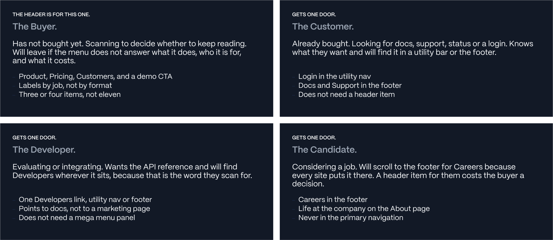
The buyer evaluates the product. They want to understand what it does, whether it solves their problem, what it costs and whether companies like theirs already use it.
The customer has a different job. They most likely want Docs, Support, Status, or Login. The developer might be evaluating an integration and looking specifically for API documentation. As the best examples of devtool website design demonstrate, that technical journey can be important without requiring the entire primary navigation to revolve around it.
Then there is the candidate looking for Careers, company culture and open positions. That overlaps with About page design, where the same problem appears: different audiences arrive wanting different information from the company.
All four audiences matter. They just do not need four equally prominent menus.
The Header is for the Buyer
The primary header should serve the buyer.
They are the audience most likely to leave when they cannot quickly understand what you sell, who it’s for, and what they should do next. Existing customers already know what they need. Developers will scan for Developers or API. Candidates already know where Careers usually lives.
Give those audiences predictable doors through the utility navigation or footer. Spend the primary navigation on the person still deciding whether to buy.
That principle needs to influence the labels too.
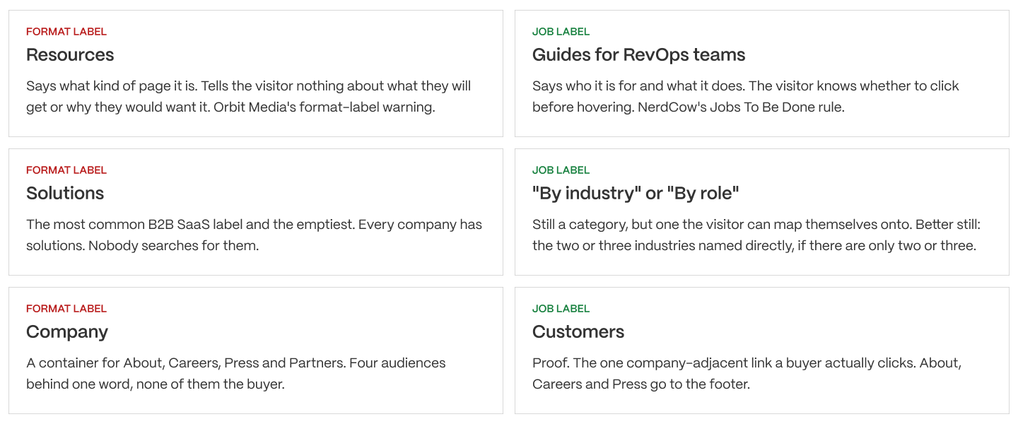
NerdCow recommends using Jobs To Be Done to structure navigation, while Orbit Media warns against generic, format-based labels. Together, those ideas produce a useful rule: label the destination by what the visitor is trying to accomplish, not the type of page you built.
“Resources” describes a container. “Solutions” could mean almost anything. “Reduce churn” communicates an outcome. “See it working” communicates a job.
A header does not have to represent every aspect of the organization. Instead, it is simply designed to help the buyer reach the next useful step in their journey.
Mega Menus, Hamburgers, and What the Research Says
The right navigation pattern depends a lot on how much information visitors are expected to choose between. A more elaborate menu can make a large website easier to explore, but complexity needs to be earned.
When a Mega Menu is Justified
Nielsen Norman Group’s Mega Menus Work Well for Site Navigation, by Jakob Nielsen and Angie Li, found that well-designed mega menus can outperform standard dropdowns. This is largely because related options are grouped into scannable panels, helping visitors compare destinations without endless scrolling.
This is crucial for enterprises boasting multiple products, industries, and buyer roles. At that scale, information architecture becomes a core part of enterprise website design.
The cost lies in complexity. Images, nested panels, and hover interaction can increase rendering overhead, introduce layout instability if poorly implemented, and hide destinations until someone interacts with the menu.
For a B2B SaaS company selling a single product across four use cases, a simple dropdown menu is perfectly sufficient.
Navigation complexity should also be judged against its commercial purpose. Whether your header CTA leads to a demo, trial or pricing page, the destination should support the visitor’s next decision. Good SaaS pricing page design is more important than surrounding that CTA with elaborate navigation.
Hidden Navigation on Desktop
The evidence against hiding desktop navigation is unusually clear.
In a 2016 study titled, Hamburger Menus and Hidden Navigation Hurt UX Metrics, Kara Pernice and Raluca Budiu of Nielsen Norman Group tested 179 participants across six websites.
On desktop, hidden navigation was used in just 27% of test cases, compared with 48-50% for visible or partially visible navigation. Hidden menus also increased completion time for tasks, and impacted content discoverability.
The hamburger navigation menu solves a genuine space constraint on mobile, but on a desktop introduces an unnecessary interaction. Recent Nielsen Norman Group research from 2025 confirms that hamburger icons are widely recognized, but this doesn’t eliminate the extra interaction involved in revealing hidden links.
Accessibility is important, irrespective of pattern. Use semantic HTML navigation, support keyboard interaction, provide accessible labels and expand states for screen readers, and aim for touch targets of at least 44 by 44 CSS pixels.
Labels, Order, and the CTA
Once you have decided on the pages that deserve more header space, you need to decide how you’re going to present them. Even something as simple as a four-item navigation menu can underperform if the labels are vague, the order is unclear, or the primary action gets lost among competing links.
Jobs, Not Formats
A navigation label should tell visitors what they will find before they click.
NerdCow recommends applying Jobs To Be Done thinking to navigation design, while Orbit Media advises against generic, format-based labels. Both lead to the same principle: describe the value or destination clearly as opposed to just naming a content category.
“Resources” tells someone almost nothing. “Guides for RevOps leaders” identifies both the audience and what they should expect. “Solutions” is similarly vague, but “By industry” is much clearer for identifying where they belong.
Every navigation item doesn't have to have a clever and concise name. Familiar labels like Pricing and Customers work because visitors understand them already. Clarity matters to visitors more than originality.
Order is essential as well. Orbit Media highlights the importance of the first and last positions in a navigation menu, where items can attract greater attention.
Put the most commercially important destination first, and be sure to arrange the remaining links around buyer priorities, and reserve the final position for your primary CTA.
One CTA, and What It Points To
Your header should have one unmistakable primary call to action.
Most B2B SaaS websites should include a button inviting visitors to book a demo, start a free trial or take another high-intent step. It’s important for the destination to match what the visitor is ready to do, instead of forcing everyone into the same sales conversation.
Two competing buttons can create an additional decision. One clear CTA gives the visitor a next step without them needing to weigh up competing priorities.
NerdCow warns against exclusive reliance on the header CTA. Visitors scrolling through a long page may never wind up returning to the navigation bar, so be sure to repeat the relevant action alongside product information and other persuasive content.
There’s an important technical consideration to make. Render navigation links as crawlable HTML text rather than relying on images or inaccessible JavaScript interactions. This allows search engines to discover important pages.
Despite claims, there is no structured data markup that guarantees Google sitelinks. Google generates them algorithmically from its understanding of a website’s structure.
Key Takeaways, and a Ten-Minute Audit
You don’t need a full website redesign in order to identify website navigation problems. Start with the header you have, and look at the way visitors use it. Make a decision about whether each item needs or deserves the position it has.
The Audit
A ten-minute audit begins with five simple questions:
- How many items are in your header?
- Who does each header serve?
- Which links get clicked?
- Do the labels describe jobs or formats?
- Is your primary CTA clear?
Make sure you count every item and classify each by its audience: buyer, customer, developer or candidate. The primary navigation needs to prioritize the buyer, even though this could mean developers evaluating a technical product.
Examine navigation-click events in GA4 over the previous 90 days. These interactions might need custom tracking, so be sure to check that the data exists before you come to a definitive conclusion. Items that receive less than 1% of header clicks are worth investigating rather than deleting.
Finally, check the labels and CTA. Can visitors predict what they will find, and is there one obvious next step?
The audit also raises questions surrounding website governance: who owns navigation, and who has the authority to change it?
These are useful questions to answer before embarking on the website redesign process.
THE TEN-MINUTE NAVIGATION AUDIT
Five questions. Your header, your GA4, ten minutes.
QUESTION 1: HOW MANY ITEMS ARE IN THE HEADER?
- Count them, including the CTA and any utility links.
- Over seven: group. Over four: ask why.
The tell: if you had to scroll the menu to count it, that is the answer.
QUESTION 2: WHO IS EACH ITEM FOR?
- Buyer, customer, developer or candidate. Write it next to each one.
- Anything not for the buyer moves to the footer or utility nav.
The tell: Careers in the header means a recruiter won a meeting the buyer was not in.
QUESTION 3: WHICH ITEMS DOES ANYONE CLICK?
- GA4, Events, filter for navigation clicks, last 90 days.
- Anything under one percent of header clicks is a candidate for removal.
The tell: the item nobody clicks is usually the one somebody fought hardest to add.
QUESTION 4: ARE THE LABELS FORMATS OR JOBS?
- Resources, Solutions, Company, Platform are formats.
- Rename each as what the visitor gets, or remove it.
The tell: if the label would work on a competitor's site unchanged, it is a format.
QUESTION 5: IS THERE ONE CTA, AND IS IT LAST?
- One button, styled differently from the links, in the last position.
- Pointing at the highest-intent action the site supports.
The tell: two buttons means nobody decided which action matters.
PRINCIPLE
Every item in the header costs the visitor a decision. The header is for the buyer. Give everyone else a door they already know how to find, and spend the buyer's attention on nothing they did not come for.
Styling: monospace code block in Webflow CMS, or bold headers with regular body. Bold each QUESTION header, each The tell line, and PRINCIPLE.
What to Do With the Answers
The audit needs to produce a short list of changes, not simply another committee meeting.
Start with links that receive very little engagement. Check if they are relevant to the buyer before you remove them. Low clicks alone don’t prove a destination has no value, particularly for less common tasks.
If you have a header that is more than seven item, make sure you look for sensible groups. If this exceeds four, ask whether every top-level choice is required. These are practical prompts, not established limitations.
Replace generic labels with language that helps describe what a visitor is able to accomplish. Move customer support, developer documentation and Careers into predictable utility navigation or footer locations, unless those journeys are integral to your buying process.
Keep one CTA that points to the action that is the most important.
Some changes need to be made instantly, while others expose deeper information architecture challenges that will need professional web design support.
Navigation remains one of the leading arguments in website redesign. But the strongest argument isn’t an opinion about what looks cleaner, rather, evidence of what visitors actually use.
Need a clearer path from navigation to conversion? Work with Veza to build a B2B SaaS website around how your buyers actually navigate.
Get the click data before the meeting.
The header is for the buyer. Everyone else gets a door.
Navigation is the first argument in almost every website redesign, because every team has an item in it and nobody wants to lose theirs. The side that wins is usually the one with the click data. We build B2B SaaS websites on Webflow, and the navigation conversation is where most of them start: who the header is for, what each item costs, and which seven can go. If your header has eleven items and a meeting is coming, run the audit above first.
FAQs
How many items should a B2B SaaS navigation have?
Three to five in the primary header, plus one CTA. NerdCow recommends three to four. Orbit Media's rule is to group when there are more than seven. The seven comes from Miller's short-term memory research rather than menu testing, and for a company with one product and a clear buyer, four is usually enough.
What are the four types of website navigation?
Horizontal bar, dropdown, mega menu, and hamburger. For B2B SaaS the horizontal bar with one or two dropdowns covers almost every case. Mega menus are justified only by a genuine catalogue, and the hamburger is a mobile convention that hurts discoverability on desktop per Nielsen Norman Group.
Should we use a mega menu?
Only if you have a real catalogue: many products, many industries, many roles. Nielsen Norman found well-designed mega menus beat dropdowns when groups are labelled and scannable. Most B2B SaaS companies have one product with four use cases, which is a dropdown. A mega menu for that is a heavy component hiding a short list.
Is a hamburger menu bad on desktop?
Yes, measurably. Nielsen Norman Group's 2016 research found hidden navigation on desktop roughly halved usage and reduced task success. The hamburger solves a space problem that mobile has and desktop does not. Keep it on mobile, show the links on desktop.
What should the navigation labels say?
What the visitor gets, not what kind of page it is. Resources, Solutions and Company are format labels that would work unchanged on a competitor's site. Guides for RevOps teams, By industry and Customers say something. NerdCow's Jobs To Be Done rule and Orbit Media's format-label warning both point the same way.
Does navigation affect SEO?
Modestly. Navigation links pass link equity, so fewer links concentrate more per link, but Google weights in-content links more heavily. Render navigation as HTML text so it is crawlable, and ignore any guide claiming structured data produces sitelinks. It does not. Sitelinks are algorithmic.
Where should Careers, Docs and Login go?
Not in the primary header. Careers goes in the footer, where every candidate already looks. Docs and Support go in the footer or a utility bar. Login goes in the utility bar top right. Each of these serves someone who is not the buyer, and each one in the header costs the buyer a decision.
How do I know which navigation items to remove?
GA4 event data on header clicks over 90 days. Anything under one percent of navigation clicks is a candidate. Then ask who each remaining item is for: anything not for the buyer moves to the footer. The item nobody clicks is usually the one somebody fought hardest to add.