.jpeg)
We searched for a “best developer tool website design”, and almost every article we found was following the same principle. What we found on Webflow, Saaspo and Behance was mostly screenshot galleries, templates, collections, and boards. While each example showed nice-looking homepages, none shared how or why they’d convert a developer.
So we started our own research, which led to this article.
Developers do not buy the way most website visitors do, so we connected their way of thinking with fourteen websites leading in this field. All sites were verified and live on the day of writing. As our analysis evolved, we found the approach to turn a technical buyer into a paying customer.
Turns out, the screenshots were the least interesting part.
Developers Do Not Read Websites, They Test Them
The Evaluation Sequence
While most of the B2B buyers read and scan a website, with modest knowledge about how everything works in the scenes, developers run them.
The typical scenario looks like this: developers land on the hero, scan for a code sample, open the docs in a new tab, and try to get a working result before ever filling out a form. Contacting sales comes later, if it ever comes.
This has nothing to do with a style preference or design trends. This audience is trained to evaluate tools long before marketing had a website to put in front of them.
Markepear puts this very plainly: “Many devs don't really trust the website as it was written by ‘fluffy marketers’. And docs have to be real, to the point, objective. So devs go there to find real info.” ”
This short statement explains a lot more about the devtool website than most design guides do.
If the homepage is how you pitch your tool, then your docs should be where developers come to see if that pitch holds.
When they find what they need in those docs, they will start doing some of the heavy lifting when it comes to selling your tool.
So with that said, there is a very practical side effect to every design decision you make on your developer tool site. The decision makes it easier for the developer to get from your pitch to testing your product, or it makes it harder.
A hero video helps if it shows the product being used. However, it is useless as a hero video if all it does is show people smiling in an office.
For more on how this plays out across a wider set of technology company sites, see Veza's technology companies we work with page. For a broader look at how this evaluation logic shows up across B2B sites, see Veza's B2B SaaS websites. To see how this evaluation logic shows up across B2B sites, see Veza's B2B SaaS websites.
Four Archetypes, Not A Ranking
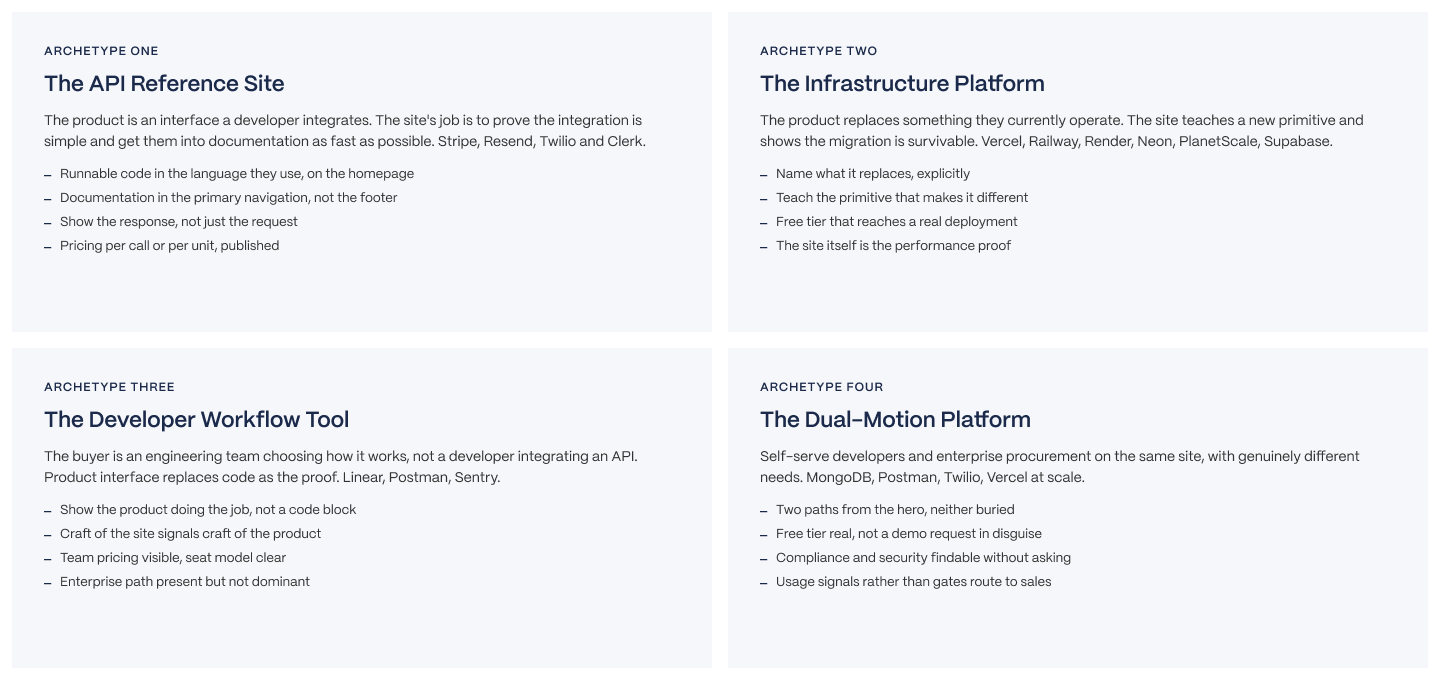
Before you start ranking these sites, let's be honest about why a straight comparison won't work. API reference products and team flow tools aren't in competition for that same ten seconds of attention, so judging them by the same criteria will produce a verdict that helps no one.
Four archetypes show up repeatedly in this category:
1. API Reference Sites for developers who are integrating a particular feature into their product. These are sites (Stripe, Resend, Clerk & Twilio) that provide developers with the necessary information to integrate a specific capability into their own product.
2. Infrastructure Platforms - These sell computing resources, hosting space or databases. The infrastructure platform sells capacity that other people use as part of their application. Examples include Vercel, Supabase, PlanetScale, Railway, Neon & Render.
This category shows the largest group within the set provided and also presents the greatest opportunity for designers to make decisions that will help a user feel comfortable trusting someone they don't know to handle something operationally important, often before the user has communicated with anyone else.
3. Developer Workflow Tools - The tools shown by this category are sold to teams that need to decide how they work together, not individual engineers trying to solve one integration issue. Examples include Linear, Sentry & Postman.
4. Dual-Motion Platforms - A dual-motion platform supports both a self-service developer experience and an Enterprise Sales Experience through the same website/portal. There is one clear example of a dual-motion platform within the data set: MongoDB.
The Five-Point Framework
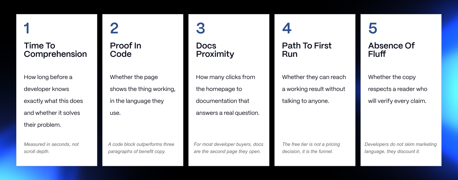
The difference between a development tool website that simply "looks nice," vs one that is converting visitors is determined by five factors:
- Conversion time - Time elapsed until a visitor has some understanding of what the product does, and for whom it is intended.
- Code evidence - Does the website demonstrate the product functioning within the visitor's own language, or simply describe how it functions?
- Documentation location - How many click paths are required to go from the home page to documentation, and do the documents appear to have been created by the same team?
- First run path - How quickly a visitor can complete the sign-up process and achieve results using the product.
- Presence of substance - Are claims made by the visitor able to be verified within a five-minute timeframe, or are claims made that only "sound" good?
The same pattern appears in AI-focused companies too. Our AI website design examples guide shows how leading AI websites handle technical audiences and complex products.
The Examples
How These Were Selected And Verified
All of the websites shown in this list were verified as live on 03 September 2026. Why is the date important? This is a category with rapid changes. The screenshots in old articles are likely outdated by at least one year, and often show companies, products, and positions that have significantly changed since then.
As a result, three of the websites in this collection have experienced material changes in 2026. Therefore, we’re going to evaluate those three websites as they stand today, not as they appeared when other older articles wrote about them.
Railway is now generally operated under railway.com.
Neon has been relocated to neon.com. Following their purchase by Databricks, Neon's focus position has transitioned from solely focusing on backend solutions for developers to providing general-purpose backend solutions for applications and AI agents.
Like Neon, PlanetScale has also expanded past the scope of MySQL/Vitess to offer support for Postgres. If you're trying to recall how any of these three were before, chances are you are recalling a version of the company before their most recent updates.
The Comparison Table
The table below is meant to be scanned, not read line by line. Two columns are worth calling out specifically.
"Code on homepage" is closer to a binary conversion signal than a stylistic choice, and where it reads "no" for Linear, that's the exception discussed above, not a gap in the product's marketing. "Docs proximity" measures clicks from the homepage nav to technical documentation, not to a support portal or a blog.
See our SaaS homepage design analysis for more homepage examples and our AI coding tools list for the broader context.
Fourteen Sites, Analysed
API reference sites
These four are selling an integration, and it shows in how aggressively they lead with code.
Stripe still sets the bar. The hero doesn't describe payments, it shows a live, updating code sample next to a working checkout demo. What Stripe does well is compress the entire evaluation sequence into one screen: read, see it run, believe it. Where Stripe falls short for a smaller team studying it as a model is scale. Stripe can afford a design and content team most companies can't, and copying its production values without copying its documentation depth is a common and expensive mistake.
Resend is arguably the strongest pure developer landing page in this set. A live snippet with more than ten SDK language tabs sits above the fold, backed by interactive send and webhook demos a visitor can trigger. It's a smaller company than Stripe pulling off something Stripe-calibre with a fraction of the resources, which is the real lesson here: the tabbed SDK snippet is a reproducible pattern, not a Stripe-only luxury.
Clerk takes a different approach and it's the right one for what it sells. Instead of raw code, the homepage shows prebuilt UI components, because the product is components. Framework targeting is extremely specific, Next.js, Remix, and so on get their own tailored messaging rather than one generic "works everywhere" claim. The lesson: show the artifact you're selling, not a generic proxy for it.
Twilio is the mature end of this archetype. Multi-product, established, and it leans on outcome framing and quantified trust (customer logos, usage numbers) more than raw code demos, because its audience already knows what an API integration looks like. What's instructive here is that Twilio still keeps documentation in primary navigation despite being a much larger, more sales-driven company than the other three. Scale didn't push docs to the footer.
Infrastructure platforms
These six sell the thing other products run on, and the design problem is different: convince someone to trust you with the plumbing.
Vercel makes its own site the pitch. Page speed, smoothness and visual polish are the product demo, since the company sells frontend hosting and performance. It's a smart, self-referential move, and it's also the reason Vercel gets cited constantly in design roundups that miss why it works: the design isn't decoration, it's proof.
Supabase has the sharpest positioning line of any site in this set: "the open-source Firebase alternative." One sentence, names the incumbent, states the differentiator. Read more on this technique in the naming-what-you-replace section below.
PlanetScale spends real homepage real estate teaching database branching and deploy requests, concepts most visitors won't already understand, until the idea lands. That's a deliberate, patient design choice in a category where most sites rush to a CTA. Its recent broadening beyond MySQL and Vitess into Postgres support is a genuine repositioning, and any teardown still describing PlanetScale as MySQL-only is working from stale information.
Railway leans on deploy simplicity and a template marketplace that shortens the path to first run, letting a visitor deploy a working project from a template rather than starting from a blank canvas. Now operating primarily on railway.com, which matters if you're checking against an older bookmark.
Neon sells serverless Postgres, scale-to-zero and database branching, and its homepage has been rebuilt around a materially different story following the Databricks acquisition: backends for apps and, increasingly, AI agents. Describing Neon purely as "serverless Postgres for developers" undersells where the company has repositioned itself.
Render's whole narrative is built around what it replaces, running a clear "Heroku successor" story that shortens evaluation for anyone who already knows what Heroku felt like to use.
Workflow tools
These three sell to a team, not a single integrating developer, and the design choices reflect it.
Linear is the exception that proves the rule stated earlier: no code block on the homepage, because the site itself, its speed, its craft, its restraint, is the argument. The product is a way of working, and the marketing site has to feel like the product before a visitor ever logs in. Copying this pattern onto an API-first product would be a mistake; copying it for another team-workflow tool is exactly the right move.
Sentry pairs a distinctive, self-aware voice (its copy doesn't take itself too seriously) with a real init snippet and a one-command, AI-assisted install. It's proof that personality and technical credibility aren't in tension, as long as the code sample underneath the jokes works.
Postman has clearly pivoted toward the AI era, and the detail worth calling out is small but telling: an agent-readable markdown version of its homepage. That's a company designing for a reader that isn't human yet, and it's an early signal of where documentation and even marketing pages are heading as AI agents start evaluating tools alongside people.
Dual-motion
MongoDB runs "Start Free" next to "Talk to Sales" and means both. Neither path is decoration; a self-serve developer can genuinely get running without ever speaking to a rep, and an enterprise buyer can genuinely reach a sales conversation without wading through a free-tier signup flow first. The failure mode most dual-motion sites hit, a free tier button that quietly delivers a demo request, doesn't happen here.
Documentation Is The Second Homepage
Why Docs Carry The Evaluation
This is the section that separates a practitioner teardown from a screenshot gallery, because no competing roundup on this topic covers it at all.
OpenView's Sam Richard argues that developer documentation is the side door to your product, and that it has to express product value just as much as any marketing page does. That's a bigger claim than it sounds. It means docs aren't a support artifact sitting downstream of marketing, they're a parallel conversion surface, often the one a technical buyer trusts more.
Draft.dev frames the stakes even more sharply: rich, well-maintained documentation is the difference between a product that sees rapid adoption and one stuck with a stagnating user journey.
The mechanism is straightforward once you say it out loud.
Docs are frequently the second page a developer opens after the homepage, and often the first one they trust. They're also a significant organic discovery surface in their own right, developers land directly on docs pages from search or community links without ever touching the marketing homepage. In a real sense, this is where the buying decision gets made, quietly, with no salesperson in the room.
See our health tech website design examples article.
The Continuity Problem
Here's the most common failure mode in this category, and it's not a visual one.
Documentation lives on a support subdomain, styled differently, maintained by a different team, shipping on a different release cadence than the marketing site. Meanwhile the developer reading it doesn't experience it as two separate projects. They experience it as one company, and when the seam shows, it costs trust exactly at the moment trust is being tested.
Here's a useful test: open your homepage and your documentation in two tabs and read them back to back as if one team wrote both. Same voice? Same visual language? Same level of care in the sentences? Most teams that try this discover it doesn't read that way, and they usually didn't know that until they looked.
What Good Looks Like
The sites in this set that get this right share a few specific habits, not a vague commitment to "good docs."
Stripe, Resend and Clerk all place documentation in primary navigation, not the footer, not a dropdown three levels deep. Sentry's docs quickstart is a genuine one-command install, no configuration essay required before you see something work.
Supabase and Neon route a new free-tier signup directly into documentation rather than an empty dashboard staring back at a confused new user.
Postman's agent-readable markdown homepage, mentioned above, is worth repeating here because it's the clearest signal in the entire set that documentation's audience is quietly expanding to include machines as well as people.
Proof, Pricing And The Path To First Run
Code On The Page
This is the clearest pattern across every strong site in this list, and it's the easiest one to act on this week.
A runnable code block in the reader's own language, producing a visible result, does more conversion work than three paragraphs of benefit copy. Resend's tabbed, multi-SDK snippet is the reference implementation for this pattern. Sentry runs a real init snippet rather than a sanitised placeholder. Clerk shows components instead of raw code, because components are literally what it sells, proof that the format should match the product, not a generic template.
Then there's the exception, and it matters as much as the rule: Linear has no code block, because its buyer is picking a team workflow, not integrating an API. Forcing code onto that homepage wouldn't be rigor, it would be cargo cult design, copying the pattern without understanding what the pattern is for. State the rule and the exception together. A reader who only absorbs the rule will misapply it on the next project.
Worth adding one more layer here, because it's where a lot of teams get the execution wrong even after they've accepted the principle: a code sample that doesn't run as written is worse than no code sample at all. It's one thing to skip proof, it's another to offer proof and have it fail the moment a skeptical developer copies and pastes it into their own terminal. If your team can't commit to keeping a live snippet accurate release over release, a shorter, honestly-labeled example beats a stale, ambitious one every time.
Pricing Transparency
Every single site in this fourteen-site set publishes pricing, and that's not a coincidence.
For a developer audience, hidden pricing doesn't read as premium positioning, it reads as a signal about who the product is for, and that conclusion gets drawn in seconds, not minutes.
Where the pricing model is genuinely usage-based and hard to summarise in a table, the better move is publishing the model plus a calculator, rather than publishing nothing and hoping a sales conversation fills the gap. See Veza's SaaS pricing page examples for a deeper look at how this plays out across pricing pages specifically.
The Free Tier Is The Funnel
Product-led growth dominates this category for a structural reason, not a trend reason: developers will not book a call to find out whether something works.
The free tier isn't a pricing decision, it's the top of the funnel, full stop. The benchmark practitioners in this space use is getting a new signup to a meaningful result, a first successful API call, a deployed instance, within roughly ten minutes.
Worth being straight about where these numbers come from. Figures suggesting PLG companies see materially higher revenue multiples, or that product-qualified leads convert several times better than marketing-qualified leads, come largely from PLG advocacy sources: OpenView, Draft.dev, daily.dev. Treat them as directional practitioner consensus, useful and widely repeated in the industry, not as independent academic findings.
Also worth citing with the same caveat: daily.dev's research on developer ad-blocking rates and outreach avoidance, which helps explain why the site and the docs are carrying so much of the persuasion load in this category, cold outreach simply doesn't land the way it does elsewhere.
See our work on conversion rate optimisation for more on applying this to a technical site.
Writing For People Who Will Check
Why This Audience Discounts Marketing Language
This isn't a stylistic quirk, it's a rational response to how easy verification is.
A developer reading a marketing claim on your homepage can usually check it within minutes: run the code, read the changelog, search the community forum for complaints.
That changes the economics of an unverifiable superlative completely. "Industry-leading" or "blazing fast" doesn't add persuasion for this reader, it costs credibility, because the gap between the claim and what they find when they check it becomes the story they tell their team.
Francois Dufour's guidance, via Decibel, is worth adopting wholesale here: skip the high-level emotional benefit statements and focus copy on the product and the jobs it does. Then make the docs and tutorials genuinely easy to find, because that's where the reader is heading next regardless of what the hero copy says.
Naming What You Replace
A pattern specific to infrastructure, and one of the most effective moves in the entire set.
The buyer here already runs something, and switching costs are real, so naming the incumbent directly shortens evaluation dramatically. Supabase's "open-source Firebase alternative" is the cleanest line in this article, one phrase does the work of an entire comparison page. Render runs the same play with its Heroku-successor positioning.
The instruction is direct and it applies well beyond these two companies: state, within one screen, what a visitor would stop using if they switched to you. If you can't name it, you probably haven't fully understood who you're competing with for that visitor's attention.
The Anti-Patterns
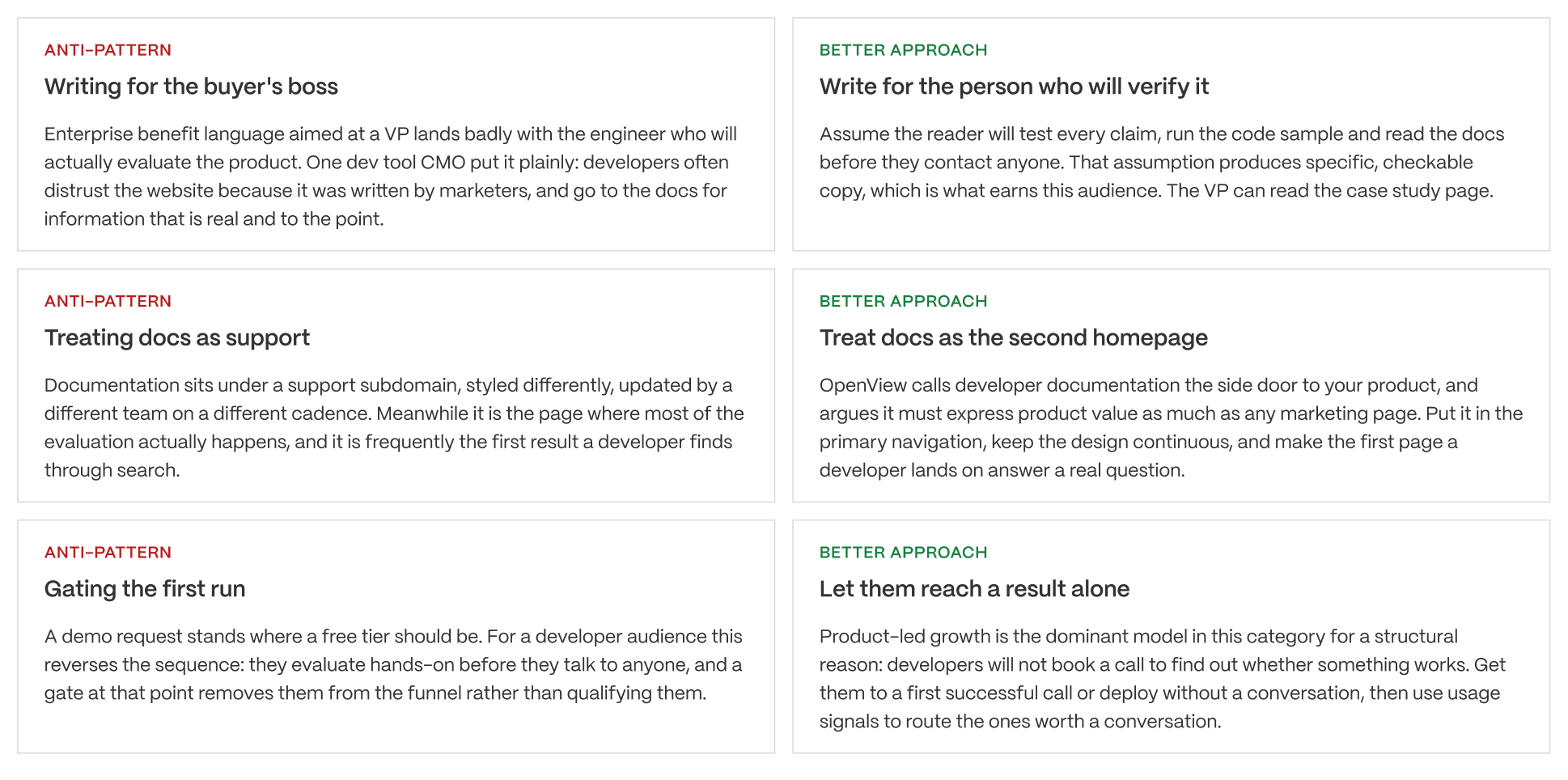
Three show up repeatedly across this category, and they're worth naming plainly rather than dressing up as nuanced trade-offs.
Writing for the buyer's boss instead of the buyer. Copy that talks about ROI and digital transformation on a page a developer is reading first. Wrong reader, wrong page.
Treating docs as support. Covered at length above, but it belongs on this list because it's the anti-pattern most companies already suspect they have and still haven't fixed.
Gating the first run. Requiring a credit card, a sales call, or a lengthy form before a visitor can see the product work. This is the most expensive anti-pattern on the list, not because it's hard to spot, but because fixing it is an organisational problem, not a design change. It usually means sales and product disagreeing about who owns the top of the funnel, and that's why it persists at companies that, on paper, already know better.
Applying This To Your Own Site
Pre-Build Evaluation Checklist
Before a redesign kicks off, run your own site against these ten questions:
- Can a new visitor tell what the product does in one screen?
- Is there a runnable code sample, or a legitimate reason there isn't one (the Linear exception)?
- How many clicks from the homepage nav to real documentation?
- Does the documentation read like the same company wrote the homepage?
- Is pricing published, or gated behind a form?
- How long from signup to a working result, timed, not estimated?
- Does the free tier lead to a real result or a dead-end dashboard?
- Is there an unverifiable superlative in the hero copy that a reader could disprove in five minutes?
- Does the site name what the visitor would stop using if they switched?
- Are two genuine paths (self-serve and sales-assisted) visible without either one being buried?
Six of these ten are technical or structural, not visual, and that's exactly where most devtool redesigns go wrong. The team redesigns the hero and leaves the docs, the signup gate and the pricing page exactly as they were, then wonders why conversion didn't move.
Decision by What You Are Building
DECISION BY WHAT YOU ARE BUILDING
Use this as a starting point, not a binding answer. The five-point framework is the real evaluation tool. The archetype gets you to the right reference sites and the right priorities.
BUILDING 1: AN API DEVELOPERS INTEGRATE
- Profile: the product is an interface, adoption means a working integration
- Reference sites: Stripe, Resend, Clerk, Twilio
- What to optimise first: time from landing to a working code sample in their language
- Why: this audience evaluates by trying. Resend puts a live code snippet with more than ten SDK tabs on the homepage and interactive send and webhook demos beneath it. That is not decoration, it is the sales process compressed into a page.
The verdict: the code block is the hero. Everything else supports it.
BUILDING 2: INFRASTRUCTURE THAT REPLACES SOMETHING
- Profile: the buyer already operates something and would be switching
- Reference sites: Vercel, Railway, Render, Neon, Supabase, PlanetScale
- What to optimise first: naming what you replace, then teaching the primitive that makes you different
- Why: Supabase positions as the open-source Firebase alternative and the entire evaluation shortens. PlanetScale teaches database branching and deploy requests until the concept lands. Railway leads on the deploy being simple. In each case the site is teaching, not persuading.
The verdict: name the incumbent, teach the difference, prove it with a free tier that reaches a real deployment.
BUILDING 3: A WORKFLOW TOOL FOR ENGINEERING TEAMS
- Profile: the buyer is a team choosing how it works, not a developer integrating an API
- Reference sites: Linear, Postman, Sentry
- What to optimise first: showing the product working, and the craft of the site itself
- Why: Linear is the instructive case. There is no code block on the homepage because there does not need to be. The product interface is the proof and the polish of the site is an argument about the polish of the product. Sentry does something different and equally effective by carrying a distinctive voice that reads as written by engineers.
The verdict: for this archetype the site's own craft is a product claim, which is rarely true elsewhere.
BUILDING 4: A PLATFORM SERVING TWO MOTIONS
- Profile: self-serve developers and enterprise procurement on the same site
- Reference sites: MongoDB, Postman, Twilio, Vercel
- What to optimise first: two genuine paths from the hero, with neither buried
- Why: the failure mode is a site that says free tier and delivers a demo request, or one that buries enterprise proof so far down that procurement leaves. MongoDB runs Start Free alongside Talk to Sales and means both. Postman goes further and publishes an agent-readable markdown version of its homepage, which is worth noting as an early signal of where this is heading.
The verdict: two audiences, two paths, one site. Neither path is a consolation prize.
CROSS-ARCHETYPE: THE DOCUMENTATION QUESTION
- Profile: all four
- What to optimise: the distance and the continuity between marketing site and docs
- Why: this is the single most under-treated surface in devtool web design. Documentation is where the evaluation happens, it is frequently the first page a developer reaches through search, and it is usually owned by a different team on a different cadence with a different design. The gap between the two is visible and it costs trust.
The verdict: if you only fix one thing after reading this, make the docs feel like the same company built them.
PRINCIPLE
Most articles in this category are galleries, and a gallery answers the wrong question. What makes these sites work is not that they look good, though several do. It is that they respect an audience which evaluates by trying rather than by reading, verifies every claim, and reaches documentation before it reaches a salesperson. Design for that sequence and the aesthetics follow. Design for the screenshot and you get a site that wins awards and converts nobody.
If you're building an API reference product, lead with code, in multiple languages if you can support it, and put docs in primary nav from day one.
If you're building infrastructure, teach the hard concept your product depends on (branching, scale-to-zero, whatever it is) rather than rushing past it, and be explicit about what a switcher leaves behind.
If you're building a workflow tool, the site's own craft is part of the pitch, and a code block may be the wrong move entirely. Judge this by your buyer, not by what the API reference companies are doing.
If you're running a dual-motion site, build two real paths and test that neither one is a decoy. A free tier button that leads to a demo request form is worse than not offering a free tier at all, because it reads as bait.
Across all four: if you only change one thing after reading this, make the docs feel like the same company built them as the marketing site. It's the highest-leverage fix on this list and the one most teams keep deferring.
What To Do First
Skip the summary. Do this instead, this week:
Identify which of the four archetypes you are, not which one you wish you were. Time your own path from landing page to a working first result and write the number down, don't estimate it. Open your homepage and your docs in two tabs and read them back to back. Count the clicks from your hero to an answered implementation question.
Check SaaS landing page examples for tips on how to reduce the distance between the claim and the next action.
Fix whichever of those four is worst before you touch a single visual element.
The sites in this article don't convert because they look good, though several genuinely do. They convert because they respect an audience that evaluates by trying, verifies every claim before acting on it, and reaches documentation before it reaches a salesperson.
Design for that sequence and the aesthetics tend to follow on their own. Design for the screenshot instead, and you end up with a site that wins design awards and converts nobody. If your own devtool site needs that kind of rebuild, Veza's web design team works with technical-buyer companies on exactly this problem.
A developer will judge your site in ten seconds and your docs in ten minutes.
Most devtool site redesigns fix the hero and leave everything that decides the outcome untouched. The docs still look like a different company built them. The free tier is still a demo request in disguise. The code sample still doesn't run as written.
We design and build sites for companies selling to technical buyers, which means treating documentation, onboarding and the marketing site as one system instead of three separate projects. If your traffic is fine and your signups aren't, that's usually where the problem lives.
FAQs
What makes a good developer tool website?
One that supports how developers actually evaluate: hero, code sample, documentation, working result, usually before speaking to anyone. The strongest sites in this category put runnable code on the homepage, documentation in primary navigation, and a free tier that reaches a real deployment rather than a demo request.
Should we put code on our homepage?
Almost always, in the language your buyers use, producing a visible result. Resend runs a live snippet with more than ten SDK tabs. The exception is when your buyer is an engineering team choosing a workflow rather than a developer integrating an API, which is why Linear shows product interface instead.
How important is documentation to conversion?
It is frequently where the decision is made. OpenView calls developer documentation the side door to your product and argues it must express product value as much as any marketing page. Docs are often the second page a developer opens, the first they trust, and a significant organic discovery surface in their own right.
Do developers really dislike marketing language?
They discount it, which is different and more damaging. A developer can usually verify a claim within minutes by running the code or reading the changelog, so an unverifiable superlative costs credibility rather than adding persuasion. Write copy that assumes the reader will test it.
Should we publish pricing?
Yes. Every site in our example set does. For a developer audience hidden pricing signals who the product is for and the conclusion gets drawn quickly. If your pricing is genuinely usage-based and complex, publish the model and a calculator rather than nothing at all.
Do we need a free tier?
For a developer audience it is close to mandatory, because developers will not book a call to find out whether something works. Treat it as the top of the funnel rather than a pricing decision, and aim for a meaningful result such as a first successful call within about ten minutes.
How do we serve both developers and enterprise buyers?
Two genuine paths from the hero with neither buried. MongoDB runs Start Free alongside Talk to Sales and means both. The failure mode is a site advertising a free tier that delivers a demo request, or one burying compliance proof so deep that procurement leaves before finding it.
What is the most common mistake?
Treating documentation as support rather than as the second homepage. Docs sit on a subdomain, styled differently, owned by a different team on a different cadence, while a developer reads them alongside the marketing site as one document. The seam is visible and it costs trust.
How many examples should we study?
Two or three from your own archetype, properly. Comparing an API reference site to a workflow tool produces a verdict that helps nobody, because they solve different problems. Identify which of the four archetypes you are building before deciding what to copy.
How do we know if our site is working?
Time your own path from landing to first working result and write the number down. Then count the clicks from your hero to an answered implementation question. Those two numbers tell you more about developer conversion than any heatmap, and most teams have never measured either.