.jpeg)
In 2026, SaaS case studies should be considered business tools, rather than simply promotional materials.
By focusing solely on storytelling or page views, SaaS teams miss the opportunity to generate revenue from their case studies. However, using case studies as decision-making tools, SaaS teams can create an environment that converts many visitors into demos.
The purpose of this guide is to show a new way to make case studies work for you. We also introduce a five-pillar design template for creating them:
- Hero Data Density: Display the large results of the customer immediately above the fold.
- Narrative Compression: Use brief and easily scanned language to present the customer's problem, solution and results.
- Trust Cascade Architecture: Organize trust-based information so that it creates credibility with the users as they scroll through the document.
- Conversion Path Design: Position calls-to-action in locations within the case study that align with the user's intent to move forward.
- Post-Consumption Continuity: Clearly outline the next steps in the process after consuming the case study to maintain momentum.
Additionally, we break down the four types of case studies used by eight top companies, including Salesforce, Snowflake and Notion. We also include a 10-question audit tool to help you improve your current case study library.
What Separates High-Converting SaaS Case Study Pages in 2026
The Strategic Mistake Most SaaS Companies Make
Many SaaS marketers treat their case study landing pages as blog posts. This means hiring a content writer, developing a story arc and measuring the effectiveness of the case study landing page based upon traffic and dwell time. The way in which most SaaS marketers develop their case studies optimizes for the wrong KPIs.
When a potential buyer visits your case study, they are likely near the end of their purchasing cycle. In fact, according to Wynter’s B2B buyers research, when a buyer has narrowed down their choice, 90% of them are reviewing no more than two vendors. At this point in the buying process, the buyer already understands how your product category works. Now all they need to know is whether your particular vendor can deliver results for companies similar to theirs.
Story first design delays that answer. The first part of story first design is company background. As you read through this section, tension will build. At the end of the section will be the results. A busy buyer with three tabs open does not have time for all of that. Good design puts the answer first and then gives the customer a reason to go deeper.
This is the same discipline that governs the broader B2B SaaS website architecture that surrounds a case study library. A case study page is not an island. It’s one very important stop along the way of a larger website architecture, including your home page, price page and demo page. It must do its job and contribute to your overall website conversion rate.
According to Wynter's research, positive word of mouth causes buyers to include vendors into their initial short list and regularly cross-reference sites to compare the information.
When a buyer arrives at your case studies they have most likely already reviewed your company on G2.com. Therefore, they are not looking for credibility proof, but for a verification or denial of what they previously thought.
The Reframe: Pipeline Instrument, Not Marketing Collateral
While both use terms such as testimonials, case studies, and ROI, the two types of marketing materials have different choices on how to lay out each term.
The columns represent the decisions a designer or content person makes when developing an instrument for their sales pipeline. When a company decides to copy the default design options for its marketing collateral, it will create a page that looks great and is bad at converting visitors into buyers. This is because the design options are designed to capture the user's attention versus drive them through the decision process.
The Five Pillars Every High-Converting Case Study Page Needs
Five design pillars separate pipeline-instrument pages from marketing collateral. Each gets full treatment in the sections that follow, but here is the short version.
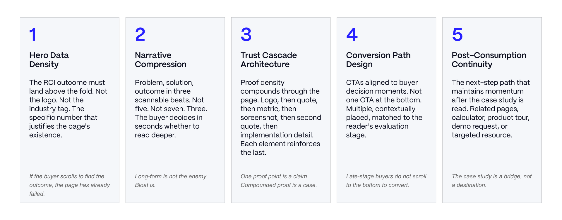
- Hero Data Density presents the outcome, the customer, and the context on the first screen a visitor views.
- Narrative Compression limits a buyer to reading the story in less than one minute by limiting it to three beats.
- The trust cascade architecture layers evidence (testimonial, logo, analyst quote, certification etc.) for credibility to build over time vs. sit flat.
- Conversion path design positions CTAs at points when a buyer is most likely to take action, rather than just at the bottom of the page.
- Post-consumption continuity provides the reader with a next-step option rather than leaving them at a dead-end.
These pillars are the same discipline Veza applies when we architect SaaS websites for pipeline: design decisions get made against buyer behavior, not against what looks good in a design review.
If your team is scoping a case study page rebuild and wants a second set of eyes on the architecture, that is a conversation worth having before the first wireframe.
Page Architecture and Hero Design
Hero Data Density: The ROI Moment Above the Fold
The hero section is the first, and often the only, chance to answer a buyer's gating question. A high-converting hero leads with a specific, quantified outcome (a percentage, a dollar figure, a time saved), the customer's logo, and a one-line context frame that tells the reader who this company is and why the comparison matters to them.
A marketing-collateral hero leads with company background or industry scene-setting instead. That approach asks the buyer to invest attention before they know whether the payoff is relevant.
The anatomy of a strong hero is short: outcome stat, logo, one line of context, and a primary CTA. Nothing else needs to compete for that space. This is the same logic that governs SaaS homepage design: the first screen has one job, and every element that doesn't serve that job is a tax on conversion.
Narrative Compression: Three Scannable Beats
High-converting case study pages compress the story to three beats: problem, solution, outcome. Not five. Not seven. Buyers evaluating three vendors in a short window cannot hold a five-beat narrative in working memory, and they will not try.
Each beat gets its own heading and takes 30 to 60 seconds to read. This does not mean the page has to be short. Long-form content is not the enemy of conversion. Narrative bloat is. An enterprise case study can run past 2,000 words and still respect the three-beat structure if each beat is clearly marked and a reader can skip straight to the outcome.
This is the same principle behind high-converting SaaS landing pages: compression is a design choice, not a length constraint.
A useful test for narrative compression: ask whether someone could screenshot each beat's heading and subhead and understand the shape of the whole story without reading a word of body copy.
If the three headings (problem, solution, outcome) don't tell the story on their own, the compression has failed regardless of how well the paragraphs underneath are written. This is also where most existing case study libraries lose points on audit. Teams that inherit a case study template built for blog-style storytelling tend to bury the outcome in a closing paragraph rather than naming it in a heading, which forces a scanning reader to read the whole page to find the one piece of information they came for.
Results Section Design: Where the Trust Cascade Begins
The results section is the pivot point of the page. Buyers who reach it are engaged enough to be worth converting. Buyers who leave before it were unlikely to convert regardless of what came next.
Results section design should present quantified outcomes with enough context that the number is credible (what was measured, over what period, compared to what baseline), use typography to elevate the most compelling figures, and place a CTA here for readers who are ready to act before finishing the page.
This mirrors the design principles behind high-converting pages more broadly: put the conversion opportunity where the reader's intent peaks, not where the content happens to end.
Trust Cascade: Social Proof and Credibility Architecture
CTA and Conversion Path Design
Above-the-Fold CTA and Mid-Page CTA Placement
High-converting case study pages place CTAs at multiple decision moments, not only at the bottom of the page. An above-the-fold CTA captures buyers who convert on outcome recognition alone. A mid-page CTA at the results section captures buyers who need to see the proof before they act. An end-of-page CTA captures the smaller group who read the full narrative.
This placement logic runs across page types, including SaaS pricing pages, where the same principle applies: a single CTA at the bottom assumes every reader needs the same amount of convincing, and most don't.
Conversion Copy That Ties to Outcomes
Generic CTA copy ("Get a demo," "Contact sales") underperforms copy tied to the outcome shown a moment earlier ("See how you can get similar results," "Talk to a specialist about your use case"). The specificity standard is simple: if the CTA copy could sit on any page on the site, it is too generic for a case study page.
Personalizing CTA copy by industry, company size, or use case takes this further, but even a single outcome-tied CTA outperforms a generic one. This is part of the broader CRO discipline for SaaS that treats every page element as a hypothesis to test rather than a template to fill in. Veza's conversion rate optimization work for SaaS clients starts with exactly this kind of copy audit.
Post-Consumption Continuity
A reader finishes the page. Where does the momentum go? A dead end at the highest-intent moment in the reader's session is a lost opportunity, not a neutral outcome.
Post-consumption continuity means designing the next step deliberately: a related case study from an adjacent industry or company size, an ROI calculator, a demo scheduling widget, or a targeted resource tied to what the reader read.
The natural next step for a reader who has finished reading the proof is often a demo page built for the same buyer profile, and the handoff between the two pages should feel like one continuous path, not two disconnected destinations.
Eight Case Study Page Examples by Archetype
Case study pages are not one-size-fits-all. A page built for a $150K ACV enterprise deal has almost nothing in common, structurally, with a page built for a self-serve PLG signup.
Four archetypes cover most of the SaaS market: Enterprise Deep-Dive (long-form, multi-stakeholder, detailed ROI), Mid-Market Fast-Read (compressed, single decision-maker, outcome-forward), Vertical Specialized (industry-specific credibility markers and metrics), and Interactive Data-Rich (dynamic elements, varied use cases, self-service exploration).
The examples below are current as of publication. Case study page URLs, layouts, and featured customers change frequently, so treat the specific pages referenced here as illustrative of the pattern rather than permanent fixtures. Each is flagged for re-verification before you cite it externally.

Enterprise Deep-Dive Examples
Salesforce (salesforce.com/customer-stories, verify at publication) runs one of the largest enterprise case study libraries in B2B SaaS, organized by industry and use case rather than as a flat list. The design pattern worth studying is the segmentation itself: a buyer in healthcare or financial services can filter to peers instead of wading through unrelated stories. The lesson for smaller teams is that filtering by relevant dimension (industry, company size, use case) does more for conversion than adding more stories to an undifferentiated pile.
Snowflake (snowflake.com/en/customers, verify at publication) leans into data-heavy narrative, which fits a buyer base of technical evaluators and procurement teams who want implementation detail, not only outcome headlines. The page mixes short video-format stories with deeper written case studies, letting a reader choose their depth of engagement. That optionality is the takeaway: enterprise buyers vary widely in how much technical detail they want before a first call, and a single fixed format underserves some share of them either way.
Databricks (databricks.com/customers, verify at publication) organizes its library around technical depth, including implementation specifics and named data platform features used in each engagement. For a technical buyer doing procurement-stage due diligence, this level of specificity does real work: it lets the reader map the case study's technical context onto their own environment, which is closer to what a real evaluation requires than a generic before-and-after story.
Mid-Market Fast-Read Examples
HubSpot (hubspot.com/case-studies, verify at publication) runs a directory-style library with immediate metric callouts (dollar savings, percentage lifts, adoption rates) visible before a reader clicks into any individual story. This is close to a reference implementation of Hero Data Density at scale: every entry point into the library leads with a number, not a headline. The design pattern to borrow, even for a much smaller case study library, is surfacing the outcome metric at the index level, not only on the individual page.
Gong (gong.io/customers, verify at publication; note the URL differs from a generic "customer-stories" path and should be re-checked before publication) leans on bold, outcome-first framing in its customer story index, with headline stats presented as the entry point rather than buried in the story. The pattern fits Gong's buyer profile: revenue leaders evaluating a sales intelligence platform want the proof up front and the narrative as optional supporting detail.
Amplitude (amplitude.com/customers, verify at publication) presents customer proof alongside broader analyst validation (Forrester recognition, benchmark data) on the same page, blending social proof types rather than isolating case studies from other credibility markers. For a product analytics buyer who is evaluating rigor as much as outcomes, mixing quantitative benchmark data into the customer story experience reinforces the vendor's own claim to data-driven credibility.
Vertical Specialized and Interactive Data-Rich Examples
Klaviyo (klaviyo.com/customers, verify at publication) targets the ecommerce vertical specifically, and its customer stories lead with metrics that matter to that buyer: revenue attributed to email and SMS flows, return on ad spend equivalents, and campaign-level lift. The credibility markers are calibrated to the vertical rather than generic. A vertical SaaS team should take the same approach: use the metrics your specific buyer already tracks internally, not generic SaaS metrics that require translation.
Notion (notion.com/customers, verify at publication) mixes long-form enterprise stories (large technical organizations documenting company-wide rollouts) with short, personal-use case studies from individual creators and freelancers, all within the same library. That range reflects Notion's genuinely varied buyer base, and the interactive, exploratory feel of the page (varied formats, varied company sizes, easy browsing) fits a product with a wide range of entry points. The lesson: archetype fit is about matching format to buyer diversity, not about picking the archetype with the most visual polish.
Include the Veza case study library in your own research pass on this topic. It is built on the same pipeline-instrument logic described here, and it is a useful reference point for what archetype fits a Webflow-built SaaS marketing site.
Audit, Anti-Patterns, and Decision by SaaS Profile
The 10-Question Case Study Page Audit
Use this checklist against your existing case study library, not only against new pages in development. Questions 1 through 5 map to the five pillars. Questions 6 through 10 cover fit and specificity issues that cut across all five.
Score one point per "yes." A score below 7 signals a page built on marketing-collateral instincts. A score of 8 to 10 signals a page engineered as a pipeline instrument. Most existing SaaS case study libraries score lower than teams expect on first audit, largely because pillars 4 and 5 (conversion path and continuity) get skipped in the rush to publish the story itself.
Anti-Patterns and Better Approaches
Three failure patterns show up repeatedly across SaaS case study libraries.
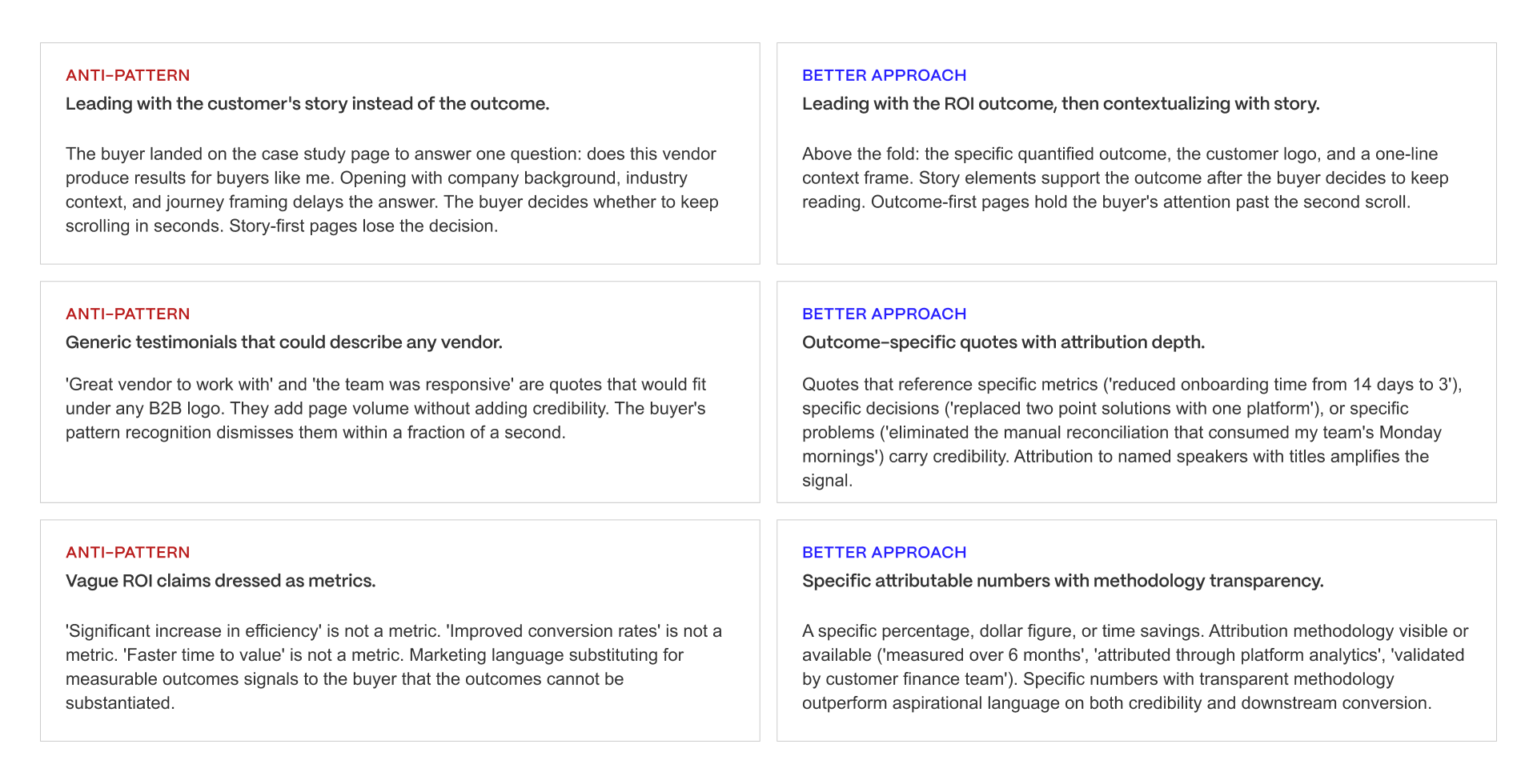
Leading with story instead of outcome. The instinct to build narrative tension (the "before" struggle, the search for a solution, the eventual resolution) comes from good storytelling training, but it fights against how a late-stage buyer reads. The better approach states the outcome first and lets the narrative supply supporting detail for a reader who wants it
Generic testimonials instead of outcome-specific quotes. A quote like "great team to work with" costs nothing to include and adds nothing to the page. The better approach requires more work from the customer marketing team (sourcing a quote with a specific number or decision attached) but does measurably more to reduce buyer risk perception.
Vague ROI instead of specific, attributable metrics. "Significant improvement" or "major time savings" reads as marketing language and gets discounted by a skeptical buyer. A specific figure, with enough methodology transparency to be credible, does not get discounted the same way.
Each anti-pattern persists because it is easier to produce than the alternative. Naming the pattern is the first step toward budgeting the extra time it takes to fix it.
There is a fourth pattern worth naming separately, because it shows up even on pages that avoid the first three: stale case studies left live long after the customer's environment, product usage, or company size has changed. A case study referencing a customer who has since churned, been acquired, or moved to a competitor does more damage than no case study at all if a buyer happens to check.
Auditing for currency, not only for content quality, belongs in the same review cycle as the 10-question checklist above.
Decision by SaaS Profile
Archetype fit depends on deal size, sales motion, and buyer type more than on company size alone.
DECISION BY SAAS PROFILE
Use this as a starting point, not a binding answer. The five-pillar framework
(Asset 1) is the real evaluation. The SaaS profile recommendation gets the
team to the right archetype.
PROFILE 1: ENTERPRISE SAAS ($50K+ ACV, MULTI-STAKEHOLDER BUYING)
- Buyer context: procurement committee with 5-15 stakeholders, evaluation
windows of 3-9 months, RFP-driven, competitive alternatives evaluated
- Case study page job: reduce risk perception at late-stage evaluation
for procurement, finance, and executive sponsors
- Recommended archetype: Enterprise Deep-Dive
- Why: multi-stakeholder buying committees need depth their individual
stakeholders can consume selectively. Executive sponsors read the ROI
summary. Finance reads the implementation timeline. Practitioners read
the technical detail. Deep-dive structure serves the committee's
distributed consumption pattern.
The verdict: build long-form pages with anchor navigation. Prioritize
executive-level ROI framing above the fold. Include detailed implementation
sections that speak to procurement's risk assessment concerns.
PROFILE 2: MID-MARKET SAAS ($5K-$50K ACV, CENTRALIZED BUYING)
- Buyer context: single decision-maker or 2-3 person buying team,
evaluation windows of 2-8 weeks, self-directed research, comparison
shopping across 3-5 alternatives
- Case study page job: rapidly demonstrate that the vendor solves the
buyer's specific problem at scale comparable to the buyer's context
- Recommended archetype: Mid-Market Fast-Read
- Why: single decision-makers evaluate quickly and need speed-to-value
communication. Fast-Read structure delivers the ROI, the problem
recognition moment, and the conversion path in under 3 minutes of
reading time.
The verdict: compress the narrative to three beats. Prioritize above-the-
fold outcome density. Include mid-page CTAs at the results section for
readers who convert without finishing the page.
PROFILE 3: SMB / PLG SAAS (LOWER ACV, SELF-SERVE WITH OUTBOUND ASSIST)
- Buyer context: often the practitioner-buyer is the decision-maker,
trial-driven evaluation, low friction expected, mobile consumption common
- Case study page job: validate the buyer's inclination to trial the
product, provide social proof at the moment of trial-vs-competitor
comparison
- Recommended archetype: hybrid between Mid-Market Fast-Read and
Interactive Data-Rich
- Why: SMB and PLG buyers evaluate at speed and expect self-serve trial
paths. The case study page needs to be brief enough to consume between
other tabs and interactive enough to sustain attention on mobile.
The verdict: keep pages tight, invest in mobile-first responsive design,
and lean CTA path toward trial signup rather than demo scheduling.
PROFILE 4: VERTICAL SAAS (INDUSTRY-SPECIFIC, COMPETING ON DOMAIN EXPERTISE)
- Buyer context: industry buyer expecting vendor to demonstrate category
expertise, evaluating alongside vertical alternatives, compliance and
industry-specific concerns weighted heavily
- Case study page job: prove the vendor understands the industry at a
depth generalist alternatives cannot match
- Recommended archetype: Vertical Specialized
- Why: vertical buyers evaluate on category expertise as much as on
functional capability. Generic case study pages signal that the vendor
treats them as one segment among many. Vertical Specialized pages
signal domain understanding through industry-specific credibility
markers, compliance signals, and outcome metrics that resonate in the
category.
The verdict: build industry-specific case study clusters. Include
compliance markers, industry certifications, and outcome metrics
calibrated to the vertical. Use industry-native language in narrative
framing.
CROSS-PROFILE: WHEN INTERACTIVE DATA-RICH BECOMES THE DIFFERENTIATOR
- Profile: SaaS brands with strong design capability and diverse buyer
personas across enterprise, mid-market, and vertical
- Top constraint: sustaining design and engineering capacity to build and
maintain the interactive layer
- Why: interactive case study pages that personalize by visitor industry,
scroll-trigger proof reveals, or embed dynamic data visualizations
signal design and engineering maturity that competitors cannot match.
The archetype produces material competitive advantage where the brand
can sustain the design investment.
The verdict: only pursue Interactive Data-Rich when the brand has
sustained design and engineering capacity. Half-executed interactive
pages perform worse than well-executed static archetypes.
PRINCIPLE
Case study pages are pipeline instruments, not marketing collateral. The
profile determines the archetype. The archetype determines every downstream
design decision. The SaaS brands whose case study pages convert late-stage
evaluation into scheduled demos at 3-5x baseline rates picked the right
archetype for their profile and executed all five pillars deliberately.
Enterprise SaaS ($50K+ ACV): Enterprise Deep-Dive fits best. Multi-stakeholder deals involve procurement, security, and technical evaluators who each need different depth of detail, and a longer page with clear internal navigation serves all of them without forcing a single format.
Mid-Market SaaS ($5K to $50K ACV): Mid-Market Fast-Read fits best. A single decision-maker or small buying committee wants proof in under three minutes, and a compressed, outcome-forward page respects that constraint.
SMB and PLG SaaS: A lighter version of Mid-Market Fast-Read, often paired with Interactive Data-Rich elements (short video, quick-hit stats) that fit a self-serve buyer moving quickly through a trial-to-paid decision without a sales conversation.
Vertical SaaS: Vertical Specialized fits regardless of deal size, because the credibility markers that matter (industry-specific metrics, compliance relevant to that sector) outweigh generic company-size logic.
Cross-profile case: Interactive Data-Rich works as a secondary layer for any profile with a genuinely varied buyer base, where a single fixed archetype would underserve some segment of readers.
The design decisions across all five pillars are what separate a pipeline instrument from marketing collateral. Getting the archetype fit right first makes every decision after it easier. If your case study library is scoring below 7 on the audit above, that is worth a conversation.
The strongest SaaS case study pages in 2026 execute all five pillars deliberately: hero data density that answers the buyer's gating question above the fold, narrative compression that respects the reader's evaluation window, trust cascade architecture that compounds proof density through the page, conversion path design that meets buyers at every decision moment, and post-consumption continuity that maintains momentum after the read.
Veza Digital architects case study pages as strategic assets for B2B SaaS growth. If your case study library is scoring below 7 on the audit framework above, we should talk.
See how we architect case study pages that drive the pipeline
Talk to our team
Verification note: This article was fact-checked and all referenced brand case study page URLs were confirmed live as of July 10, 2026. Brand case study libraries, page layouts, featured customers, and URLs change frequently and without notice, and are outside Veza Digital's control. Statistics attributed to Wynter and HubSpot reflect the specific published research cited at the time of writing. Readers should independently re-verify any brand-specific page reference, statistic, or URL before citing it externally or relying on it for a live campaign.