.jpeg)
The fintech industry builds financial software, handles payments, and manages banking behind the scenes. Unlike other industries, fintech deals with delicate things and its success depends mostly on how trustworthy the company appears. Even if the design is a key component of building trust, it’s not the primary way of getting people to buy your product.
This article analyzes ten best fintech websites - we highlight what they do, what’s the smartest thing about their digital approach, and who should apply the same principles to their fintech website.
Why Fintech Design Is Not Just SaaS Design
The Trust Burden Is Structural
Fintech is acting differently than most SaaS companies. Let’s use an example to illustrate this fact.
Imagine two different companies selling products online. One sells project management software, the other is responsible for someone’s money. If you pick the wrong project management tool, the worst thing that can happen is wasting time and money. The risks are different from those discussed in our guide to B2B SaaS websites worth studying, because fintech products often involve money, regulation, and customer data.
But if you choose the wrong fintech software, you could break rules you didn’t know existed, or put customer money at risk. This example shows that the fintech industry brings higher risks, and the main task for their website is to gain trust, rather than just look nice.
Baymard Institute, who study online shopping habits, found some interesting facts that support this example. In February 2024, they found that about 18 to 19% of users leave a website without buying anything. Why? The websites clearly didn’t gain their trust.
They also noticed that adding a small trust symbol, such as a lock icon, makes people feel safer. But adding six or more trust symbols makes the company look suspicious.
Note: This research was done on regular online stores, not fintech companies specifically. This research is used as a helpful tip rather than an exact rule.
Two People Are Reading The Same Page
.avif)
Once the fintech company starts selling its product, it usually has a defined target audience. But what most fintech companies get wrong is that there are two sides of the coin. There are two different visitors on the same fintech website that show up at the exact same time.
One visitor is a developer, an experienced person who writes code and wants to know how to connect the software to their own product. The other visitor is a compliance officer, a person looking for proof that the company follows financial laws and regulations.
Both visitors want different things from the same page. The same dual-audience problem appears in HR tech website design, where different stakeholders evaluate the same product based on their own requirements.
Plaid does a great job with this. Plaid helps apps connect to people's bank accounts. Their website uses simple diagrams to explain how information moves between systems. A technical person looking at the diagram sees how it works. A non-technical person looking at the same diagram understands the general idea. Nobody gets left out, and nobody is forced onto a separate, boring page just because they're not a coder.
Ten B2B Fintech Sites Worth Studying
Quick note: These ten companies are listed in alphabetical order, not ranked from best to worst. We're not saying one is better than another. We're just showing ten good examples.
Payments And Money Movement
Adyen
Adyen helps big companies accept payments. Here's the interesting part: you can't see their prices anywhere on the website. That's on purpose. Their customers are large businesses who need to talk to a salesperson before getting a price, kind of like buying a custom car instead of one off the lot. This only works if your business does need a conversation before pricing makes sense.
Airwallex
Airwallex helps businesses send and receive money across different countries. As of April 2026, the company was worth around $8 billion, with about $1.3 billion a year in revenue (those numbers change often, so always double check them before repeating them). What we liked about their website is how clearly it splits information for two kinds of customers: technical teams who want to build with their tools, and regular business owners who just want banking services. Neither group feels ignored.
Column
Column is an actual licensed bank, but it's built specifically for software developers, not everyday customers. It doesn't rely on outside investors for funding. Big companies like Brex and Mercury quietly use Column behind the scenes. Instead of a flashy homepage with videos, their website leads straight into technical documentation, basically an instruction manual for developers. That's not laziness. It's because their actual customers want to read instructions, not watch a commercial.
Modern Treasury
Modern Treasury helps companies manage and track payments. What stands out is that their website explains exactly what they do, in plain words, instead of vague marketing phrases like "streamline your finances." If you're building a website for technical customers, saying exactly what your product does, clearly, is a smart move.
Stripe
Stripe is one of the biggest names in online payments, and we're spending extra time on it because most of this industry compares itself to Stripe, whether they admit it or not. As of February 24, 2026, Stripe was valued at $159 billion, and in 2025 alone, $1.9 trillion moved through their systems. Those numbers will be outdated soon, so treat them as a snapshot in time, not a permanent fact.
Here's what's worth copying: their instruction pages (called "documentation") include real, working code you can try out immediately, and the examples even use your own test information if you're logged in. They also use one consistent look and feel across their whole website, instructions, and product, so nothing ever feels disconnected. In fact, their instruction pages are the second most-visited part of their entire website, right after the homepage. We'll explain later why that matters so much.
Identity, Fraud, And Compliance
Alloy
Alloy helps banks and fintech companies figure out if someone is who they say they are, which helps prevent fraud. Instead of just showing security badges (which almost every company shows), their website lists over 900 real banks and financial companies that use their product. That's a much harder thing to fake than a badge, and it's a smart way to build trust.
Brex
Brex offers business banking and expense management tools. We're spending extra time here because their website does two hard things well at once: it looks polished and professional, and it clearly explains a tricky legal requirement we'll cover in the next section. Their site is also split into different paths depending on who's visiting, whether you're a small startup, a mid-sized business, or a large company, so everyone sees information relevant to them.
Persona
Persona helps companies verify people's identities online. Their website makes it clear that their tool is flexible and can be customized, not a rigid one-size-fits-all system. That matters to technical buyers who don't want to be forced into someone else's rules.
Plaid
Beyond the diagrams we mentioned earlier, Plaid's website does something smart: it clearly separates "here's what we do" from "here's how we handle your data," instead of mixing the two together in a way that leaves people with unanswered questions.
Sardine
Sardine helps companies catch fraud before it happens. Instead of vague phrases like "advanced risk detection," their website names specific types of fraud they catch. Being specific like this is rare in this industry, and it's a good example to follow.
The Disclosure Nobody Designs For
The Not-A-Bank Line
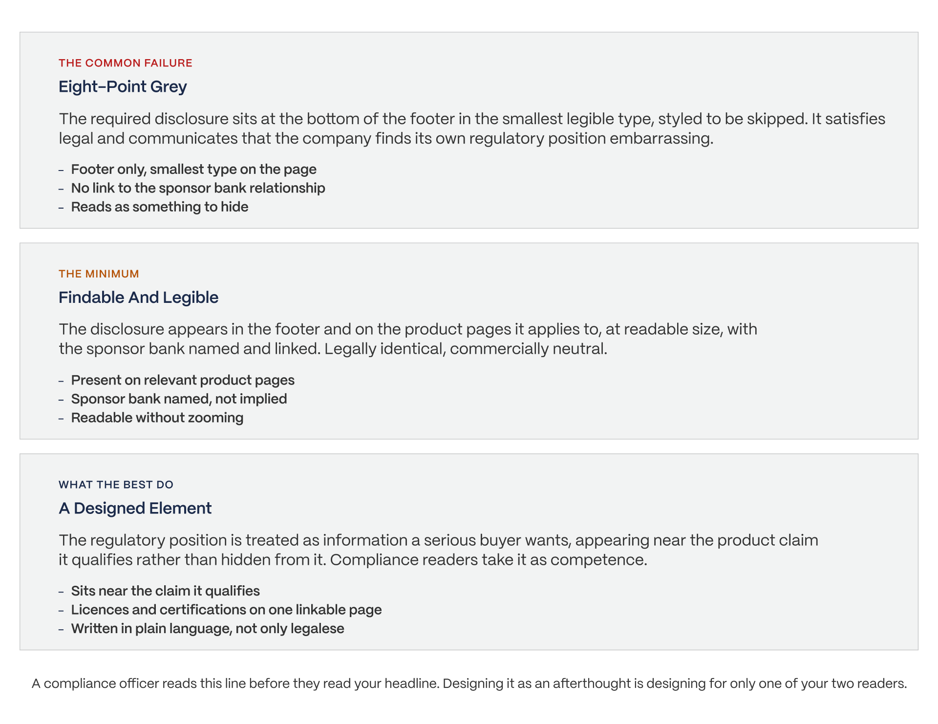
This next part is the most unique section in this whole article, so let's slow down and explain it carefully.
Most fintech companies are not actual banks. By law, they have to say so clearly somewhere on their website. Here's exactly how Brex writes theirs, word for word, because the exact wording matters: "Brex is a financial technology company, not a bank. The Brex business account consists of Checking, a commercial checking account provided by Column N.A., Member FDIC, and Treasury and Vault, cash management services provided by Brex Treasury LLC, Member FINRA/SIPC."
In plain terms, this means Brex itself isn't a bank, but they partner with real, government-regulated banks to hold and protect customer money. FDIC and FINRA/SIPC are official U.S. organizations that protect customers if a bank or financial company fails.
Here's the problem: that sentence is required by law, it's a little awkward to read, and most companies bury it in tiny gray text at the very bottom of the page, almost like they're embarrassed by it. Similar trust challenges also appear in health tech website design.
But the companies that handle it well do the opposite. They treat that sentence as useful information, not something to hide, because the person reading it carefully, like a compliance officer, isn't looking for a reason to leave. They're looking for proof the company understands its own rules.
Where Badges Actually Belong
You've probably seen little badges on websites like "SOC 2," "PCI DSS," or "ISO 27001." These are official certifications proving a company follows strict security and privacy standards.
Instead of scattering these badges across every single page, the smartest approach is putting them all on one clear "trust" page that a company can point a nervous customer to directly.
Remember that research from earlier: one badge builds trust, but six or more badges can make people suspicious instead.
Pricing matters here too.
In an industry built on trust, hiding your prices can hurt you, because it makes people wonder what else you're hiding. Our guide to SaaS pricing page examples looks at different approaches to pricing communication. Adyen, mentioned earlier, is the one exception that makes sense, because their business truly does require a real conversation before pricing.
Documentation Is A Conversion Surface
The Stripe Evidence
We promised we'd explain this. For a company like Stripe, their instruction pages (documentation) aren't just extra help for existing customers. They're often the very first thing new visitors look at. In fact, those pages are the second most-visited part of the entire website, right after the homepage. That means for a lot of visitors, the instructions basically are the website.
Smart things worth copying: real, working code examples instead of fake sample code. Instructions that use your own personal test information once you're logged in. Most importantly, one consistent look across the whole website, so moving from "learning about the product" to "actually using the product" feels smooth, not like jumping to a totally different company.
What To Copy, And What Not To
Copy this: Instructions that are easy to find, no sign-up wall blocking access to them, real working examples, and one consistent design throughout.
Don't try to copy this: Stripe's massive amount of documentation as your starting goal. It took them roughly ten years and a huge team to build all of that. A shorter, simple, correct set of instructions beats an ambitious one that's outdated and confusing, every time. Our guide to devtool website design covers a similar documentation challenge for technical products.
What To Take Away
The Patterns Worth Stealing
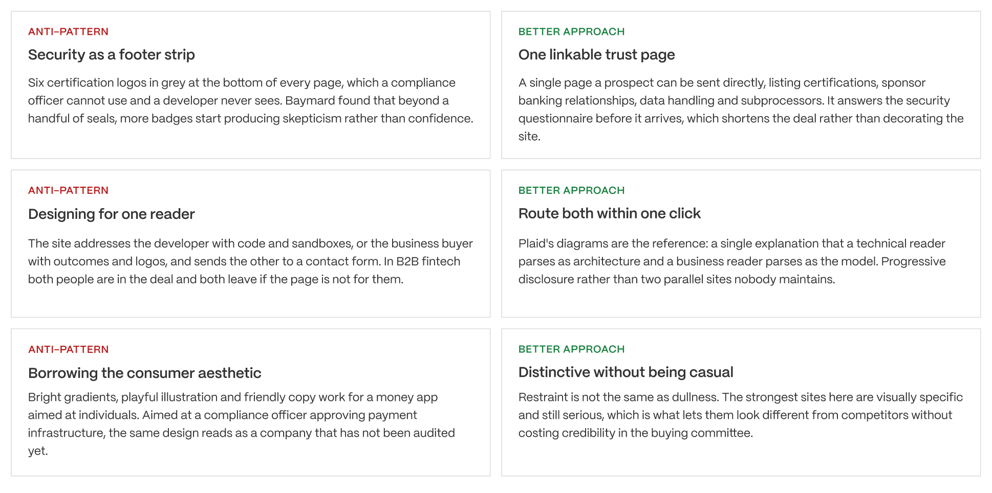
The same principles apply to SaaS homepage design: clear messaging, a defined audience, and a page structure that helps visitors find the information they need.
What Not To Copy
There are two things to avoid.
First, don't copy the fun, colorful style you see in everyday banking apps. That playful look works great for a regular person managing their personal money, but it can make a business look unserious to someone evaluating you for a big financial decision.
Second, be careful about jumping on the trend of building special pages for "AI agents." We cover this more in our B2B landing page examples guide. It's still very new, mostly unproven, and not a good enough reason to rebuild a website that's already working well.
Closing
The legal disclaimer is the first thing a careful reader looks for.
Every company on this list solved the same tricky problem: two very different people, looking at the same webpage, and either one of them can stop a deal from happening. The companies that handled it best didn't hide their legal information in tiny print. They treated it as something worth explaining clearly, because a serious customer wants to see it.
We help build websites for companies in trust-sensitive industries like this one, which usually means answering the hard questions before anyone even has to ask them. Our web design services focus on answering the hard questions before anyone even has to ask them.
See Our Case Studies - Work With Veza
FAQs
What makes a good fintech website?
It serves two readers at once. A developer evaluating the API in ten minutes and a compliance officer evaluating the regulatory position over six weeks. Sites that design for only one of them lose deals at the stage where the other gets involved.
How is fintech web design different from SaaS web design?
The trust burden is structural rather than stylistic. Regulatory disclosure, sponsor banking relationships and certifications have to appear somewhere, and where you put them is a design decision that compliance-literate buyers read as a competence signal.
Where should trust badges go on a fintech website?
On one linkable trust page rather than as a footer strip. Baymard found that adding any security icon raises perceived security, but that six or more seals starts creating skepticism. A page a prospect can be sent directly is more useful than logos on every page.
Do fintech companies need to publish pricing?
Not always, but in a regulated category opacity carries a cost. When a buyer is already assessing risk, hidden pricing reads as something to hide. Adyen is the counter-example: no self-serve pricing, because the enterprise sales motion is genuine rather than concealed.
What is the not-a-bank disclosure?
Most B2B fintechs are technology companies partnered with a chartered bank, and they are required to say so. Brex states it plainly and names Column N.A. as the FDIC member holding checking. Where that line sits on the page is a design decision, not just a legal one.
Should our documentation be part of the marketing site?
For API-first products, yes. On Stripe the docs are the second most-visited destination after the homepage, which means for many visitors the docs are the site. Put them one click from the homepage with no signup wall.