.jpeg)
When you search for "app landing page examples," you likely get the same result on the first page: a gallery of 20+ consumer apps, sorted by how good the screenshots look. This result is fine if you’re building a game or a habit tracker. Not that fine if you run marketing for a B2B SaaS company whose mobile app supports a web product.
The mechanics that determine whether visitors will download your app rarely appear in those galleries. Rather, answering the next questions could bring you closer:
- Will the page know what kind of device the visitor is on?
- Does the campaign click mean something after the app is downloaded?
- Is the page going to load fast enough so the visitor doesn’t give up before taking action?
In this article, we research some of the best app landing page examples for B2B and product-led teams. You will find five current, dated examples categorized based on the task each page performs. Also, we cover conversion mechanics that no other articles on the first page of search results touch.
Why B2B App Landing Pages Are a Different Problem
The Store Listing Is Not a Landing Page
The App Store or Google Play listing is a rigid template, and it’s clear why:
- You don’t control the layout
- You can’t break out segments of it based on your target audience
- You can’t create a custom message for the campaign that drove the click to the listing
You only need to build a landing page when it can perform tasks a fixed listing template can’t.
If your landing page simply replicates everything your store listing said, then your landing page did nothing but add another step to the process of converting a visitor and slow them down rather than move them closer to installing the app. Good web design can make the page easier to understand, but visual quality alone does not solve routing, attribution, install continuity, or load performance.
If you are looking for broader SaaS landing page examples focused on product positioning, messaging, and lead generation, we cover those separately.
Four Archetypes, Not a Ranking
B2B and product lead SaaS companies create app landing pages to solve four different types of problems. It helps to name them before looking at any examples:
#1The companion app page
The mobile app supports a web-based product. The goal is to convince users who currently reviewing your web product to add the mobile app to their phones. This creates a different job from a primary SaaS homepage design, where the page often has to explain the full product and move a visitor toward a broader buying or signup decision.
#2 The product-led growth page
The app is a significant part of the product or the product itself. The purpose of the page is to convert a visitor into an enrolled user, typically without any sales conversations in between.
#3 The enterprise credibility page
The buyer is not the end-user. This page has a clear goal: to provide security and deployment answers/concerns to IT and procurement departments before anyone installs anything.
#4 The campaign page
This page is for a single channel or promotion. The purpose of the page is to connect one message with one audience for a set amount of time.
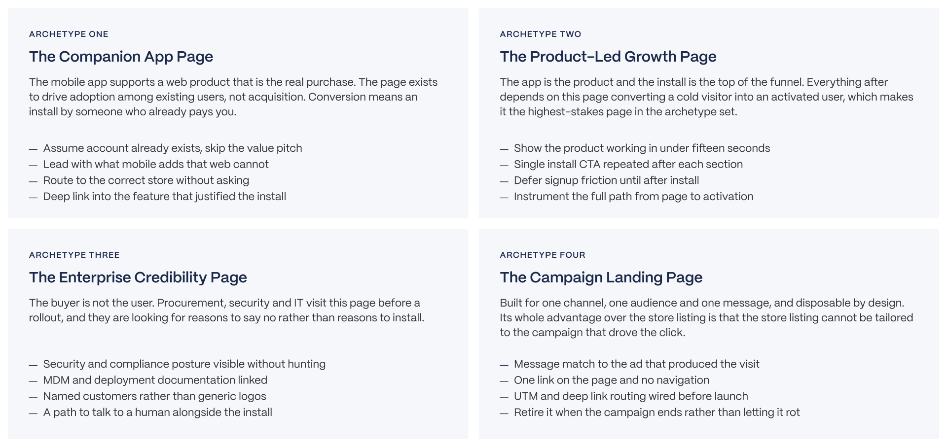
Four archetypes mentioned solve different problems, the key is how you use them. If you’re ranking them against each other, which is what most of the roundups do, it produces a verdict that won’t get you anywhere. Instead, all of them should be treated separately.
This matters because the patterns that work across strong B2B SaaS websites do not always translate directly to an app landing page with a single install or activation goal.
The Five-Point Framework
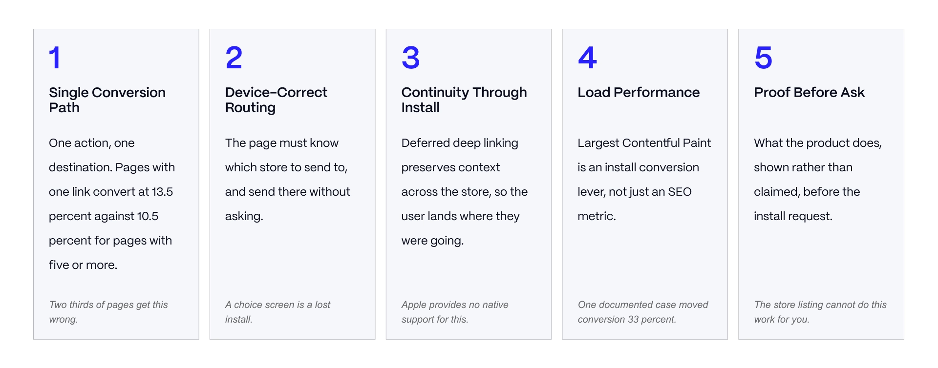
All examples we used in this article were evaluated utilizing the following five points:
- Single conversion path - A single, clear action, rather than several competing for attention.
- Device-correct routing - The visitor sees the install path that matches their device, not every option at once.
- Continuity through install - Whatever brought the visitor to the page (a campaign, a specific feature, a referral) should still be there after they install the app.
- Load performance - The page loads fast enough on a real mobile connection to not lose the visitor before they act.
- Proof before ask - The page gives the visitor a reason to trust the product before it asks them to install anything.
Of these five points, four are technical. not visual. This is precisely why design-driven roundups overlook them.
The Examples
How These Were Selected and Verified
This is worth noting because most articles fail in this step. Each example we used here was manually visited and verified on the date of writing.
When selecting examples, we prioritized companies that have both a B2B or product-based customer base. Also, we checked companies that have some sort of visibility within the app stores, regardless of how visually appealing those pages are. If there is a strong example coming from a company whose primary focus is on customers, then that is explicitly stated.
What the Comparison Actually Shows
Instead of forcing all examples into a similar checklist format, we have identified structural methods used to compare the installation/download pages.
There were two different ways. Some companies split their download experience, giving both iOS and Android their own dedicated page. Others used another method and let the visitor pick from the same page. Even if neither approach is wrong, both create different visitor experiences, and it’s worth deciding which one is better for your case.
Five Examples, By Archetype
Slack
Slack, like many companies operating today, supports different products for each major mobile and PC operating system. Therefore, Slack maintains separate download pages for users running the iOS version of the app and those running the Android version. Each of these individual pages is located at unique URLs. This means that other companies may provide a single download page that allows users to select their desired platform on downloading.
- What it does well: the page commits to one platform per URL, so there is no decision for the visitor to make about which badge applies to them.
- What it leaves on the table: the page offers no path forward for a visitor who lands there without already knowing they want Slack. It is built purely for an existing or referred user, which fits the companion app archetype but would not work as a stand-alone acquisition page.
Asana
The design employed by Asana, unlike Slack, shows all applicable platforms to a prospective customer at the same time. One page at Asana.com/download includes the badges for Apple iOS, Google Android. Also, Asana links to download desktop versions for both Mac and Windows. asana.com/download shows the iOS badge, the Android badge, and desktop download links for Mac and Windows side by side.
- What it does well: a visitor on any device finds their platform without hunting for it, and the page doubles as a hub for anyone setting up Asana across multiple devices at once, which fits how a team rolls out a tool.
- What it leaves on the table: showing three platforms at once on a single page asks a visitor to self-select, rather than routing them automatically to the option that matches the device they are already on.
Notion
The mobile download page by Notion shows a similar design as Asana. However, Notion also displays another product available for download (Notion Calendar) in addition to showing links for both Apple iOS and Google Android.
- What it does well: for a company selling more than one connected product, this avoids forcing a visitor into a second navigation step to find the companion app.
- What it leaves on the table: putting two separate app downloads on one page adds a second decision, which works against the single-conversion-path principle unless the second product is genuinely something most visitors want at the same time.
Superhuman, product-led growth archetype
Superhuman (acquired by Grammarly in 2025) splits its download experience into three separate destinations: a desktop and browser-extension page, an iPhone-specific page, and an Android-specific page.
- What it does well: this mirrors Slack's platform-split pattern, and for a product where desktop and mobile serve genuinely different use cases (a full inbox workflow versus quick triage on the go), separating them avoids cramming unrelated options onto one page.
- What it leaves on the table: a visitor who does not already know which of the three pages applies to them has to make that decision themselves before they even reach the install step.
1Password, enterprise credibility archetype
1Password is instructive here less for its install page and more for what it puts in front of a security-conscious buyer before that buyer ever reaches an install step. The company operates a public Trust Center that lists its SOC 2 Type II status, its ISO 27001, 27017, 27018, and 27701 certifications, and links directly to its own security documentation and reports.
- What it does well: it answers a procurement or IT reviewer's questions in the same channel where a sales conversation happens, rather than making that reviewer ask for a document separately.
- What it shows for this article: an enterprise credibility page does not need to be flashy. Its job is to be findable and specific.
What Actually Drives Install Conversion
Link Count and the Single Conversion Path
The strongest large-sample evidence available on this question comes from Unbounce's analysis of 18,639 landing pages. Pages with a single link converted at 13.5 percent. Pages with two to four links converted at 11.9 percent. Pages with five or more links converted at 10.5 percent.
Only 14.8 percent of the pages in that sample used a single link. 68.2 percent carried five or more. The implication is direct: roughly two out of three pages in that dataset were structured against their own conversion goal.
Repeating the same install action after each section of a page is not the same thing as adding competing links. The problem is not repetition of one action. The problem is offering the visitor several different actions to choose between.
Navigation Removal, With Honest Numbers
VWO ran a case study on Yuppiechef where removing the site navigation from a page moved conversion from 3 percent to 6 percent, a doubling. That is a real, independently reported result.
HubSpot ran its own multi-page test on the same idea and found smaller, funnel-dependent results: 0 to 4 percent gains on top-of-funnel pages, and 16 to 28 percent gains on mid-funnel pages.
Present both of these honestly rather than picking the more dramatic one. A doubling is a result from one specific test, not a rule you can bank on for every page. Treating a single case study as a universal law is exactly how this category's advice became unreliable in the first place.
Video, and the Claim You Should Stop Repeating
A figure claiming that adding video lifts conversion by roughly eighty percent appears across almost every article on this topic. It traces back to a single pre-2020 test run by EyeView Digital, on one education-sector landing page. It is not a general rule, and it was never meant to be treated as one.
Current results on video range from a ten percent decline to a doubling, depending on the type of video and where it sits on the page. One Unbounce and Vidyard case study using a lightbox video moved conversion from 6.5 percent to 13 percent, a genuine and useful result, but a different result from the eighty percent figure, from different conditions, and not interchangeable with it.
Takeaway: a short demo showing the product actually working is usually worth testing, because it does something copy cannot do as efficiently, which is prove the product works. Include it because it does that job, not because a decade-old study promises a specific lift. Test it on your own page and measure what you get. The same principle applies to demo page design: the visitor should be able to see how the product works rather than relying entirely on marketing copy.
The Technical Layer Nobody Covers
Smart App Banners and What They Do Not Do
Apple's Smart App Banner is controlled by an apple-itunes-app meta tag and works only in Safari on iOS. According to Apple's own documentation, it opens either the App Store listing or the app itself if it is already installed, switching its button text from "View" to "Open" once the app is present on the device.
That is the entire scope of what it does. It provides no deferred deep linking, meaning it cannot carry campaign context through the install process, and it provides no built-in analytics.
The practical consequence: teams frequently assume the smart banner covers deep linking because it sits in the same conceptual space. It does not.
This gap usually gets discovered only after a campaign has already underperformed and someone goes looking for why.
Deferred Deep Linking
This is the single most useful section in this article, because it is a gap the rest of the SERP leaves completely open.
Deferred deep linking preserves context through the install process, so a visitor who clicks a specific campaign link lands on the relevant content inside the app after installing it, rather than landing on a generic home screen. Apple provides no official support for this, and there is no industry standard covering it.
Third-party attribution SDKs fill this gap. Branch, Adjust TrueLink, and AppsFlyer each provide cross-platform banners with tracking and deferred deep linking built in.
Without this in place, two things break at once. Campaign context gets lost at exactly the moment the visitor was most engaged, right after they took the action you asked for. And attribution becomes unreliable, because you can no longer connect an install back to the specific campaign that produced it.
Conversion work like this is what Veza does for B2B SaaS marketing teams. See our approach to conversion rate optimization.
Load Performance as a Conversion Lever
The strongest independent evidence in this entire article comes from Google's own published Core Web Vitals case studies.
Rakuten 24 improved its conversion rate by 33.13 percent and its revenue per visitor by 53.37 percent through Largest Contentful Paint (LCP) optimization. Vodafone Italy gained 8 percent in sales from a 31 percent improvement in LCP.
Treat Core Web Vitals as an install conversion lever, not just an SEO metric. In practice, that means measuring your page load on a throttled mobile connection rather than your office wifi, lazy-loading any hero video instead of loading it upfront, and keeping the assets above the fold lean.
Building and Instrumenting the Page
Device Detection and Routing
Presenting both an App Store badge and a Google Play badge to a visitor whose device you can already detect adds a decision at the exact moment you are asking for an install.
Serve the one primary action that matches the visitor's actual device, and keep the alternative available but secondary rather than equally weighted.
Desktop visitors need a different path entirely, since neither badge applies to them directly. The common solutions are a link to send the install link to a phone, or a QR code the visitor can scan. Getting this edge case wrong, meaning showing a desktop visitor two mobile store badges with no other option, is a common and avoidable mistake.
Tracking, Wired Before Launch
UTM parameters, deep link routing, and post-install event tracking need to be in place before your first campaign runs, not added afterward. If they are missing at launch, that first campaign's data becomes unusable, because you cannot retroactively attribute installs you did not track at the time.
A useful test before any campaign goes live: run one install yourself, end to end, and confirm the full event chain from the initial click through install to the first meaningful in-app action is intact.
Install count on its own is a vanity metric for a product-led growth product. Activation, meaning whether the person who installed did the thing that makes the product useful to them, is the number that matters.
Testing Discipline
Sequential, single-variable tests produce results you can read and trust. Changing several things on a page at once produces a lift (or a drop) that you cannot attribute to any one change and cannot reliably repeat. That is how teams end up relying on folk wisdom instead of evidence.
A useful diagnostic question for any team running these pages: did your last three changes to this page ship together? If so, do you actually know which one worked?
Choosing Your Approach
Pre-Launch Evaluation Checklist
Before a campaign sends real traffic to an app landing page, run through this checklist. Several of these items are technical checks that most teams only discover they missed after a campaign has already underperformed, which is the most expensive time to find them.
Anti-Patterns
Watch for these mistakes, all of which show up repeatedly across the SERP for this topic:
.png)
The page that just repeats the store listing. If the page adds nothing the listing does not already say, it is adding a step without adding value.
Showing both store badges regardless of device. This forces a decision the visitor should not have to make, and it is avoidable with basic device detection.
Citing the eighty percent video lift figure. This figure appears in most competing roundups on this topic, which says more about how carefully those articles were researched than it says about video's actual effect on conversion.
Decision by Archetype
A landing page earns its place only when it does something the app store listing structurally cannot do. Before copying a reference page from this article or anywhere else, decide which of the four archetypes you are building.
A companion app page, a product-led growth page, an enterprise credibility page, and a campaign page each solve a different problem, and the reference page that works for one will not automatically work for another.
DECISION BY ARCHETYPE
Use this as a starting point, not a binding answer. The five-point framework is the real evaluation tool. The archetype gets you to the right reference page and the right priorities.
ARCHETYPE 1: THE COMPANION APP
- Profile: B2B SaaS with a web product and a supporting mobile app
- Top constraints: the visitor is usually already a customer, so acquisition framing wastes the page
- Top priorities: adoption among existing users, deep linking into the feature that justifies the install
- What to optimise first: routing and continuity, not persuasion
- Why: someone who already pays you does not need convincing that the product is good. They need to understand what mobile adds and then get there in one tap. Most companion app pages are written as though the visitor has never heard of the company.
The verdict: cut the value proposition, invest in the deep link.
ARCHETYPE 2: THE PRODUCT-LED GROWTH APP
- Profile: the app is the product and the install is the top of the funnel
- Top constraints: cold traffic, install is the first commitment, activation is the real metric
- Top priorities: showing the product working fast, single install path, minimal friction before install
- What to optimise first: time to comprehension, then load performance
- Why: this is the highest-stakes page in the set because everything downstream depends on it. Show the product doing its job inside fifteen seconds, defer signup until after install, and instrument the whole path from page view to activated user rather than stopping at install count.
The verdict: optimise for activation, not installs. An install that never activates cost you money.
ARCHETYPE 3: THE ENTERPRISE APP
- Profile: B2B app deployed across an organisation rather than adopted individually
- Top constraints: the buyer is not the user, and IT is looking for reasons to decline
- Top priorities: security posture, MDM and deployment documentation, named customers, human contact
- What to optimise first: making the security and deployment answers findable without asking
- Why: procurement, security and IT all visit this page before a rollout, and none of them will install anything. They are evaluating risk. A page built only for the end user fails the audience that actually decides.
The verdict: serve two audiences on one page, and make sure the one that can say no finds its answers first.
ARCHETYPE 4: THE CAMPAIGN PAGE
- Profile: built for one channel, one audience, one message, disposable by design
- Top constraints: message match to the ad, single conversion path, short lifespan
- Top priorities: continuity from ad to page to install, tracking wired before launch
- What to optimise first: message match, then link count
- Why: the entire advantage over sending traffic straight to the store is that the store cannot be tailored to the campaign. If the page does not match the ad that produced the click, that advantage is gone and you have added a step for nothing.
The verdict: one message, one link, no navigation. Retire it when the campaign ends.
PRINCIPLE
The app store listing is a fixed template you do not control, shown to an audience you cannot segment, carrying a message you cannot tailor. A landing page is worth building only where it does something the listing structurally cannot: match a campaign, serve a buyer who is not the user, or carry a narrative the store template forbids. Where it merely restates the listing, it is a step in the funnel rather than a lever on it. Decide which of those you are building before choosing a reference page to copy.
The Page Is the Easy Part. The Mechanics Underneath Are Where Installs Are Won or Lost.
Most app landing pages fail on things that are invisible in a screenshot: a device routing decision the visitor should never have faced, a deep link that drops context at install, a hero video that costs two seconds of load time and returns nothing.
We build conversion-focused pages for B2B SaaS teams and instrument them so you know which change did the work. If your install numbers are not where they should be, we should talk.
Frequently Asked Questions
Do I need a landing page if my app is already in the app store?
Only if the page does something the store listing cannot. The listing is a fixed template with no campaign message match, no audience segmentation and no narrative control. Where you need any of those, a landing page earns its place. Where you would simply restate the listing, it adds a step rather than a lever.
What converts better, app store badges or a direct download button?
For mobile visitors, a single device-detected action outperforms presenting both badges, because you are removing a decision the visitor should not have to make. Keep the alternative available but secondary. Desktop visitors need a different path entirely, usually send to phone or a QR code.
How many CTAs should an app landing page have?
One conversion action, repeated. Unbounce analysis of 18,639 pages found single-link pages converting at 13.5 percent against 10.5 percent for pages with five or more links. Repeating the same install action after each section is not the same as adding competing links.
What is deferred deep linking and do I need it?
It preserves context through the install, so a user who arrives from a specific campaign lands on the relevant in-app content rather than a generic home screen. Apple provides no native support and there is no standard, so it requires an attribution SDK such as Branch, Adjust or AppsFlyer. For any paid campaign, yes.
Does a smart app banner handle deep linking?
No, and this is a common misconception. Apple's Smart App Banner works only in Safari on iOS via the apple-itunes-app meta tag, and it opens the App Store or the app home. It offers no deferred deep linking and no built-in analytics. Third-party SDKs cover what it does not.
Does page speed affect install conversion?
Materially. Google's published case studies show Rakuten 24 improving conversion rate 33.13 percent through Largest Contentful Paint optimisation, and Vodafone Italy gaining 8 percent in sales from a 31 percent LCP improvement. Treat Core Web Vitals as a conversion lever, not just an SEO metric, and measure on throttled mobile.
Should I put a video on my app landing page?
Usually yes, but not for the reason commonly cited. The widely repeated eighty percent lift figure traces to a single pre-2020 test on one education page. Current results range from a decline to a doubling. A short demo is worth including because it proves the product works, which the copy cannot do as efficiently.
What is different about a B2B app landing page?
The buyer is often not the user. Procurement, security and IT visit before a rollout and none of them will install anything. Security posture, deployment documentation and admin controls need to be findable without asking, alongside the install path for the end user.
How many examples should I study before building?
Two or three from your own archetype, studied properly. Comparing a campaign page to an enterprise credibility page produces a verdict that helps nobody, because they solve different problems. Identify which archetype you are building first, then look only at pages solving that problem.
How do I know if my app landing page is working?
Measure activation, not installs. An install that never activates cost you acquisition budget and returned nothing. Wire the event chain from page view through install to first meaningful action before the first campaign, because retrofitting it means the first campaign's data is unusable.
A note before you act on this article: The five examples above reflect what was live on the dates these pages were checked, in August 2026. Vendors change their pages, pricing, and certifications regularly, so confirm anything you plan to rely on directly against the vendor's current site before you use it to make a decision. The conversion figures cited here (Unbounce, VWO, HubSpot, Google, EyeView Digital) are attributed to their original source in the text; treat vendor-published figures as illustrative rather than as a guarantee of what will happen on your own page, and test changes on your own traffic before committing budget to them.