.jpeg)
Most of the web design trends come and go. Each year brings something new to the table, and what feels modern today is often outdated tomorrow.
But small businesses can’t afford to chase each new visual idea. It’s both time-consuming and expensive. In 2026, we want to play it smart and bridge the gap between a modern look and effective performance.
Customer expectations are also rising, so you can’t lose their attention before they reach our offer. The challenge with web design trends for small businesses today isn’t spotting new ones, but knowing what’s worth investing in.
MANDATE (Featured Snippet)
The best web design trends for small businesses in 2026 focus on mobile-first responsive design, fast page speeds, clean, minimalistic layouts, accessibility, and trust-building elements. Priority trends include intuitive navigation, strategic CTAs, high-quality imagery, readable typography, and local SEO. The most impactful approach combines modern aesthetics with conversion-focused functionality, ensuring your website looks professional and turns visitors into customers.
ABSTRACT
Small businesses need a professional website, but often on a realistic budget. For them, the goal isn’t to have an aesthetically pleasing website but to improve conversions.
When applying trends - mobile-first approach, speed, minimalism, and trust signals are the best starting points. In this guide, we will show you practical ways to implement trends and define what’s really important for small businesses.
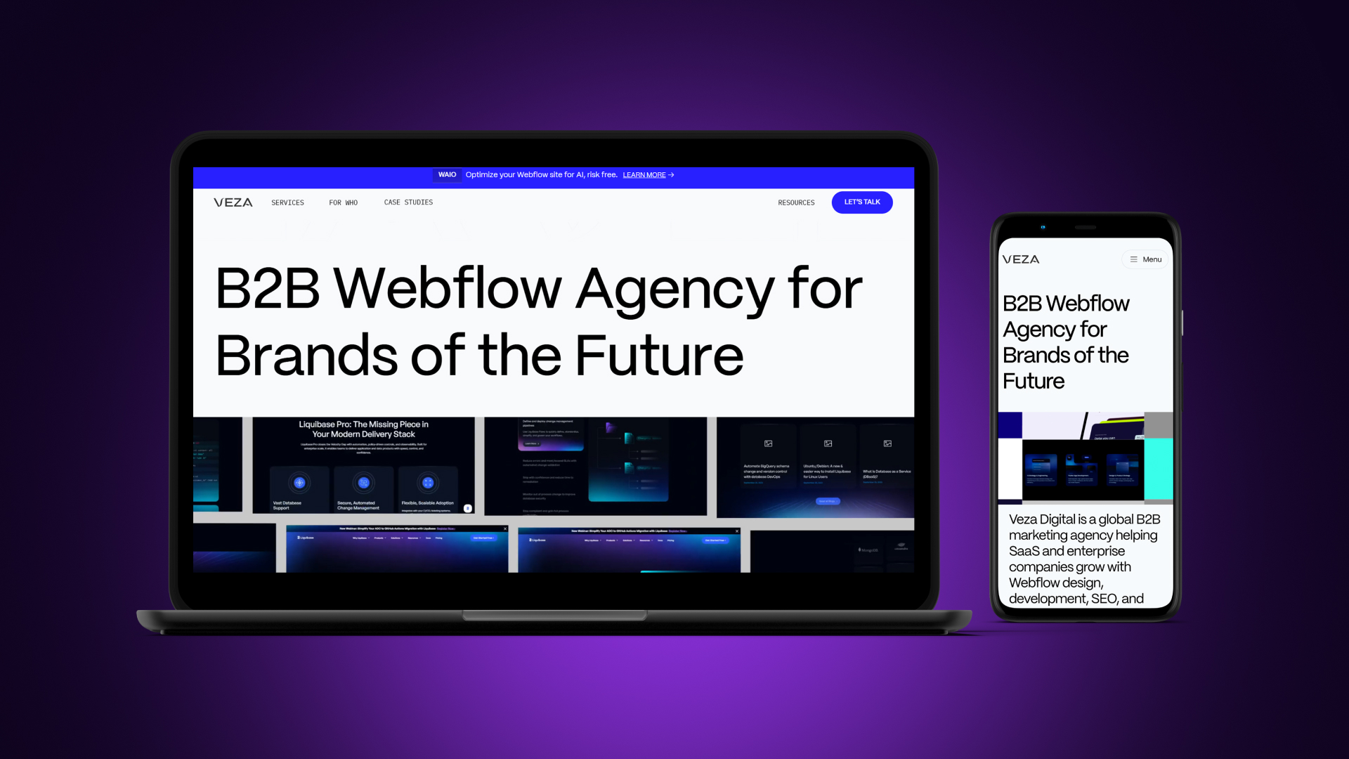
As a Webflow agency, Veza Digital builds websites that help small businesses compete with larger competitors through smart design and modern technology.
2026 Web Design Trends: Quick Reference
Insight: Focus on Must-Have trends first. They deliver the highest ROI for small businesses with limited budgets by directly influencing search rankings and user conversions.
Small Business Priority Guide
Must-Have (Do These First):
- Mobile-first responsive design: Ensuring the site works perfectly on phones where most searches happen.
- Fast page speed: Aiming for a load time under 3 seconds to prevent bounce rates.
- Clean, uncluttered layout: Using minimalism to keep the focus on the business message.
- Clear navigation and CTAs: Making the path to purchase or inquiry obvious.
- Trust signals: Displaying testimonials and reviews to build immediate credibility.
- Basic accessibility: Meeting standard contrast and readability requirements for all users.
Should-Have (Add When Possible):
- Modern typography: Improving readability with clean, professional font pairings.
- Quality, authentic imagery: Using real photos of your team and work instead of generic stock.
- Local SEO optimization: Ensuring NAP (Name, Address, Phone) consistency for local search.
- Professional branding consistency: Maintaining a unified look across all pages.
Nice-to-Have (Only If Resources Allow):
- Dark mode option: Providing a toggle for user preference.
- AI chatbots: Automating FAQs only if you can maintain the response quality.
- Complex animations: Adding movement only if it doesn't hurt performance.
- Advanced personalization: Tailoring content to specific user segments.
The Simple Rule: If you haven't nailed the Must-Haves, don't worry about the Nice-to-Haves. A fast, mobile-friendly site with clear CTAs will outperform a slow, trendy site every time.
User-Centric Design for Small Businesses
The best user-centric design means that your website addresses user needs, goals, and user behavior at each phase. Establishing a good user-centric foundation is the first step.
Typically, there are 3 user-centric design standards: user experience, accessibility, and mobile-first design.
Prioritizing User Experience (UX)
In the first few seconds, users decide whether they want to stay or leave your website. This means that if the navigation is confusing, you will lose customers.
On the other hand, good UX builds trust with first-time visitors, encouraging them to explore your website. The better the user experience, the higher the conversions will be.
Key UX principles include:
- Intuitive navigation where users find what they need quickly
- Clear visual hierarchy and the most important content standing out
- Consistent design patterns where interactions are predictable
- Fast feedback with responding buttons and confirmation forms
As a small business that prioritizes UX, you should pay attention to 4 key things:
- Your homepage clearly communicates what you do
- Contact information is easy to find
- Services/products are clearly presented
- Path to purchase/inquiry is transparent and obvious
Accessibility Standards and Inclusivity
A user-centered website accommodates users with disabilities. To reach the 15-20% of users who have disabilities, ensure your site meets modern accessibility standards.
Accessible design improves SEO through better site structure and content readability. Don't overlook legal requirements since many regions mandate ADA-style accessibility standards.
If you want to improve accessibility and user experience for everyone, make sure:
- There’s sufficient color contrast to improve text readability
- Each image has alt text
- Keyboard navigation works well
- Forms have proper labels
- Text can be resized according to different needs
Bad user experience that hurts accessibility includes:
- Light gray text on white background
- Images with no alt text
- Videos without captions
- Click-only navigation (no keyboard)
Mobile-First and Responsive Design
The reality is that more than 60% of web traffic comes from mobile devices. Also, most local searches are performed on phones.
Mobile-first approach is a must for small businesses in 2026 - for both users and SEO. Google uses mobile-first indexing, meaning it evaluates the mobile version of a website before the desktop.
Mobile experience isn’t difficult to manage, but a poor one will cost you customers.
In practice, mobile-first principles include:
- Design for small screens first, then work on desktop versions
- Prioritizing essential content and then working on tweaking details
- Implement touch-friendly buttons with a 44px minimum size
- Ensure fast loading on cellular networks
Responsive design essentials mean that your layouts adapt to the screen size while images scale appropriately. You shouldn’t sacrifice anything, but ensure that navigation transforms for mobile while text remains readable.
Before you launch your website, use this testing checklist:
Testing checklist:
- Test your website on actual phones (not just browser resize)
- Check how forms work on mobile
- Verify that tap targets aren't too small
- Ensure there’s no horizontal scrolling
Mobile-First Design Checklist
Layout & Structure:
- [ ] Design for mobile screens first, then scale up
- [ ] Essential content (Headline, CTA) visible without scrolling
- [ ] Single-column layout used on mobile to prevent clutter
- [ ] No horizontal scrolling required (all content fits width)
- [ ] Adequate spacing (white space) between elements to prevent accidental clicks
Touch & Interaction:
- [ ] Tap targets (buttons/links) at least 44x44 pixels
- [ ] Buttons easy to tap with a thumb (placed in the "thumb zone")
- [ ] No hover-dependent functionality (all interactions work via tap)
- [ ] Forms are easy to complete (large input fields, mobile-friendly keyboards)
- [ ] Phone numbers are set to "tap-to-call."
Navigation:
- [ ] Hamburger menu used to save screen space
- [ ] Sticky header implemented to keep key actions visible
- [ ] Easy-to-reach navigation elements
- [ ] Back button works as expected without losing user data
- [ ] Search function is easily accessible if the site is content-heavy
Content & Media:
- [ ] Text readable without zooming (minimum 16px body font)
- [ ] Images scale automatically and do not overflow the screen
- [ ] Videos are responsive and do not autoplay with sound
- [ ] PDFs avoided or provided with a mobile-optimized HTML alternative
Performance:
- [ ] Fast loading on cellular (4G/5G) networks—aim for <3 seconds
- [ ] Images optimized for mobile (using WebP or compressed formats)
- [ ] Minimal third-party scripts to reduce mobile CPU load
- [ ] Tested on actual mobile devices to verify real-world speed
Testing:
- [ ] Tested on iPhone and Android native browsers (Safari/Chrome)
- [ ] Tested on multiple screen sizes (from small SE models to large Pro Max sizes)
- [ ] Google Mobile-Friendly Test passed successfully
- [ ] No mobile usability errors appearing in Google Search Console
Note: Test on real phones, not just browser resize tools. The tactile experience, loading speed on data, and "thumb reach" are significantly different on a physical device than on a desktop emulator.
Visual Design Trends for Small Business Websites
Visual design plays a big role in how users perceive a small business. Before reading any text, visitors already form an opinion based on how the website looks and feels.
Clean, modern visuals help build trust, show professionalism, and make users more comfortable staying on the site. On the other hand, an outdated or cluttered design can make even a good business feel unreliable.
For small businesses, visual trends are not about being fancy or following every new style. They are about clarity, consistency, and making the website easy to understand.
Good visual design supports content, guides attention, and helps users take action without confusion. When done right, it improves usability and strengthens the brand.
Below are some of the most effective visual design trends that small business websites should focus on today.
Minimalism and Simplicity
Minimalism works because it removes distractions and helps users focus on what matters most. Less clutter means a clearer message, faster loading times, and easier navigation.
When users are not overwhelmed by too many elements, they can understand the website more quickly. Simple layouts also tend to look more professional and trustworthy, especially for small businesses trying to build credibility.
Minimalist design is not about empty pages, but about intentional choices. It uses space, color, and hierarchy to guide attention naturally.
Generous white space makes content easier to read, while a limited color palette keeps the design consistent. Only essential elements should be visible, and every section should have a clear purpose.
Common things to remove when simplifying a website include:
- Unnecessary animations that distract users
- Too many stock photos that add no value
- Multiple competing calls-to-action
- Cluttered sidebars with rarely used content
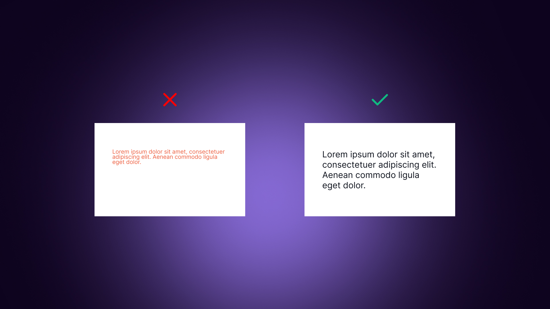
Typography and Readability
Typography strongly affects how users read and understand content. Modern websites use bold and confident headlines to grab attention, combined with clean and simple body text.
Sans-serif fonts are commonly used because they are easier to read on screens. Good typography helps users scan content and find important information faster.
Readability depends on more than just font choice. Text size should be large enough, usually at least 16px for body text. Line height matters too, as cramped text feels tiring to read. Proper spacing and clear hierarchy between headings and paragraphs improves overall experience.
Basic readability essentials include:
- Enough contrast between text and background
- Line length between 50 and 75 characters
- Clear difference between headings and body text
When pairing fonts, keep it simple. One font for headings and one for body text is usually enough. Using more than two fonts often looks messy. Google Fonts offers many free and professional options suitable for small business websites.
Color Palettes and Branding
Color is one of the strongest visual signals of a brand. Modern small business websites often use bold primary colors combined with softer background tones. Accent colors are used strategically, mainly for call-to-action buttons. A consistent color palette across all pages helps users recognize and remember the brand.
Different colors also communicate different emotions. For example:
- Blue often represents trust and professionalism, while green is associated with growth and health
- Orange feels energetic and action-oriented, and black is often linked to luxury or sophistication
Choosing the right colors depends on brand personality and target audience.
When implementing colors, the primary brand color should be used for key elements like headers or highlights. Accent colors should be reserved for CTAs, so they stand out clearly. Neutral backgrounds improve readability and keep focus on content.
Imagery and Animations
Imagery has shifted toward more authentic and human visuals. Real photos of the team, workspace, or actual products help build trust and make the business feel genuine.
Custom illustrations can also add personality, while high-quality product photography improves perceived value. Generic stock photos are less effective, as users recognize them quickly and find them impersonal.
Authentic imagery helps differentiate a business from competitors and shows the real people behind the brand. It creates an emotional connection and makes the website feel more honest. Even simple, imperfect photos often perform better than polished but fake-looking stock images.
Animations should be used carefully. Subtle hover effects and small transitions can improve usability, but too much movement becomes distracting. Performance is also important, especially on mobile devices.
Things to watch out for include:
- Large, unoptimized images that slow down the site
- Too many animations that hurt mobile performance
Visual Design Checklist for Small Businesses
Layout & White Space:
- [ ] Generous white space around elements to prevent overwhelm
- [ ] Clear visual hierarchy (guiding the eye to the most important info first)
- [ ] Consistent spacing throughout all sections and pages
- [ ] No cluttered or busy sections that distract from the offer
- [ ] Important content stands out clearly from the background
Typography:
- [ ] Body text at least 16px for effortless reading on all screens
- [ ] Line height 1.5–1.7 to prevent text from looking cramped
- [ ] Maximum 2 font families (one for headings, one for body)
- [ ] Clear heading hierarchy (correct use of H1, H2, and H3 tags)
- [ ] Sufficient contrast between text and background colors
Colors:
- [ ] Consistent color palette (sticking to 2–3 main brand colors)
- [ ] CTA buttons in a contrasting color to make them "pop."
- [ ] Sufficient color contrast (meeting WCAG guidelines and accessibility standards)
- [ ] Colors align with brand identity (e.g., blue for trust, green for growth)
- [ ] No color as the only indicator (using icons or text labels for accessibility)
Imagery:
- [ ] High-quality, non-pixelated images that look professional
- [ ] Authentic photos showing your real team, workspace, or actual work
- [ ] Images optimized for web (correct dimensions and WebP/compressed files)
- [ ] Alt text included on all images for SEO and screen readers
- [ ] Consistent image style (filters, framing, or lighting) throughout the site
Animations & Effects:
- [ ] Animations are subtle and serve a purpose (like hover effects on buttons)
- [ ] No autoplay videos with sound (which often frustrates users)
- [ ] Effects don't slow page load or cause mobile lag
- [ ] Animations can be reduced or disabled (respecting "prefers-reduced-motion")
- [ ] Nothing distracts from the main marketing message or CTA
Overall Polish:
- [ ] Consistent design (headers, footers, and buttons) across all pages
- [ ] No broken images or missing graphical elements
- [ ] Professional, trustworthy appearance that matches your business quality
- [ ] Looks good on all screen sizes (no overlapping text or cut-off images)
Note: When in doubt, simpler is better. A clean, intentional design builds far more trust than a cluttered site full of unnecessary trends.
Performance and Speed Optimization
Website performance is one of the most critical factors for small business success online. Users expect websites to load fast, especially on mobile devices. If a site feels slow, visitors quickly lose patience and leave.
Speed is not only a technical detail; it directly affects trust, credibility, and conversions. A slow website often feels outdated and unprofessional, even if the content and design are good.
For small businesses, performance can be a real competitive advantage. Many small business websites are slow because of heavy design, too many plugins, or poor hosting choices. This means that simply being faster than competitors can already put you ahead.
Veza Digital has helped dozens of small businesses level up their performance and fix sluggish mobile speeds. See our case studies to learn how we’ve helped businesses like yours.
Speed also impacts search engine rankings, as Google considers page speed when ranking websites. Faster websites are easier to crawl, easier to use, and more likely to convert visitors into customers.
Optimizing performance does not always require complex development work. Many improvements can be achieved with basic decisions, like optimizing images, choosing the right platform, and avoiding unnecessary features. The goal is not perfection, but creating a smooth and responsive experience that keeps users engaged.
Page Speed as a Priority
Page speed matters because users make decisions very quickly. Studies show that around 53% of mobile users leave a website if it takes more than 3 seconds to load.
Every extra second of delay increases bounce rates and reduces conversions. Slow websites also perform worse in Google rankings, which means less visibility and traffic. For small businesses, this can have a direct impact on revenue.
Speed benchmarks help understand where a website stands. Loading under 3 seconds is considered good, under 2 seconds is excellent, while over 4 seconds usually means you are losing customers. Even small improvements can make a noticeable difference.
Some quick wins for improving speed include:
- Compressing and optimizing images
- Using modern image formats like WebP
- Reducing plugins and third-party scripts
- Choosing fast and reliable hosting
- Enabling browser caching
To measure performance, free tools are available. Google PageSpeed Insights, GTmetrix, and WebPageTest can show loading times and highlight issues that slow the site down.
Lightweight Design for Small Business Websites
Lightweight design focuses on loading only what is truly necessary. Heavy themes, unused features, and excessive scripts slow websites down without adding real value. For small businesses, simplicity often performs better than complex design.
The biggest performance issues usually come from unoptimized images, too many plugins, and bloated themes. Third-party scripts, tracking tools, and embedded social feeds also add extra load time. Each additional feature increases complexity and reduces speed.
Basic lightweight design principles include:
- Avoiding heavy themes with unused functionality
- Minimizing third-party scripts
- Choosing quality features over quantity
Platform choice also matters. WordPress websites with many plugins often become slow over time, especially when page builders are used. Webflow generates cleaner and faster code, while static websites are usually the fastest option overall.
Webflow design services offer clean, fast code with easy maintenance. For other platforms, simpler setups tend to perform better long-term.
Page Speed Optimization Checklist
Images (Biggest Impact):
- [ ] Compress all images before uploading (aim for <200KB per image)
- [ ] Use modern formats (WebP or AVIF) to maintain quality at smaller file sizes
- [ ] Resize images to actual display size (don't upload a 4000px photo for a 400px slot)
- [ ] Implement lazy loading for all below-the-fold images
- [ ] Use responsive images (srcset) so mobile users don't download desktop-sized files
Code & Scripts:
- [ ] Minimize third-party scripts (only keep essential tracking/tools)
- [ ] Remove unused CSS and JavaScript that bloat the code
- [ ] Defer non-critical JavaScript so the page content loads first
- [ ] Minimize plugins (WordPress) or heavy embeds that slow down the backend
- [ ] Avoid render-blocking resources that prevent the page from showing text immediately
Hosting & Delivery:
- [ ] Use fast, reliable hosting (avoid the cheapest "shared" tiers if possible)
- [ ] Enable browser caching so returning visitors load the site faster
- [ ] Use a CDN (Content Delivery Network) for faster global delivery
- [ ] Enable GZIP or Brotli compression on your server
- [ ] Use HTTP/2 or HTTP/3 for more efficient data transfer
Content:
- [ ] Avoid auto-playing videos, which consume massive bandwidth immediately
- [ ] Limit embedded content like live social feeds or heavy interactive maps
- [ ] Optimize custom fonts (load only the weights/subsets you actually use)
- [ ] Avoid excessive animations that can cause "jank" on mobile processors
Testing & Monitoring:
- [ ] Test with Google PageSpeed Insights to see your official score
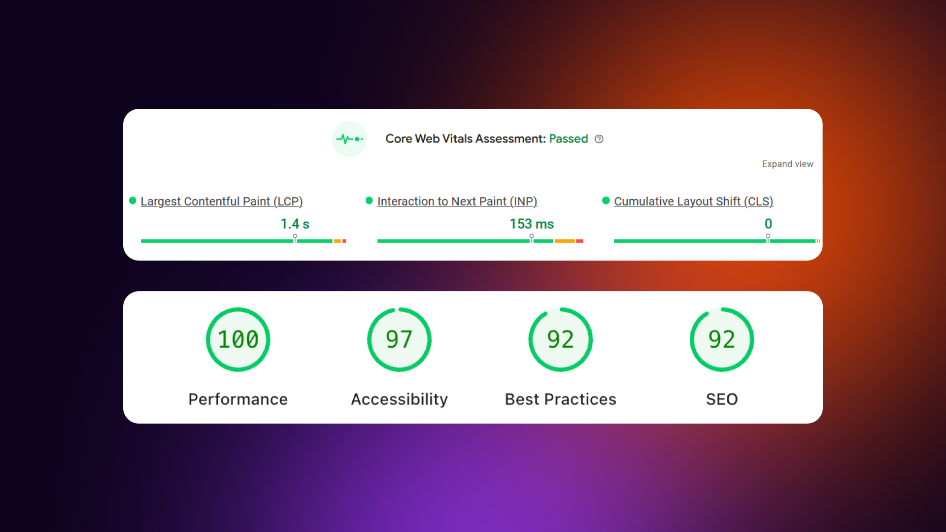
- [ ] Check Core Web Vitals (LCP, FID, CLS) in Search Console
- [ ] Test on both mobile and desktop connections
- [ ] Monitor speed regularly (especially after adding new content)
- [ ] Set a performance budget (e.g., "Our homepage will never exceed 2MB total")
Speed Benchmarks:
Note: Images are usually the biggest culprit. Most small business websites can cut their load time in half just by optimizing their media. Start there for the quickest wins.
Strategic Content and Navigation
A website isn’t just visuals; it's a tool designed to guide users toward action. For small businesses, this means designing every page with conversion in mind.
Strategic content and navigation ensure that visitors understand what you do, why they should care, and what steps to take next. Without clear messaging or logical paths, even an attractive site can fail to convert.
Conversion-focused websites combine clear hierarchy, persuasive content, and intuitive navigation.
Every element should answer these questions:
- Who is this for?
- What do they gain?
- How do they act next?
Small businesses often benefit from simple, scannable content paired with strong calls-to-action (CTAs) that guide users naturally. Trust signals, like testimonials or recognizable logos, reinforce credibility.
The goal is not just to inform, but also to make the visitor’s next step obvious and easy.
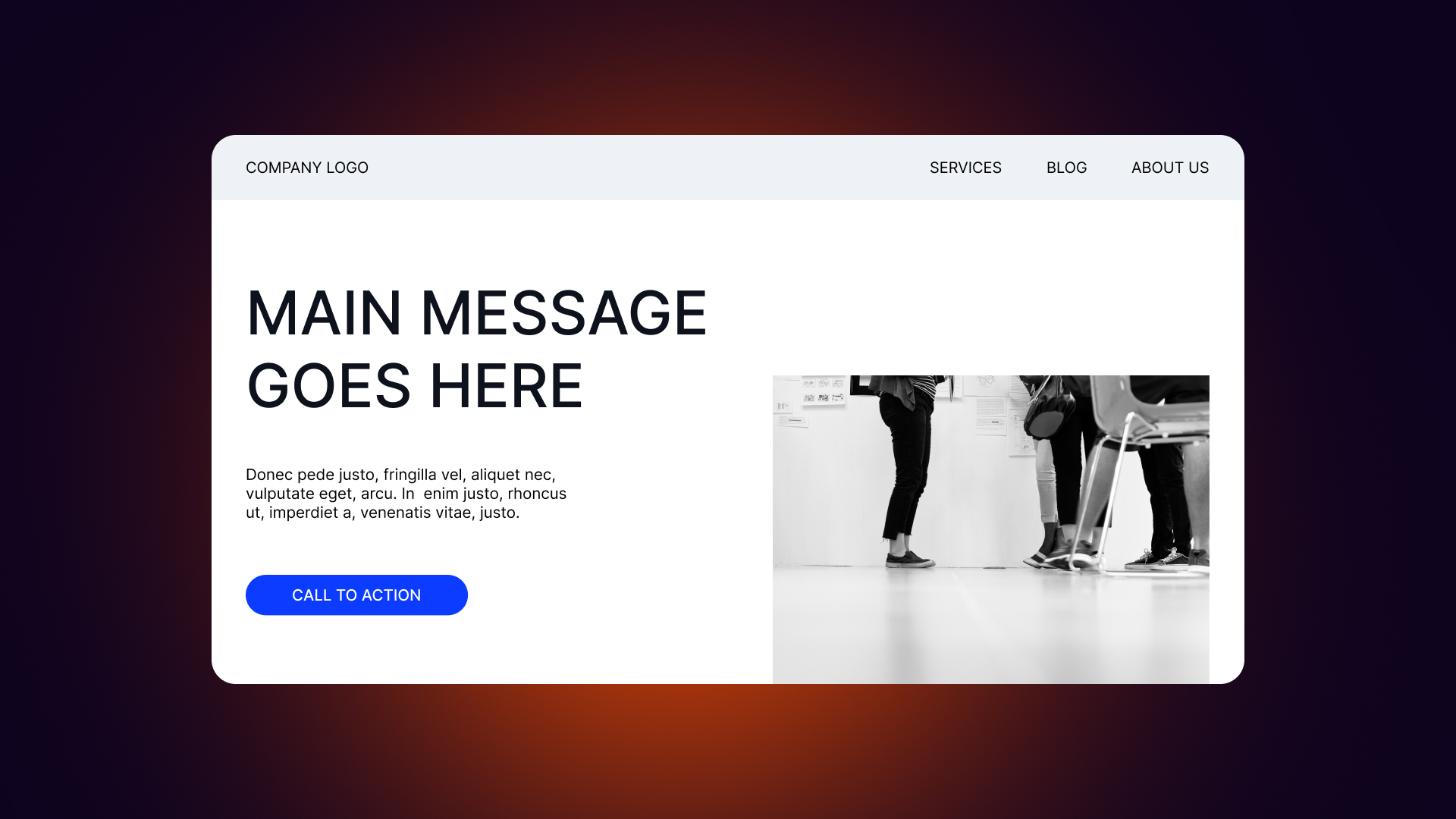
Homepage Design and Layouts
Your homepage is the first impression, and for many visitors, the only one. It must immediately communicate what you do, who it’s for, why visitors should choose you, and what action they should take.
Above-the-fold content is critical: headline, subheadline, primary CTA, and trust signals should all be visible without scrolling.
Homepage sections typically include:
- Hero section with a clear headline and value proposition
- Overview of services or products
- Social proof, like testimonials or logos
- About/story section introducing the team or mission
- Contact or CTA section to encourage the next step
Above-the-fold priorities are simple: make it clear what you do, who it’s for, why you’re different, and what the visitor should do next. Every element below should support this main purpose.
Read our latest pieces on design trends - Fintech web design trends
Navigation and User Flow
Navigation is the roadmap for your website. Keep the main menu simple, with 5–7 items and the most important pages first. Labels should be clear and descriptive, and contact information should always be visible. The goal is to guide visitors along paths that lead to conversion while minimizing friction.
User flow design ensures that visitors reach the right content in as few steps as possible. Breadcrumbs and clear back/forward options help on deeper sites. For mobile, hamburger menus are standard, but sticky headers and thumb-friendly layouts make key actions easy to reach. A search function can help on content-heavy sites.
Good navigation supports user confidence, reduces frustration, and improves conversion rates by making the next step obvious.
Content Strategy and CTAs
Content should lead with benefits, address pain points, and speak in the customer’s language. Scannable formatting with headers, bullets, and short paragraphs improves readability.
Microcopy matters too: clear form labels, button text, error messages, and confirmations all affect conversions.
CTAs should be obvious and actionable.
One primary CTA per page is best, using action-oriented language like “Get Started” instead of generic words like “Submit.” Contrast colors help buttons stand out, and each CTA should clearly communicate value.
Examples of effective CTAs for small businesses:
- "Get a Free Quote"
- "Book a Consultation"
- "Start Your Free Trial"
- "View Our Work"
- "Call Us Today"
CTA Optimization Checklist
Design & Visibility:
- [ ] CTA buttons use contrasting color (distinct from the background and primary brand color)
- [ ] Buttons are large enough to tap easily (minimum 44px height for mobile thumbs)
- [ ] Primary CTA stands out visually from secondary or "ghost" buttons
- [ ] CTAs visible without scrolling (placed prominently in the hero section/above the fold)
- [ ] Consistent button styling throughout the site so users recognize interactive elements
Copy & Messaging:
- [ ] Action-oriented language (using verbs like "Get," "Start," or "Book" first)
- [ ] Clear value proposition (explaining exactly what the user receives)
- [ ] Specific rather than generic (avoiding robotic terms like "Submit")
- [ ] Creates a sense of urgency (e.g., "Limited Spots" or "Offer Ends Today")
- [ ] Addresses customer benefit (focusing on what they gain, not what you do)
CTA Examples (Good vs. Bad):
Placement:
- [ ] One primary CTA per page/section to avoid decision paralysis
- [ ] CTA at the end of key content sections (after you've made your point)
- [ ] Sticky CTA on mobile so the primary action is always within reach
- [ ] CTA in navigation or header (usually at the top right)
- [ ] CTA repeated for long-form pages or detailed service descriptions
Supporting Elements:
- [ ] Microcopy (small text) explains what happens next (e.g., "No credit card required")
- [ ] Trust signals near CTA (logos, "Secure Checkout," or satisfaction guarantees)
- [ ] Reduce friction (using as few form fields as possible to lower the barrier)
- [ ] Clear privacy assurance if collecting email or phone data
Testing:
- [ ] A/B test button colors to see which drives more attention
- [ ] Test different copy variations (e.g., "Join Now" vs. "Sign Up")
- [ ] Track click-through rates (CTR) using heatmaps or analytics
- [ ] Monitor conversion rates to ensure clicks turn into leads
Note: Your CTA should answer: "What do I get and what do I do?" in under 5 words.
SEO and Credibility Enhancements

A well-structured, fast, and mobile-friendly site not only improves rankings in Google but also reassures visitors that your business is professional and reliable.
Good SEO and strong credibility signals go hand-in-hand: search engines reward clear, user-focused sites, and users reward trustworthy sites with engagement and conversions.
Small businesses often overlook simple design choices that affect SEO. Page structure, navigation, and mobile responsiveness all influence how search engines crawl and understand your content.
At the same time, well-placed trust signals increase confidence and encourage visitors to take action. By combining these two areas, a small business website can attract more traffic, keep users engaged, and convert more leads without relying solely on paid marketing.
Search Engine Optimization (SEO) Best Practices
Design decisions play a major role in SEO.
Site structure and navigation, page speed, mobile responsiveness, and proper header hierarchy all make it easier for search engines to understand your content.
Images also need attention: optimized file sizes, descriptive alt text, and appropriate captions improve both speed and discoverability.
On-page SEO basics include:
- One H1 per page
- Descriptive page titles
- Meta descriptions for each page
- Alt text on images
- Internal linking between relevant pages
Local SEO is especially important for small businesses. Google Business Profile is essential, and NAP (Name, Address, Phone) consistency ensures your business is easy to find. Including local keywords, creating location-specific pages if you serve multiple areas, and collecting customer reviews boost local visibility.
Technical SEO should not be ignored. Ensure your site uses HTTPS, has an XML sitemap, clean URLs, no broken links, and, when possible, structured data like local business schema.
Building Trust and Credibility
Trust signals are critical for small businesses. Visitors decide quickly whether to trust your business with their money or personal information.
Customer testimonials with photos and names, client logos for B2B, reviews, certifications, and guarantees all help establish credibility. Even small details like years in business or clear policies make a difference.
Read our latest pieces on design trends - Healthcare web design trends
Professional credibility also comes from consistent branding, error-free copy, professional email addresses, real team photos, and a clearly displayed physical address. Security matters too: HTTPS, privacy policies, and secure payment badges signal safety and reliability.
Placing social proof strategically improves impact. Highlight testimonials on the homepage, showcase studies or portfolios, include “as seen in” logos, and use review widgets to reinforce trust throughout the site.
This checklist is derived from the article's emphasis that visitors decide quickly whether to trust a business with their money or data. For small businesses, these signals bridge the "credibility gap" between you and larger competitors.
Trust Signals Checklist for Small Businesses
Social Proof:
- [ ] Customer testimonials with real names and photos
- [ ] Star ratings and review counts from third-party sites (Google, Yelp)
- [ ] Client logos (for B2B) to show you work with reputable brands
- [ ] Case studies or success stories detailing real results
- [ ] User-generated content (photos or posts from real customers)
- [ ] Number of customers served (e.g., "Over 500 local homes served")
Credentials & Authority:
- [ ] Industry certifications displayed clearly (e.g., Licensed, Insured, BBB)
- [ ] Awards and recognition (e.g., "Best of the City 2025")
- [ ] Professional memberships (Chambers of Commerce, Trade Associations)
- [ ] Years in business to establish longevity
- [ ] "As seen in" media logos for PR validation
- [ ] Team credentials or specific qualifications (degrees, licenses)
Security & Safety:
- [ ] SSL certificate (HTTPS) — the padlock in the browser bar is non-negotiable
- [ ] Secure payment badges (Visa, Stripe, PayPal)
- [ ] Privacy policy link in the footer
- [ ] Clear refund/return policy to reduce purchase anxiety
- [ ] Terms of service documentation
Transparency:
- [ ] Physical address displayed (builds local trust)
- [ ] Phone number clearly visible in the header or footer
- [ ] Real team photos and bios (avoid stock photos of "generic teams")
- [ ] Clear pricing (or a transparent "request quote" process)
- [ ] Response time expectations (e.g., "We respond in under 2 hours")
Professional Presentation:
- [ ] No spelling or grammar errors (errors signal a lack of attention to detail)
- [ ] Professional email address (e.g., hello@yourbusiness.com, not @gmail.com)
- [ ] Consistent branding (colors and logos match across all pages)
- [ ] Up-to-date content (copyright year in footer is 2026, recent blog posts)
- [ ] Working links and forms (dead links kill credibility)
Placement Tips:
Note: Trust signals answer the question: "Why should I believe this business?" Make sure you have clear, visible answers.
Emerging Trends and Innovations
Small business websites don’t just need to look good and perform well; they also benefit from keeping an eye on emerging trends.
Innovations like dark mode, AI chatbots, and authentic storytelling can enhance user experience when implemented thoughtfully. Not every trend is essential, and sometimes simpler solutions perform better.
The goal is to adopt trends that genuinely improve usability, engagement, or credibility, without adding unnecessary complexity or maintenance burdens.
Dark Mode and Customization
Dark mode has grown in popularity because it is easier on the eyes in low-light settings and can give websites a modern, sophisticated look. Some users prefer it, and certain apps and websites now offer it as standard.
For small businesses, dark mode is a nice-to-have, but not a must-have. Implementing it requires designing a second color scheme and offering a toggle option for users, which adds extra work.
Most SMB websites are better off focusing on light mode first, ensuring readability and accessibility are solid before experimenting with alternative modes.
Verdict: Nice-to-have, not essential for small businesses.
Read our latest pieces on design trends - Web design trends for AI companies.
AI Chatbots and Automation
AI chatbots promise 24/7 customer support, instant answers to common questions, lead qualification, and appointment booking. They can improve responsiveness and reduce manual workload, but only if set up and maintained correctly. Poorly implemented chatbots frustrate users and can feel impersonal.
For small businesses, simpler alternatives often work better: contact forms, FAQ pages, live chat during business hours, and a clearly displayed phone number.
Chatbots make sense only if your business has a high volume of repetitive questions, the resources to maintain them, and clear use cases like booking or FAQ automation.
Verdict: Only implement if you can maintain it properly.
Authenticity and Storytelling
Customers increasingly want to connect with real people and understand the story behind a business. Sharing your values, mission, and community involvement helps create emotional connections that large competitors cannot replicate.
Authentic storytelling differentiates your small business, builds trust, and supports local preference.
Storytelling elements can include:
- About page with the real story behind the business
- Team photos and bios
- Behind-the-scenes content and processes
- Customer success stories and testimonials
- Community involvement highlights
Emerging Trends Decision Matrix
Decision Framework
Before implementing any emerging trend, ask these five questions:
- Conversion: Will this directly help convert visitors to customers?
- Resources: Do we have the technical resources to implement it properly?
- Maintenance: Can we maintain it long-term (updates, bug fixes, content)?
- Performance: Will it hurt our page speed or mobile usability?
- Longevity: Is this a passing fad or a timeless design improvement?
Priority Recommendation
- Phase 1: If basics aren't solid → Focus on fundamentals first (Speed, Mobile, CTAs).
- Phase 2: If basics are solid AND resources available → Consider should-haves (Custom photos, SEO).
- Phase 3: If everything else is optimized → Explore emerging trends (AI, Dark mode).
The Reality Check: Most small businesses should focus on fundamentals. A fast, mobile-friendly site with clear CTAs and high-quality "Must-Haves" will outperform a slow site with trendy features every time.
Conclusion and Implementation
Small business websites succeed when design decisions focus on conversions and user experience, not just looks.
Mobile-first layouts, fast page speed, clear navigation, and prominent CTAs are non-negotiable foundations. Trust signals, social proof, and accessibility basics matter more than flashy effects.
Authentic storytelling and consistent branding help differentiate small businesses from larger competitors and create lasting impressions.
When it comes to implementation, priorities should be clear:
- Mobile responsiveness and speed optimization
- Clear CTAs and intuitive navigation
- Trust signals and social proof
- Accessibility essentials
- Visual polish and modern aesthetics
DIY website builders can work for simple sites, but professional guidance often makes the difference for conversion-focused design. Platforms like Webflow provide the best of both worlds: fast, modern, and easy-to-update websites with built-in performance and flexibility. Investing in professional design pays off by improving conversions, user satisfaction, and overall credibility.
Veza Digital specializes in building Webflow sites for small businesses. We focus on results, not just aesthetics, creating sites that are easy to manage, load fast, and drive meaningful actions.
CTA: "Ready to implement these trends on your website? Veza Digital builds Webflow sites that help small businesses compete and convert. Let's talk about your project."
Web Design Implementation Priority
Phase 1: Foundation (Do First)
Focus on technical performance and core usability.
Phase 2: Trust Building (Do Second)
Focus on establishing credibility and a human connection.
Phase 3: Polish (Do Third)
Focus on aesthetics and regional visibility.
Phase 4: Advanced (Only After Phases 1–3)
Focus on "Nice-to-Have" features if budget and time allow.
Quick Wins (Can Do Anytime):
- Compress existing images: Reduces load time immediately.
- Add alt text to images: Boosts SEO and accessibility.
- Fix broken links: Prevents user frustration and 404 errors.
- Update outdated content: Ensures your business looks active and reliable.
- Add Google Business Profile: Drives local traffic with minimal effort.
Note: Don't move to the next phase until the previous one is solid. Fundamentals first, fancy later. Following this order ensures that every dollar spent on design actually works toward growing your business.
FAQ
General
What are the most important web design trends for small businesses?
For small businesses, the focus should be on trends that improve user experience and conversions. Mobile-first design, fast loading times, clear navigation, and strong CTAs are essential. Minimalist layouts, readable typography, and consistent branding help convey professionalism.
Accessibility, authentic imagery, and trust signals like testimonials or client logos build credibility. Emerging trends like AI chatbots or dark mode can enhance the experience, but are secondary.
Overall, the goal is simplicity, clarity, and functionality - design choices that guide visitors toward taking action while creating a trustworthy, modern impression.
How often should a small business update its website design?
Small businesses should review their website at least once a year to ensure it meets current standards. Updating design isn’t only about aesthetics; it’s also about performance, usability, and SEO. Refreshing content, visuals, and CTAs keeps the site relevant and helps maintain conversions. Major redesigns might be needed every 2–3 years if the layout feels outdated or no longer reflects your brand. Regular minor updates, like optimizing images, updating testimonials, or improving mobile experience, can keep the site modern without a full overhaul.
Do small businesses really need a professional website?
Yes, a professional website is critical for credibility and visibility. Even locally-focused small businesses are judged by their website. Poor design or slow performance can turn customers away.
Professional websites not only look trustworthy but also perform better in terms of speed, SEO, and mobile usability. While DIY builders can work for simple sites, professional design ensures conversion-focused layouts, clear messaging, and proper technical setup.
In many cases, investing in a well-designed site pays off quickly through increased leads, improved user experience, and higher perceived professionalism.
Implementation
How can I make my small business website mobile-friendly?
Mobile-friendly design starts with a mobile-first approach. Prioritize essential content for smaller screens, make buttons and links touch-friendly, and ensure text is readable without zooming.
Responsive layouts adapt to different screen sizes, and navigation should remain simple on phones. Avoid heavy elements that slow loading, and test your site on actual devices, not just desktop browser resizing.
Fast loading times and accessible CTAs on mobile are essential, since most users visit on smartphones. Tools like Google’s Mobile-Friendly Test can help identify issues. Focus on usability first, aesthetics second, and prioritize user experience above all.
What's the best way to improve website speed?
Improving website speed requires both design and technical steps. Start by compressing and optimizing images, ideally using modern formats like WebP. Minimize plugins, third-party scripts, and unnecessary animations that add load time.
Choose fast hosting and enable browser caching to reduce repeated requests. Lightweight design, loading only essential elements, also helps. Test your site regularly using tools like Google PageSpeed Insights, GTmetrix, or WebPageTest to spot slow elements.
Even small improvements, like resizing images or removing unused scripts, can significantly boost performance and reduce bounce rates.
How do I add trust signals to my website?
Trust signals reassure visitors that your business is reliable. Start with customer testimonials, ideally with names and photos, and showcase client logos if you work B2B. Display reviews, certifications, awards, guarantees, and years in business.
Professional design, consistent branding, and error-free copy add credibility. Include real team photos, clear contact information, and a physical address if applicable. For e-commerce or payment pages, use HTTPS and show secure payment badges.
Placement matters: highlight trust signals on the homepage, near CTAs, and on product or service pages to increase visitor confidence and improve conversions.
Platform
What's the best website platform for small businesses?
The best platform depends on business needs and technical resources. For simple, low-maintenance sites, Webflow offers clean code, fast performance, and easy updates, combining design flexibility with speed and reliability.
WordPress is popular for its plugin ecosystem and familiarity, but it often requires careful plugin management to avoid slow sites. Static site generators are fastest but need more technical expertise.
For most small businesses looking for conversion-focused design, Webflow balances speed, modern visuals, and ease of content updates without extensive technical knowledge.
Should I use WordPress or Webflow for my small business?
WordPress is flexible and widely used, but it can become slow if overloaded with plugins or page builders. Maintenance and security updates require attention.
Webflow generates cleaner, faster code and offers more visual design control without needing extra plugins. Small business owners can update content easily, and sites often load faster and perform better for conversions.
For businesses prioritizing speed, mobile-friendliness, and professional aesthetics with less technical hassle, Webflow is often the better choice. WordPress may be suitable if you need extensive custom functionality or a large plugin ecosystem.
Can I implement these trends on my existing website?
Yes, many trends can be applied gradually to an existing site. Mobile responsiveness, page speed improvements (follow Google PageSpeed Insights), better CTAs, optimized images, and trust signals can all be added without a full redesign.
Some changes, like visual overhaul, layout simplification, or advanced features like AI chatbots, may require professional help or platform migration.
Start with the highest-impact changes, like mobile usability, speed, and clear CTAs, and then layer in visual updates and storytelling elements. Incremental improvements often yield measurable results without the cost of a complete rebuild.
Budget
How much should a small business spend on web design?
Costs vary depending on complexity, platform, and whether you hire a professional or DIY. Simple DIY websites can cost a few hundred dollars, while professional, conversion-focused sites often range from $2,000–$10,000.
Investing in performance, mobile-first design, and user-focused layouts usually pays off quickly through higher conversions and credibility. Prioritize features that directly impact users and revenue, like fast loading, mobile-friendliness, clear CTAs, and trust signals.
For most small businesses, a modest professional investment is worthwhile, especially if it improves leads and customer engagement.
What web design trends give the best ROI for small businesses?
Trends that improve usability and conversions typically deliver the best ROI. Mobile-first design, fast page speed, intuitive navigation, strong CTAs, and trust signals have an immediate impact.
Minimalist layouts and clear content reduce bounce rates, while accessibility improvements can expand reach. Authentic imagery and storytelling build customer connection and loyalty.
Emerging trends like AI chatbots or dark mode have value but often offer lower ROI unless the business has high traffic or specific use cases. Focus on trends that make it easy for visitors to understand your offer and take action.
Should I hire a designer or use a website builder?
Hiring a designer is worth it for conversion-focused, professional websites, especially if your site needs custom layouts, speed optimization, or high-end visuals. Website builders can work for simple informational sites, but they may limit flexibility and performance.
Platforms like Webflow combine both approaches: you get professional design capabilities with user-friendly editing tools for DIY updates. For most small businesses, investing in professional design upfront ensures a strong foundation, while still allowing ongoing updates without relying on a developer for every change.
.jpg)