.jpeg)
By Veza Digital
About Veza Digital
Veza Digital is a global design & performance agency shaping how people experience brands online. We help fintech and financial companies design for trust, scale with clarity, and grow through digital confidence.
Designing for Trust in a Data-Heavy World
Financial design in 2026 is less about decoration and more about decision clarity. This happens because users no longer arrive on a banking site or app looking to be impressed, they want to feel safe.
In an industry where milliseconds of hesitation can equal millions of dollars, design is the new compliance, and this is not negotiable. Fixing, improving or starting all over again with your fintech design will be your first stop in 2026.
The financial web has matured into an environment of trust UX: we officially stepped into the era where interfaces feel credible because they are calm, clear, and quick. Here, we see that typography whispers security, colors suggest integrity, and interactions feel consistent, predictable, and human.
Despite that modern fintech users live in constant context-switch: investment dashboards, budgeting tools, cross-border payments, crypto wallets - they don’t need more movement.
They need more meaning.
So, the brands that win in 2026 are the ones who make finance feel less like math and more like momentum.
Why Financial Web Design Is Evolving in 2026
Now, let’s explore why financial web design is evolving in 2026 and what changes we can expect in the upcoming year.
What’s Driving the Shift in Fintech UX?
The first thing we need to mention is that finance design is no longer a technical problem, it’s a human problem with regulatory consequences. Users expect transparency from their bank and fluidity from their music app; the two must now coexist seamlessly.
These patterns show up in everything from healthcare web design trends to enterprise AI platforms.
Here, we notice five forces that are driving this shift:
- AI Normalization: Users trust AI to assist but not to decide for them. Design must frame AI as a partner, not an oracle.
- Privacy & Regulation: Compliance copy is becoming a core design element, visible and reassuring.
- Micro-Confidence: Small moments of feedback replace grand gestures of credibility.
- Accessibility as Equity: Inclusive interfaces expand market share and project maturity.
- Trust as Design Language: The most beautiful finance products now look slightly boring on purpose.
Takeaway for users: The most successful financial brands in 2026 don’t feel futuristic, they feel familiar. Predictability is the new innovation.
Comparison Table: Old vs New Finance UX
Definition List: Key Concepts
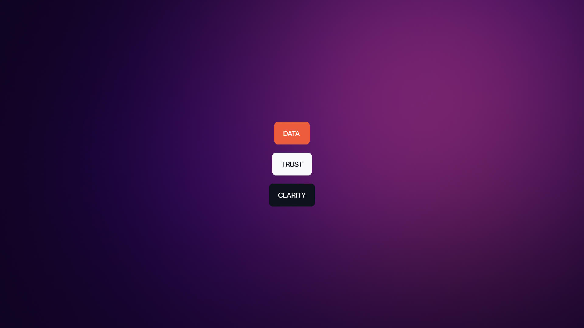
When it comes to the concept of fintech web design - some rules are predetermined. Follow them and you will be a half way done in position your brand as the company that’s worth trust.
- Quiet confidence: A fintech design principle that replaces flash with clarity, signaling trust through predictable interaction patterns.
- Calm motion: Subtle transitions that confirm change without anxiety; used to anchor the user in high-stakes moments like payments and transfers.
- Micro-confidence: Small visual or textual affirmations that a user action has been received and processed correctly.
At a Glance:
- Fintech UX in 2026 focuses on calm, predictable interaction over visual flash.
- Regulation and AI normalization shape the design baseline.
- Design becomes a trust contract between brand and user.
AI-Powered Personalization and Predictive UX

AI for fintech brands will be the key in 2026, for both internal operations to how they look in the eyes of users. Let’s see why.
How AI Is Redefining Financial Interfaces
Artificial intelligence has moved from novelty to necessity.
In 2026, the best financial interfaces no longer surprise or impress users, they anticipate them. Predictive UX means the product knows the next likely action and shortens the path to it.
Instead of overwhelming dashboards, users see contextual recommendations:
- Pre-filled transfers based on past behavior
- Automated expense categorization
- Forecasted balances or bill reminders
- Smart, just-in-time insights (without jargon)
Takeaway for users: AI doesn’t replace intuition , it enhances it. The best fintech products feel intuitive because they predict intent accurately, not aggressively.
Design Principles for Predictive UX
Note: Predictive design wins when it feels invisible, helpful but humble.
Definition List: Key Terms in Predictive UX
When it comes to predictive UX some terms are already in motion, slightly pointing out on what will be the next must-have for fintech.
- Predictive friction: The balance between speed and reassurance; removing too much friction too early erodes trust.
- Intent mapping: The process of predicting next actions based on sequential behavior instead of static data.
- Quiet automation: Automation that confirms its purpose clearly but executes silently, maintaining user control.
At a Glance
- Predictive UX focuses on foresight, not surprise.
- Transparency and reversibility drive trust in AI systems.
- Personalization must clarify, not complicate, the user’s financial life.
Calm Design: The New Financial Aesthetic
When you think of finance, you probably imagine endless lists of numbers. Put that in the digital era, and you get cyber-styled websites that flooded the web.
This principle also shows up across design trends for AI companies, where interfaces balance automation with human understanding.
Why Calm Design Dominates 2026 Fintech Aesthetics
In 2026, “calm” is the main metric, not an aesthetic mood. Users associate smooth transitions and predictable layouts with credibility, and the less energy an interface demands, the more trustworthy it feels.
Finance is inherently stressful; calm design reduces anxiety by making every movement meaningful.
This means that soft motion, white space, and restrained color contrast produce a sense of balance , a visual cue that says, “Your money is safe here.”
Takeaway for users: In fintech, confidence is communicated through stillness, not spectacle.
Comparison Table: Visual Evolution of Financial Interfaces
Definition List: Calm Design Vocabulary
- Visual respiration: Spacing rhythm that gives users “breathing room” between decisions.
- Predictable motion: Animation designed to teach interface logic instead of distract.
- Rest states: Screens with minimal movement to help users reset between high-cognitive actions (e.g., payments).
At a Glance
- Calm design builds user trust by lowering cognitive load.
- Predictable motion reinforces brand reliability.
- Minimalism in finance is not about style, it’s about stability.
Biometric Security and Humanized Authentication

Passwords are clunky, easy to forget, and even easier to hack, and in fintech, every logging in should feel personal. In this spin, biometrics are changing the game. A smooth, human-centered login flow says, “We’ve got this,” without making people jump through hoops.
Why Biometrics Are Replacing Traditional Logins
In finance, the safest login is the one that feels personal.
By 2026, passwords have become a liability, forgotten, reused, or phished. Biometrics (fingerprint, face, voice, gesture) aren’t just faster; they’re a design language of trust.
Users read friction as incompetence. A clean login flow communicates maturity:
- Passkeys and fingerprints establish confidence in seconds.
- Voice and facial ID reinforce personal connection.
- Recovery paths are visual and human-centered (“Let’s confirm it’s really you”).
Takeaway for users: Security is no longer invisible, it’s emotional. The goal is reassurance, not restriction.
Design Principles for Biometric UX
Design cue: The login is your first trust handshake. Treat it like an introduction, not an obstacle.
Definition List: Core Biometric Concepts
- Passkeys: Encrypted login credentials tied to a specific device and user identity, replacing passwords.
- Fallback UX: Secondary access options (PIN, email link, security question) ensuring inclusivity for all users.
- Progressive disclosure: Revealing only necessary steps, maintaining confidence during security flows.
At a Glance
- Biometrics humanize authentication and reduce cognitive load.
- Transparent microcopy fosters comfort during security tasks.
- Calm, confident login flows turn friction into familiarity.
Accessibility as a Trust Signal
Accessibility isn’t just a box to tick anymore, it’s a signal that your brand cares, and every choice that makes your app or site easier to navigate helps users with disabilities, older audiences, and even those on shaky connections. Inclusive design isn’t just nice to have, it’s smart UX.
How Accessibility Became a Trust Multiplier
Accessibility used to be a checklist; now it’s a trust contract.
In 2026, accessible fintech design signals competence, empathy, and stability , exactly what users want from anyone handling their money.
Accessible design helps everyone: users with disabilities, older audiences, or those on poor connections. Each inclusive choice is also a UX improvement.
Takeaway for users: In finance, accessibility isn’t optional. It’s an expectation that earns conversion through credibility.
Practical Accessibility Patterns for Fintech
Definition List: Accessibility in Context
- WCAG 2.2 AA+ , Global accessibility standard guiding fintech UX compliance.
- Inclusive readability , Type hierarchy that guides scanning without fatigue.
- Cognitive calm , The mental ease users experience when digital flows are consistent and forgiving.
At a Glance
- Accessibility builds measurable trust and loyalty.
- Every inclusive choice reduces friction for all users.
- Consistency and clarity are the new compliance metrics.
Ethical Transparency: Designing for Informed Trust

Trust is something that you show, or you don’t. It can’t be claimed and it isn’t predefined. Ethical transparency means making every step clear, from how data is used to what fees they’ll actually pay. When your design communicates integrity through copy, layout, and motion, it signals that your brand can be trusted with more than just money.
Why Ethical Transparency Defines Fintech Leadership
Trust in 2026 isn’t declared, it’s demonstrated.
Users expect to see honesty, not just feel it. Transparent design communicates integrity through layout, copy, and motion.
The financial sector now treats ethics as a visual component:
- Simplified language replaces jargon in disclosures.
- Data usage is shown contextually (“We store this data for 30 days to confirm your transaction”).
- Pricing and fees are surfaced early, not hidden in fine print.
- Microcopy acknowledges risk and responsibility instead of avoiding it.
Takeaway: Transparency is not an add-on , it’s the design layer that converts skepticism into loyalty.
Principles of Ethical Interface Design
Definition List: Key Transparency Terms
- Contextual consent: Asking for user approval at the point of relevance, not during onboarding.
- Dark patterns: Interface designs that mislead or manipulate; increasingly penalized by regulators.
- Readable honesty: Language that respects intelligence and clarifies complexity without dilution.
At a Glance
- Transparency builds measurable confidence in fintech products.
- Contextual consent replaces preemptive consent forms.
- Honest design is quiet, legible, and visually fair.
Inclusive Design: Financial UX for Everyone
Inclusive design is thinking beyond the “average” user. When people feel seen and understood, they trust your platform and stick around.
How Inclusivity Shapes Financial Growth
Inclusive design goes beyond accessibility, it’s about designing with difference, not just for it.
In 2026, fintech products will thrive when they reflect the real diversity of their users: languages, cultures, cognitive styles, and financial literacies.
Financial empowerment begins with recognition.
A savings interface written in plain English may fail to resonate globally; inclusive UX adapts its metaphors, visuals, and guidance for every context.
Takeaway: Inclusive design isn’t just ethical , it’s scalable. The more people feel seen, the more they stay.
Inclusive Design Tactics for Fintech Platforms
Definition List: Inclusive Design Vocabulary
- Cultural calibration , Adjusting design elements to match local norms and emotional cues.
- Universal usability , Design that adapts seamlessly to varying literacy levels and devices.
- Equitable friction , Intentional pacing that keeps complex tasks fair and understandable for all users.
At a Glance
- Inclusivity expands market share and strengthens brand credibility.
- Localization is now part of core UX design, not post-launch adaptation.
- Equity and empathy are measurable through retention and referrals.
Micro-Interactions: Small Motions, Big Trust

We often see that micro-interactions are the last feature fintech companies check off, and this is a huge mistake. Micro-interactions are subtle additions to the user experience that can help your brand signal that you care about how users will explore your offer.
Why Micro-Interactions Matter in Finance
In 2026, users measure quality not by design trends , but by response confidence.
Every tap, hover, and confirmation is a conversation between brand and user. Micro-interactions are the punctuation marks of that dialogue.
They confirm success, indicate progress, and reduce uncertainty.
For finance apps, this means the difference between a confident transfer and an abandoned checkout.
Takeaway for users: Micro-interactions are the microcopy of motion , silent proof that everything is working as expected.
Design Principles for Micro-Interactions in Fintech
Each motion should teach, not distract. The rhythm of reassurance is part of your brand’s visual identity.
Definition List: Motion Design Terms
- Temporal hierarchy , The timing pattern that guides user focus through sequential motion.
- Response confidence , The feeling of assurance produced when feedback matches expectation.
- Affirmation pattern , Repeated visual confirmation that builds habit trust (e.g., same “success” motion for payments and profile updates).
At a Glance
- Motion communicates trust faster than words.
- Repetition builds predictability, which builds confidence.
- The quietest animations are often the most persuasive.
Financial Dashboards: Designing for Clarity and Control
In the financial industry - clarity means control, because how can you signal to users that you can control their finances if your website feels overwhelming and out of control?
How Dashboards Evolved Into Decision Interfaces
The financial dashboard used to be a report; now it’s a relationship.
By 2026, dashboards are no longer static spreadsheets, they’re intelligent companions. Each card, chart, and alert serves one purpose: empower informed action.
Users don’t want more data, they want direction.
A dashboard succeeds when it guides without overwhelming, showing what’s relevant now and why it matters.
Takeaway for users: A good dashboard doesn’t say “look at everything.” It says “here’s what needs your attention today.”
Design Principles for Financial Dashboards
Definition List: Data Visualization Vocabulary
- Data serenity , A design state where visual minimalism meets full functional clarity.
- Narrative metrics , Numbers supported by a short human-readable explanation.
- Adaptive layout , Responsive design that reorders cards based on context or user preference.
At a Glance
- Dashboards are living systems, not static reports.
- Each metric needs a narrative, not just a number.
- Visual calm transforms financial data into confidence.
Animation & Motion Principles: Communicating Without Noise

Animations are a great way to keep your users engaged and satisfied while browsing your website. For the fintech websites, animations can give your website a meaning turning it from a static to dynamic.
How Motion Became Meaning in Financial Design
Motion in fintech isn’t decoration , it’s direction.
Every animation teaches users how information behaves. The subtle fade, the timing between a click and confirmation , these are the micro-lessons of trust.
In 2026, the most effective motion design does three things:
- Guides attention toward the next logical step.
- Confirms successful actions without fanfare.
- Creates rhythm and predictability, reducing user anxiety.
Takeaway for users: Great motion design is like great customer service , it answers questions before they’re asked.
Design Principles for Motion in Fintech UX
The best transitions make financial complexity feel manageable, they humanize data through visual rhythm.
Definition List: Motion Terminology
- Ease-in-out consistency , A timing pattern that ensures natural acceleration and deceleration across all animations.
- Continuity mapping , Maintaining a sense of spatial connection between states or screens.
- Predictable pacing , Uniform motion timing that builds subconscious trust through familiarity.
At a Glance
- Motion is narrative; every animation teaches interface logic.
- Predictability in timing equals reliability in perception.
- Less motion, more meaning.
Compliance and Trust: The Invisible Design Framework
There’s an invisible string that connects design framework with compliance and trust, let’s see why that happens.
Why Compliance Is Now a Design Function
Compliance once lived in fine print; in 2026, it’s a visual signal. Now, users notice when interfaces look compliant, not through legal language, but through structural clarity and calm.
Finance brands are now designing compliance into the product:
- GDPR and PCI badges appear in context, not at the footer.
- Privacy confirmations read like affirmations, not warnings.
- Form validation messages sound human (“Let’s double-check that account number”).
Takeaway for users: Compliance design is invisible clarity , it earns trust by removing doubt before it appears.
Practical Compliance UX Patterns
Every reassurance is an invisible feature , users remember how it felt to trust you.
Definition List: Compliance Vocabulary
- Inline provenance , Showing update and verification data within design flows.
- Compliant interaction , UX behavior that aligns with regulations while remaining seamless.
- Trust indicator , A visual or textual cue signaling security or verification.
At a Glance
- Compliance and design now share the same goal: user confidence.
- Human language transforms regulation into reassurance.
- The safest interfaces are the clearest ones.
Key Takeaways: What Fintech Design Means in 2026
Financial design has matured into an ecosystem of calm authority.
The modern fintech interface doesn’t compete for attention , it earns it through reliability, predictability, and grace.
In 2026, design is no longer about visual dominance; it’s about emotional predictability. The most successful fintech brands communicate safety and empathy with every pixel.
Across industries the best web design trends prove one thing: trust is designed, not claimed. Platforms like Webflow make it practical for fintech teams to deliver that level of clarity fast.
Takeaway for users: Trust is no longer told, it’s designed.
Why Clarity Wins Before Authority
Authority still matters, but clarity wins first.
In a world shaped by AI retrieval systems and passage-level competition, precision and transparency are what get seen , and trusted , first.
The same holds true in design:
- One calm layout beats ten clever animations.
- One clear message outperforms a crowded homepage.
- One simple process earns more conversions than a funnel of distractions.
Takeaway for users: The new aesthetic of success is silence. Calm wins confidence.
FAQs: Fintech Design and Strategy
What Makes Fintech Web Design Different From Other Industries?
Fintech design merges trust psychology with regulatory clarity. It has to convert complexity into calmness, building user confidence through layout, language, and consistency.
How Does Veza Digital Approach Fintech UX Strategy?
We begin by studying how users think, not just how they click.
Our UX methodology focuses on clarity, emotional predictability, and cognitive calm , translating financial systems into experiences that feel secure and effortless.
What Are the Biggest Fintech Design Trends for 2026?
Key trends include predictive AI experiences, calm motion, accessible frameworks, and ethical transparency.
Each contributes to a unified goal: making financial interactions feel lighter and more human.
How Important Is Accessibility in Financial Design?
Accessibility is non-negotiable. It’s not just a compliance measure , it’s a credibility multiplier. Inclusive design reduces friction and demonstrates long-term responsibility.
What Does “Calm Design” Mean in Finance?
Calm design means fewer surprises and more reassurance.
It replaces dramatic transitions with micro-confirmations and visual consistency. It’s how modern fintech makes risk feel manageable.
How Long Does a Typical Veza Fintech Project Take?
Our average fintech engagement spans 8–16 weeks, covering strategy, UX/UI design, testing, and full-scale development. Each stage is designed for precision and transparency.
Does Veza Digital Handle Development as Well as Design?
Yes. Veza’s in-house developers build systems that are as technically sound as they are visually confident.
Our focus is on speed, scalability, and compliance , ensuring design integrity from concept to launch.
How Can a Brand Start a Fintech Project With Veza Digital?
It begins with a discovery call.
We align on brand goals, audience behavior, and compliance context, then map a design roadmap that turns complexity into clarity.
Ready to redefine trust in fintech? Let’s build it together.
Partner With a Team That Designs for Trust
If your fintech or finance brand is preparing for 2026 and beyond, Veza Digital builds clarity-driven, conversion-ready experiences.
We translate complex systems into calm confidence, from first impression to final transaction.
Let’s create trust by design.
Brand Signature
Veza Digital © 2026
Clarity. Confidence. Conversion.